ArcGIS Dashboards Beta Lets Users Try Out New Features
Each month, Esri users create thousands of dashboards using ArcGIS Dashboards (formerly known as Operations Dashboard for ArcGIS). Informative and dynamic, they serve multiple purposes, from managing performance and monitoring progress to doing impact assessments and sharing information. They’re built for a variety of audiences, too, including operations staff, line-of-business managers, and C-suite executives.
To help users achieve these objectives and more, the ArcGIS Dashboards team is always working to improve the product. The new ArcGIS Dashboards beta, available in ArcGIS Online, is the latest version of Esri’s dashboard authoring technology. Built on ArcGIS API 4.x for JavaScript, it enables dashboard authors to take advantage of multiple enhancements that have been introduced across the ArcGIS platform.
With ArcGIS Dashboards beta, users get to test-drive several new features, highlighted below, and provide feedback to the team. All ArcGIS Online users have access to ArcGIS Dashboards beta through the app launcher. Just look for the familiar ArcGIS Dashboards icon labeled BETA. Also, once this version of ArcGIS Dashboards comes out of beta, it will be available in ArcGIS Enterprise.
Improved Usability and Performance
The ArcGIS Dashboards team has made a number of user experience improvements, many of which are exposed through dashboard configuration options. These include new and improved summary statistics for percentile and count, as well as support for Hex, RGB, and HSL formats for color input. Options such as these enable authors to customize their dashboards to create the information products they want and need, supporting diverse audiences and adhering to organizational branding.

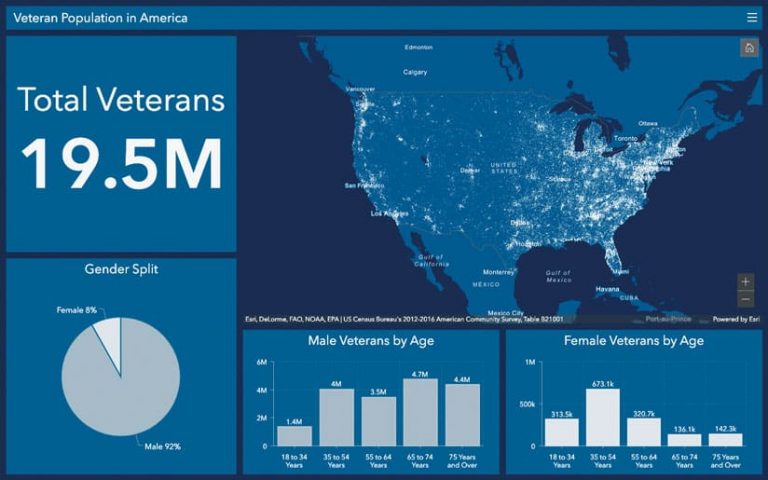
The beta version has also been built to take advantage of the latest mapping innovations available in the ArcGIS platform. These include overall improved map performance and the ability to draw more features on a map. The best way to see this in action is to create a map with the new Map Viewer beta and employ its new mapping capabilities, such as the dot density mapping style and/or improved pop-ups, and bring that map into a dashboard. The capabilities carry over, and the map looks great and renders fast.
Support for ArcGIS Arcade
ArcGIS Arcade is a portable, lightweight, and secure expression language written for use in the ArcGIS platform. It can perform mathematical calculations, manipulate text, and evaluate logical statements. Dashboard authors have been asking for the ability to leverage Arcade features, so the ArcGIS Dashboards team has added support for Arcade to the beta version in two ways.
First, just as other mapping enhancements carry over to the beta version, ArcGIS Dashboards beta now fully leverages all map authoring customizations made using Arcade. This enables users to take advantage of custom attribute expressions they’ve already written within their maps, whether in layer styles, labels, or pop-ups.

Second, the beta version has an interface that lets users compose Arcade expressions directly in ArcGIS Dashboards for both list and indicator elements. This allows users to customize how data points are rendered. Within these elements, Arcade can be used for conditional formatting, value conversions, and more. For example, users can employ Arcade to alter list items so special text appears when specific event conditions occur or to change the background color based on a reference value.
New Data Sources
Historically, dashboards supported a variety of different data sources, depending on the element and behavior. The map element supported the widest range of sources, but those sources could only be shown on a map, meaning they could not be used as the data source for other dashboard elements. In ArcGIS Dashboards beta, dashboard authors now have the flexibility to use the layers that were added to a map as the data source for other dashboard elements, such as lists, indicators, gauges, or charts.
Try It Out
To try ArcGIS Dashboards beta and provide feedback to the team, sign in to your ArcGIS Online account or get a free trial. Documentation, FAQs, and a discussion forum for ArcGIS Dashboards beta are available on GeoNet.
The ArcGIS Dashboards team is continuing to work on other features and will make them available for beta testing as they become stable.

