Over the summer, David Ho, a newly minted high school graduate from Alameda, California, was hired for a five-week summer internship with the City of Alameda’s Information Technology (IT) Department. The goal of the internship program, which is sponsored by the city’s Community Development Department, is to connect with young talent to advance city objectives while introducing students to the critical functions of operating a city.
When Ho came on board, Alameda was taking its first steps toward implementing a smart city plan. The plan includes unifying data collection with maps to help the city improve decision-making to secure better outcomes.

“We felt confident that David could master Esri tools to help us with GIS projects that other departments needed,” said Carolyn T. Hogg, the City of Alameda’s IT director. “As it turned out, the Alameda Police Department [APD] had a burning need for a GIS-powered dashboard that David Ho delivered.”
In Alameda, which is home to 80,000 residents, APD reports to hundreds of traffic stop and collision incidents each month. It is paramount that APD have steady access to vehicle incident data so that officers can make decisions quickly and respond to problems appropriately. Being able to locate hot spots with high traffic stop and/or collision rates is helpful.
Previously, to do this, APD had been using data in an ArcGIS Online web map. But police staff were printing PDFs of the map when they conducted monthly reviews, which meant that the department wasn’t using GIS at its full potential.
“After meeting with police leadership, IT and APD agreed that a GIS dashboard would be a better way to present the data,” said Zachary Baron, GIS analyst for the City of Alameda and Ho’s internship supervisor. “So David got to work.”
APD documents traffic stops and collisions through its computer-aided dispatch (CAD) software. The police department’s records supervisor exports incident report data from the CAD system into Microsoft Excel. The reports include latitude and longitude fields, allowing the data to be converted into a point feature class using the Display XY Data button in ArcGIS Pro. The records supervisor then uses the Append tool to upload the new data points to the existing ArcGIS Online hosted feature layer.

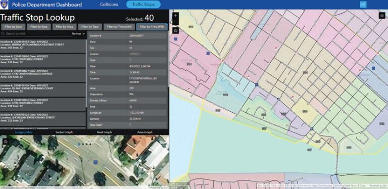
Police department staff wanted to see traffic stops and collisions overlaid on police sector, beat, and reporting area polygons. So Ho added two more existing layers: high-incident roads and high-incident intersections.
ArcGIS Online offers many methods for creating maps, apps, and dashboards. After testing out different templates, Ho decided to use ArcGIS Experience Builder to construct a customized experience from a blank template.
The GIS team at Alameda’s IT department had a list of criteria for the dashboard. The dashboard needed to be easy to use and have a gentle learning curve. It needed to display data in a clear and concise manner. It needed to be versatile so that it could be refined later. And it needed to be organized and uncluttered.
To make navigation of the dashboard easy, Ho split each part of the dashboard into sections that display different information. The map is integral to powering the dashboard, since the map and its data are linked to dynamic content in the widgets. When selecting and filtering data, the map reflects the changes in real time, giving users clarity when sorting incidents.
Ho made it so that sections visually separate different parts of the dashboard while retaining the changes made to them, even when the sections are hidden. This allows users to sort traffic stops and collisions into their own sections, each with their own lists, filters, and graphs. Users can feature data from one section without interfering with the other. Additionally, users can filter traffic stops and collisions at the same time, and both will show on the map in real time. This versatility vastly improves APD’s data organization.

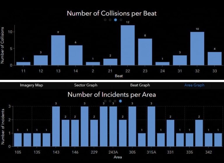
In the end, the dashboard that Ho built met—and then exceeded—the criteria the IT department had set for it. Ho added a separate small map that employs satellite imagery of the city and moves dynamically alongside the other map to increase visibility and clarity when users navigate the dashboard. He also made it possible for users to elect to show other sections in place of the secondary map if needed. These sections include graphs that sort incidents by police sector, beat, and reporting area. The graphs, like the map, change dynamically based on what users select and filter.
APD’s new dashboard proves the importance and relevance of GIS within the city.
“We are all fortunate to have a summer intern help our city’s [GIS] team by gathering traffic data that includes traffic collisions and traffic stops,” said APD police chief Nishant Joshi. “From this map, we visually saw the problematic areas and concentrated on traffic stops in places more prone to traffic collisions, resulting in a reduction of collisions.”
Hogg reiterated her commitment to applying GIS to helping solve problems in other city departments.
“While the demands and requests from city staff get more complex over time, technology always needs to stretch our capacity to meet these requirements,” she said. “With the help of ArcGIS, the City of Alameda plans to expand GIS into other departments to increase productivity [and improve] decision-making and organization. In addition to implementing GIS citywide, we are also excited about future plans to introduce GIS to students in the Alameda Unified School District.”

