Utility in Alabama Zeroes In on Clusters of Dead Meters Using Insights for ArcGIS
Opelika Utilities in Opelika, Alabama, serves nearly 20,000 customers. Its mission is to determine the current and future water needs of Opelika’s citizens and industries while ensuring that its water sources, facilities, and staff continually provide pure and plentiful water.
With a view to improve its operational efficiency, Opelika Utilities began taking a closer look at where it was losing revenue and how it could increase earnings more effectively. While many utilities are concerned about water loss due to leaky infrastructure, this is not a major issue for Opelika Utilities, since its infrastructure-based water loss is well below industry standards. Instead, Opelika Utilities’ primary concern was dead meters—meters that are either broken or not reporting accurate usage. The utility had no way of knowing how vast its dead meter problem was, though, until it assembled all its data in Insights for ArcGIS and visualized some unexpected patterns.
Transitioning from Manual to Automated to Easy
For years, Opelika Utilities had employed a manual process to identify potential dead meters and extremely high and low monthly meter readings, which often indicate leaks or meters that aren’t tracking water being used. Once a month, an office-based team member would spend a day reviewing the meter reports, painstakingly combing through 14,000 daily readings in Microsoft Excel, line by line. Unsurprisingly, a significant amount of information likely got overlooked. Opelika Utilities needed an easier—and automated—way to review its meter readings, analyze them, and generate work orders so that nonoperating meters could be attended to.

In 2016, Opelika Utilities teamed up with Esri partner GISinc to connect its billing system to the Cityworks solution (which it was already using) and GIS. To collect, filter, and aggregate data, the team used Python scripts along with ArcPy, a Python site package, to develop a mostly automated way to comb through meter reports and find discrepancies in readings. With this scripting process, Opelika Utilities was able to simplify its meter inspection and work order processes, leading to an increased annual revenue of about $100,000. But the scripting process was demanding on the hosted servers, and maintaining and modifying the scripts took a lot of time and effort.
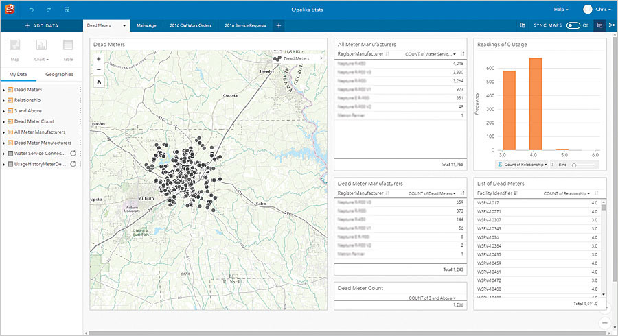
By April 2017, Opelika Utilities was ready to make dead meters easier to identify. Armed with hundreds of thousands of records on service connections, meter usage, work order history, and more, Opelika Utilities and GISinc put all this data into Insights for ArcGIS.
Discerning Patterns in Dead Meters
This web-based data analytics workbench made it simple to visualize the results, which were eye-opening—so much so that Opelika Utilities’ general manager, Dan Hilyer, almost fell on the floor. Out of 14,000 meters, more than 3,000 (between 20 and 25 percent) were dead. This translated into an estimated $25,000-per-month loss in revenue, or $300,000 per year.
“It’s information that no manager wants to hear, but information that we need to know,” said Hilyer.
This was a much higher loss than Opelika Utilities had expected. The company’s capital projects manager, Alan Lee, knew there had to be a larger problem. Thankfully, with Insights for ArcGIS, Opelika Utilities could do further analysis to discern patterns in dead meters and identify specific manufacturers, model numbers, and when meters were installed. It turned out that most of the issues were occurring in meters from a single manufacturer that were being installed in new developments. The good news was, all the problematic meters were still under warranty. So replacing the majority of the dead meters would cost Opelika Utilities nothing in equipment.
“Insights for ArcGIS gives [the] end user the power to filter data and see results without the requirement of being a computer programmer or Python scripter,” said Lee. “Once the data is connected, it’s all plug and play—a very powerful software.”
As Opelika Utilities continues to replace the dead meters, some of its next steps include working with GISinc to enhance the results by integrating them with Operations Dashboard for ArcGIS to show progress, Collector for ArcGIS to assist with field collection, and Cityworks to automate the work order process even more. Additionally, Opelika Utilities is identifying the next big question it wants to ask and analyze data for using Insights for ArcGIS.
“[This illustrates] what can happen when you combine powerful technology from Esri with the desire to improve operational efficiency and a vision of location-enabled business,” said Kevin Stewart, director of state and local sales at GISinc.
Identifying and Curbing Revenue Loss
At some point, every meter will stop working due to manufacturer defect, age, or damage and require maintenance or replacement. The power of being able to connect meter usage with billing and service requests can help utilities identify the extent of their equipment problems. And with Insights for ArcGIS, the process can be replicated repeatedly, meaning that utilities can use the technology to identify and curb all issues causing revenue loss.
For more information, email Lee from Opelika Utilities or Stewart of GISinc.
To see how to put Insights for ArcGIS to work in any organization, watch this collection of demonstrations.