The right map presented at the right time helps advance conversations about the issues communities face. For GIS analysts and managers, the challenge is not simply creating a map—it’s crafting a map that shows where there’s an opportunity to intervene.
If you’re a GIS analyst for a city grappling with housing affordability, you could easily create a dozen maps showing median income, rent prices, and housing density. But what if you could create a map that shows which neighborhoods have the highest number of residents spending more than 30 percent of their income on housing? What if you could further break that down by renters and owners? That’s the power of a policy map. It doesn’t just present data—it tells a story and points to solutions.
Esri Maps for Public Policy—or Policy Maps for short—is a collection of thousands of high-quality maps and layers in ArcGIS Living Atlas of the World that provides a powerful starting point for developing policies that can change communities. These ready-to-use maps and resources, which can be integrated with other relevant data, help GIS practitioners dig deeper into key geographic information and show leaders and the public the best ways to move forward.

From Data to Wisdom
Many GIS professionals are familiar with the DIKW—data, information, knowledge, and wisdom—pyramid, a concept that illustrates the progression from raw data to actionable wisdom. A policy map is a great example of this progression. It transforms raw data into information—which, when analyzed and understood, becomes knowledge.
This knowledge informs the wisdom of sound policy decisions. Any policy that is intended to address real issues must be informed by good data and valid reasoning. At the same time, many issues that are addressed by policy have a spatial component. Sound policy decision-makers consider the spatial component when evaluating problems, reviewing alternatives, implementing new plans, and communicating results.
As an example, a standard GIS map might show all the snowplow routes in a city. This is an infrastructure map, useful for operational purposes. A policy map, on the other hand, might focus on the efficiency or frequency of service, showing areas of success alongside areas needing improvement. It answers a specific question, such as, “Are all neighborhoods receiving equitable snowplow service within 24 hours of a major snowfall?”
This distinction is important: A GIS map can have many layers to answer many questions; a policy map presents data in a way that highlights opportunities for action.

Insights from Hurricanes to Housing
The use of geographic data to inform public policy has a long and storied history. In 1961, the TIROS III satellite detected a weather disturbance that would become Hurricane Esther. This was the first time a hurricane had been discovered by satellite imagery, and the warnings that followed were a direct result of this new geographic perspective.
This also marked a turning point in using geographic data to protect lives and property. Before this, forecasters relied on ship reports and reconnaissance aircraft, which left vast parts of the ocean unmonitored. The satellite image provided the first piece of evidence—the data part of the DIKW pyramid—that a storm was forming. This data was then transformed into information as meteorologists tracked the storm’s path and intensity. This information became knowledge as they applied their understanding of atmospheric science to predict the storm’s future movements and layered that information on maps to show where people, housing, and businesses were at risk of inundation and damage—leading to public warnings that saved countless lives. Finally, this knowledge became wisdom when those and other related maps were used to illustrate where cities could develop policies to improve infrastructure, strengthen insurance coverage, enhance evacuation routes, and more.
Today, we have access to an unprecedented amount of geographic data, and the applications for policy mapping are virtually limitless. From tracking the spread of diseases to identifying areas in need of affordable housing, policy maps are an essential tool for understanding and addressing the complex challenges facing our communities. For example, a map showing the percentage of income people spend on rent can quickly identify neighborhoods where housing costs are burdensome, allowing policymakers to target assistance programs more effectively. Another map might show the average educational attainment of adults in different census tracts, informing decisions about where to put new job training centers or establish adult education programs.
-

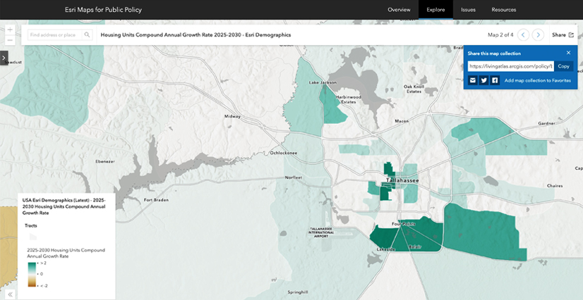
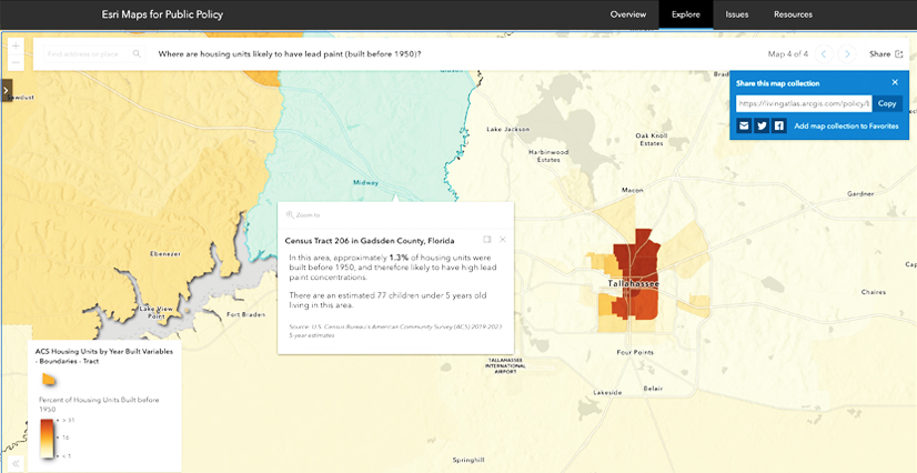
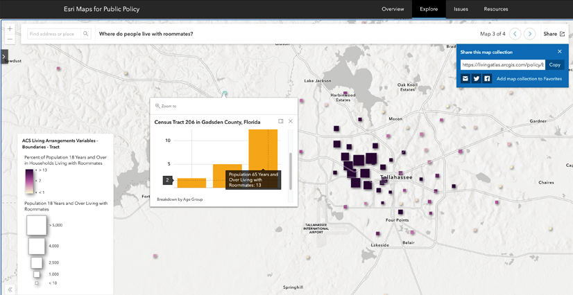
Policy Maps can present various datasets on housing, such as how much people pay for it, what kinds of units are being built, families’ living arrangements, and the likely composition of building materials based on when units were built.
Your ArcGIS Online Advantage with Policy Maps
Esri Maps for Public Policy is a curated collection of maps and layers that are freely available to all ArcGIS users. This library of content is designed to help users create compelling policy maps quickly and easily. The maps are fueled by living data from sources such as the US Census Bureau’s American Community Survey and cover timely issues, so they are constantly evolving and being updated.
Because these maps are part of ArcGIS Online, users can easily integrate them with their own GIS data. This allows you to create custom maps that are tailored to the specific needs of your community. You could take a map of an area’s housing cost burden and overlay it with your city’s zoning data to see if there is a correlation between zoning regulations and housing affordability. You can also customize the symbology and pop-up explanations of the data to suit your needs.
Building Your Community’s Map Portfolio
As a GIS professional, you are in a unique position to deliver high-quality maps and geospatial information products that support policy initiatives. The Policy Maps website provides a wealth of resources to help you get started. You can browse maps by topic, explore curated content, and access training resources and best practices. An ideal map portfolio for your area would orient people to the basic facts, teach them that things vary by geography, and inform them how policies are helping or not helping a given issue.
We encourage you to build a collection of maps on topics that are important to your community and share them with your leadership. You can even contribute your own policy maps to the site so that others can benefit from your efforts. By working together, we can create a rich and diverse collection of policy maps that will help us all make better-informed decisions and build stronger, more resilient communities.