With 189 member countries and offices in more than 130 locations, the World Bank Group is a global partnership that aims to end extreme poverty and promote shared prosperity in economically underdeveloped countries. Composed of five unique institutions, the World Bank has worked with local governments on 12,000 projects that support development and relief and has distributed more than $45 billion in financial assistance.
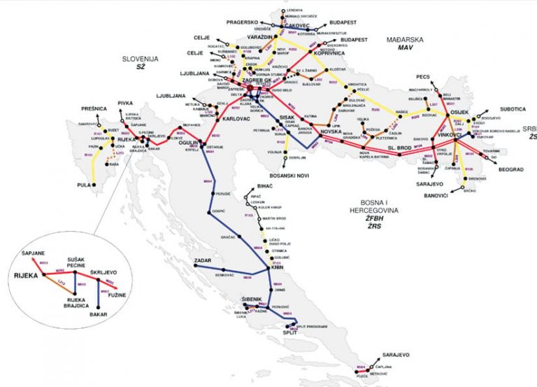
The World Bank recently partnered with a group in Croatia to gain insight into the country’s rail network, an effort that would lead to improved safety and the more efficient transport of goods. As part of this effort, the two teams inventoried Croatia’s railways to better identify sections that were at risk of deterioration and in need of maintenance or that could become commerce choke points. In the inventory, however, some of the data was shown in different systems of measurement, and a lot of the schematic diagrams were rudimentary, which made it difficult to view and manage the data.

To enhance and streamline the railway’s existing data management system, the World Bank and the local teams in Croatia joined forces with Esri partner SymGEO. Based in Maryland, the company provides cost-effective GIS mapping solutions and digital community engagement platforms for government, commercial, and nonprofit clients. Over the course of two months, SymGEO worked with staff from the World Bank to develop a high-resolution, unified dataset and create a dashboard solution that improved data management and analysis.
Inconsistent, Cumbersome Data Precipitates Automation
Croatian rail data used to be stored in a series of spreadsheet files. Depending on what was being queried, the methods of linear referencing (a way of storing geographic locations using relative positions along a measured linear feature) differed. The data included railway information such as network age, speed limits, and transportation volumes.
The different referencing systems made it time-consuming to cross-reference data and get answers to specific questions, such as how many gross tons were transported on networks within a certain time frame. The incompatible linear referencing methods also led to other inconsistencies in the data, such as mismatched railway segments and misnamed stations. It was challenging for the World Bank’s analytical staff to understand which section of the railway particular files were referring to and how that section related to other files in the spreadsheet.
What’s more, this way of storing and managing data made it difficult to identify sections of the Croatian railway that needed upgrades or maintenance. One of the World Bank’s jobs in Croatia was to find railways that might be at risk of structural failure—for example, railways over a certain age that transport a specific amount of cargo per year. Its other job was to pinpoint potential trade bottlenecks due to speed limitations.
World Bank staff members wanted a solution that would allow them to get answers to their questions interactively rather than having to request individual analyses on a per-question basis. To make this happen, SymGEO developed an automated solution that would streamline data management for Croatian railways, allow staff to answer their own queries on the fly, and enable them to create their own report graphics.
“They approached us with a classic GIS problem: they have attribute data in one format and geospatial data in another. Unfortunately, the two don’t talk,” said Kevin McMaster, principal at SymGEO. “Our job was to facilitate the communication between datasets, leading to greater insight and [giving them] the ability to tell a story with their data.”
Easy-to-Configure App Improves Data Querying, Summarizing
To simplify data management and increase accessibility, SymGEO used best-available railway data from OpenStreetMap for the geospatial component of the new feature service and calibrated the network based on the multiple linear referencing systems. The SymGEO team then attached attribute values to the geospatial data on a per-section basis.
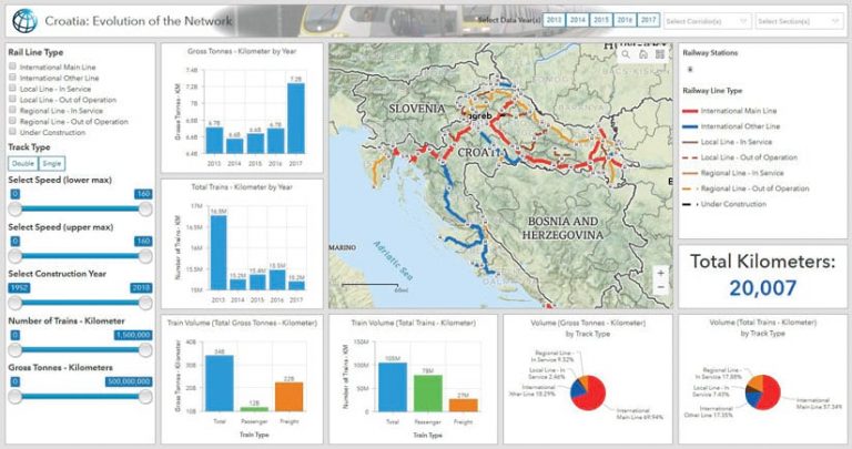
Once the data was cleaned, validated, and published, SymGEO used ArcGIS Dashboards to configure a unique dashboard for the World Bank that shows Croatia’s railways. According to McMaster, the World Bank invested in ArcGIS Dashboards because the configurable web app includes tools for data analysis, aggregation, processing, and preparation. For this project, it meant that stakeholders in Croatia’s railways could perform interactive querying in ArcGIS Dashboards and have access to all the attributes originally contained in spreadsheet files but in a more visual format.
“ArcGIS Dashboards was the most cost-effective solution given that it is an easily configurable application as opposed to building custom code from the ground up,” said McMaster. “It is also a very shareable resource.”

To create the Croatian railway dashboard, all the information in the spreadsheets had to be available for the app to query. This included data such as a railway’s segment name, age, speed, transport volume, and rail type. Once the data was set up, configuring ArcGIS Dashboards to read the feature service and summarize the statistics was relatively easy, according to McMaster.
“With ArcGIS Dashboards, you can now click on a particular segment and get the network age, what is the total speed, and what is the transportation volume,” he explained. “The client also has access to multiple years of data.”
After running queries on the railway data, ArcGIS Dashboards can also efficiently summarize it.
“The real power of the application is being able to summarize one attribute based on another, as this wasn’t possible with the multiple spreadsheet files referenced to different systems,” said McMaster. “The fact that now a spatially accurate, attributed railway system was produced as part of this project was an added bonus.”
Better-Informed Decision-Makers and Room for Advancement
For the World Bank and the local teams in Croatia, implementing ArcGIS Dashboards has improved data accessibility and analysis and streamlined processes. Now, decision-makers can easily access information about Croatia’s railways and gain better insight into them so they can come up with better-informed strategies.
Additionally, the World Bank’s GIS team no longer has to field multiple requests for maps that focus on different aspects of rail infrastructure, and analytical staff can now use ArcGIS Dashboards to query the data interactively. The solution summarizes data on the fly and makes report-ready information available immediately.
ArcGIS Dashboards also gives users the ability to zoom in and out of a map, create report-ready graphics, and focus only on the railway segments of current interest. Overall, this has increased efficiency and enables the World Bank team to get the answers it needs quickly.
“This configurable application is a solution that allows deeper insight into the data than was possible using the individual source datasets,” said McMaster. “The railway feature service data can also be easily expanded to include future years of data.”
With ArcGIS Dashboards, the World Bank now has the robust solution it needs to get an overview of all Croatia’s railway infrastructure and take action based on the best-available data. In the future, McMaster would like to see data from each new year added to the solution so it can be used to answer new questions. He also thinks ArcGIS Dashboards would work really well for similar projects in other countries.
“Now that the data is set up, there is certainly a lot of room for advancement,” said McMaster. “I have found that virtually every project can be complemented by ArcGIS Dashboards.”

