Australia’s most populous city faces a worrying outlook: Heat-related deaths in Sydney could rise by up to 444 percent under current warming trajectories, according to Australia’s first-ever national climate risk assessment, released in September 2025. This projection comes as heat waves already cause more deaths in Australia than all other extreme weather events combined, with about 341 heat-related excess deaths recorded in Sydney between 2007 and 2017 alone. Even under the best-case warming scenario, Sydney’s heat-related mortality is expected to double.
The crisis is already manifesting in concerning ways: Between 2000 and 2020, the greater Sydney region experienced more days with temperatures exceeding 35°C (about 95°F) than during the preceding 120 years combined, according to research by Professor Sebastian Pfautsch and his colleagues at Western Sydney University.
In response to this escalating threat, the City of Sydney partnered with Western Sydney University to conduct the most detailed analysis of urban microclimates ever undertaken in the city. With more than 100 sensors deployed across diverse urban landscapes in 2023 and 2024, the project leveraged tools like ArcGIS Velocity and ArcGIS Pro to transform temperature and humidity measurements into actionable intelligence for protecting vulnerable communities.
A City Under a Microscope
The project grew out of earlier work the City of Sydney had undertaken. According to Zoe Morrison, a senior sustainability strategist who oversees the city’s environmental and resilience strategies, a 2022 climate equity study had identified communities that were most at risk from heat. But Sydney needed more detailed information.
“We decided that we wanted to find out more about how heat’s going to impact the city on more of a granular level,” Morrison said.
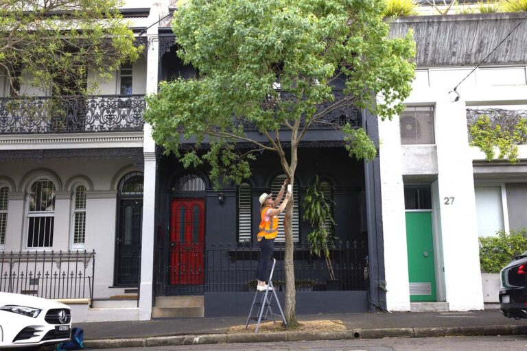
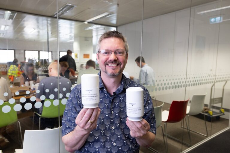
Led by Western Sydney University’s Urban Transformations Research Centre, the urban heat mapping project took place from December 2023 to March 2024 and involved deploying 127 sensors across a range of urban landscapes. Developed at the university, the sensors each consisted of a single-use temperature logger protected by a passively ventilated radiation shield. Placed three to four meters from the ground, the devices recorded near-surface ambient air temperatures—and, in some locations, relative humidity—every 10 minutes for 110 days.

From public parks and residential streets to the city’s bustling waterfront and industrial hubs, the sensors collected more than 1.5 million measurements, painting a granular picture of how heat is distributed across the city.
Processed in R—a powerful programming language designed for statistical computing and data visualization—this huge dataset required a robust platform for analysis and visualization. ArcGIS Pro provided the core of the data analysis and cartography workflow.
To manage real-time data streaming from the sensors, the team also used ArcGIS Velocity, an ArcGIS Online add-on that enables real-time and big data processing. This allowed the team to collect a continuous flow of temperature and humidity readings and process them on the fly. Researchers fed the data into ArcGIS Online, providing a centralized, cloud-based platform for the project’s data and maps.
Now, the public can access time-enabled maps that show temperature changes across the city on various hot days, providing a visual narrative of how the urban environment heats and cools.
Pulling Back the Curtain on Sydney’s Thermal Landscape
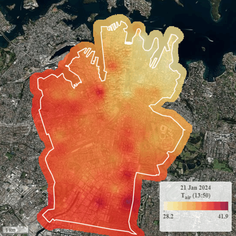
The analysis revealed stark thermal inequalities across the city. On hot days of 35°C (95°F) or higher and extreme heat days of 40°C (104°F) or higher, a clear north-south thermal gradient emerged. Specifically, while the cooling influence of Sydney Harbour and the Pacific Ocean provided more benign temperatures in northern areas such as the Royal Botanic Garden, southern suburbs such as Alexandria and Rosebery endured temperatures more than 10 degrees higher. These findings challenged common perceptions about the city’s climate.
“A lot of people assume that since Sydney is a coastal community, it’s going to be fine during a heat wave,” Morrison explained. “But having this study helped show that it actually gets really hot and humid here, and we don’t cool down much [at night] either.”

The data also pinpointed specific hot spots. On December 9, 2023, the hottest day of the summer that year in Sydney, temperatures in the city’s boundary with the St Peters neighborhood were as high as 45.3°C (almost 114°F). The project also identified areas with the highest summer nighttime temperatures, a key factor in heat-related health risks.
Animations created in ArcGIS software provided a world-first visualization of Sydney’s harbor breeze, when cool air over the ocean moves inland. Time-enabled maps show the intensity and spatial extent of this cooling breeze as it moves across the city, and provide insights into natural cooling resources that can be enhanced via strategic planning.
From Data to Actionable Intelligence
The project’s findings provided the City of Sydney with a clear road map for heat mitigation. Detailed maps and analysis allowed the city to move beyond a one-size-fits-all approach and develop targeted, place-based cooling strategies such as planting trees or installing water-based cooling infrastructure.
For Morrison, the ability to layer multiple datasets in ArcGIS was a key advantage. She combined the new microclimate data with existing layers for canopy cover and demographic information to create a comprehensive risk profile.
“The data has helped us map the resulting GIS microclimate maps and overlay them with canopy cover layers, our climate priority community layers, and flooding layers to profile our most at-risk suburbs and where to target action,” she said.
Recommendations stemming from the report call for focusing cooling efforts on the city’s central and southern suburbs, increasing tree canopy cover along the hottest streets, and promoting cool zones such as public parks during heat events. The data also highlights the need to cool specific hot spots, such as the playground at Juanita Nielsen Community Centre in the inner-city suburb of Woolloomooloo.

Pfautsch, who works at the Urban Transformations Research Centre, emphasized the importance of this evidence-based approach.
“The key outcome of this project is to provide the City of Sydney with the evidence to make targeted decisions on where to implement greening strategies to cool the city,” he said. “So instead of just planting trees anywhere, we can now tell them, ‘These are the streets that are hottest, and these are the communities that are most vulnerable, and this is where you should invest first.’”
Collaboration between the City of Sydney and Western Sydney University serves as a powerful example of how cities can leverage GIS to build resilience to rising temperatures. By combining scientific research with analytical and visualization capabilities of the ArcGIS platform, the project has transformed a complex environmental challenge into clear solutions. The resultant publicly available maps, data, and clear recommendations help ensure that the project’s insights can inform decision-making at all levels, from city planners to individual residents.
“Some of the actions, like increasing tree cover and being more equitable with planting, are already being monitored through thermal flyovers and greening reporting,” Morrison said, adding that this data is also processed into a GIS.
The city is exploring how to create a permanent monitoring network, such as by looking at whether the city has permanent sensors plugged into its smart light poles.
As cities around the world grapple with rising temperatures, Sydney’s urban heat mapping project offers a model for evidence-based climate adaptation. It demonstrates that by understanding the intricate details of their thermal landscapes, cities can develop smarter, more effective strategies to protect their communities and create more livable, resilient urban environments for the future.


