A perennial hurdle for cities around the world is the task of ensuring infrastructure projects are planned, communicated, and monitored clearly. These projects are the bones of any well-functioning city, and having a framework for effective communication in place can only save time and money within departments and make life easier for city residents.
In Schertz, Texas, this issue was acute. To provide effective communication about capital improvement projects (CIPs) to stakeholders, city management would have to reach out to the engineering department directly for information. This meant requiring formal reports, waiting for scheduled meeting times, or communicating vital information with numerous phone calls. The team recognized the need for a solution that would streamline this communication.
The Schertz engineering department collaborated with the city’s GIS team to address this challenge by using ArcGIS Dashboards to develop the Capital Improvement Projects dashboard. This dashboard has not only improved internal processes but also enhanced transparency between city management and residents. The dashboard’s ability to provide real-time project updates reduced the need for countless inquiries and allowed users to view ongoing and upcoming projects on demand.
Elements of Design
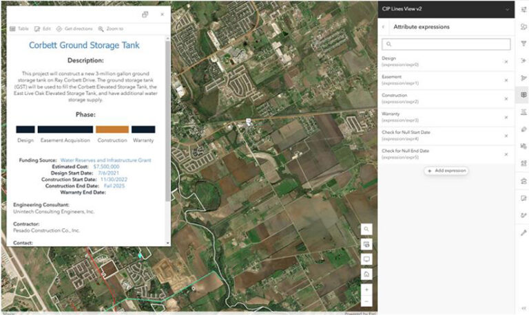
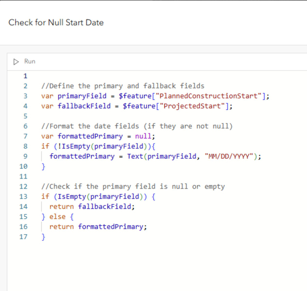
While the dashboard prioritizes a user-friendly, intuitive design and filtering capabilities, many of its impacts lie behind the scenes. ArcGIS Arcade and HTML coding enhance the pop-ups with unique features, including a dynamic progress bar, which visually represents each project’s stage along its timeline. The design for the progress bar is coded using HTML in the pop-up editor in Map Viewer by adding an Arcade expression under Add Content. The information needed to feed the progress bar is housed in the attribute expressions using conditional logic and ultimately referenced in the HTML script.

Another challenge addressed through coding involved the project’s start and end dates. Definitive dates for CIPs are not always available due to the bidding process and contract variations with third-party companies. To accommodate this, Arcade conditional logic ensured dates were accurate and flexible. The dashboard dynamically defaults to showing the projected season and year (e.g., “Spring 2025”) for projects without a finalized deadline. Once a contract is in place, the start and end dates update automatically to show the official timeline. These design features ensure that the dashboard is user-friendly and highly accurate, providing stakeholders with a clear picture of the project status when needed.
Development and Evolution
The development of the CIP dashboard was a collaborative effort that spanned almost a year. The GIS team and the engineering department met monthly to discuss revisions of the design, identify pertinent project details, and determine what was deemed public information. This iterative process allowed for continued improvements and feedback from stakeholders to ensure that the tool met both functional and aesthetic needs.
While continually evolving, the current version of the dashboard represents months of planning, coding, and testing. The result is a living, breathing application that can be updated regularly to reflect real-time data and developments.
“The customization and creation of our new dashboard is not only user-friendly but it also has the capability to display all the information we want,” said John Nowak, assistant city engineer for Schertz and active collaborator for the CIP dashboard. “Since our dashboard has gone online, we have received many compliments from the public and our elected officials on how easy the information is to access and how helpful it is. The dashboard has been such a success that other departments are now working with GIS to develop similar dashboards for their needs.”

The success of the current rendition of the dashboard has set the stage for future enhancements. Since the dashboard has gone live, the city has been actively working on collecting data for future projects leading all the way out to 2050. One long-term goal is to give users the ability to query upcoming projects for the next five years without having to display the linework for all future projects. This will require at least a date field reflecting the fiscal year in which the project is planned. With the use of conditional logic, as each new year begins, projects scheduled for the sixth year will automatically transition into the five-year project list, ensuring that the dashboard remains current and relevant without having to manually update all its elements. By leveraging this automation and data management, the Schertz GIS team aims to further enhance the dashboard’s functionality, making it an important asset for future planning and decision-making.
Schertz’s Capital Improvement Projects dashboard is a straightforward, powerful example of how GIS can solve complex challenges, enhance workflows, and promote clear communication and transparency within municipalities. Combining ArcGIS Dashboards with additional coding techniques, Schertz’s GIS team has developed a solution that supports communication across city management, the engineering department, and the public alike.


