There’s a good chance that no matter where a person lives in the United States, they have a YMCA—or Y—nearby.
With nearly 2,600 locations across the country, the Y has been a popular destination for people looking to improve their health and wellness; build community; access free and nutritious meals; and participate in water safety, childcare, and youth development programs.
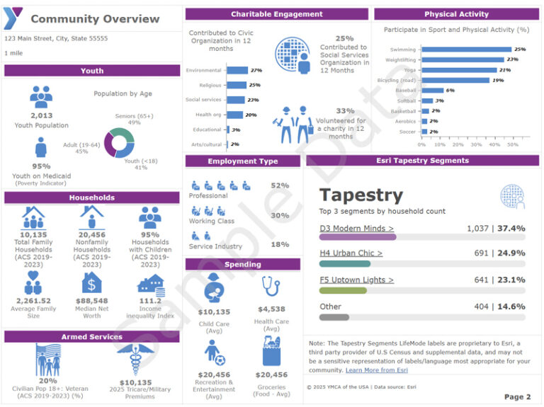
“Ys have a strong awareness of their members and need support in better understanding the broader communities they serve,” said Andy Henry, senior analyst for GIS and data visualization with YMCA of the USA (Y-USA). Henry has helped provide that understanding. He uses ArcGIS Business Analyst to create infographics tailored to each location, showing data about the surrounding community. This information has become critical to crafting strategies and growing operations.
Knowing more about current and potential members, to identify the services and programming that might appeal to both, is essential to running a Y. So is being savvy at picking the best places to open or grow a location and being adept at advocacy when seeking support or grant funding.
“When Y staff see the infographics, it gives them the insights they need for helping with strategic planning, grant applications, and more,” Henry said.
For one location in South Dakota, for example, the infographic shows details about the median household income, how many households have children, the largest population groups based on age and gender, and characteristics such as interest in exercising regularly and seeking information on healthy diets. It shows what jobs community members hold. It also shows how many people swim (24 percent), lift weights (20 percent), and do yoga (13 percent). The Y can then make decisions on what kind of programming to offer based on community interests and characteristics.
Transformational Data
For Rob Totaro, director of member advancement for the Alliance of New York State YMCAs, the information gained through ArcGIS Business Analyst has been transformational.
“Visualizing economic and health-related needs in specific neighborhoods has allowed Ys to expand into underserved communities, create new programs, and refine services to better meet demand,” he said.
Totaro works with 38 independent Ys and more than 135 branches. In his role, he also advocates on their behalf, providing lawmakers with tailored, district-specific data to make more compelling cases for policies and funding that support YMCA programs across New York.

“At the statewide level, it has made our advocacy more precise and impactful,” he said.
Access to rich data has been a departure from the limited data he often encountered throughout his 25-year career in marketing across multiple industries. The insights, often limited to basic demographics and surface-level information, weren’t enough to drive meaningful strategy. Now, as he supports YMCAs through strategic planning and board governance processes, he can analyze membership trends, comprehensive demographic data, and socioeconomic profiles to lead change management initiatives that challenge assumptions and preconceived ideas.
“With these tools, I can show YMCA boards where their members actually are and highlight community needs they may not have considered,” he said. “Ultimately, the reports have helped demonstrate both accountability and vision. They show that we understand our communities deeply and that we are making thoughtful, data-driven choices to improve health, strengthen families, and build stronger communities.”
Sometimes the data confirms what YMCA boards already knew, but other times, it reveals blind spots. “In both cases, it ensures that choices are grounded in evidence rather than guesswork,” he said.
Custom Reports, No Additional Cost
Henry generates each infographic report in ArcGIS Pro using a Python script to update it automatically. He includes Esri’s latest demographic data, the ArcGIS Tapestry segment profile, which is updated once a year. Every YMCA branch location gets an infographic showing data within a 12-minute drive time, or a three- to five-mile radius. There are also reports for each of the more than 700 YMCA associations across the 50 US states, the District of Columbia, and Puerto Rico.
What made Business Analyst particularly appealing to Henry was the ability to integrate Y-USA’s own internal, proprietary datasets with Esri’s available datasets to create custom infographics and reports.
Previously, individual YMCAs would have had to pay for a third party to do a special analysis of their communities and members. Now, they can request reports directly through the national resource office, Y-USA, at no additional cost. They can also access the data on their own, in a self-serve capacity, to make their own reports.
Henry has also used Business Analyst to run sustainability assessments for site selection of new locations or expansions; quickly produce reports on demand (including demographics profiles, market potential, and consumer segmentation); and compare locations against key benchmarks for further analysis.
“Data isn’t the final answer, but it’s a good starting point,” Henry said. “These tools make it easier for Ys to visualize who lives in their communities and begin asking the right questions.”
For Totaro, the tools have done even more than that.
“The reports have fundamentally elevated the Y’s ability to plan strategically, serve effectively, and advocate persuasively,” he said. “By grounding decisions in credible, visualized data, they help Ys move beyond intuition and anecdote to a more objective, evidence-based approach.”


