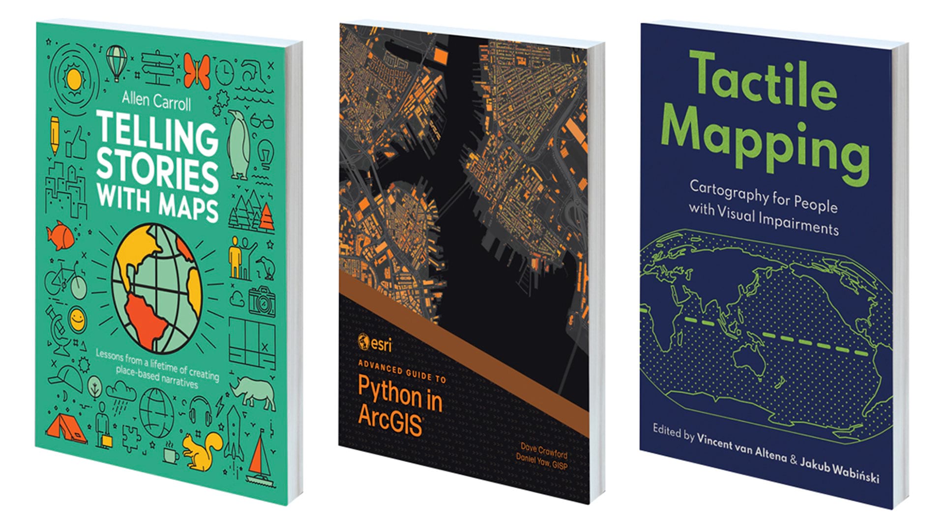
With ArcGIS Dashboards, it is important that your data has a look and feel that suits the story you are trying to tell. You may be delivering a business brief or planning a land-conservation project with your community—each of these will involve different colors and styling options that best communicate the data to your audience.
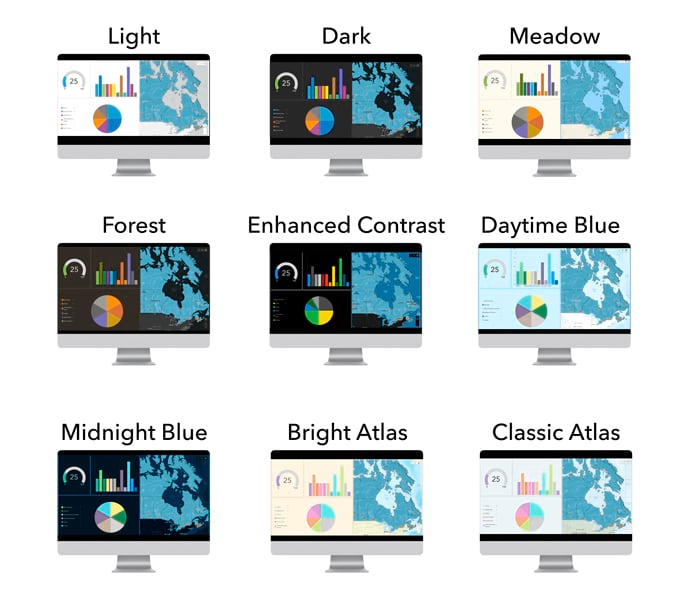
This is where dashboard themes come in. Within ArcGIS Dashboards, there are several provided themes that you can apply with a single click. You can also create custom themes to match your organization’s style guidelines and user environments, complement the data, and more. The theme is saved with the dashboard and applied to both desktop and mobile views.
When you create a dashboard, you will see theme options available in the Theme panel. The light theme option is applied by default. Switching between theme options is easy, allowing you to choose one that suits your needs. All provided themes have been tested for appropriate contrast between text and foreground, ensuring that your dashboard is not only attractive but also easy to read. When adding a new chart, built-in colors for data visualizations are paired with colors in the layout for a professional, consistent aesthetic.
Using the theme panel, these theme options can also be applied to dashboards created prior to the June 2024 update. Your current theme will appear as a custom theme. To switch to the new theme, simply copy a new one for use from the themes list. If you want to try modifying an out-of-the-box theme, it will override your existing custom theme.
Custom Themes
Creating a custom theme, whether from scratch or based on an out-of-the-box theme, is simple and efficient. To copy and configure it, use the Customize selected theme button—you will see a custom theme panel displayed. Here you’ll find options to further customize your colors along with additional styling controls for corner radius and element spacing.
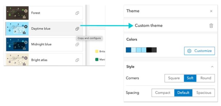
Digging deeper into custom theme settings will help you find additional options to tailor the look and feel of your dashboard to meet your needs. In the Color section, click Customize to see options to edit the colors in your dashboard. Three key colors are used for the text, foreground, and accent for your dashboard, and they play a significant role in the overall appearance. If you expand the Advanced colors panel, you will see additional color options to adjust areas of the dashboard that were previously unavailable for adjustment.
If you’re working with brand guidelines from your organization, this may be where you choose to incorporate them. As you adjust colors, you may notice an alert next to the color you’ve changed. These are part of a built-in color contrast checker, which can ensure that you’ve achieved adequate contrast between text and foreground. If this alert shows up, open the color picker and expand the area at the bottom to see where contrast may need improvement. As you adjust the color, you will see the alert in the panel disappear and the contrast checker will provide a positive indication.
Basemaps That Match Your Theme
Basemaps play an important role in making your data stand out. When it comes to aligning a map with the overall theme of a dashboard, balance is key. The right basemap can help tie your dashboard together, ensuring that the map’s geographic context enhances your data without overpowering the overall design.
Many basemaps come with color-rich schemes and intricate details, which can be distracting and diminish your data’s ability to stand out. They can also compete with the theme colors in the dashboard. In such cases, ensuring that the basemap complements your dashboard theme is essential for maximizing both aesthetics
and clarity.
To choose a basemap, open Map Viewer and access the Basemap pane by clicking the Basemap option on the Contents toolbar. You can then select from various basemap types, such as topography, imagery, or streets.
Whether your dashboard is using a provided theme or a custom one, the base-map’s color is important in complementing your dashboard’s overall color scheme.
Tint Your Basemap
If your map requires important geographic context, such as road networks or city boundaries, but the color scheme of the basemap clashes with your dashboard theme, you can easily adjust the basemap colors. Let’s take the permits dashboard shown here as an example to demonstrate how to modify the basemap to better align with its dashboard theme.
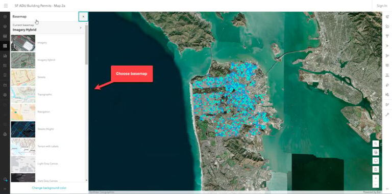
- Open the web map in Map Viewer and start by selecting a basemap that provides the necessary geographic context for your data. In this case, World Imagery provides context to proposed building locations.
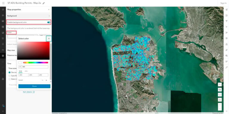
- To match the overall look and feel of your dashboard, apply a background color. From the map properties option on the Contents toolbar, click Enable background color to select a color that complements the theme.
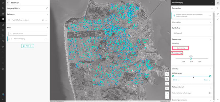
- Combine blend modes with effects to fine-tune the appearance of your map. Adjusting the transparency can help you control the visibility of underlying layers, while blend modes give you additional control over how the layers’ colors and textures are displayed.
As an example of this last point, applying luminosity blending to the permits web map helps the data stand out by softening the colors in the basemap.
To apply this effect, point to the Basemap pane on the Contents toolbar and click Current Basemap.
First, select the layer and click Properties. Then under Appearance, in the Blending drop-down menu, select Luminosity. Finally, adjust the transparency as needed to improve the overall aesthetic.
The result is a map that aligns with the dashboard’s theme and accentuates the data points, all while providing important satellite imagery context for reviewing construction sites.
(Tip: Turn off the web map’s background color in Map Viewer and instead set it in the dashboard. This allows you to try different dashboard themes and see the tinting happen directly in the dashboard.)
Additionally, adjusting your effects can enhance specific map features, such as roads. Subtle adjustments can help the map align with the dashboard’s design.
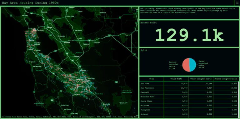
Balancing your basemap with the dashboard theme is key to ensuring that the data remains clear and easy to interpret. The goal is to adjust content-rich basemaps—by tinting or modifying them—to complement the dashboard theme without overshadowing the data itself. A visually appealing map can enhance your dashboard’s effectiveness. When done thoughtfully, themes allow you to achieve both a beautiful design and a functional dashboard that communicates critical information.


