Staff members of the Data Visualization Office of the Tennessee Department of Transportation (TDOT) used Esri tools to identify ideal locations for meetings with the public about new transportation developments, with special emphasis on including vulnerable segments of the population who should be protected by environmental justice laws.
These vulnerable populations include minorities, impoverished people, zero car households, youth under 18, adults 65 and older, persons with disabilities, those with limited proficiency in English, and those with less than a high school education.
Executive Order 12898 was issued in 1994 to bring federal attention to the environmental and health effects of federal actions on vulnerable populations. The federal government was tasked with “identifying and addressing, as appropriate, disproportionately high and adverse human health or environmental effects of its programs, policies, and activities on minority populations and low-income populations.” A year later, the US Department of Transportation (USDOT) finished its strategy for applying these principles to transportation. By ensuring that minority and low-income communities are meaningfully involved in the public engagement process, transportation benefits and burdens can more fairly be distributed among all communities.
TDOT has followed USDOT’s lead, participates in these efforts, and is working to make sure that the voices of vulnerable populations are heard. A major focus of TDOT’s public engagement process is gathering input from local stakeholders and incorporating it into planned changes for transportation corridors.
TDOT’s planning and GIS practitioners play key roles in these efforts. The Data Visualization Office operates as part of TDOT’s Long Range Planning Division. It acts as the analytical GIS hub for all spatial and nonspatial transportation data across the agency.
The Data Visualization Office staff wanted to produce a data-driven, scalable methodology that would be adaptable for either rural or urban analysis of population distribution. Outputs from this analysis could be combined with qualitative, localized knowledge possessed by TDOT liaisons and local stakeholders. This methodology was tested in a pilot project for the Interstate 55 (I-55) corridor.
Corridor studies done at the interstate level are particularly challenging due to the length of the corridors involved. For example, I-40 is a major east–west corridor that runs for about 455 miles. As part of these corridor studies, TDOT and its contractors are holding public engagement meetings in communities that will be affected by any ensuing transportation developments.
Identifying Optimal Meeting Locations
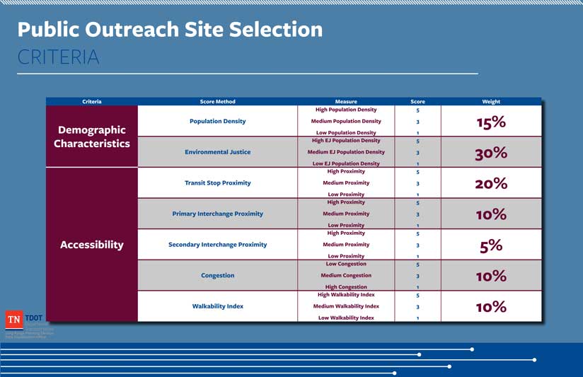
The Data Visualization team gathered data to measure how well each potential meeting location performed in two broad categories: demographic characteristics and accessibility. Each location received scores in the individual criteria that were weighted and compiled into a final score measuring that location’s suitability for public engagement meetings. TDOT liaisons identified schools, libraries, aging population facilities, religious organizations, and public administration facilities as categories of potential meeting sites. Potential meeting facility data was derived from InfoUSA’s 2018 US Business Data.
Demographic Characteristics
The team had limited resources available to determine the optimal locations for public engagement meetings. Ideal locations would have high population density, and a high proportion would belong to vulnerable populations and were assigned comparatively high weights.

Vulnerable populations were identified using block group-level data from the US Census Bureau American Community Survey. Population densities are typically calculated as uniform rates across an entire census boundary. To more accurately estimate where people were located, the team used the Intelligent Dasymetric Mapping (IDM) Toolbox developed by the Environmental Protection Agency (EPA). The IDM Toolbox contains a suite of tools written in Python that uses both ArcPy and arcpy.da functionality. [These tools use dasymetric mapping, a geospatial technique that more accurately distributes attribute data assigned polygons, such as census block boundary data, by using information such as land-cover types to more accurately estimate where people live.]
Current parcel data maintained by the Tennessee Comptroller of the Treasury was inputted into the IDM Toolbox and used to redistribute population to parcels based on residential land use. Population was not assigned to parcels classified as vacant land, industrial, or other nonresidential land uses. Dasymetric mapping helped paint a clearer picture of not only where people lived but, combined with census data, specifically where environmental justice populations were concentrated.
Evaluating the Accessibility of Locations
Once residential data was refined, the factors affecting accessibility to potential meeting sites were examined. Vulnerable populations typically rely on public transit and walking for transportation, so measures of walkability and accessibility by public transit were included in this analysis.
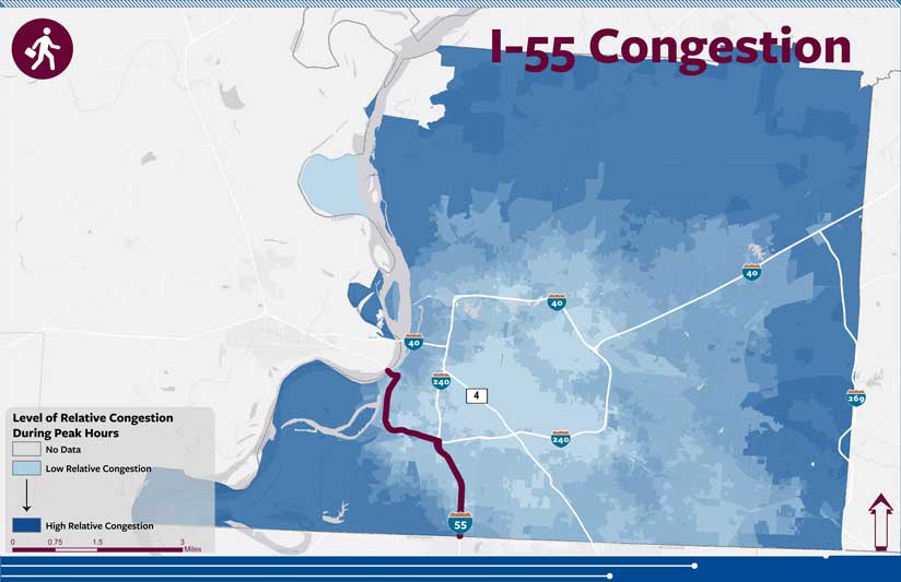
Because corridor studies are conducted on interstates, accounting for those who would be accessing potential meeting locations by car was relevant. In the pilot study, the team included a measure of how accessible these potential meeting locations were from interchanges along the I-55 corridor. Any congestion will affect accessibility, so a relative measure of congestion using job accessibility by car was included. Evaluating locations for their accessibility by both car and alternative modes of transportation helped identify locations that would serve people from all walks of life.
Transit Stop Proximity
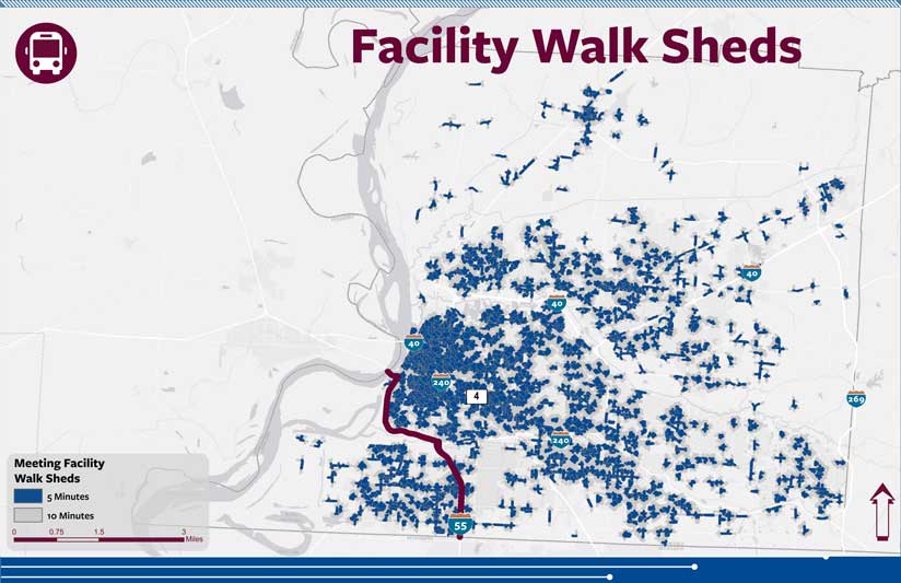
Ensuring that populations that potentially could be adversely affected are adequately served was the focus of this methodology. Since these populations tend to rely on public transit, they are particularly vulnerable as transportation systems evolve. To address this, the Data Visualization team measured how accessible potential meeting locations were by public transit.
TDOTs Forecasting Office’s HERE network data was used to create 5- and 10-minute walk sheds around each meeting facility. These walk times correspond to a quarter-mile and half-mile distances, respectively. Five minutes per quarter mile is a standard rate used in walk shed analysis.
Using ArcGIS geoprocessing tools, the number of bus stops in each walk shed was determined. A raw score was calculated for each potential meeting location. Two points were added to the score for each bus stop within a 5-minute walk, and one point was added for each bus stop within a 10-minute walk. Meeting locations were then rated on a scale of 1 to 5, based on these raw scores.
Creating a Walkability Index
Because the populations being targeted rely on walking in addition to public transit, the areas surrounding potential meeting locations needed to be evaluated for walkability. The EPA provides the Walkability Index.
This dataset measures how walkable each block group is, based on data from the 2010 Census. This national dataset also includes the underlying attributes used to calculate walkability. Some variables in this dataset include employment mix, occupied housing, street intersection density, and commute mode split. Each 10-minute walk shed was scored according to the Walkability Index(es) of the block group(s) it intersected with. The scores assigned to the walk sheds were then applied to their respective potential meeting locations.
Accounting for Interchange Proximity
Automobile accessibility was a factor. Optimal meeting locations should be easily accessible from the corridor in question. Consequently, interchanges were used as access points to meeting locations. In addition, people living near interchanges would be particularly affected by new developments along interstates and changes in ingress/egress to the corridor. Choosing meeting locations close to interchanges would help ensure that the populations surrounding the corridor were fairly represented.
Interchange accessibility was measured using Tennessee’s Statewide Travel Demand Model. By creating 5- and 10-minute automobile travel bands around each interchange along I-55, potential meeting locations could be scored based on how many 5- and 10-minute interchange travel bands they fell within. Like evaluating locations for proximity to public transit, two points were added for each 5-minute travel band, and one point was added for each 10-minute travel band. Meeting locations were again rated on a 1 to 5 scale based on these raw scores.
Measuring Congestion
The difference in job accessibility during peak versus nonpeak hours was used as a relative measure of congestion. Job accessibility for both intervals was derived from a dataset provided by the University of Minnesota’s Accessibility Observatory. This dataset contains job accessibility counts at the census block level. The Data Visualization team examined job accessibility based on a 30-minute travel time. For this analysis, peak was defined as between 7:00 a.m. and 9:00 a.m. and between 4:00 p.m. and 6:00 p.m. Nonpeak was defined as between 12:00 a.m. and 2:00 a.m. Census blocks that lost a higher percentage of job accessibility during peak hours versus nonpeak hours received lower scores.
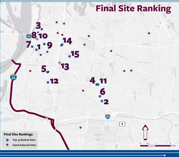
Final Ranking of Locations
Each criterion was given an assigned weight. The score for each criterion is multiplied by its respective weight and then summed to calculate the final score for a location. This ranked list of possible locations for public engagement is meant to guide local planners rather than as an authoritative list. After it is given to the regional office, hand-selected sites from the community are incorporated and further refined using local knowledge of building occupancy, handicap accessibility, and locational site policies.
Conclusion
This unbiased and data-driven methodology has proved valuable in identifying meeting locations that serve populations that require environmental justice protection. It will continue to be used internally on other corridor studies. Studies for I-26, I-115, and I-75 have already been completed. Studies for I-40 and I-81 are under way and will be the first ones to incorporate both rural and urban analysis at a statewide scale.
The Data Visualization Office staff developed and documented this methodology, enabling TDOT’s Office of Community Transportation (OCT) to make greater inroads with local stakeholders. Having a data-driven approach for allocating time and resources has proved immensely helpful to OCT staff. This methodology will serve as a blueprint for other site selection projects. The skills developed by the Data Visualization Office staff throughout this process will be used in the future, ensuring that vulnerable populations are fairly represented when new transportation development occurs.
For more information, contact Chris McPhilamy.
Acknowledgments
This article was produced under the direction of David Lee, PhD, assistant director of Long Range Planning at the Tennessee Department of Transportation. The authors acknowledge the University of Minnesota’s Accessibility Observatory, the Environmental Protection Agency, and the US Census Bureau for providing data.
About the authors

Chris McPhilamy

William Brewer