With a background in tourism, geography, and even cattle wrangling, Dave Taylor forged an unconventional path to becoming a GIS team lead. Taylor is a cartographer and analyst with Pathfinder Geospatial, a company that provides data acquisition and analysis services along with cartographic design. Determined to stay ahead of the curve, he embraced the shift from ArcMap to ArcGIS Pro, mastering its modern tools to create stunning visualizations.
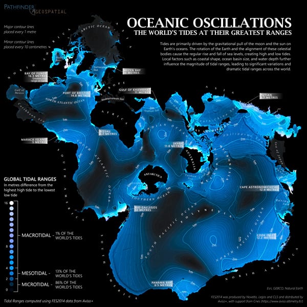
In 2024, Taylor’s Oceanic Oscillations map, showing the range and variety of Earth’s tides, was featured on maps.com for both its eye-catching design and the depth of information it conveys. The map is also a stunning use of the Spilhaus map projection, which displays the world’s oceans as a single, connected body of water.

In this interview, Taylor shares the story behind his Oceanic Oscillations map, the power of ArcGIS Living Atlas of the World, and how pushing past ArcGIS Pro’s learning curve unlocked a new level of creative cartography.
Q. How did you become a GIS team lead and a cartographer?
I came into it from a bit of an odd direction—at least I think so. I double-majored in tourism and geography and did a little bit of work with ArcView in school. I had always thought it was interesting, but at the time, I wasn’t ready to dive into it. Instead, I pursued a job in tourism, working as a horseback trail guide and a dog sled guide for a bit. I was an honest-to-goodness cowboy, riding a horse through pens of cattle, looking for sick cattle, and treating them. At some point, I decided I should probably find a job where, when it’s -40 [degrees] outside, I can choose to stay inside.
I thought back to my days in school and realized I was good at GIS and enjoyed it as well. So, I worked my way through GIS books and enrolled in a local GIS program to obtain a certificate. My first GIS job was for a company that handled land leases and other things for oil, gas, telecom, and renewable businesses. I started doing data entry using Google Earth until one day, I overheard a colleague expressing the need for a good map. Luckily, they had an ArcMap license, and I jumped at the chance to apply my skills and enjoyment for making maps. After that, I helped them go from making maps in Google Earth and PowerPoint to showing what is possible with GIS. Within a year, it became a core offering, and I became their first GIS technician.
Q. I enjoy seeing maps entirely made in ArcGIS Pro. The Oceanic Oscillations map happens to be one of those, and Esri cartographer John Nelson noticed it. How did you move from making maps in ArcMap to making ones in ArcGIS Pro only?
I wasn’t one of the early adopters of [ArcGIS] Pro, but I did get into it early, knowing ArcMap was eventually going to phase out. During some downtime at my company, I decided for one month I would not open ArcMap until I absolutely needed it. And that was a painful time, as I could run ArcMap with my eyes closed. I was doing very basic, technical-looking maps in [ArcGIS] Pro using default settings that got the point across. I always thought those beautiful maps I saw were made in Adobe Illustrator or Photoshop, and that a GIS analyst like me could never make anything like that. One day, I discovered the Cartography. MOOC Esri offers and found that you can do a lot of cool stuff right in [ArcGIS] Pro. You’ve just got to be willing to click that scary button on the side, which opens the settings of your layers, to change your fonts a little bit, adjust your spacing, and tinker. And that was it. The rest is history. Now, if I can’t make a map in [ArcGIS] Pro, then generally that just means I can’t make it.
Q. It certainly looks like you put a lot of effort and thought into getting this Oceanic Oscillations map just right. It is engaging and fantastic. I’d like to know what inspired you to create it.
Growing up on the east coast of Canada, I was within a half-day’s drive of the Bay of Fundy, which is famous for having the most dramatic tides in the world. This was a pet project, to see what kind of map I could create, and I remember John Nelson had made a video of how to visualize glacial recession over time. He showed the process of pulling these different images from Sentinel[-2], and I thought that might be a good way to show the tides. I knew I’d need to find an image of the tide all the way in and all the way out to show the progression; however, it took a long time to find a complete dataset. I finally discovered raster data of the different tidal ranges for not just the Bay of Fundy but the whole world in the ArcGIS Living Atlas of the World. It was created by Keith VanGraafeiland, a product engineer at Esri. Thankfully, he did all the hard work of taking this very complex dataset and turning it into something that anyone can easily consume. I just had to make it pretty.
Q. What was the biggest challenge you encountered with making the map? And how did you overcome it?
It’s a bit of a 90/10 thing; 10 percent of the work on the map takes 90 percent of the time. The hardest part was the text. With a Spilhaus projection, you’ve got to have some reference of where the land is. Africa’s easiest to spot. Antarctica and Australia are easy to spot. Even Canada and the United States are easy to understand. But when you look at South America, it starts at the top of the map and goes all the way to the bottom. It’s such a strange way of looking at the world compared to what folks are used to. I needed to start with the label engine, let it do its best job, and then manually place all the text. It can be tricky to show all the depths of these tides while maintaining legibility.
Another challenge was what to label. I wanted to use callouts to draw attention to some of the most impressive tidal ranges in the world, like the Bay of Fundy; and Ungava Bay, Canada; and others, in Argentina. However, this made the map feel unbalanced. Therefore, I did a combination of big and not-big tides that helped draw the viewers’ attention to the other side of the map. For example, parts of Asia get to 6.5 meters, which, while not nothing, is small compared to the Bay of Fundy’s 16 meters. That happens almost daily, and you can imagine the change in the landscape as ports go from completely dry to floating large ships in half a day.
Q. Can you walk us through your decision-making process for the visual elements?
I’ve always found that the dark design works well with the Spilhaus projection because you’ve got so much negative space around it. If you were to reverse that with the land white and the tides in black, it wouldn’t be quite as eye-catching. While other projections focus on displaying the land, Spilhaus does a good job of showing the coastlines without breaking them up. Once you move to the edges, the coastlines begin to fade into the background.
The tidal range layer itself is used four times with various blend modes, helping areas with very little tide stand out. John Nelson gets credit for this because his instructional videos on how to use blend modes aided me in keeping the Sea of Japan, which experiences almost no tides, from disappearing into Asia’s mainland. Additionally, there was a lot of playing around with applying blending and transparency to create different combinations of tidal ranges. The result shows how much I love bathymetry and National Geographic maps. Their ability to use faint, pale shading and contour lines to create the illusion of depth and height. I was lucky to also find another dataset in ArcGIS Living Atlas, the Gridded Bathymetry Data [GEBCO], and easily add it to create context and texture—emphasizing how the underwater relief contributes to the tides.

Q. It’s clear all the elements came together to create a visually stunning map that, to me, just glows. You really tapped into ArcGIS Living Altas, using ready-made data to hone your cartography skills and complete fulfilling mapping projects. How beneficial was this approach?
I think it will make or break a project if you can find this stuff in [ArcGIS] Living Atlas. If I had to scour the Internet to find these different path image layers and turn them into something usable, it would be time-consuming. The hard part is finding the data in a format that you can use. Without [ArcGIS] Living Atlas, I wouldn’t be able to complete projects like these.


