The Global Wind Atlas is a collection of layers in ArcGIS Living Atlas of the World that can be used not only to visualize factors like wind speed and density around the world, but also to assess wind energy resources for policy and planning.
Humankind has harnessed the wind’s power for millennia—first to propel sailboats across oceans and against river currents, then by windmills for grinding grain, cutting wood, or pumping water. By the late 1800s, small wind turbines were generating electricity. It took almost 100 more years before wind turbines would be deployed on an industrial scale to capture this free and renewable resource.
The first wind farm in the world was built in 1980, on Crotched Mountain in New Hampshire. It was mostly a test of whether this network of electricity-generating turbines would disrupt the existing power grid. The site wasn’t able to generate any meaningful power, and in 1981, it was relocated to a windy corridor northeast of Livermore, California, known as the Altamont Pass.
Since then, the economics of wind energy production have improved, as has wind turbine technology. With a growing need for renewable energy and energy independence, wind farm capacity has more than doubled in the last 10 years. This new interest comes with a need to make more informed decisions about where to invest in new wind farms and their supporting infrastructure, while minimizing any negative impacts to the local environment or its residents.
Tracking the Wind
The Global Wind Atlas puts wind potential on the map for the world to use. This project is the result of a partnership between the Department of Wind and Energy Systems at the Technical University of Denmark and the World Bank Group. The goal is to help policymakers, planners, and investors identify high-wind areas for wind power generation virtually anywhere in the world.
Wind power estimates are made using a downscaling process, starting with the ERA5 climate data from 2008–2017, provided by the European Centre for Medium-Range Weather Forecasts (ECMWF). ERA5 provides hourly estimates of multiple climate variables and includes climate data stretching back to 1940.
The result of this process is a collection of 250m resolution local wind estimates across the globe, at five elevations above the ground (or ocean) surface: 10m, 50m, 100m, 150m, and 200m. These different elevations account for the local “roughness” of the terrain below, and its influence on wind strength and turbulence.
You can use the following multidimensional Global Wind Atlas layers for analysis, planning, and visualization in ArcGIS Pro, ArcGIS Online, ArcGIS Enterprise, or in custom applications:
- Global Wind Atlas – Wind Speed
- Global Wind Atlas – Power Density
- Global Wind Atlas – Capacity Factor
-
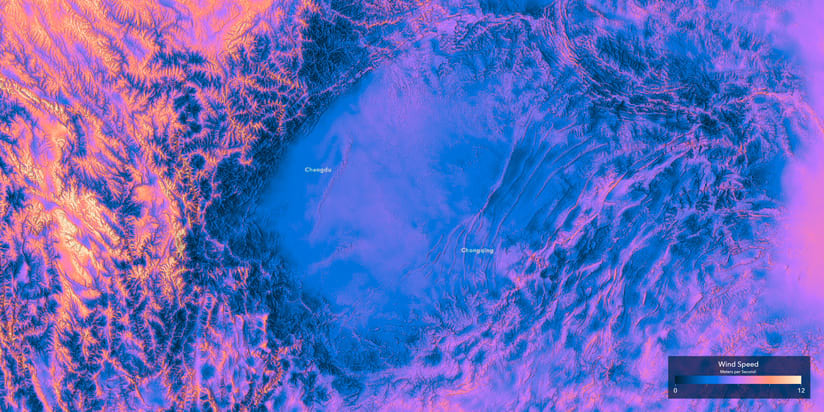
Higher mean wind speeds normally indicate better wind resources.
Wind speed is a measure of the wind resource and is expressed as a velocity in meters per second (m/s). Higher mean wind speeds normally indicate better wind resources. This 250-meter resolution layer displays the mean wind speed over the 10-year period (2008–2017) for five wind turbine hub heights: 10, 50, 100, 150, and 200 meters.
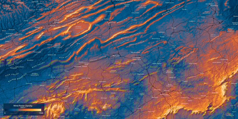
Wind power density is a measure of the total wind resource—in other words, the amount of wind power available per unit area. This is calculated using factors such as wind speed and elevation and reported in watts per square meter (watts/m2). Wind density also takes into account geographical variations in terrain roughness, high values of which will reduce wind power at a given height. Compared to wind speed, wind power density generally gives a more accurate indication of the availability of wind resources and their ability to move a turbine. This 250-meter resolution layer displays the power density over the 10-year period (2008–2017) for five wind turbine hub heights: 10, 50, 100, 150, and 200 meters.
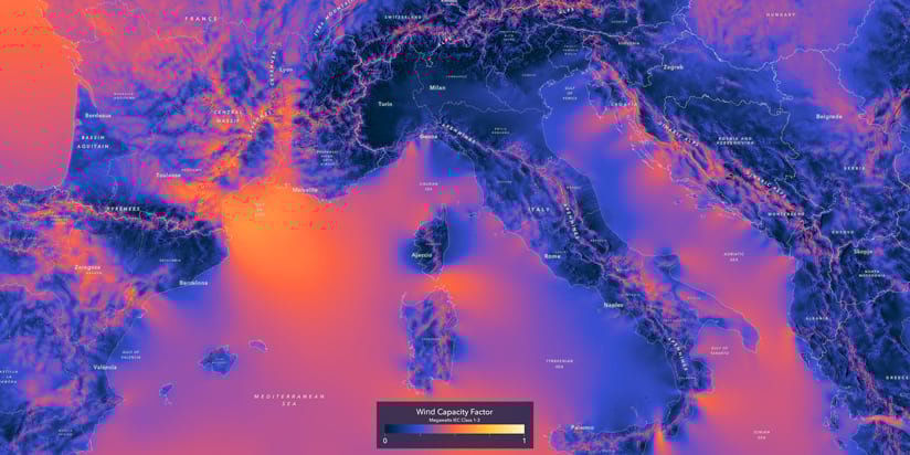
The capacity factor is a measure of the annual energy yield of a wind turbine and is reported in megawatts (MW). Higher capacity factors indicate higher annual energy yield. The maps show estimated capacity factors, and wind turbine site suitability should be considered separately. The capacity factor layers were calculated for three distinct wind turbines, with 100-meter hub height and rotor diameters of 112, 126, and 136 meters, which fall into three International Electrotechnical Commission (IEC) Classes—IEC1, IEC2, and IEC3. Capacity factors can be used to calculate a preliminary estimate of the energy yield of a wind turbine (in the MW range), when placed at a location. This can be done by multiplying the rated power of the wind turbine by the capacity factor for the location (and the number of hours in a year).
The height of a wind turbine—and the size of its blades—also has a lot to do with the amount of power it can produce in a given location. The height values of 10 meters to 200 meters used by the Global Wind Atlas correspond directly to common wind turbine hub heights. These range from a 10-meter small turbine, which might generate 200W–400W, all the way up to a 200-meter offshore wind turbine with a 200-meter rotor diameter, which can output 11MW, or 27,500 times more than a 10-meter turbine. While many of the onshore turbines being installed are commonly in the 80m–100m hub height range, offshore turbines have migrated to 200 meters, with plans to go higher.

Exploring the Global Wind Atlas
The Global Wind Atlas offers a tremendous amount of information about wind power generation around the world. For instance, where are the largest wind projects being built? What are the new frontiers of wind energy on land and sea? You may notice some striking differences in onshore as opposed to offshore wind resources.
China has dominated in onshore wind energy. In 2023, it had 404,605 MW of installed electricity capacity, according to the International Renewable Energy Agency (IRENA). By comparison, the United States had less than a third of that, at 147,979 MW. In fact, the three largest onshore wind farms in the world can all be found in China, which plans to greatly expand capacity in the coming decade.
Some of the most powerful offshore wind farms can be found off the coast of the United Kingdom, in the North Sea. Offshore farms, free of surface obstacles to wind currents, can produce much more electricity than those onshore.
A simple comparison of the wind power density at any of these locations and turbine heights is easy to do using the multidimensional analysis tools in ArcGIS Pro, including Sample or Zonal Statistics.
Wind Suitability Modeling in Practice
Of course, these ArcGIS Living Atlas wind layers are more than just objects of curiosity. Their primary purpose is to help make better-informed decisions on where to invest in future wind farm infrastructure.
For a deeper dive, we’ll analyze a particularly wind-rich state: Wyoming.
Wyoming’s bounty of wind potential is a byproduct of the state’s geography. As prevailing westerly winds from the Pacific Ocean pass over the Rocky Mountains, they funnel through mountain passes and gust over the plains to the east. This makes Wyoming a great case study to determine some ideal candidate sites for future wind farms.
Suitability modeling starts with a goal in mind—in this case, finding a suitable location for a wind farm. This is an iterative process where subject matter expertise meets experimentation, evaluation, and repetition. It involves determining relevant base criteria to make an informed decision, then analyzing, transforming, weighing and combining these layers to arrive at the most suitable locations.
Finding locations for potential wind farms is a perfect use case for the Suitability Modeler tools in ArcGIS Pro. For this exercise, we’ll use the Wind Power Density layer to determine which site in Wyoming would be a suitable place for a new wind farm, using several ArcGIS Living Atlas layers to aid in our site evaluation and selection.
First, consider that different criteria are considered when selecting onshore and offshore wind farms. Since Wyoming is landlocked, our terrain, transportation, and other infrastructure layers will apply only to locating onshore wind farms.

The first step in the modeling process is to compile and prepare the layers that will participate in the suitability model. In this case, some are related to the availability of wind resources, which include Power Density and the types of landforms where the wind is highest. Other criteria might include how difficult it is to access and construct the wind farm or connect it to the power grid. This can be done using suitability submodels in ArcGIS Pro.
Once you have a list of criteria assembled, you need to prepare the layers, which may include creating derivatives of the source data or projecting to a common coordinate system among all criteria (geographic coordinate systems using decimal degrees are not allowed). For our example, we’ll use the following criteria layers in Web Mercator Auxiliary Sphere for simplicity:
- Global Wind Atlas – Power Density
The 100m turbine height approximates the ~80m–94m wind turbine sizes that are common in Wyoming, as seen in the ArcGIS Living Atlas US Wind Turbine database. - US Electric Power Transmission Lines
The Distance Accumulation tool creates a raster surface whose cell values represent the distance to the nearest power transmission line. - USGS Wyoming Roads
Road segments with road classes of 1, 2, and 3 represent major roads in the state, which can support the enormous blades and towers on their journey to assembly on the wind farm site. The Distance Accumulation tool creates a raster surface whose cell values represent the distance to the nearest road. - Elevation: Landforms
The Geomorphon Landforms tool converts a statewide Wyoming digital elevation model (DEM) to a classified landforms raster, delineating slopes, valleys, peaks, ridges, and other landform types. You will often see wind farms on ridges and flatlands, but never in hollows or pits. - Elevation: Slope
A slope raster was created from a statewide Wyoming DEM. Construction on steep slopes is dangerous and expensive, so we are going to prefer low values (up to ~10–15 percent) and not build if it’s much steeper than that.
Knowing where you can’t place a wind farm is just as important as where you can, which is where restricted areas come in. Whether the construction restriction is due to land ownership, line of sight or viewshed analysis, or areas where plant and animal habitats are endangered or imperiled, these locations are taken into account early in the suitability modeling process—effectively masking and removing them from contention. You will find all of these in ArcGIS Living Atlas:
- USA National Park Service Lands
- Areas of Unprotected Biodiversity Importance of Imperiled Species in the United States
- US Wind Turbine Database
Configuring the Suitability Model
A power company constructing a real wind farm would likely have a much more exhaustive list of suitability criteria and restrictions, but this exercise will illustrate the overall process with a simplified set of inputs and configuration steps.
To start a new suitability model, add all the prepared criteria and restriction layers to a new map in ArcGIS Pro.
In the Analysis tab of the top ribbon, select Suitability Modeler.
In the Suitability Modeler pane, specify a new model name and configure the input type, scale, and weight options. (We’re using default values.)
Next, add the Restricted Locations. We’ve preprocessed and merged the national parks and biodiversity areas into a single restriction raster, but you can also use the Add Clause button to create an “OR” expression and combine multiple restriction layers.
Click Apply and a new Restricted areas group layer will be added to the Contents pane on the left.
Click on the Suitability tab in the Suitability Modeler pane and use the drop-down menu to select multiple inputs. In our case, these are the criteria:
- Global Wind Atlas – Power Density (100m)
- Transmission Lines Distance
- Road Distance
- Landforms
- Slope

Once selected, click the Add button to add them to the model.
The new criteria layers will be added to the Suitability Model group in the Contents pane on the left. Now, you can start to configure each input.
Click the radio button next to the Global Wind Atlas layer in the Suitability Modeler pane to open the Transformation pane.
This process will transform the min-max range of the data in the raster to output values between 1 and 10, representing least- to most-suitable regions.
Configure Wind Power Transformation
With the Global Wind Atlas layer selected, the Transformation pane will open below the map.
Because our data is continuous, we will use a function to transform the value range to a suitability range. Use the drop-down to select a function that is appropriate to the preferred distribution of the values in your raster, using the graph on the right.
We’ve selected the MSLarge function, which prefers the highest values. Feel free to experiment with the Mean multiplier and other options to find a curve shape that best ranks the suitability of the wind power. As you change the settings, the Suitability_map layer in the Contents will update, giving you immediate feedback on your choices. The most suitable areas are green, while the least suitable are red.
It can be helpful here to compare the Power Density values to the Suitability map to make sure high wind areas correspond to the green high suitability areas.

Configure Transmission Lines Transformation
Next, select the Transmission Lines Distance layer in the modeler window to configure its transformation.
We are using a Continuous Function again, preferring small values, with a Mid point of 20 km and a maximum Upper threshold of 50 km. This limits the distance we are willing to build new power lines to connect to the existing electrical network.
As you move through the modeling process, it can also be helpful as a check to add the existing wind turbine points to the map to make sure we are capturing the existing wind farms (which were presumably constructed under similar constraints) in the green areas of the Suitability_map.

Configure Road Distance Transformation
Treat this function the same as transmission lines, as they’re both infrastructure and have similar building/distance constraints to keep costs down.
Only the larger, multilane classes of road segments were used in this analysis, due to the challenge of transporting large wind farm equipment on single-lane roads.
Transporting large wind turbine blades requires advanced planning to traverse the road network.

Configure Landforms Transformation
Next, configure the Landforms layer. We are dealing with a categorical raster with 10 landform types, so select the Unique Categories tab in the Transformation pane.
The drop-down allows you to change from numeric values to text Landform names. Once populated, the Suitability values in the right column can be ranked from most suitable (10) to least suitable (1).
If you are unsure of how to rank landforms, one option is to determine the landform type for each of the existing 1,560 wind turbines in Wyoming. Using the existing distribution of wind turbines to set landscape type ranks falls back on the expertise of those who have already constructed these farms in Wyoming. We can mimic their distribution in our suitability model.
Flat, Shoulder, and Ridge are the most popular landform types for installing wind turbines in Wyoming.
Flats were given the top ranking of 10, followed by Shoulder at 8, down to the least desirable Hollow and Valley at 1.

Configure Slope Transformation
Click on the Slope layer in the modeler to configure the final layer transformation.
We are back to a continuous function, MSSmall. This prefers small values (lower slope percent = flatter) as it is expensive and dangerous to construct wind turbines on steep slopes. Use the Mean multiplier and Threshold values to make the function curve drop to one before we exceed 30-percent slope. The bulk of our preference appears in the tall 0–4.4 percent green bar in the graph to the right.
As always, it is useful to turn off the Suitability_map in the Contents pane to check the Transformed Slope surface against the existing wind turbines. If these existing sites are mostly in the green areas, we’re probably making reasonable decisions based on previous construction restraints.

Add Criteria Weights
Once all the criteria are transformed, each one is then weighed against the others. These weights then multiply each individual input’s contribution to the final suitability model.
If one criteria has a weight of one and another has a weight of 2.5, the second is 2.5 times more important.
In our case, the most important criteria is Wind Power Density, so it received the highest weight value: if there is no wind, there is no wind farm. Landforms were given the lowest weight, with the other criteria falling in between. (These weight values are for demonstration purposes only.)
With weights assigned to all criteria, click the Run button to calculate the suitability raster.
Locate Suitable Regions
The final step is to combine the suitability layers, transformations, and weights to determine where a new wind farm can be placed. Click on the Locate tab of the modeler pane to enter the tool parameters.
For this example, we’ll look for 10 suitable wind farm sites, each about twice as big as the largest cluster of wind turbines in the US Wind Turbine Database—about 500 square kilometers. That gives us a total area of 5,000 square kilometers, which goes in the first box.
We’ll use the default Circle region shape, and specify a Shape/Utility trade-off of 25 percent, which will prefer higher suitability over maintaining our target shape.
This is also where we can add an existing regions feature to our model, which are our existing wind farm points that we don’t want to build on. The Find Point Clusters tool makes this easy. It uses the Self-Adjusting (HDBSCAN) option, with 10 features per cluster. Then, you can calculate the Minimum Bounding Geometry, using the Cluster ID, to create individual wind farm polygons.
Once the inputs are specified, click on the Run button to create the suitability raster dataset.

Exploring the Results
When the calculation is complete, the 10 suitability regions are added to the map. Notice that the suitable regions are near existing wind turbine locations. To reduce that encroachment, rerun the model, this time providing a minimum distance between regions value. You can also buffer your wind turbine cluster polygons, try a slightly larger region maximum area to place a larger wind farm, or add new criteria. It’s an iterative process!
To summarize your work, use the Generate Report button for a PDF summary of the model. Or, to access a suite of analytical maps and tools, use the Evaluate tab in the Suitability Modeler pane.
With a suitability model completed, use the map to investigate the optimal wind farm sites that were generated. Existing wind farm points have additional attributes about the year they were installed and the height of the wind turbine hub, which are useful for creating compelling 3D visuals using animated symbols in ArcGIS Pro.
ArcGIS Living Atlas of the World was created to share authoritative geographic data with people who can make a difference through its application towards a better and more sustainable world. Coupled with powerful visualization and analytic tools in ArcGIS, the Global Wind Atlas is a valuable resource to help achieve this goal.
About the authors

Craig McCabe