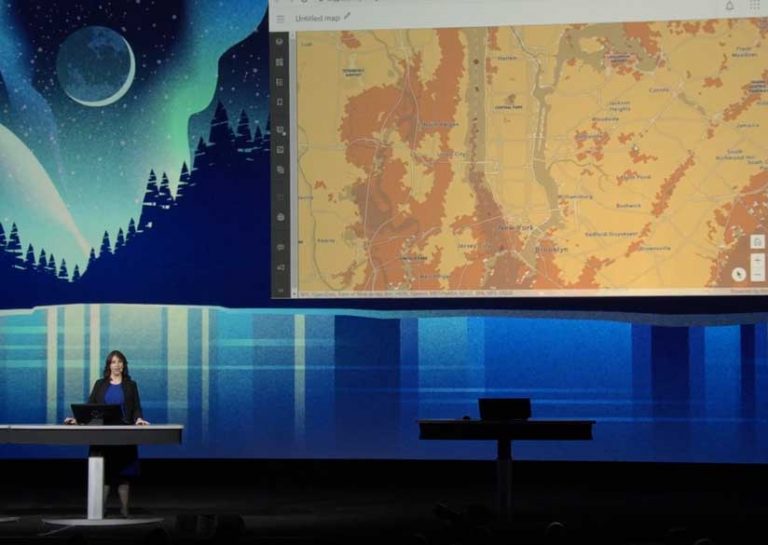
You already have a new mapmaking tool that lets you more easily transform data into impactful maps. Map Viewer Beta is available directly from the app launcher in ArcGIS Online, so you can use it today to create new maps or open existing ones.
It supports improved functionality and adds a dot density mapping style, smart summaries for field attributes, additional color ramps, interactive data filtering, and improved pop-ups. These features let you explore and map your data in compelling ways.
Only in ArcGIS Online
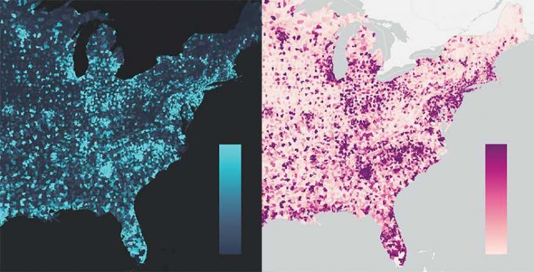
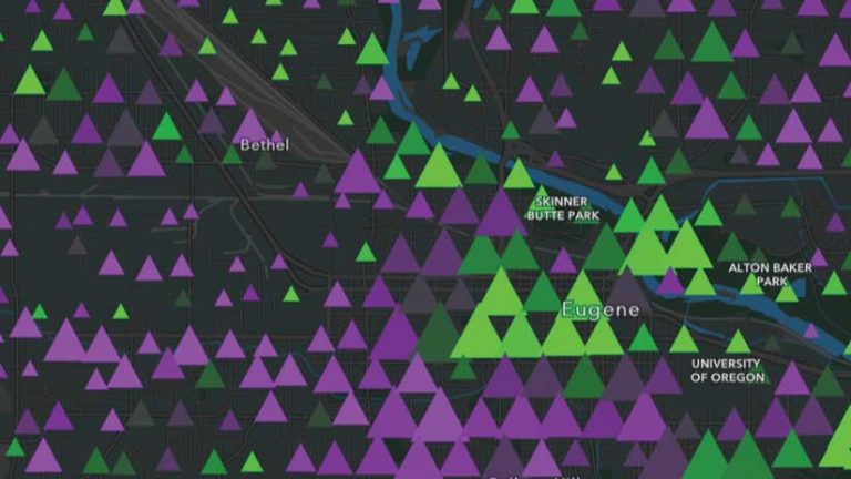
The dot density mapping style is only available in the new Map Viewer. This style works well with polygon data containing count attributes, such as census data or crime incidents, to visualize the distribution of one attribute or compare multiple attributes.
This mapping style personalizes data by representing a single count with a single dot. For example, one person experiencing homelessness could be symbolized with one dot, and together, the dots reveal where homelessness occurs and to what degree, humanizing the data describing this problem.
Exploring and Understanding Data
The immediate feedback and interactive filtering in the new Map Viewer make it much easier to locate the data you are interested in mapping. Layers can contain hundreds of fields, but you just need to find the one containing the data you are interested in. With a convenient search bar and sorting options, you’ll be able to find that field quickly and then interactively find the best visualization for it.
In addition to sifting through many fields to find the data you need, another related mapping challenge is deciphering often cryptic file names so you can understand what the data represents and use it intelligently.
The smart summaries available in the new Map Viewer provide a description, data sample, and numeric statistics for the values in each field. Data organization is more understandable, and the item detail information is displayed. Data for the field is quantified with the number of records; sum of all values; minimum, maximum, average, and standard deviation of field values; and the currency of the data.
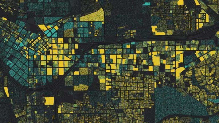
Color Ramps Categorized
Map Viewer Beta contains more than 300 color ramps! Each is tagged and categorized by use (e.g., Best for Light Backgrounds, Subdued) so you can easily explore mapping options and find the best ramp for your data. Ramps show color groupings, and depending on the mapping style and theme, specific color ramps are displayed to guide you to the best combinations.
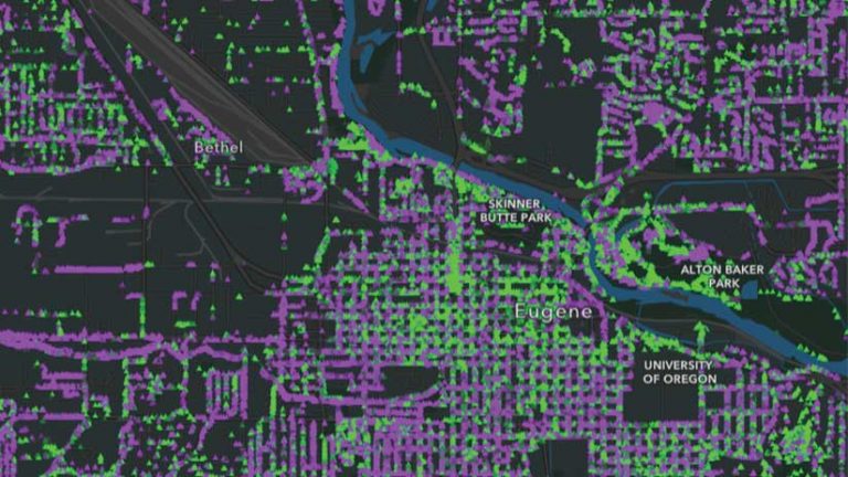
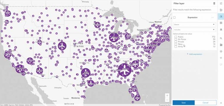
Interactive Data Filtering
Filtering can help you see the most important features by limiting the visibility of other features in a layer. As you adjust the data filter in the new Map Viewer, it provides instant visual feedback so you can better understand and explore the data.
Pumped Up Pop-Ups
Mixing and matching pop-up content elements, such as attributes, images, and text, lets you logically organize information for your map’s viewers. Easily reorder content elements by dragging them. Add attachments to pop-ups by choosing from the multiple image attachments that automatically appear in a carousel. The Map Viewer can dock pop-ups, improving the viewing experience on mobile devices.
Currently, the new Map Viewer is available only to ArcGIS Online users, but in future releases, it will be available in ArcGIS Enterprise. Resources for getting started, as well as feedback and discussion forums, are available in the ArcGIS Online Map Viewer Beta GeoNet space at go.esri.com/GeoNetMapViewer. Learn more about this next generation mapping tool at go.esri.com/MapViewerBeta.