In this age of COVID-19 and the 24-hour news cycle, many of us look at maps daily. Maps provide opportunities to uncover patterns that cannot be easily understood from tables or big blocks of text alone. They allow us to see hot spots and by watching the change in maps over many days or weeks, we can begin to see dynamic patterns emerge.
Often, these are graduated symbol maps that show some quantitative measure for a political boundary unit, such as a county (for most of the United States) or parish (in Louisiana) or borough (in Alaska). For COVID-19 maps, that measure can be the number of new cases or deaths. The symbol size is proportionate to the magnitude of the measure. These maps have been featured heavily in the news since COVID-19 began its nearly exponential increase.
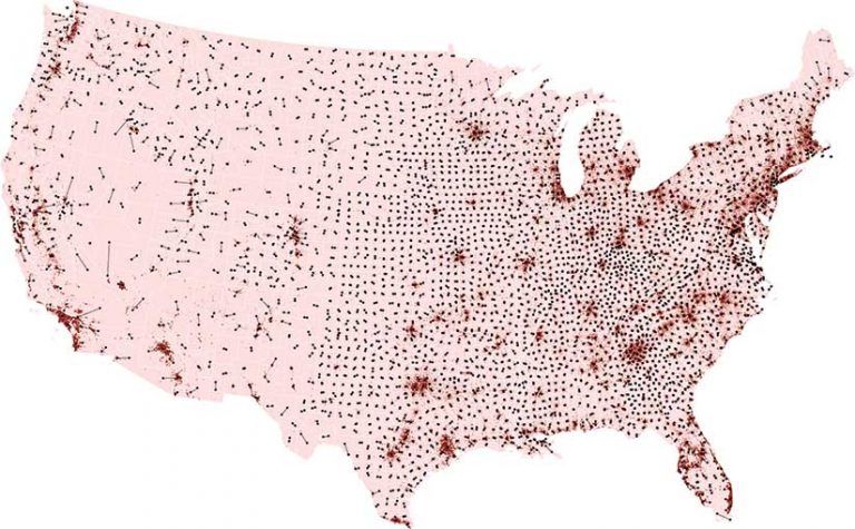
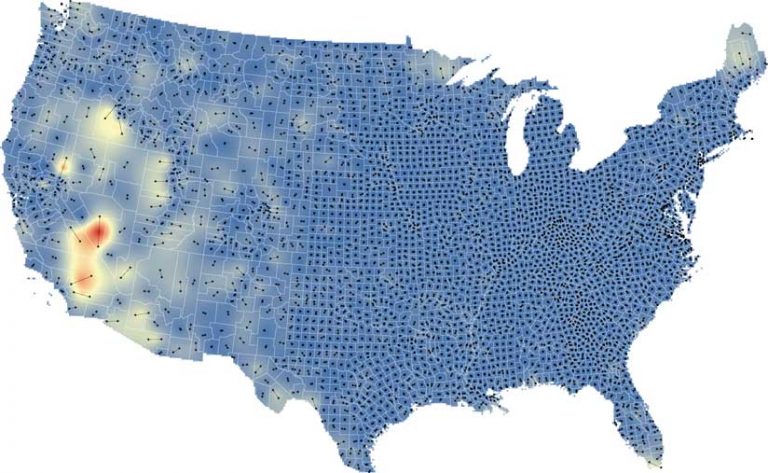
There is one aspect of graduated symbol maps that has not received much scrutiny but is readily apparent to the careful observer. In the United States, populated areas of a county are not usually located near the geographic center of that county. Consequently, symbols can appear misplaced on the map.
This mismatch between the geometric center and the population center is most apparent in the western states, which typically have large, sparsely populated counties. For example, in San Bernardino County, California, the geometric center of the county is located about 8 miles north of Ludlow, an unincorporated community of 40 people in the Mojave Desert. In contrast, the largest city in the county, San Bernardino, is 80 miles away from Ludlow, in the southwest corner of the county.
Population-weighted centroids are one alternative to geometric centroids. The author of this article created population-weighted centroids for each county/parish/borough in the United States to determine whether population-weighted centroids represent these administrative units in a more realistic manner than geometric centroids.
These centroids can be created using the Mean Center tool in the Spatial Statistics toolbox for ArcGIS Pro with the Gridded Population of the World (GPW) version 4 data from the Center for International Earth Science Information Network (CIESIN) at Columbia University. The GPW version 4 data was combined with US Census TIGER county shapefiles in a custom model in ArcGIS ModelBuilder.
[GPW is a raster data product developed to provide a spatially disaggregated population service. It is a free and open-source, census-based global population grid that was first published in 1995. GPW was initially produced by Waldo Tobler, Uwe Deichmann, Jon Gottsegen, and Kelly Maloy as a tool for interdisciplinary study.]
The maps the author produced show large discrepancies between population-weighted and geometric centroids. Large counties in the western United States and Alaska have centroids in quite different places. Although county size is one of the primary reasons why the geometric and population-weighed centroids differed, climatic and population factors also played a strong role.
In the arid portions of the western US, settlement was constrained by lack of water, and cities tend to be highly clustered. Furthermore, many cities, such as Las Vegas, Nevada, and Phoenix, Arizona, are among the largest in the West yet are surrounded by vast expanses of federally owned open land. At 146 miles, the Yukon-Kuskokwim Census Area in Alaska was the administrative unit with the biggest difference between the location of its geometric and population-weighted centroids; while in the contiguous 48 states, Nye County, Nevada, had the greatest difference—112 miles.
In this era of COVID-19, when we see many graduated symbol maps, thinking critically about the geometry underlying the placement of those symbols is worthwhile. Using population-weighted rather than traditional geometric centroids can result in maps with symbol placement that better reflects the underlying population characteristics of a place.
For more information, contact Thomas Dilts.
Resources
Erin Doxsey-Whitfield, Kytt MacManus, Susana B. Adamo, Linda Pistolesi, John Squires, Olena Borkovska, and Sandra R. Baptista (2015). “Taking Advantage of the Improved Availability of Census Data: A First Look at the Gridded Population of the World, Version 4.” Papers in Applied Geography, 1(3), 226–234.
All data and the model used to build these maps are available for download.
About the author