When working with evolving data, creating and maintaining a dashboard comes with plenty of challenges. Maybe you want to reuse your carefully crafted dashboard designs for another project, only to find it’s not as easy as it should be—and nothing is more frustrating than that yellow warning triangle signaling a data source error, knowing how tedious it is to fix.
As of the October 2025 ArcGIS Online release, the process of working with data sources within ArcGIS Dashboards has become a lot simpler and faster. Data source replacement has been one of the most requested features for ArcGIS Dashboards, and with this upgrade, authors can easily update or replace data sources, ensuring that dashboard creation, reuse, and error resolution is faster, smarter, and more intuitive.
Here are some of the things you can now do as a dashboard author:
- Review all data sources—maps, layers, and data expressions—in one centralized location.
- Reuse a dashboard’s layout and configurations across multiple dashboards by simply replacing or remapping data sources.
- Repair broken data sources by reconnecting them to valid ones—no need to start from scratch.
- Spot issues quickly with cues that guide you to the fix.
- Edit data expressions independently outside of element configuration, so your element configuration stays intact.
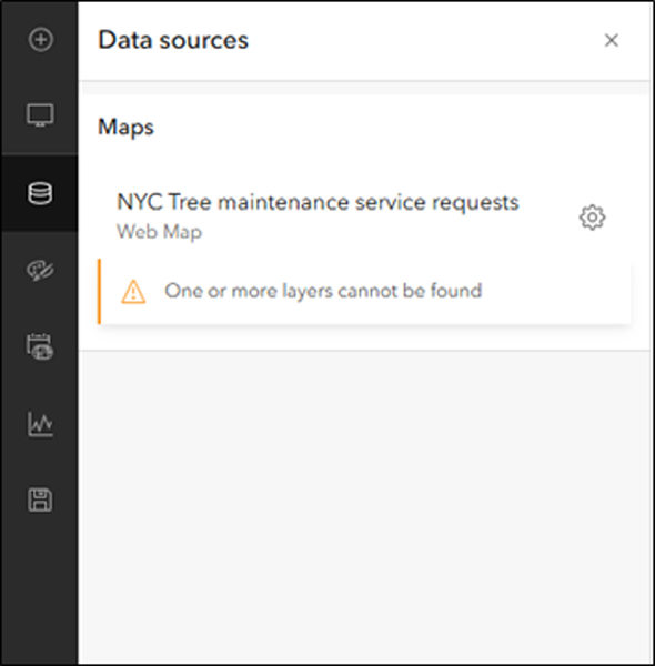
Located under the action bar on the left, the Data sources panel gives you a bird’s-eye view of all your data sources—web maps, web scenes, stand-alone layers, and data expressions—all in one place. Using the Configure data source option, you can update or replace a data source in just a couple of steps.
Reusing a design layout and repairing a broken dashboard are two common scenarios for which this capability might come in handy. It’s worth understanding the workflow for both scenarios in detail.
Reuse Your Design Layout
Whether you’re building annual performance dashboards or creating similar dashboards for multiple clients across different regions, reusing your design and interactivity are key.
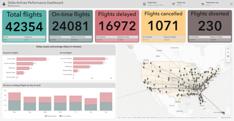
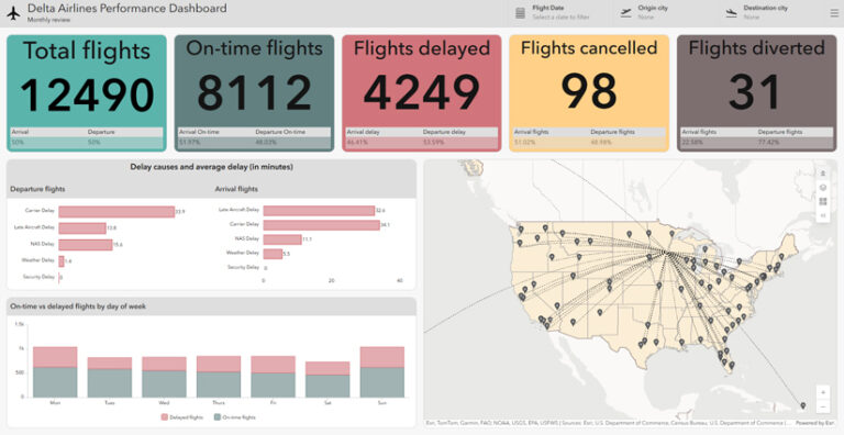
Take the Performance Dashboard above, for example. This dashboard provides a monthly performance review of an airline’s operations at its hub in Atlanta (ATL). It tracks key flight metrics such as total flights, on-time flights, delays, cancellations, and diversions. Below the indicators, two bar charts effectively display average delay times categorized by cause and flight direction. Additionally, a stacked chart shows delay patterns by day of the week.
This dashboard has been carefully built with considerable time and effort. If you want to build a dashboard with a similar layout design for a different airline hub, such as Minneapolis (MSP), you can now streamline the process using the capabilities introduced in the October 2025 ArcGIS Online update.
With the Data sources panel, you can easily swap out the existing data source for a new one in just a few clicks. This allows you to maintain the integrity of the dashboard while updating the data.
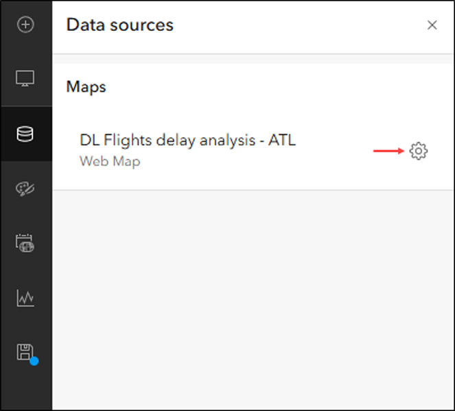
- In the Data sources panel, click the Configure icon next to the current data source.
- A window opens showing side-by-side columns: the current data source on the left and the replacement on the right. Click the Change button under Replacement to browse and select a new item.
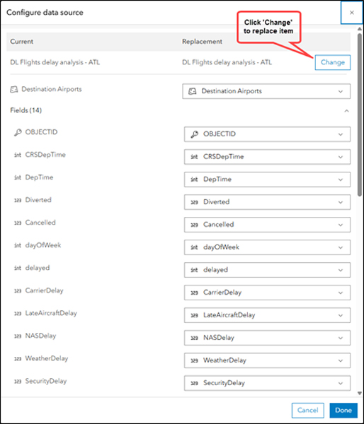
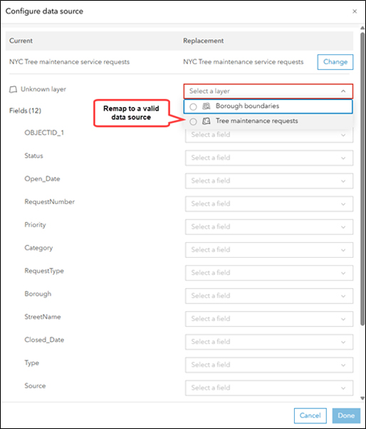
- Layers and fields are automatically matched based on their names and types. Otherwise, manually map any unmatched layers and fields, then click Done.
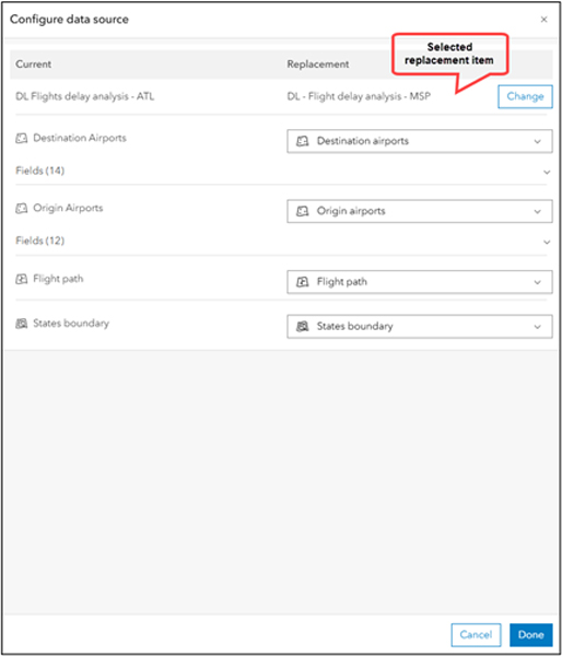
That’s it! The dashboard preview updates with the new data, and the Data sources panel reflects the changes. In the example below, the dashboard now shows the airline’s performance at the MSP hub, created by reusing the original Atlanta version of the dashboard as a template. Same layout, new insights—made possible with minimal effort.
Repair a Broken Dashboard
If everything’s working fine with your dashboard, that’s great. But if something’s off, the Data sources panel will show visual cues and meaningful error messages to help you fix issues quickly and confidently.
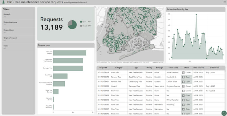
Here’s another example—a review dashboard that displays information about New York City tree maintenance service requests, including request status, total requests over time, and request types (below). However, this dashboard is currently broken.
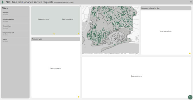
One of the required layers is missing. As data evolves, this can happen for a variety of reasons—such as the layer being deleted, permissions being modified, or the layer being republished.
Previously, fixing this meant manually investigating and updating each element—often leading to fully rebuilding the dashboard.
Now, the Data sources panel can immediately highlight what’s wrong—whether it’s an inaccessible item, a missing layer, or a mismatched field—giving authors a clear starting point for troubleshooting.
Here are the steps to repair the dashboard:
- Open the Data sources panel and click the Configure icon.
- Replace the entire item or remap broken layers/fields to valid data sources.
- Click Done.
With just a few clicks, the dashboard is restored, and there is no need to rebuild elements from scratch.
This update is all about saving you time, reducing frustration, and making dashboards more flexible than ever. Whether you’re building dashboards for your stakeholders or adapting to a schema change, you’ll now spend less time troubleshooting and more time creating.


