Just because you can visualize hundreds of thousands of features in a single view doesn’t mean you should.
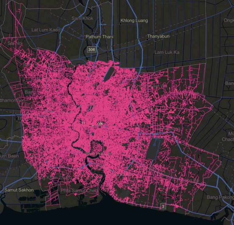
You should always design your visualization in a way that communicates a meaningful message. Here are some things you can do when visualizing large datasets at small scales that will optimize performance and improve understanding. These tips reference a web map containing more than 550,000 polyline features that represent water distribution pipes in Bangkok, Thailand.
Set a Visible Scale Range on the Layer
The Bangkok pipelines layer is detailed and dense. While you can view all data at the full extent of the layer, the data is more appropriately viewed at larger scales (i.e., zoomed in closer). A maximum scale of zero may be appropriate so the features are always viewable as you zoom in, but setting a minimum scale so that you can’t view the data as you zoom out to view several neighborhoods at once may be more appropriate than viewing it at a citywide scale.
Thinning
While quantization provides a certain measure of thinning out of the box, you can more aggressively thin your data using filters. For example, instead of turning layer visibility off at a citywide scale, you can display only large pipes at that scale and include the smaller pipes as you zoom in. Views of moderately thinned and aggressively thinned layers will appear almost identical because most of the small lines in the full dataset can’t be seen.
Aggregation
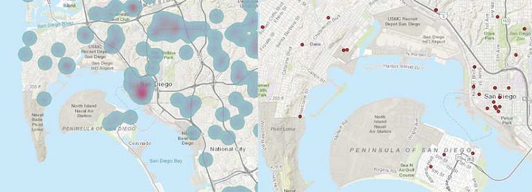
ArcGIS Online and ArcGIS Enterprise allow you to cluster point data. When points become very dense, you can no longer make sense of your map. Clustering will reduce the number of visible features in the view by summarizing them as cluster graphics.
Binning similarly summarizes point data as polygon bins instead of icons. Keep in mind that client-side clustering and binning still require that all features be downloaded to the client before aggregation takes place. Server-side clustering and binning are available with ArcGIS Enterprise for enterprise geodatabase-backed services. These capabilities will be available in ArcGIS Online soon.
ArcGIS Online and ArcGIS Enterprise also provide aggregation analysis tools that create new layers for feature reduction and data summarization. Aggregation tools are intended for improving understanding, because displaying everything isn’t always the best thing to do.