My favorite part of mapping is the text. Perhaps you disagree and find the task of “lettering” a map to be time-consuming and tedious. To me, getting it right can feel like solving a particularly satisfying puzzle.
Text can make or break a map. There are three kinds of text on maps made with ArcGIS Pro: labels, annotation, and layout text. This tutorial will help you improve your labeling skills. You can follow along with this tutorial (to whatever degree of perfection you prefer) using the Darwin.ppkx project package. By the end, you will have a map of the region around Darwin in Australia’s Northern Territory that you can convert to annotation in the following companion tutorial in this issue of ArcUser, “Place Text Exactly Where You Want with Annotation in ArcGIS Pro,” which shows you how to refine the map by converting labels to annotation.
Or you can read this tutorial and simply enjoy learning about labelling.
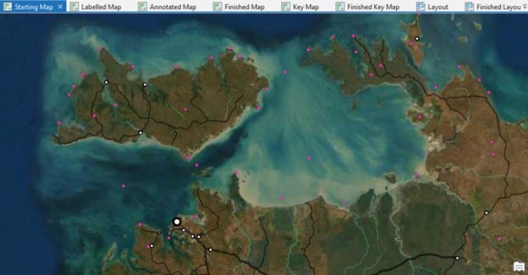
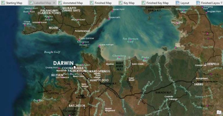
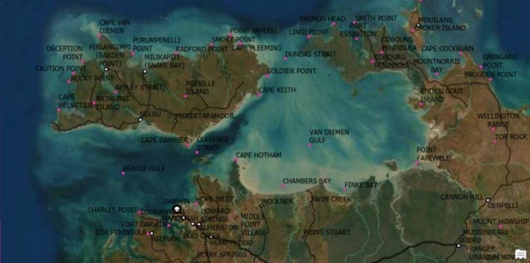
Start by opening Darwin.ppkx in ArcGIS Pro and opening Starting Map. This map is already symbolized. Anything pink won’t appear in the final map, but it’s useful to visualize while you are working with text. Of course, it’s your map now, so you can resymbolize it any way you like—but please wait until after you make the labels.
Most of the data is from Geoscience Australia, which is Australia’s preeminent public sector geoscience organization. Look at the metadata within the project for more information on the data.
In the Contents pane, select the Places layer. On the ribbon, on the Labeling tab, click Label. The labels look alike. The labels would be more useful if they used different styles to represent different kinds of features. For example, different label styles would help the map reader know if a place called Port Darwin is a town or a bay. To accomplish this, you can set up label classes.
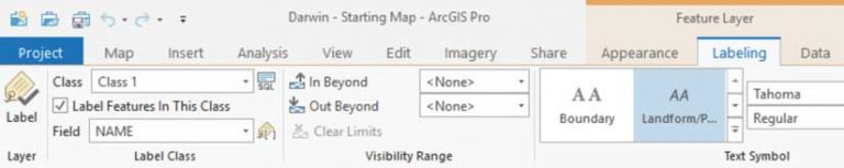
On the Labeling tab, expand the Class menu and choose Create label classes from symbology. In this case, I’ve already set up symbol classes to match the different label classes that I want to use. However, most of the time, your data will not be so nicely classified. It’s worth your time to examine your data and classify it in a way that supports the kind of labels that you want. It will save you some headaches down the road.
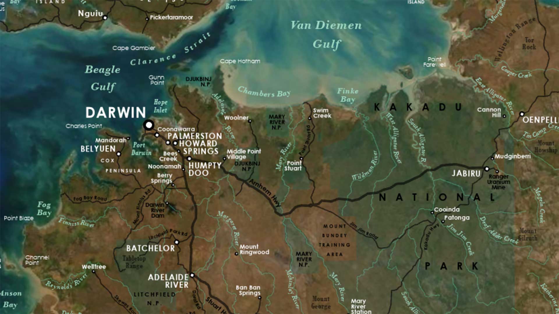
Uncheck Append to current label classes and Scale range and click OK. In the Contents pane, click the Labeling tab. Here you can see all your new label classes. They are all selected, and that’s a good thing, because the first problem you want to fix applies to all labels. The text is black, and it’s hard to read. Typically, maps with an imagery basemap use white text. On the Labeling ribbon, change the text color to white.
The second problem is that all labels are in all caps, which looks classy but makes labels harder to read. Typically, you want to reserve uppercase text for large areas or particularly important features. In this case, the problem is that place-names are stored as uppercase text in the attribute table.
To fix this, click the Expression button next to Field on the ribbon. The Label Class pane opens. Unfortunately, it’s empty because you have multiple label classes selected. You need to do one label class at a time.
In the Contents pane, select Coastal Feature. Now you have options! Ensure that Language is set to Arcade.
Under Expression, type
Proper($feature.NAME)The Proper function will display uppercase words in proper case without altering the underlying data. Click Apply.
Repeat these steps to make proper case labels for the Cultural Feature, Homestead, Mountain, and Water Feature layers. You’ll leave as uppercase text the other label classes to make them appear either large or important. Save the project.
Next, you need to choose a font. On most maps, I recommend that you stick to only one font (sans serif). You still have a lot of options for variety by mixing up the size, color, and style (italic, bold, and so on). This map is text heavy. In this and similar cases, it’s common practice to choose a pair of fonts: one serif and one sans serif. The convention is to use the serif font to label natural features and the sans serif for cultural features.
For this map, I chose Bodoni MT as the map serif font because it has a particularly broad range of styles. For the sans serif font, I chose Century Gothic, which is a classic, reliable mapping font.
In the Contents pane, select the Coastal Feature layer. On the Labeling ribbon, change the font to Century Gothic, and change the size to 7.
Wait a minute. Didn’t I just tell you to use serif fonts for natural features?
Well, that’s why it’s called a convention and not a rule. I decided that this map has more natural than cultural features, and that Century Gothic is easier to read. I reserved Bodoni for only water and terrain features. For your own map, it’s your call.
Next, select the Water Feature label class. On the ribbon, change the font to Bodoni MT, Bold Italic. For Color, choose Turquoise Dust (HEX #9ED7C2).
Water features are almost always labeled in italics. Italic text is slightly harder to read but suggests something flowing. Water features are also often labeled in blue. In the regular text world, bold imparts emphasis to a word. But in the map text world, bold is sometimes used as the default, since it makes short bits of text in small sizes easier to read. On the ribbon, on the Labeling tab in the Label Placement area, click Centered Point.
The labels for gulfs and bays on this map are all different sizes. Later you’ll have to adjust some of the labels to match—but for now, 10 point seems like a good starting size.
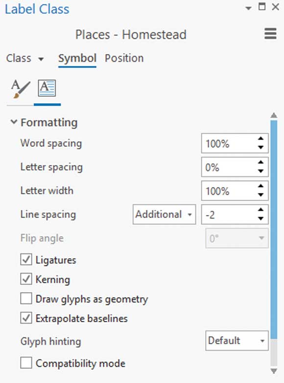
Select the Homestead label class. Change the font to Century Gothic Bold 7 point. It’s quite common to use very small text on a map to accommodate crowded features. Six-point text is generally considered the smallest legible size, so don’t try anything smaller.
On the ribbon, click the expander button in the Text Symbol group. The Label Class pane opens. On the Symbol tab, click the Formatting button. On the map, you can see that some of the labels are stacking, and that’s a good thing. However, their stacking could be tighter. The default space between lines of text is designed for paragraphs, not for maps. Text on a map almost always benefits from condensed line spacing because this makes it more obvious which label goes with which point.
In the Label Class pane, change Line spacing to -2. This property is also known as leading. I usually use a default line spacing of -2 for all map labels. For larger fonts, you may want to decrease the leading even more.
Next, we’ll work on rivers. In the Contents pane, switch to the List by Drawing Order view. Right-click Streams and choose Label.
These labels look bad. You don’t need to set up label classes for this layer, since you don’t need to distinguish between different kinds of streams. However, you need to use the Arcade expression Proper($feature.NAME) again to convert these labels to proper case.
Change the font to Bodoni MT Italic 8 point. For Color, choose Turquoise Dust. The rivers already look better. In the Label Class pane, click the Position tab. For Placement, choose River placement and Offset curved. Click the Fitting strategy subtab (knight chess piece symbol) and uncheck Stack label.
Click the Conflict resolution subtab, expand Unplaced labels, and check Never remove (place overlapping). Before you checked this box, some of the river labels were not being drawn on the map because there wasn’t enough room for them. That’s good if you are going to use automatic labeling; but if you intend to convert labels to annotation, you probably want to decide for yourself which labels are important and which labels can be removed.
Next, turn on labels for the NationalParks layer. Change the font to Black 9 point Century Gothic Bold. In the Label Class pane, click the Position tab then Placement, then choose Regular placement and Horizontal in polygon. This time, you have the opposite problem: the text is stored in proper case and you want to display it in uppercase. You can make this change on the Symbol tab.
Large areas (like national parks) are often labeled with uppercase text. It’s part of a strategy that tries to suggest the expanse of an area without dominating the map with large text that appears more important than it is. By making the text black, which has low contrast with the basemap, you’re also helping to push these labels into the background. If you were converting labels to annotation, you could spread the letters out to cover a larger area without increasing the text size.
The next problem you have is that the park names don’t include the words National Park. Click Class in the Label Class pane and use Arcade to fix this problem with the expression $feature.NAME + “ N.P.”
You can handle the rest of the labels on your own. You can set them up any way you like, or you can copy the properties I’ve chosen. Refer to the map named Labelled Map in the Darwin project.
Warning! It’s going to look messy. That’s okay.
You can change anything and everything later when converting to annotation in “Place Text Exactly Where You Want with Annotation in ArcGIS Pro” also in this issue. The goal with labeling is to choose and apply the best defaults for each label class so you have less work to do later.
In the next tutorial, I will show you how to convert these labels into annotation and edit them into cartographic perfection.