Malaria is a life-threatening disease that is both preventable and treatable. Transmitted by mosquitoes, it affects millions of people worldwide, especially young children in sub-Saharan Africa. But there’s good news. Due to treatment and prevention efforts, such as insecticide-treated mosquito nets and rapid diagnostic tests, incidence rates have been shrinking.
What you will need
- ArcGIS Pro
- ArcGIS Image Analyst extension or the ArcGIS Spatial Analyst extension
(If you don’t have ArcGIS Pro or an ArcGIS account, you can sign up for an ArcGIS free trial at esri.com/en-us/arcgis/trial.) - An Internet connection to download data
This tutorial shows you an adaptable workflow that will let you quickly analyze and visualize raster data so you can find out how much malaria rates have decreased. Using data from the nonprofit Malaria Atlas Project, you will analyze how malaria rates for children aged 2 to 10 in sub-Saharan Africa have changed since 2000. After downloading the data, you’ll use the Raster Functions analysis tool in ArcGIS Pro to calculate the change in malaria prevalence from 2000 to 2015. Then, you will visualize malaria rates over time in sub-Saharan Africa. (You also will need the ArcGIS Image Analyst extension or the ArcGIS Spatial Analyst extension to complete this tutorial.)

Step 1
Download Data from the Malaria Atlas Project
- Go to the Malaria Atlas Project website (https://map.ox.ac.uk/).
- Under TOGGLE AND DOWNLOAD LAYERS (on the left side of the screen), click the Download button and choose ZIP (DATA FILES). Download the data on a local machine. The download may take a few minutes.
- Extract and unzip the files.
- Start ArcGIS Pro. Make sure that either the Image Analyst or Spatial Analyst extensions are available. Under Create a new project, click Blank. Name your project Malaria.
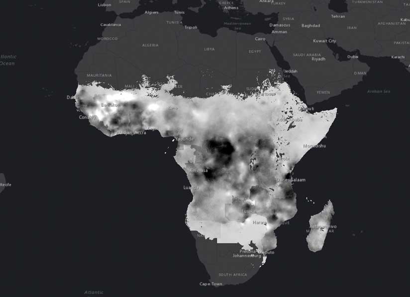
- Add a New Map. In the Catalog window, navigate to the folder where you saved the unzipped malaria data. Use Add Data to add 2015_Nature_Africa_PR.2000.tif and 2015_Nature_Africa_PR.2015.tif to the map.
A map will open that displays the data with a black–white ramp. These two layers show malaria rates among children aged 2 to 10 in sub-Saharan Africa in 2000 and 2015. White pixels represent higher malaria rates, while darker pixels represent lower rates.
Step 2
Calculate Change
Next, you’ll analyze the change in malaria rates from 2000 to 2015. Because the data is in raster format, it is represented as pixels, or cells. Each cell shows the average value of the area it covers. To calculate the change in malaria rates, you’ll subtract the value of overlapping cells using the raster functions in ArcGIS Pro. The resultant layer will be calculated on the fly as a temporary layer instead of being saved to your computer, which would take up storage space.
- On the ribbon, click the Analysis tab. In the Raster group, click Raster Functions.
- In the Raster Functions pane, type Minus in the Find Raster Functions Search box and click the Minus tool. The Minus tool subtracts the value of the second input from the value of the first input on a cell-by-cell basis.
- In the Minus Properties pane, click the menu for Raster. For Raster1, select the 2015_Nature_Africa_PR.2015.tif layer from the drop-down. For Raster2, select the 2015_Nature_Africa_PR.2000.tif layer. Accept the defaults for Cellsize Type and Extent of Type. Click Create new layer. Save the project.
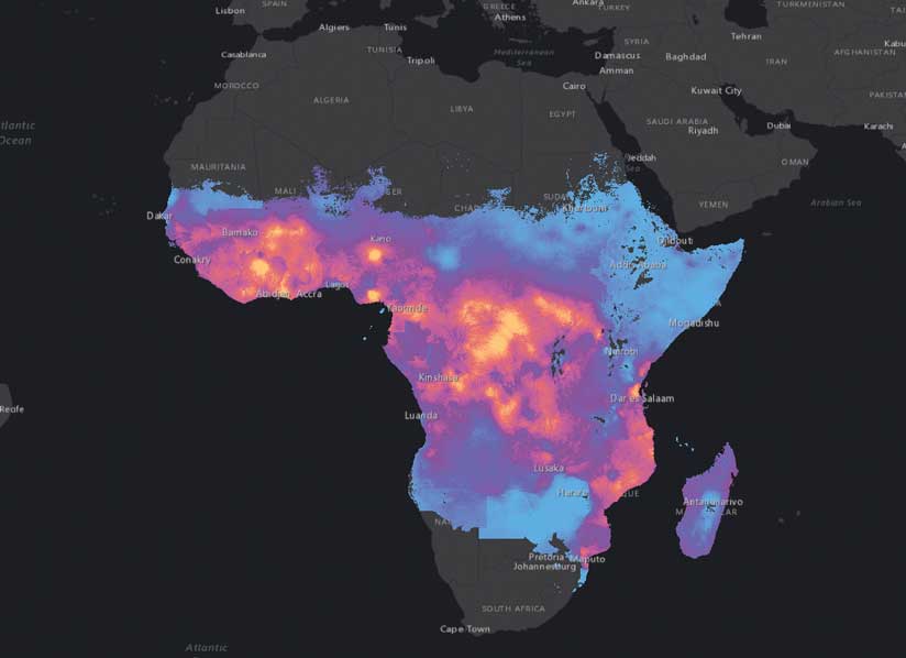
The result is added to the Contents pane. White areas represent positive values, or an increase in malaria rates, while darker areas represent negative values, or a decrease in malaria rates. It is clear from this map that there were significant decreases in malaria rates in the Congo, Burundi, Uganda, and Tanzania. Increases occurred in Mali and Guinea, but most of the other shades of gray do not show a clear visual pattern.
Step 3
Visualize Your Results
To better visualize where malaria rates increased or decreased, change the colors of the layers.
- On the ribbon, click the Map tab. In the Layer group, click Basemap and choose Dark Gray Canvas. Changing the basemap to a simple one like Dark Gray Canvas helps your data stand out because it removes distracting details like topography and river features. Now, you’ll symbolize the 2015 data for malaria.
- In the Contents pane, turn off the new Minus layer, and click the color ramp for the 2015_Nature_Africa_PR.2015.tif layer. The Symbology pane opens for the 2015 data layer.
- In the Symbology pane, under Color scheme, click the black–white color ramp. A drop-down opens and shows a color scheme choices menu. On the Color scheme menu, click Format color scheme. The Color Scheme Editor opens. This window allows you to create custom color schemes by specifying color values for each stop, or relative percentage of the data.
- On the top right of the Color Scheme Editor, click the plus sign to add a color stop. There are now three stops, at 0 percent, 50 percent, and 100 percent.
- Click the 0 percent stop (black, on left). Under Settings, click Color, then click Color Properties to invoke the Color Editor.
- In the Color Editor, make sure the Color Model is set to HSV. Look for the text box next to HEX # and change the HEX value to #7AB6F5. Click OK.
- Repeat the same process to change the middle value to #805499, and the right-most value to #F5CA7A.
- Click OK to return to the map and view your symbology changes. Save the project.
- Repeat steps 4 through 8 to apply the same symbology to the 2000 imagery.
- In the Contents pane, turn off the 2015 and 2000 imagery layers, and turn on the Minus layer. Save the project. The Minus layer opens in the Symbology pane.
- Immediately under Primary symbology in the Symbology pane, click the Stretch type drop-down and choose Classify. Choosing Classify breaks the data into defined categories instead of being symbolized along a single ramp, as the 2000 and 2015 layers are. The color scheme also changes to a default color ramp, such as red to yellow.
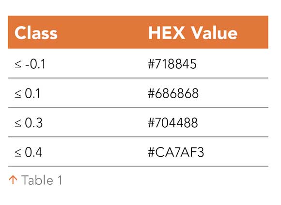
- In the Class breaks section, change the numbers in the Upper value column to -0.3, -0.1, 01, 0.3, and 0.4. Save the project. Negative values represent areas that had a decrease in malaria rates, while positive values indicate an increase in malaria rates. For example, 0.1 indicates that there was a 10 percent increase in malaria among children from 2000 to 2015. Because this data has a clear and important midpoint (0), it calls for a divergent color scheme. By showing positive change in one color and negative change in another color with a neutral middle color, the change is clear.
- In the Color column, click the color symbol next to ≤ -0.3, and in the Color picker, click Color Properties. In the Color Editor, make sure the Color Model is set to HSV. Change the HEX value to #AACC68. Use the same process to change the rest of the color symbology as shown in Table 1.
This workflow for visualizing data can be applied to most raster datasets. Raster functions require little processing time, making them ideal for quick analysis and visualization. The most difficult part of the workflow is deciding which of the hundreds of visualization techniques you’ll apply to your data.
For more ideas on raster data visualization, check out John Nelson’s posts on the ArcGIS Blog. Learn more about the ArcGIS Pro cartographic capabilities by doing the Learn ArcGIS lesson called Cartographic Creations in ArcGIS Pro.
About the author