Creating regular tessellations to summarize spatial data isn’t a new workflow in the world of GIS. Geoprocessing tools like Generate Tessellation and Generate Grids and Hexagons have supported this need for years. Specify your desired tessellation shape, area, and extent and go to town. So, with all the shape options available, why do people gravitate to the hexagon?
- Among all shape types, hexagons have a low perimeter-to-area ratio, reducing sampling bias due to edge effects. Circles have the lowest perimeter-to-area ratio of any shape, but can’t tessellate (i.e., fit closely together with no gaps or overlaps).
- A hexagonal grid’s inherent circularity captures curved patterns in spatial distributions.
- If the grid is being used for hot spot or outlier analysis, hexagons have more neighboring cells that share an edge (6) than square (4) or triangular (3) grids.
Unfortunately, one of the drawbacks to most tessellations is that these grids often have ad hoc sizes or alignments. It’s not easy to create a multiscale grid template that nests neatly through different defined scales—and no universal grid ID to synthesize work from multiple organizations.

Generating these spatial summaries can consume a lot of time and resources, especially at a global scale. To avoid one-off siloed data products, there was a need for a smarter tessellation approach.
H3 Hexagonal Hierarchical Spatial Index
Enter the H3 hexagon. Created by Uber to analyze and optimize ride-sharing pricing and dispatch at the city scale, it solved a lot of the limitations of previous tessellated grids.
First, H3 is hierarchical, meaning that it was designed so that each hexagon has seven smaller “child” hexagons nested neatly inside it. They range from Level 0, about the same land area as the European Union, down to Level 15, which is roughly a meter wide.

Second, H3 is spatially indexed. Each hexagon index is used for identifying the grid cell, as well as knowing its resolution and any spatially related parent or child hexagons, along with other geospatial manipulations.
In 2018, Uber made H3 open source and available to other organizations. H3 has been part of ArcGIS Pro since version 3.1, where H3 hexagons were added as an output option to the Generate Tessellation and Generate Grids and Hexagons geoprocessing tools.
The availability of a hierarchical, spatially indexed hexagonal grid system has opened the door to combining and summarizing geospatial data using a standardized methodology at the global scale.
Take the Global Environmental Hexagon Atlas. This collection of layers in ArcGIS Living Atlas of the World applies the geographic approach to datasets contributed by organizations from around the globe. Each of these layers provides critical information on different aspects of biodiversity, conservation, and sustainability, whether on land or in the ocean.
The Global Environmental Hexagon Atlas
The Global Environmental Hexagon Atlas combines different biodiversity and conservation summaries to help users discover patterns and explore the relationships that emerge. These biodiversity and conservation indicators include human activities and footprints, land-use types, protected areas, biomass assessments, and future projections of ecosystem change, among many others.
Using filtering and multivariate symbology, each of the 13 maps included in the atlas is a useful example of how these individual source datasets can benefit from—and gain context through—their comparison with others. Spanning land and sea, these maps use a combination of multivariate symbology, layer effects, and filters to explore specific challenges our planet faces, today and in the future.
Where does high population density coexist with high biodiversity intactness?

Map A combines one-kilometer resolution WorldPop 2025 population estimates with the Biodiversity Intactness dataset, which uses a 1970 baseline and future projections to determine the expected biodiversity loss in 2050.
Areas with high population density are colored blue; areas with high biodiversity intactness are colored green. If both are high, the color is purple. Dark purple areas may represent the regions of greatest sustainable development.
Where are areas of high species richness and irrecoverable carbon but low protection?

Map B combines 30-kilometer resolution International Union for Conservation of Nature (IUCN) species richness data with 300-meter resolution irrecoverable carbon data from Conservation International, using a drop-shadow layer effect to elevate the hexagons above the basemap. Human activity is the primary threat to the richness of local native species and to the vast stores of irrecoverable carbon that are vulnerable to release.
Areas with high irrecoverable carbon are colored yellow; areas with high species richness are colored blue. If both values are high, the color is black. Areas that have greater than 25 percent protection are filtered out of the map. The black hexagons represent areas that should be considered for greater protection to prevent irrecoverable carbon loss.
Where might ecosystem change have the greatest impact on species richness?

Map C looks to the future and uses IUCN species richness data again, this time filtered by the predominant Terrestrial Ecosystem Change driver for that hexagon in the year 2050.
The World Terrestrial Ecosystems 2050 data identifies how bioclimate and land cover may change. In this map, we see the average species richness for an area, with purples indicating more amphibians, reptiles, birds, and mammals. The data is filtered by areas with expected ecosystem shifts.
Which parts of the ocean are subject to the greatest fishing intensity?

Map D looks to the oceans, showing the relative global fishing intensity in vessel hours for 2020, compared to the local predominant seafloor geomorphology, combining raster fishing intensity with vector ocean morphology polygons.
Seafloor geomorphology features influence currents, nutrients, and habitat that create productive fishing grounds. This map displays the relationship between the predominant seafloor geomorphology and the annual total of commercial fishing hours for each hexagon. Larger circles indicate higher numbers of fishing hours.
Creating the Hexagonal Earth
There are two main analysis workflows for summarizing spatial data within defined areas, depending on its format. To tackle a wide variety of global biodiversity datasets for the Global Environmental Hexagon Atlas, two geoprocessing tools were applied for raster- or vector-based sources:
- Raster: Zonal Statistics (Map E) creates summary statistics, such as minimum/maximum/mean, sum, or categorical breakdowns like area percent or predominant class within each hexagon.
- Vector: Summarize Within (Map F) summarizes vector features, primarily points or polygons, to determine feature counts or areas within each hexagon.
-
Map E: The Zonal Statistics tool can create basic summary statistics or categorical breakdowns like area percent or predominant class within each hexagon.
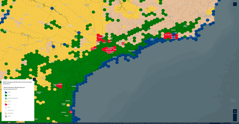
Given the diversity of authoritative datasets available in ArcGIS Living Atlas, summaries were focused on those with global extents to serve the broadest audience possible.
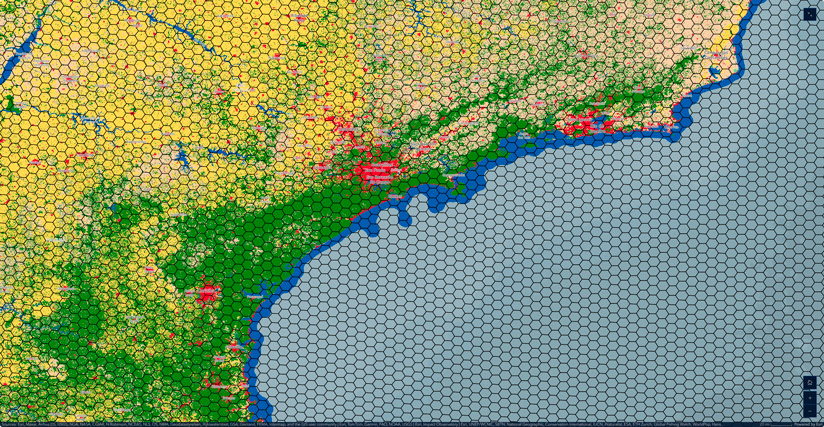
For instance, how is a layer like Sentinel-2 10m Land Use/Land Cover converted from a categorical raster to H3 hexagons?
Creating a global hexagon grid starts with a H3 hexagon template for Level 2 through Level 5.
(To create your own global H3 hexagon grids, use the Generate Tessellation tool and set the extent to latitude -90°/+90° and longitude -180°/+180° in WGS84, then repeat for each level. Analysis-ready global H3 hexagon grids can also be copied from an ArcGIS Online service that includes Level 0 through Level 6.)
Next, the Sentinel-2 10-meter raster is downsampled to 30 meters to reduce processing time. Even the smallest Level 5 hexagon is still hundreds of square kilometers, so this resolution reduction has little impact on the statistical summaries.
Next, Zonal Statistics is used to determine the relative contributions of the different land-cover types in each cell, by area percent, along with the predominant/majority type.
The result is a single land-use/land-cover type for each hexagon, at each level, symbolized in the same manner as the Sentinel-2 raster classes.
Explored individually, these hexagonal maps distill noisy spatial data into simple cellular summaries. However, the real power of the analysis comes from the combination of these layers—including a total of 55 individual metrics—into a single, multiscale biodiversity atlas.
Using Hexagons with Your Own Data
One benefit of using H3 hexagons is the ability to combine summaries from a variety of sources. If you’ve created your global or local tessellations using the H3 option, each level will always be coincident and have the same hexagon grid IDs. This is great news for collaboration—and for building your own maps and mashups. For instance, you can take a H3 hexagon summary table for your own dataset and join it to the Global Environment Hexagons for fresh new bivariate insights.
This collection of biodiversity summaries represents a new pattern for synthesizing spatial data globally or locally. Having dozens of biodiversity indicators at your fingertips at multiple scales and geographies is an incredibly powerful concept. What makes this particular location unique? What will it look like in 25 years? Can you show other locations like it? These are the questions the geographic approach helps us answer.