
Whether you are interested in mapping political elections or other thematic topics or analyzing and visualizing data to keep your communities healthier and more secure, the following three new books from Esri Press will inspire and educate you.
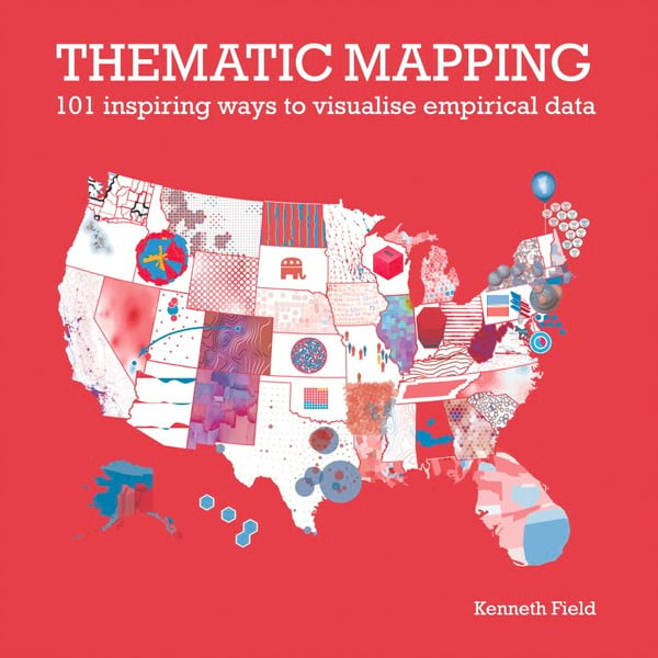
Thematic Mapping: 101 Inspiring Ways to Visualise Empirical Data
For his new book Thematic Mapping: 101 Inspiring Ways to Visualise Empirical Data, Kenneth Field, principal cartographic project engineer at Esri, created 101 different maps, graphs, charts, and plots using data from the 2016 United States presidential election.
He did this to demonstrate how, even if you rely on the same data as other mapmakers, your thematic map—whether it’s related to an election or another topic—will likely look quite different from theirs because of design choices and other factors. “This entire book is based on the fundamental idea that there are few maps that can be thought of as right or wrong,” Field wrote in Thematic Mapping. “They all tell different truths and different shades of the truth and what represents one person’s truth well may not chime with another person’s truth.”
In an online interview, Field expanded on his thoughts.
“People always ask me, ‘What is the right way to make a map?’ And the answer is always, ‘It depends,’ and this is as true for maps of political data as anything else,” Field said. “From the same data, the political map of the United States can look very red . . . or very blue. It all depends on your design choices, the technique you choose to use, the intent behind the map, and the audience you’re playing to. I could have used any number of datasets, but election geographies tend to impact everyone. We all have opinions, and so we’re all, on some level, interested in the map.”
Chapters in Thematic Mapping cover map preparation; area maps; point maps; line maps; cartograms, graphs, charts, and plots; chart maps; and 3D maps. Field walks readers through how to employ various mapping techniques and design choices, including basics such as selecting a projection, choosing map colors, and deciding what data to highlight. For example, in the case of elections, a mapmaker could decide to color all counties in a state red or blue based on the final vote count, or create a more nuanced map such as one that includes purple counties, meaning the electorate in that area was less divided than one might expect by looking at a red-and-blue map.

Field added a chapter he calls “curiosities,” meaning unusual and even downright bizarre ways of displaying data on a map. One example Field included was an all-red map and an all-blue map of the United States to denote the winner and the loser of the 2016 presidential election. Another map Field created shows the least partisan counties (where the winning margin was plus or minus five percent) as islands floating in what he describes as “more partisan seas.” Field says these types of maps are more artistic in nature.
“It’s relevant and accurate, but not a product that is designed to support more serious commentary on the results,” he wrote in the book.
The book’s audience is as much for map readers as it is for mapmakers, according to Field. He hopes Thematic Mapping teaches people to be more discerning when studying election or other thematic maps.
“All maps can lie. Being mindful of the message your map carries is important when making the map,” Field said in the interview. “There are a lot of ethical decisions involved, whether we like it or not or want to consider them or not. And we also have to remember that map readers are not necessarily equipped to understand how the mapmaker’s choices have mediated the message. So one aim of the book is to hopefully encourage map readers to be more questioning about what they see, to be more critical of the message, and to appreciate that the map is as much a product of the mapmaker’s choices as it is [of] the data.”
Field drew on a deep wealth of experience from academia and commercial practice to write Thematic Mapping. He has won many cartographic awards for maps he has created as well as for his writing. Thematic Mapping won a prestigious International Cartographic Association (ICA) award in 2021 for best education product. His first book from Esri Press, Cartography., also won first-place honors for best education product from the ICA in 2019.
(Print edition ISBN: 9781589485570, $59.99; ebook edition: 9781589485587, $39.99)
Keeping People Safe: GIS for Public Safety
Are you a public safety professional interested in finding out how GIS technology can keep your community more secure? The 19 case studies in Keeping People Safe: GIS for Public Safety will be an excellent resource.
The book introduces GIS in the context of public safety. Organizations—ranging from law enforcement agencies, fire departments, and emergency medical services to humanitarian groups—detail how they’ve implemented the technology and used location intelligence to mitigate, respond to, and recover from threats and hazards and make their communities safer.
Public safety officials are faced with an ever evolving, and interconnected landscape of threats and hazards that place people, facilities, and communities at risk. “This book provides a framework for applying GIS to better analyze these risks, plan strategies that reduce their impacts or keep them from occurring and coordinate a response in real-time when they do occur,” said the book’s co-editor, Ryan Lanclos, director of public safety solutions at Esri. “These are great use cases that will inspire action for anyone focused on the safety and security mission in their organization.”

Readers will learn, for example, how Surrey Fire Service in British Columbia, Canada, used ArcGIS software from Esri to locate areas in the community with the highest fire risk and the most vulnerable populations. Maps created were then used to identify where to focus fire prevention efforts. In another case, the International Association of Fire Chiefs (IAFC) deployed ArcGIS Survey123 to collect data on personal protective equipment (PPE) shortages at fire agencies during the early days of the COVID-19 pandemic. IAFC then used ArcGIS Dashboards to create a dashboard to view the data.
“We saw indicators of shortages in the supply chain early on,” said Jeff Dulin, strategic adviser for the IAFC national and international programs. “The survey data, visualized on our PPE dashboard, helped guide which departments needed help first and connected departments in need with others that could provide help.”
GIS is also used extensively in law enforcement.
One story in the book profiles how the San Bernardino County Sheriff’s Department’s homeless outreach proactive enforcement team used a mobile GIS app to help provide assistance to the homeless population in San Bernardino County, California. Team members used ArcGIS Survey123 on smartphones and tablets to survey people who were homeless, as well as to collect contact information and profiles. Maps of homeless encampments also were created with ArcGIS Collector in order to direct resources such as food, shelter options, and mental health services to the right locations.
Another story describes the deployment of a handy GIS app in San Juan County Sheriff’s Office in New Mexico. Deputies use the app to search for active, open warrants in their locations and find the last known addresses of wanted fugitives. “Apps have to be practical, easy, and straight to the point for our deputies to even want to use them,” said Sherice Snell, GIS manager for San Juan County. “We’ve had good success with this app because it makes the job much easier.”
Keeping People Safe is meant to help public safety professionals see how their organizations would benefit from GIS technology. The book includes a section with helpful guidance on how to get started using GIS, along with a link to a PDF with additional GIS resources such as pertinent Learn ArcGIS lessons, GIS solution templates, videos, and more public safety case studies.
The book is one in a series from Esri Press called Applying GIS, which aims to help people become spatial thinkers by offering ideas and strategies for building location intelligence into professions, industries, or disciplines. Keeping People Safe was edited by Lanclos and Matt Artz. In his role as director of public safety solutions, Lanclos is in charge of strategic initiatives in the public safety and national security domains. Artz works as a content strategist for Esri Press and is well-versed in environmental science, technology, and marketing.
(Print edition ISBN: 9781589486867, $19.99; ebook edition ISBN: 9781589486874, $19.99)
Mapping Community Health: GIS for Health and Human Services
The COVID-19 Dashboard, created by the Center for Systems Science and Engineering (CSSE) at Johns Hopkins University (JHU), is likely the most famous example of GIS technology being used to communicate health information.
However, many other organizations in the health and human services space rely on GIS to increase access to health care, improve health outcomes, and build healthier communities. Mapping Community Health: GIS for Health and Human Services tells more than a dozen stories that focus on the use of GIS by these organizations, showing how the technology can be used to do the following:
- Prepare for health emergencies
- Track diseases
- Reduce homelessness
- Fight vector-borne diseases
- Tackle the opioid crisis
“The health and human services disciplines haven’t witnessed an overnight digital transformation,” said Christopher Thomas, Esri government marketing director and one of the book’s editors. “Our new book captures the lessons learned and provides insights into the tools and applications that are reshaping how we think about the way we deliver services to our communities.”
At the University of Texas Health Science Center at Houston, for example, James Langabeer, a cognitive scientist and health services researcher, said that GIS technology is used to analyze and map data on deaths caused by opioid overdoses. “This helps us understand progressions of drugs, movement of dealers, and the disease,” he said. “We don’t necessarily understand why it’s happening, but the data and the analysis help us understand where [the problem] is and try to dig deeper for the triggers.”
The City of Rancho Cucamonga, California, used GIS software to analyze and map community health, safety, and economic development information as part of Healthy RC, an initiative to improve the health and well-being of community residents. For example, maps were created of food deserts—areas that lacked access to stores and markets selling healthy foods.
And at Loma Linda University Health (LLUH), which operates six hospitals and clinics in the western United States, staff uses GIS to visualize patient information such as the rooms where patients are staying or being treated. To do this, LLUH integrated ArcGIS with the Epic electronic health records (EHR) system. Epic EHR includes an admission, discharge, transfer (ADT) module, which stores the location and status of each patient. Now staff can call up a patient’s record and see, on a dashboard in real time, where that patient is located within the facility.
Mapping Community Health will guide health and human services professionals as they get started using GIS. The book includes a link to a PDF with additional resources, including more health and human services-related case studies, Learn ArcGIS lessons, and GIS solution templates.
Mapping Community Health is part of the Applying GIS series. The book was edited by Thomas—a subject matter expert in government, technology, GIS, marketing, and global business development—as well as Shannon Valdizon and Matt Artz. Valdizon is the state and local government marketing lead on the industry solutions team at Esri, where she works with strategists to pinpoint emergency trends in government and GIS globally. Artz works as a content strategist for Esri Press and has many years of experience in fields such as environmental science, technology, and marketing.
(Print edition ISBN: 9781589486997, $19.99; ebook edition ISBN: 9781589487000, $19.99)