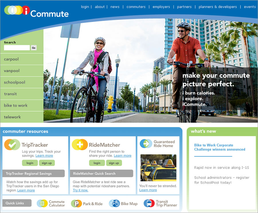
Planning a bike ride in San Diego County, California, just became easier and more fun and practical using a new interactive map powered by Esri ArcGIS. Riders just log on to iCommuteSD.com—San Diego’s commuter resource website—click the Bike to Work tab, and view the San Diego Regional Bike Map (RBM).
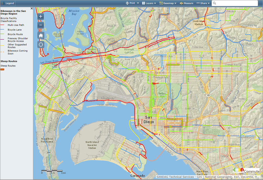
The map shows San Diego’s vast, 1,340-mile bikeway network, which stretches almost the entire length of the county, north to San Onofre and south to the Mexican border. More than a map, San Diego’s new civic information tool encourages citizens to ride their bikes to work or hop on a bike to pedal that “last mile” from a bus or trolley stop to their job. They also can use the map to tailor their routes to avoid (or seek out) strenuous grades.
RBM is the brainchild of the San Diego Association of Governments (SANDAG), an agency that plans and builds regional transportation infrastructure in San Diego County.
“Under California law, regional planning organizations are required to develop a sustainable communities strategy to reduce greenhouse gas emissions,” says Helen Gao, public information officer at SANDAG. “An online bike map helps our region meet sustainability targets by making it easier for people to ride their bike to get to wherever they need to go.”
San Diego’s bike map has become even more popular than its creators envisioned. Since April 2014, it has received more than 17,000 views, confirming the San Diego region’s anticipated demand for such a tool and justifying its maintenance and continued evolution.

Bike Map 1.0
SANDAG goes way back with Esri to when Esri’s customer numbers were no higher than double digits. As customer #54 in 1988, SANDAG was an early adopter of enterprise GIS and has managed proposals and projects with Esri software ever since. The iCommute site hosted one of SANDAG’s first embedded web maps—created with ArcGIS API for Silverlight—which displayed San Diego’s bike network. Although it served its basic mission, it was sparse in terms of functionality.
Since then, civic expectations for pedestrian and bike amenities have grown, and TransNet, the half-cent sales tax for local transportation projects, provided funds to add miles to the bike network.
SANDAG wanted to integrate a multifunctional interactive bike map into iCommute to provide riders with more information about bike commute options and bike facilities throughout the region (the map includes the locations of electronic and mechanical bicycle lockers). The interactive version of the bike map complements the traditional hard-copy map, which is available at select locations throughout the region or via download as a PDF on the iCommute website.
“We had two options in undertaking a new map project: we could create a new bike map from scratch using one of a handful of APIs that Esri supports,” says Pat Landrum, senior GIS analyst at SANDAG. “That was well within our staff’s skill set, but it would also take some time.” The second option was more appealing: find a template in ArcGIS Online and customize it to SANDAG’s specifications. Landrum immediately downloaded the “Basic Viewer” web mapping application template and began adjusting it.

Bike Map 2.0
The San Diego Regional Bike Map is now colorful, interactive, and useful. It displays all bike trail infrastructure in a color-coded network of reds, blues, greens, and yellows. For example, a red line denotes a multiuse path, while a blue line indicates a bicycle lane.
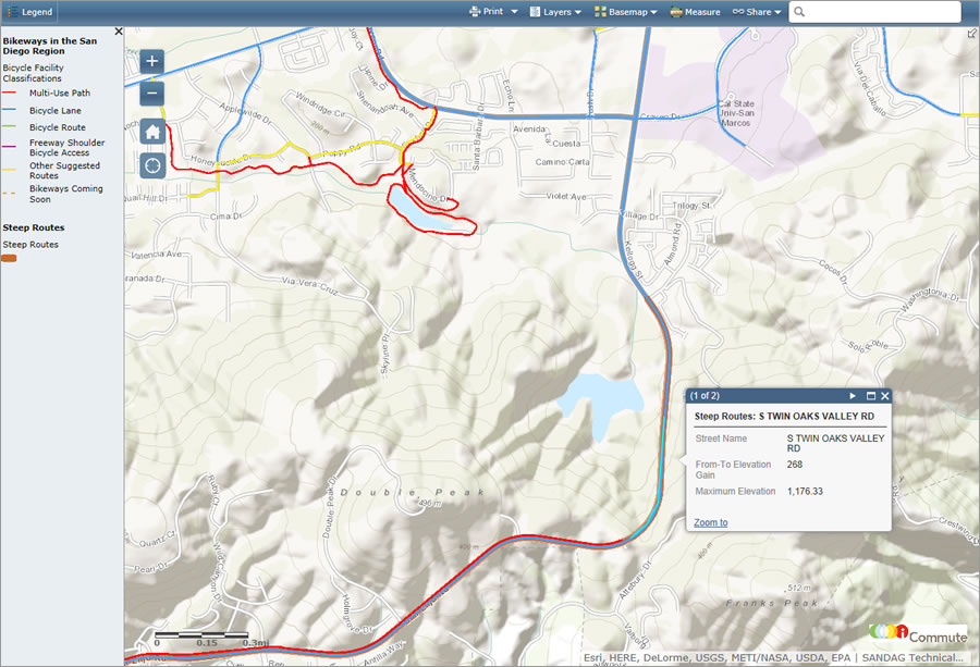
The map also shows path widths; paths with freeway shoulder access; and even planned pathways, which are denoted by an orange dotted line. A Layers tab pull-down menu lets users display link-based elevation data—a very useful tool to assess the difficulty of bike lane grades. Beginners can now avoid strenuous grades and speed wobbles. Conversely, expert bicyclists can use that tool to seek out more difficult sections of the network for the extra challenge.
Using the new version of SANDAG’s bike map, riders also can measure routes, square mileage of an area, and distance between coordinates. Though lacking full mobile support for now (a mobile app is in the works), people can print out routes to guide them on their jaunts.
Embedding the interactive map into iCommute wasn’t disruptive and required only Landrum’s elbow grease and a few minutes’ time. The template needed minimal customization to change the width of the sidebar where the legend is located and tweak the messaging for the Share buttons (Facebook, Twitter, and e-mail).

“Social media and e-mail sharing was another attractive option in the template,” says Landrum. “It’s an easy way for commuters and visitors to promote the map if they want to tell their friends and family.”
Overcoming the Last-Mile Problem
SANDAG uses the interactive bike map to encourage residents to use a clean, alternative mode of transportation. With trolleys, buses, and rail, green transit options are plentiful. One of the more popular alternatives commuters choose combines public transportation with biking. Using bikes with mass transit solves what SANDAG calls the “last-mile problem” that commuters typically experience after arriving at their last stop.
“Buses and trolleys can often stop a mile or more from people’s final destinations,” says Gao. “The bike map helps those types of commuters by showing the proximity of stops and stations to the trail network so they can ride [a bike] the rest of the way home.”
Bike to Work Day
The map also helps riders in other ways besides route planning. Like many counties, San Diego has an annual Bike to Work Day that encourages bike-based commuting with promotional events. San Diego celebrates the day by hosting pit stops, where workers from participating businesses, public agencies, and community-based nonprofits hand out free drinks and snacks to pedal-pushing commuters. Symbols on the map show where to find all the pit stops along the bike network.
“We add the pit stops prior to Bike to Work Day and remove them after the event,” says Gao.
The electronic and mechanical bike lockers at trolley stop locations are also represented using custom symbology developed for the bike map.
Engaging Stakeholders
The impressive number of website views and high visibility of the bike map have helped SANDAG provide important information to stakeholders such as elected officials, planning and civic groups, and the traveling public. Rather than prepare complicated reports to show officials how useful the bike map is proving to be to residents, SANDAG can show the website’s visitor tally to the county’s various jurisdictions and easily alert them to new functionality.
“All these types of tools are part of our overall transportation strategy,” says Gao. “We’re always looking at new and different ways to be able to expand and improve sustainable transportation options.”

