
ArcGIS Experience Builder is a dynamic tool for building interactive web apps without getting bogged down in code—all you need is a few clicks to get your web app up and running. One of the many useful widgets in ArcGIS Experience Builder is the Filter widget, which allows you to limit the visibility of features in one or more layers to only those that meet specific criteria. In this tip, you’ll learn how to make an app with the Experience Builder Filter widget and a little bit of Structured Query Language (SQL).
Imagine you’re a GIS analyst for a federal agency that oversees national energy policy. Part of your agency’s mission is to improve public understanding of the energy supply chain. Your role in achieving that mission is to curate map and data resources. Today, you are tasked with providing an interactive map that shows the locations and primary fuel types of North American power plants. Here’s how to do that using the Filter widget in ArcGIS Experience Builder.
Use the Filter Widget
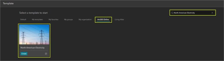
Step 1: Sign in to ArcGIS or create a free trial account. Go to experience.arcgis.com. Click Create new in the upper right corner.

Step 2: Browse to the ArcGIS Online tab. Search for North American Electricity and click Create.
This is a fixed page template with a header, a Divider widget, and a Map widget.
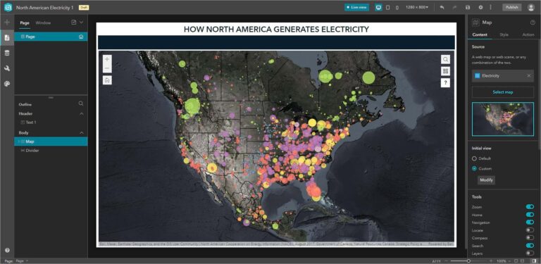
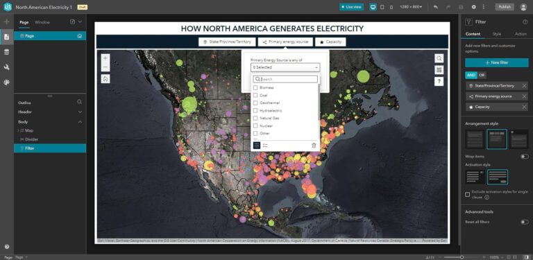
The map shows power plants in the United States, Mexico, and Canada. Plants are symbolized by size based on megawatt capacity and by color based on primary energy source. Right now, the only way this web map differs from a static printed map is that you can zoom in and out. You’ll add more interactivity with the Filter widget.
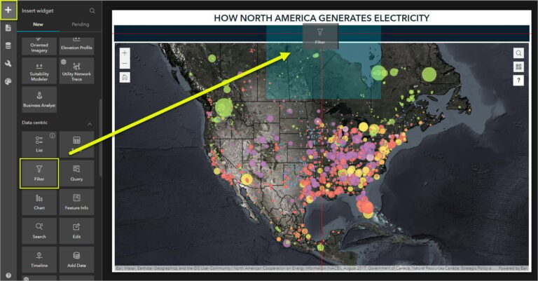
Step 3: From the Insert pane, scroll down to the Data-centric section and drag a Filter widget onto the Divider widget—the black bar just above the map. This ensures the added filter widget won’t obscure the map. Red guidelines appear to help you center it.
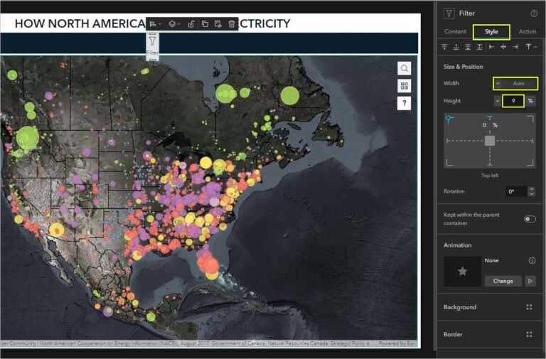
Step 4: Click the Style tab in the settings panel to the right. Under Size & Position, change Width to Auto and Height to Custom. Set the height to 9%. Auto width means that the total widget width will adjust automatically as you add new filters.
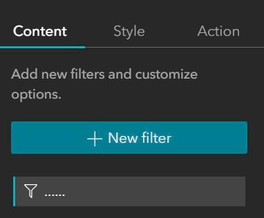
Step 5: Next, you’ll add filters to the widget. Click the Filter widget’s Content settings tab.
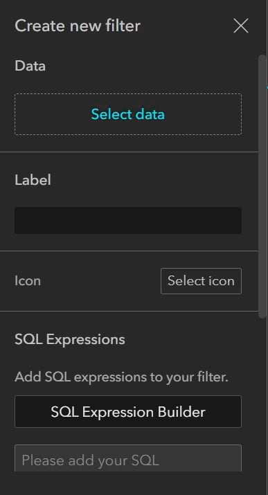
Step 6: Click +New filter. The Create new filter panel appears.
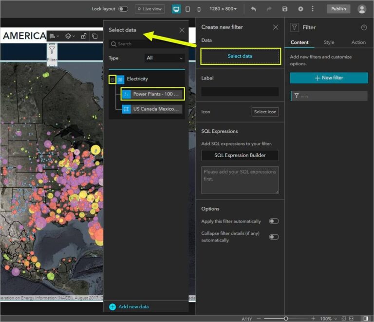
Step 7: Click Select data, then click the add button (+) to the left of the Electricity web map. Select the Power Plants – 100 MW or more point layer.
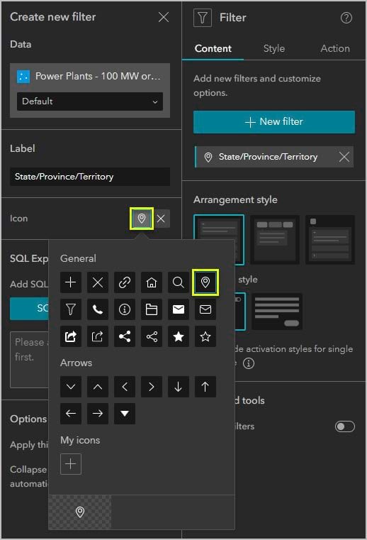
Step 8: Under Label, delete “Power Plants – 100 MW or more” and type “State/Province/Territory”.
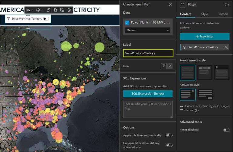
Step 9: Under Icon, click the filter icon. By default, ArcGIS Experience Builder includes several general icons and arrow icons. You can also upload your own icons. For this tip, choose the pin.
The Filter widget evaluates the connected data using logical expressions. Those expressions are written in SQL. Here, you will learn how to create a filter with a simple SQL expression. Learn more about how Experience Builder uses SQL in Experience Builder documentation.
Step 10: Click SQL Expression Builder. The expression builder window appears.

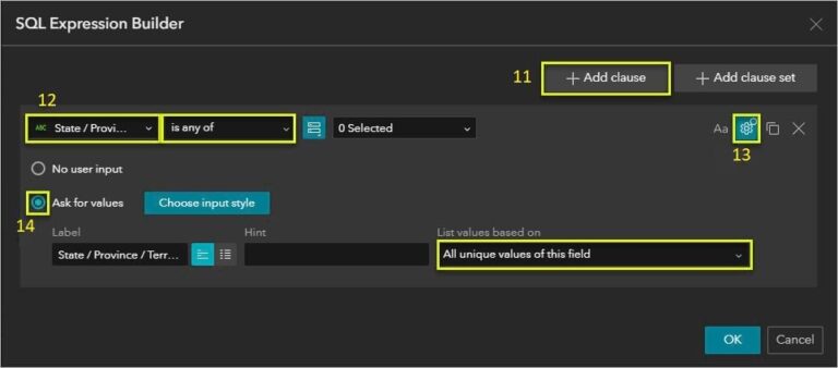
Step 11: Click +Add clause.
Step 12: Using the drop-down arrows, choose State / Province / Territory for the field and choose “is any of” for the operator.
You want your users to select locations from a list at runtime, so instead of selecting specific values you’ll ask for user input.
Step 13: Click the More input settings button in the upper right corner.
Step 14: Select Ask for values. If necessary, for List values based on, select All unique values of this field. Click OK.
You have now successfully created a filter for your web app. However, the Power Plants – 100 MW or more layer has plenty of attributes that you can use to set filters.
Step 15: In the widget’s Content settings, under Arrangement style, choose Horizontal. Under Activation style, choose Button.

Step 16: Next, you’ll make one more filter to let users navigate the app based on the primary energy source of each state, province, or territory. Make sure you place this filter in a different location than the first filter.
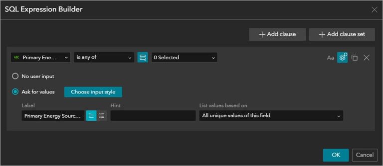
Repeat steps 3-9 to make the second filter that will enable users to filter not only location, but also the primary energy source of each location. Label it Primary energy source and choose the icon Share 4.
Step 17: Repeat steps 10-14 to write an SQL expression for your second filter. Choose Primary energy source for the field and “is any of” for the operator. Make sure to click More input settings to select Ask for values.
Now you have created a web app you can filter by location and primary energy source. Make sure to save your app.
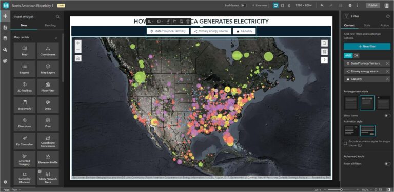
Since your filters and the map are both connected to the Electricity web map (and specifically the power plants layer), the filters affect the map.
You can further connect the two widgets using message actions. Next, you’ll make your filters trigger the map to automatically zoom and pan to the filter result.
Make the Filters Zoom and Pan the Map
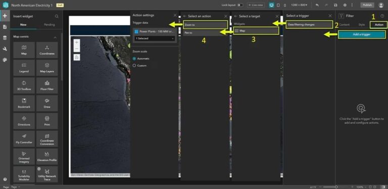
Step 1: In Filter settings pane, click the Action tab.
Step 2: Click Add a trigger. Click Data filtering changes.
Step 3: Click Map as the target.
Step 4: Click Zoom to. Optionally, you can set a custom zoom scale.
Step 5: Under the Data filtering changes trigger, click +Add action.
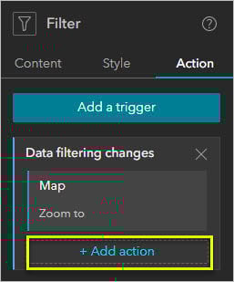
Step 6: Click Map as the target widget.
Step 7: Click Pan to.
Now your web app will automatically pan and zoom to the area indicated by the filter. Save your app, then click the Live view button at the top of the interface to test out your filters or click the button with an arrow (Preview) to open the app in a new window.
More Information
For more information about Experience Builder, see the following resources:
