Canada’s 2025 wildfire season is the second-worst on record, according to the Canadian Interagency Forest Fire Centre. Scientists link the surge in fires to environmental changes that are extending fire seasons and drying landscapes. ArcGIS Living Atlas of the World (ArcGIS Living Atlas) includes authoritative content to help explore current and predicted smoke conditions as well as current air quality resulting from the Canadian wildfires. Follow these steps to make a Canadian smoke, fire, and air-quality map.
1. Sign in to your ArcGIS account and open Map Viewer. There are two ways to add layers from the Contents (dark) toolbar:
(1) Click Add, then Browse layers.

or (2) Click Layers, then Add.

2. Choose Living Atlas from the Add layer drop-down menu.

3. Enter the word “smoke” in the search bar to locate matching layers from ArcGIS Living Atlas. Locate the National Weather Service Smoke Forecast layer and click the + Add button to add it to the map.

Tip: To learn more about any layer, click the layer card to view the item’s information such as an overview and a description. Click View details at the bottom to open the item page.

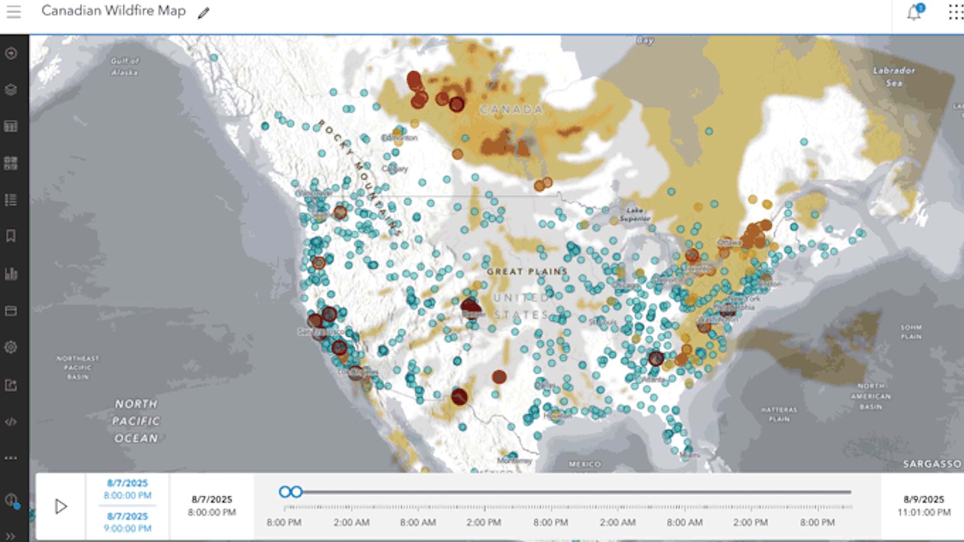
The National Weather Service Smoke Forecast item shows that the layer displays projected visible surface smoke for the next 48 hours in 1-hour increments and is updated every 24 hours by the National Weather Service.
4. If you visited the item page, go back to your map in Map Viewer. Currently, the map shows the spread of smoke from fires in Canada and the US. Because the layer is time-enabled, a time slider automatically appears at the bottom of the map that allows you to play or step through the time intervals in the forecast.

Clicking on a yellow, orange, or red area on the map brings up a pop-up that delivers additional information about the smoke polygons.

5. With a few additional steps, the map can be customized using styles, effects, and additional layers to make it more expressive.
You can alter layer transparency and symbols to emphasize the content you want or use effects to emphasize layers or alter their display.
Change the Style
1. On the Contents (dark) toolbar, click Layers.
2. In the Layers pane, select the National Weather Service Smoke Forecast layer.
3. On the Settings (light) toolbar, click Styles.
4. Under Style options, select Types (Unique symbols), then Symbol style.
5. In the Symbol style pane, click the pencil icon under Fill color to change the fill color to a light gray, similar to the image below.
6. Close the Symbol style pane and click Done twice to close the Style options and Styles panes.
Smoke areas are now colored from gray (light smoke) to dark brown (heavy smoke).

Adjust the Transparency
1. With the National Weather Service Smoke Forecast layer selected in the Layer pane, click Properties on the Settings (light) toolbar.
2. Scroll to the Appearance section.
3. Under Transparency, adjust the transparency by moving the slider until it shows 10 percent.
Change the Blur
1. On the Settings (light) toolbar, click Effects.
2. On the Effects pane, turn on the toggle button for Blur.
3. In the Blur window, slide the Strength slider or press the up and down arrows to experiment with different settings and achieve the desired result. For example, try a blur strength of 4 as shown in the image below.
Because the smoke area polygons are only an approximation, the blur effect provides a more realistic representation of the smoky areas.

Add Other Layers
Optionally, add more layers such as USA Current Wildfires, Satellite (VIIRS) Thermal Hotspots and Fire Activity, or OpenAQ Recent Conditions in Air Quality to provide additional context. Compare this to the original map authored above.
1. On the Contents (dark) toolbar, click Add layers.
2. Choose Living Atlas from the Add layer drop-down menu.
3. Search for a layer you want and click Add to add it to the map. For example, the map shown below uses the OpenAQ layer.

Visit the Esri tutorial gallery to explore additional topics and find other step-by-step workflows on a variety of products.