Three statisticians walk into a bar.
The first one orders five drinks, the second one orders one drink, and the third one orders three drinks.
The bartender fills the orders for the first and second statisticians, but not for the third one. “You’ll have to go somewhere else,” she says, “I don’t serve anyone who’s mean.”
Now that you’re finished laughing at that hilarious math joke, it’s time to get serious and start discussing bar charts. Bar charts show a categorical value and a number. In the case of my knee-slapping intro, the category would be the individual customers and the number would be count:
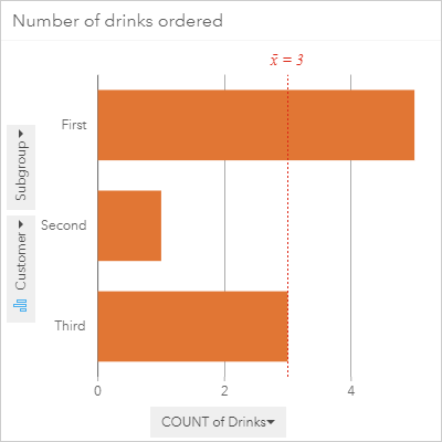
The bar chart above displays beautifully why the statistician who ordered three drinks is called “mean” in the punchline.
Note: Insights for ArcGIS supports both bar charts and column charts. The two chart types are identical except for the orientation of the bars, which are horizontal for bar charts but vertical for column charts. In ArcGIS Pro, the bar charts are available with a vertical orientation only.
What are bar charts?
Bar charts show a single numerical value for unique categorical values. Each bar represents a different categorical value, and the size represents the number value. The number can be a count of the number of features in each category, or an aggregation (such as sum or average) of a number field for each category.
Why use bar charts?
Bar charts give you an overview of your data that is quick and easy to understand. When I was a student they were often the first charts that I made in my analysis, especially if I was unfamiliar with my data or unsure what type of analysis I wanted to perform. Interestingly, though, I rarely ever used them in my final reports, in part because I could use other chart types to show the same information, plus some extra. That’s not to say that bar charts aren’t going to be an important part of your final report, though. Which charts you choose to use will be entirely dependent on the type of data you have, the information you want to learn from your data, and the information you want to communicate to others.
How do bar charts work?
Bar charts are used when you want to compare a single number across categories. I know I’ve said that a lot already, but it’s important to know exactly what you’re doing when you’re trying to make effective data visualizations. When I say “a single number” that does not mean that your data has to be set up with a single number value for each category. In fact, normally your data will have multiple number values per category and the bar chart will be made by aggregating those numbers.
Here’s an example of some raw data that you may use to create a bar chart:
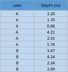
In this example, data was collected in two lakes: Lake A and Lake B. The data that was collected for these fictional lakes included the depth of the water in meters in randomly selected locations across the lakes, which is why there are multiple depth values for each lake.
When you create a bar chart from a data table like the one above, the chart does not have a bar for each individual row. Instead, the data is aggregated for each unique category so that there is a single number value for each category. The possibilities for aggregating data will depend on the data that is collected, but will generally include counts, averages, sums, minimums, and maximums. In this example, there are two ways that the data could be aggregated:
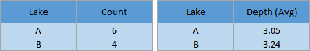
Of course, it would be possible to calculate the sum, minimum, or maximum values, but given the scenario and data collection method those choices don’t really make sense.
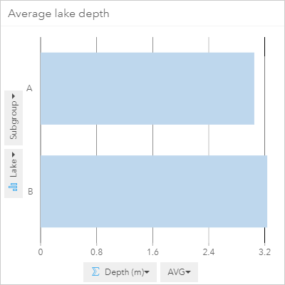
Note that this step of creating new aggregated tables will not be required when you create a chart using ArcGIS software. All you will have to do is select the fields you want to use and the software will do the aggregation for you. Here is the result when I open my original table in Insights for ArcGIS and create a bar chart using Lake and Depth (m):
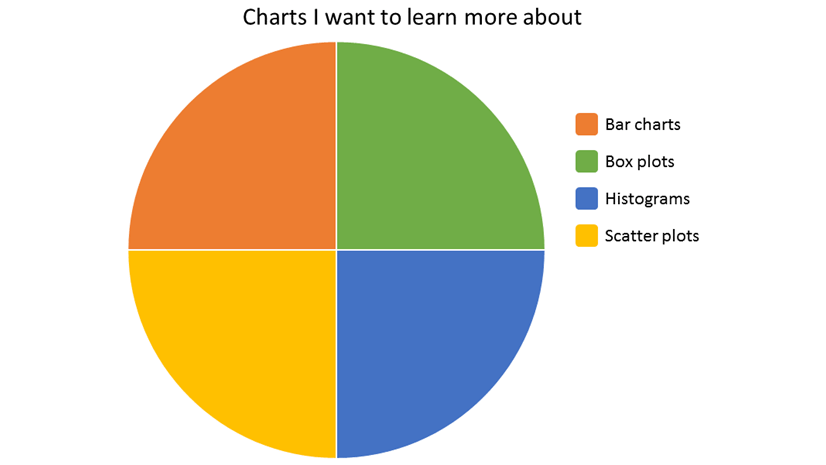
I want to know more!
Are you enthralled by this explanation of bar charts? You can learn more about charts from the rest of my series:
Overview – There’s a chart for that
Box plots – Even Schrodinger thinks this blog is alive
Histograms – A normal chart used with a lot of frequency
Scatter plots – Coming soon!
Resources
- Insights for ArcGIS – Bar charts
- Insights for ArcGIS – Column charts
- ArcGIS Pro – Bar charts
Photo credit
Sorry, we just can’t trust you bar graph – From WeKnowMemes


Article Discussion: