My human left the puzzle box out again! What a great place to have a nap. It looks like the box will fit about 50% of my data, which is the perfect size. My human knows how I love a challenge. If I put my median in here, and then fill in the first to third quartile… Perfect! Now all that’s left sticking out are my whiskers. My human is going to be so happy that I found her box to sleep in. Here she comes now! Human, are you puurrrrrrrroud?

Box plots (also called box-and-whisker plots) are my favorite type of chart. Not because they are more intuitive than other charts or because they use special combinations of data, it’s because they make me think of kittens. And I love kittens. It’s ok if you’re more of a dog person; they have whiskers, too.
Box plots are also super functional, especially if you want to get a sense of the distribution of your data. Keep reading this blog if you want an educational experience that includes cute pictures of cats.
What is a box plot?
A box plot is a chart that shows the distribution of numeric data, either for an entire dataset or for each unique value from a categorical variable. Therefore, a box plot can be made either with one number field, or with one number and one string field.
Anatomy of a box plot
Box plots are quite easy to interpret as long as you know what you’re looking at. This diagram will help you wrap your head around box plots. Please note that the box plot is meant for demonstrating labels, and is not drawn to a realistic scale.

Box – The range of data between the 1st and 3rd quartiles. 50% of the data lies within this range. The range between the 1st and 3rd quartile is also known as the Inter Quartile Range (IQR)
Whisker – The range of data less than the 1st quartile or greater than the 3rd quartile. Each whisker has 25% of the data. Whiskers normally cannot be more than 1.5 times IQR, which sets the threshold for outliers.
Maximum – The largest value in the dataset, or the largest value that is not outside the threshold set by the whiskers.
3rd Quartile – The value where 75% of the data is less than the value and 25% of the data is greater than the value.
Median – The middle number in the dataset. Half of the numbers are greater than the median and half are less than the median. The median can also be called the 2nd quartile.
1st Quartile – The value where 25% of the data is less than the value and 75% of the data is greater than the value.
Minimum – The smallest value in the dataset, or the smallest value that is not outside of the threshold set by the whiskers.
Outliers – Data values that are higher or lower than the limits set by the whiskers.
Why use a box plot?
So now you know what a box plot looks like, but why would you want to use one? Box plots are the best type of chart to use when you want to see the range and distribution of your dataset, or if you want to compare the distributions between categories. Box plots make it easy to compare the minimum and maximum values, the size of the IQR, and the location of the median value.
How do box plots work?
Like bar charts, box plots can show numerical data for unique categories. However, that’s about where the similarity ends. Rather than showing a single number value, box plots show the entire distribution of the data, which gives you a lot more information about your categories.
Once again I’ll start you off with some fictional raw data where the depth of lakes has been measured in meters. A few weeks have passed, though, so there are more measurements this time, including in a third lake.
Here is an example of the raw data that was collected in Lakes A, B, and C:

A box plot does not show every individual value from the raw table on the plot, but it will show the full range of data and give information about the distribution. Here are the values that will be shown on the box plot using the example data:

This table is included to demonstrate how the values for the box plot are chosen. When you create a box plot, you will simply use the raw data table and the software will calculate the values for the plot.
Here is the box plot that was created in Insights for ArcGIS using the raw data:

Take a minute to examine the box plot. What information can you gather from it?
First, look at the median for each lake. The median is lowest for Lake B and highest for Lake C. The median for Lake A is between the other two, but closer to Lake B. Next notice the range of the values using both the size of the box and the full length from minimum to maximum. Lake C has the largest IQR and the largest full range. It is also the only lake with an outlier. It is clear from the box plot that the depth of water in Lake C is extremely variable. Lake A has almost the same range as Lake C, minus the outlier. However, the IQR for Lake A is smaller than that of Lake C and the orientation is more central within the range of depths. The whiskers in Lake A are about the same length, whereas for Lake C the top whisker is much smaller than the bottom. The top and bottom whisker each contain 25% of the data points, so there were the same number of data points measured with a depth of 6 to 6.5 meters as there were 0.5 to 3.5 meters. From looking at these box plots it seems possible that Lake A and B have similar depths, but Lake A has more gradual slopes, whereas Lake C has small areas with large changes in depth. Lake B has a more compact range than the other lakes, which implies that the depth is more uniform within that lake. It’s important to note too that these assumptions are based on proper sampling techniques including random sampling.
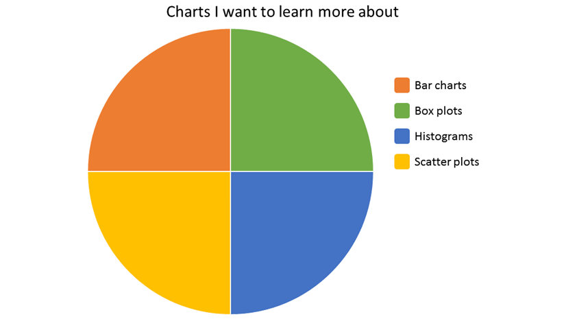
I want to know more!
Did you love learning about box plots? You can learn more about charts from the rest of my series:
Overview – There’s a chart for that
Bar charts – Three statisticians walk into a bar
Histograms – A normal chart used with a lot of frequency
Scatter plots– Coming soon!

Resources
- Insights for ArcGIS – Box plot
- ArcGIS Pro – Box plot
- Photo credit: “Cat 1” by Manfred Schulenburg. CC BY-SA 4.0, via Wikimedia Commons.*
*The original photo has been edited for use in this blog post.

Article Discussion: