Dear diary,
I’ve been doing a lot of self-analyzing and I’ve come to realize that I am not “normal”. I don’t know how it happened; my data was sampled randomly, so how come I’m skewed to the left? Do I need a transformation, or should I be happy the way I am?
Sincerely,
Histogram
Histograms are often a very misunderstood type of chart. They look similar to bar charts, but they are used for completely different reasons and with completely different types of data. Part 4 of Intro to charts will take a closer look at histograms, when they’re used, what they mean, and whether or not they’re “normal.”
What is a histogram?
A histogram is a chart for a single numerical field. The numbers are generally continuous, like height or distance. A histogram is created by taking the number values, dividing them into bins, or ranges, along the x-axis (horizontal) and then plotting the frequency of values in each bin on the y-axis.
Is my data normal?
One of the major uses of a histogram is to see if your data follows a normal distribution, or bell curve. In nature, it is expected that all measurements will follow this distribution, which is characterized by the most frequent measurements centered around the mean, and decreasing frequencies as the measurements move away from the mean.

Since randomly measured samples are expected to be distributed normally, you can use a histogram to determine whether or not your data might be influenced by some outside factor. Looking at the shape of the histogram can give you valuable information about the data. Things to look for are the mean of the data and its proximity to the middle of the data’s range, the height of the bars, and the length of the tails. In the next section I will provide an example and walk you through an analysis of a histogram.
How do histograms work?
Histograms are created by grouping numeric values into equal-interval bins then plotting the frequency of values for each bin. For example, the annual cost of colleges in the United States (including tuition, fees, and on-campus housing) could be plotted in a histogram. Here is a small sample of the data that could be used:
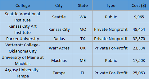
In this case, the histogram would be created using the Cost ($) field. The cost would be aggregated into bins, and the frequency would be calculated for each bin. Here is the histogram that is created in Insights for ArcGIS using the full dataset of 3,897 US colleges:
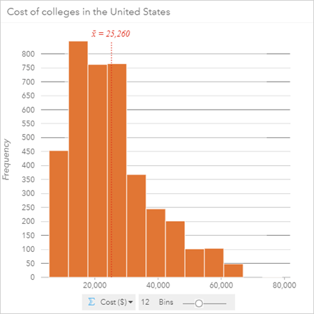
The first thing to notice is the mean, which has been labelled on the histogram. The mean cost of college in the US is $25,260 annually. The mean is not centered along the x-axis, which ranges from $5,536 to $79,212. Rather, the mean and the dataset are skewed to the left of the range toward lower cost colleges. The height of the bars shows that the highest frequency bins are near the average, with the most frequent costs being about $10,000 below average. These aspects of the histogram imply that the majority of colleges are below average cost; in fact, the median value is $23,264, which is approximately $2,000 below the average. The leftward skew has made it so that there is no left tail and the right tail is elongated. The shape of the right tail shows that the frequency decreases as the cost of colleges increases. The most expensive college is in a bin by itself, separated from the rest of the colleges by two empty bins. By looking at the most expensive college, it would be reasonable to treat that college as an outlier.

Take a look at this diagram and think about the analysis we did earlier. What conclusions can you draw from the analysis we performed? What questions are you left with? Where would you like the analysis to go from here?
I want to know more!
Did you enjoy this explanation of histograms? You can learn more about charts from the rest of my series:
Overview – There’s a chart for that
Bar charts – Three statisticians walk into a bar
Box plots – Even Schrodinger thinks this blog is alive
Scatter plots – Coming soon!
References
Insights for ArcGIS Help – Histogram
ArcGIS Pro Help – Histograms
ArcMap Help – Histograms
Photo credit
“The Extended Bell Curve” by Yau Hoong Tang. Licensed under CC BY-NC-ND 2.0, via Flickr.


Commenting is not enabled for this article.