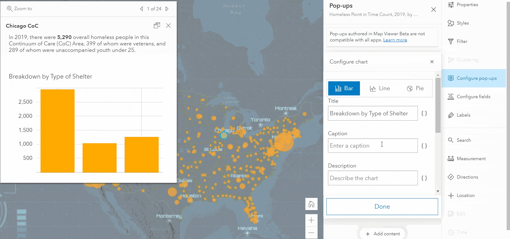
It is often difficult to present all your information in one map. Overloading your map with complex symbology and detailed labels can take away from the story you’re trying to tell with your data. Pop-ups provide an interactive way to share more with your audience without jeopardizing the readability of your map. Charts are especially useful for providing more detail about your features, which is why we’re excited to announce that pop-up charts are now available in Map Viewer.
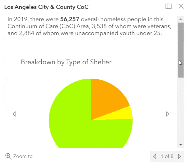
Charts offer easy-to-understand visual comparisons of a feature’s attributes that might be less meaningful when presented as other pop-up content types. For example, it is much easier to glean information from the bar chart on the left compared to the fields list on the right.

You can use charts to help your audience spot trends and to spark their curiosity about the features in the map. To get started with adding charts to your pop-ups, click the Add content button in the Pop-ups panel.
The old vs. the new
The chart authoring experience in Map Viewer should feel familiar to veteran ArcGIS Online users, but the new experience brings in some enhancements you’ve been asking for to improve productivity. The enhancements made to chart authoring allow users to do the following.
1. Easily toggle between different charts
Sometimes it’s not always obvious what chart type is best for your data. Now you can quickly switch between chart types and try them on for size to find the best fit for your data. You can also reorder fields in charts so that your information is presented in a way that makes the most sense.
2. More layout options and grouping
When adding charts and images, you can easily group them together and allow them to be viewed as a carousel or simply stack them in the pop-up. The carousel option allows you to share multiple charts without eating up a bunch of vertical space in your pop-up.
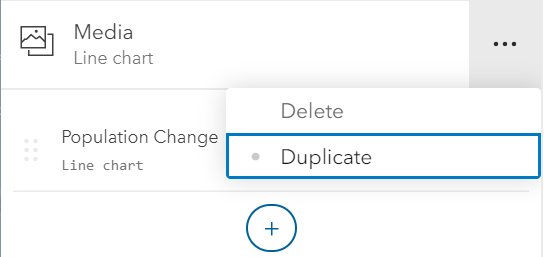
3. Duplicate media to save time
You can now duplicate a chart or image to save time when configuring charts showing similar information.
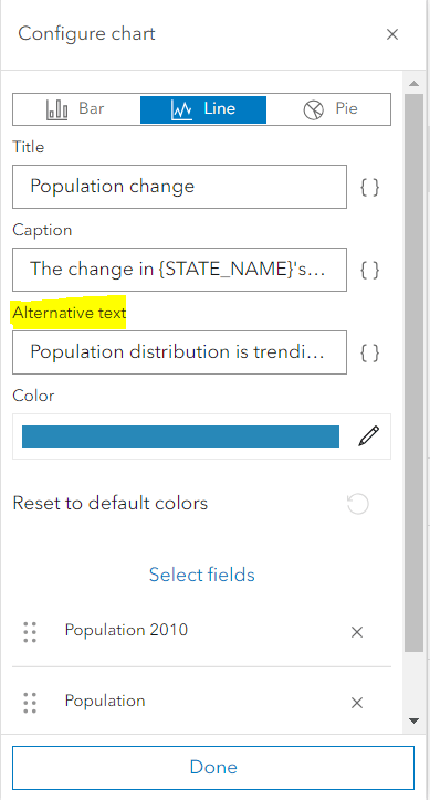
4. Describe your media to improve accessibility
When configuring charts and images, you can now add alternative text. This text isn’t shown in the pop-up but is read by screen readers for visually impaired users.
Things to consider
There are a couple of things to keep in mind when authoring pop-up charts in Map Viewer. One thing to be aware of is that not all configurations (for example, stacking charts) are supported in all applications. Charts and images that are stacked on top of one another in the Map Viewer pop-up are shown in a carousel when the pop-up is viewed in a some applications. Another thing to consider is that chart color schemes are not the same in all applications. The chart color scheme in Map Viewer ensures that fields are easily distinguishable, but this is not the case for all applications.
What will be popping up next in pop-ups?
Future updates of Map Viewer will bring more exciting enhancements to pop-ups, such as:
- Configuring pop-ups for related records
- Improved Arcade integration with the text editor
- Dragging charts and images in and out of groups
- Customizing chart colors


Commenting is not enabled for this article.