Pop-up chart color customization is here! That’s right, with the October 2023 update of ArcGIS Online you have full control over the colors in your pop-up charts. This feature is a great tool for curating professional and impactful maps.
Let’s explore some of the ways you can use custom chart colors to elevate your maps and apps.
1. Match the theme of your app
When designing your apps, you might have a go-to color scheme and carrying those colors throughout your app can take it to the next level. That’s where custom pop-up chart colors come in. You can set the chart colors to match those in your app to give an extra touch of refinement.
2. Match your layer style colors
You now have the freedom to set your chart colors to match the colors of any renderer. Matching the chart colors to those used to style the layer gives a map a cohesive look.

3. Match other pop-up content colors
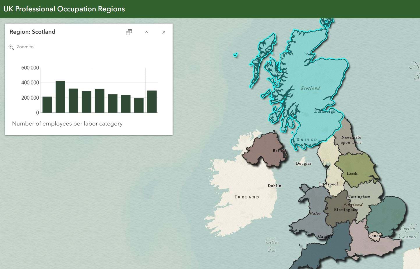
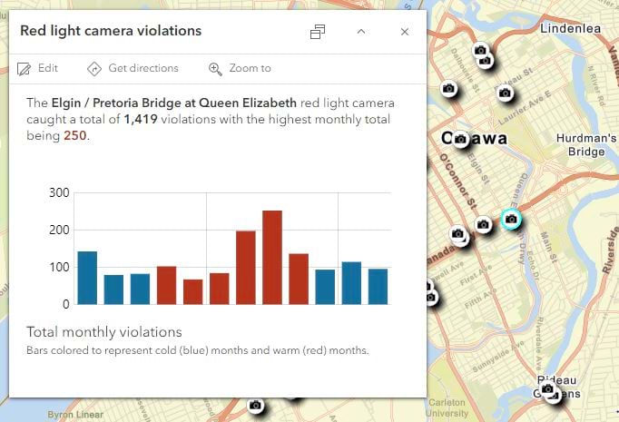
Matching connected content together through color helps highlight information, draw conclusions, and elevate your pop-up.
How to configure chart colors
In Map Viewer, you can author pop-up charts using chart content elements and Arcade content elements. We’ll go through how to add color in both scenarios.
Chart content elements
Once you’ve added a chart and selected fields to populate the chart, you’re ready to customize the chart colors. For bar and pie charts, simply click the color ramp and toggle through the available ramps. Line charts are represented by a single color, so you’ll use a color picker or HEX, RGB, or HSV inputs to set your color of choice.
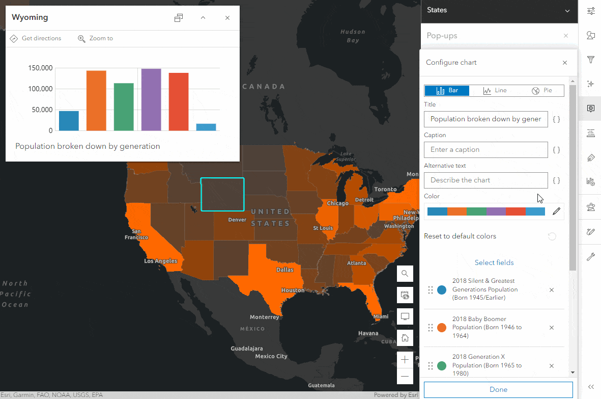
If the color ramps don’t fit your needs or you want to adjust colors on a field-by-field basis for your bar and pie charts, you can do that by clicking on the color icon beside each field. You can then set the color using the color picker or color value inputs.
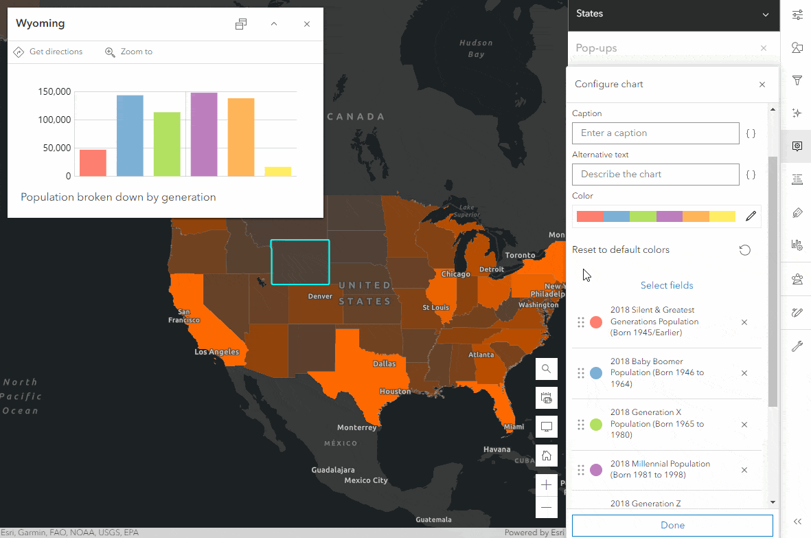
Pro tips: 1) When playing around with colors for line charts or on a per field basis, click the + button to save them for easy reuse. 2) If you want to revert to the default color ramp, Olympic Sunset, simply click the Reset to default colors button. If you have fields in your chart that are also used to style the layer and the style type is either Predominant category, Charts, or Dot density then custom colors will reset to those set in the renderer.
Arcade content elements
Arcade content elements are arcade expressions that return an entire content element, which can be text, field lists, or charts. If you aren’t sure how to build charts using Arcade or what the benefits are then check out this introductory blog by my colleague, Paul. With this update, the chart template includes a colors property where you can add RGB values to drive the colors of your chart.
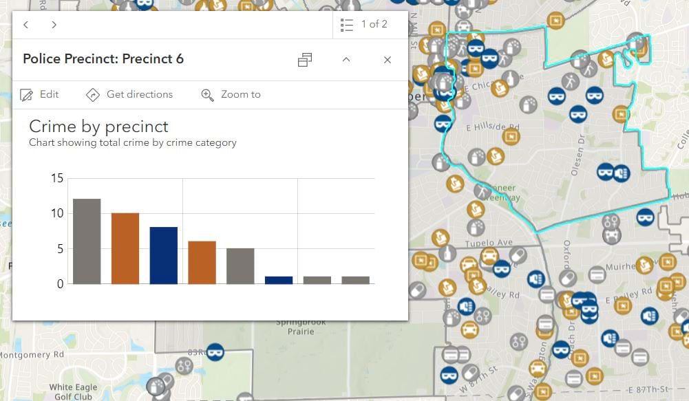
To better understand how to use the colors property, let’s look at how we can add a splash of color to the chart in Paul’s blog map. When opening the map and clicking on a precinct, we see a chart showing the number of crimes, categorized by type, in that precinct. To better relate the information displayed in the chart to the crimes layer, we can set the colors of the bars to match the colors of the corresponding crime symbols. I adjusted Paul’s expression to include the following:
- An empty array to store the chart colors
- A look-up dictionary to associate the crime type (key) with the symbol color (value)
- A default color array containing a RGB value
- An if statement that uses the look-up dictionary to add colors associated with specific crime types to the chartColors array, if no match is found then it adds the default color
The chart now has a greater connection with the data shown in the map.
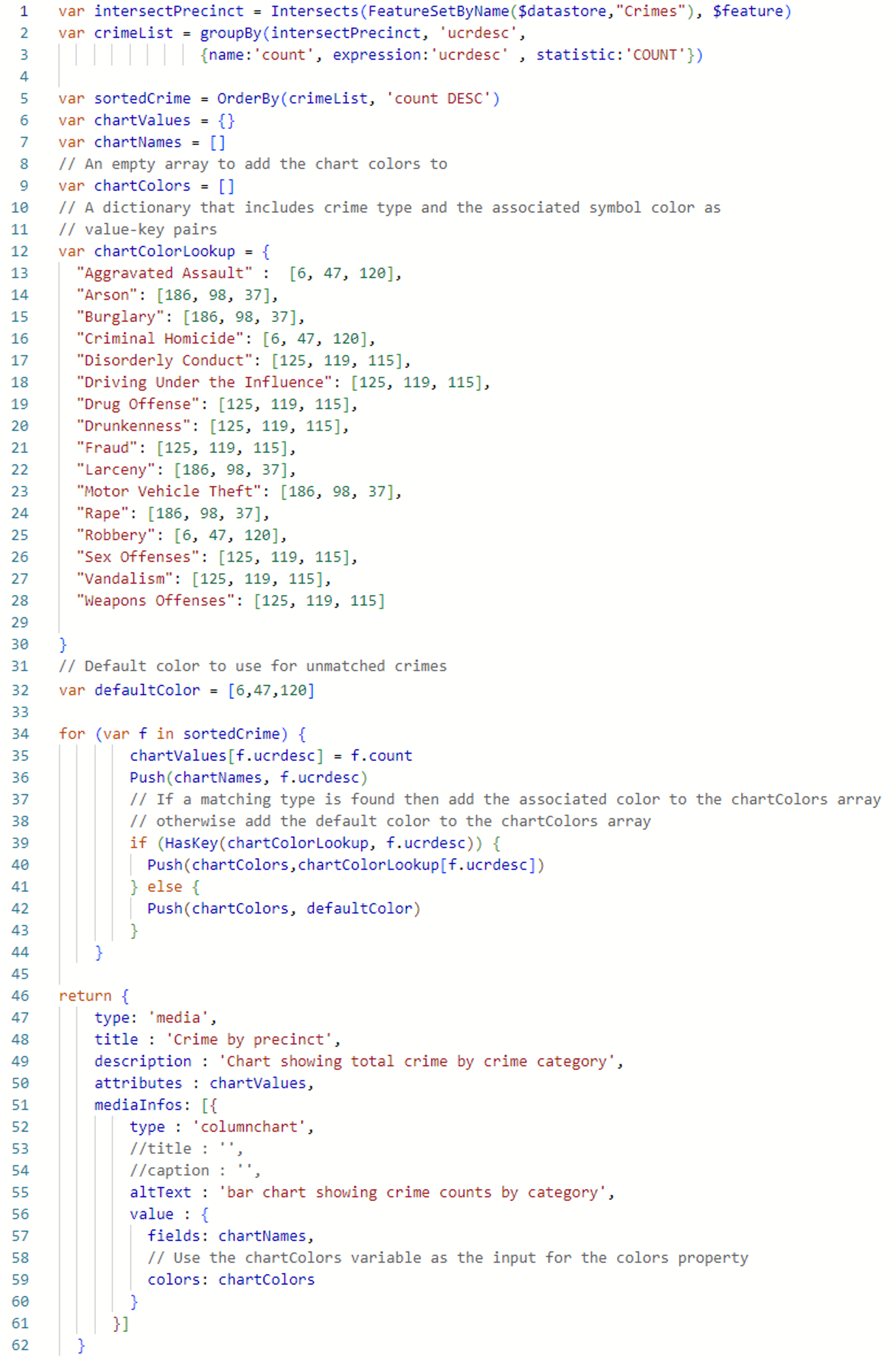
The code for the above work would look like this:
What’s next
We are beyond excited to bring custom colors to your pop-up charts as we know it’s been a long time ask. In future updates you can look forward to seeing:
- More color ramps
- Colorblind friendly color ramps
- Thicker line for line charts

Commenting is not enabled for this article.