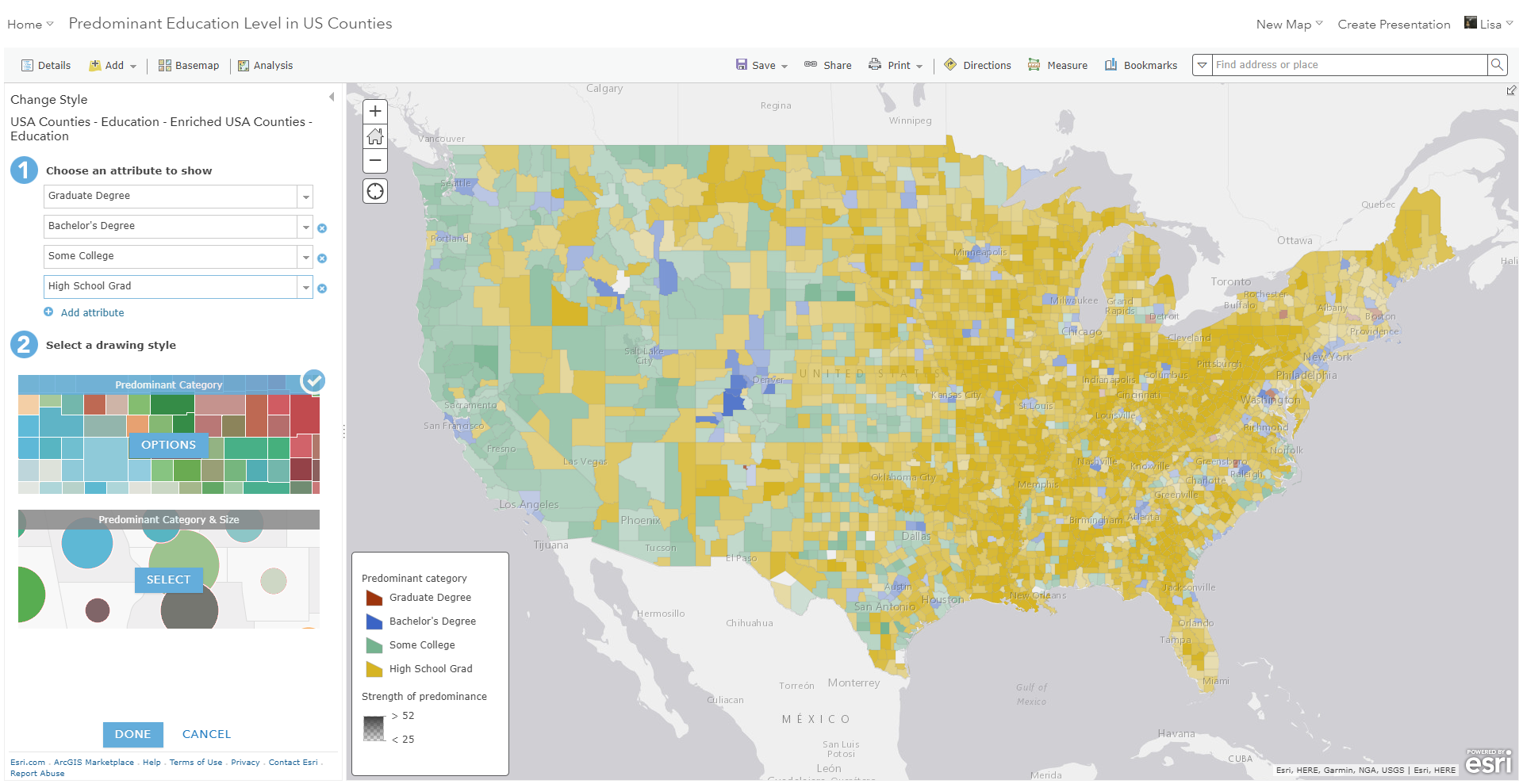
Smart mapping allows you to select multiple attributes, and will automatically show you the largest value of those attributes. This uses a technique known as predominance, and can be done in minutes within ArcGIS Online and ArcGIS Enterprise. This quick guide introduces how to get started with predominance in smart mapping. To follow the same tutorial within an interactive story map, click here.
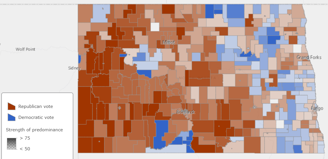
An election map is an example of a predominance map. It simply tells you which of two or more candidates have the highest vote count. The map features are colored based on who “won” the predominance, and the amount of transparency is determined by HOW MUCH they won.
You can use smart mapping to compare multiple columns of related data in order to determine which has the highest, or predominant, value for each feature. Try a predominance map anytime you see multiple columns of data that share a common subject and unit of measurement.
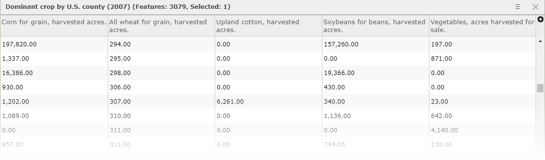
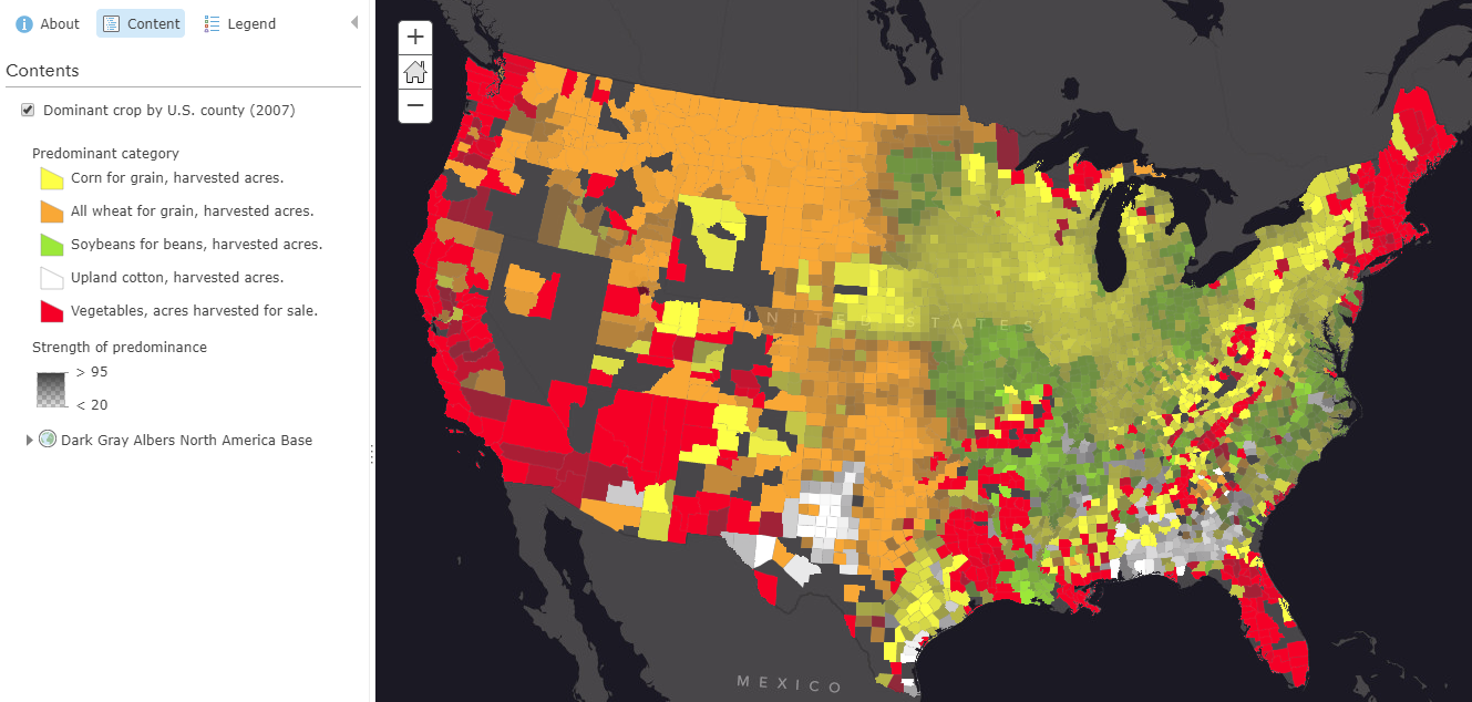
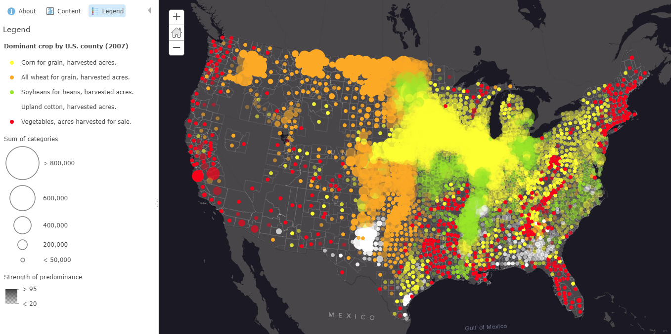
For example, I have data regarding the crop output of US counties. Within my table, there are five attributes which track the amount of harvested acres by the type of crop. I can use predominance to determine which crop type produced the most yield. It compares the values of my five attributes and immediately tells me which one is the largest value.
When I input two or more numeric attributes like these into smart mapping, it will automatically offer the following two predominance styles:
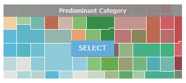
Predominant Category
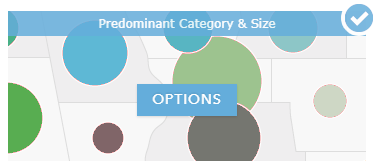
Predominant Category & Size
If you select one of these mapping styles, you will automatically get a map which compares the values of the attributes you selected.
Let’s step through an example in the ArcGIS Online Map Viewer:
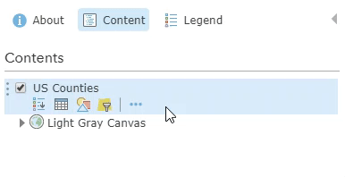
1. Go to Change Style in the layer options
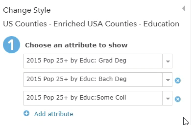
2. Select up to five attributes by using the “add attribute” button
3. Choose to map with “Predominant Category” or “Predominant Category & Size”
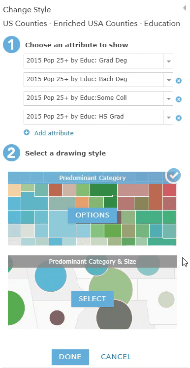
4. Accept map or make adjustments within “Options”
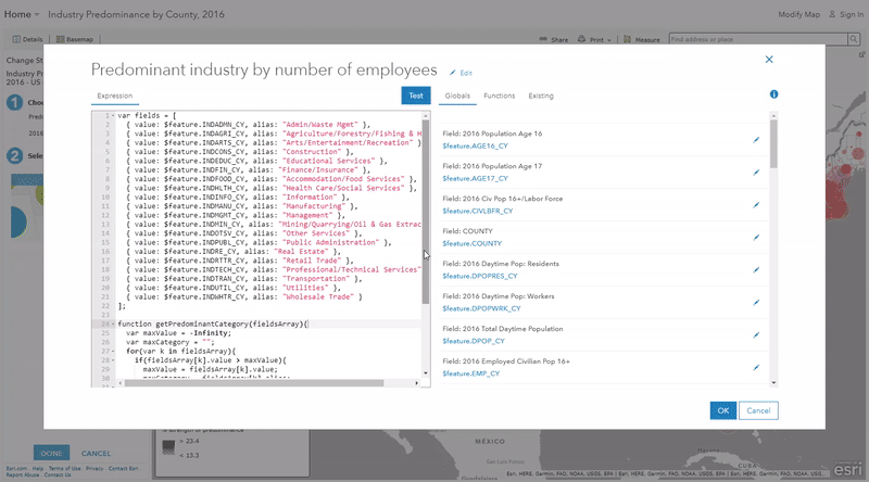
If you want to compare more than five attributes, you can do so using an Arcade Expression to calculate the predominant value.
Arcade is a simple expression language that allows you to create custom cartography, attributes, labeling, and more. The following blogs introduce Arcade and how to use it to create a predominance map similar to what is created by smart mapping:
Use Arcade Expressions to Map Your Ideas
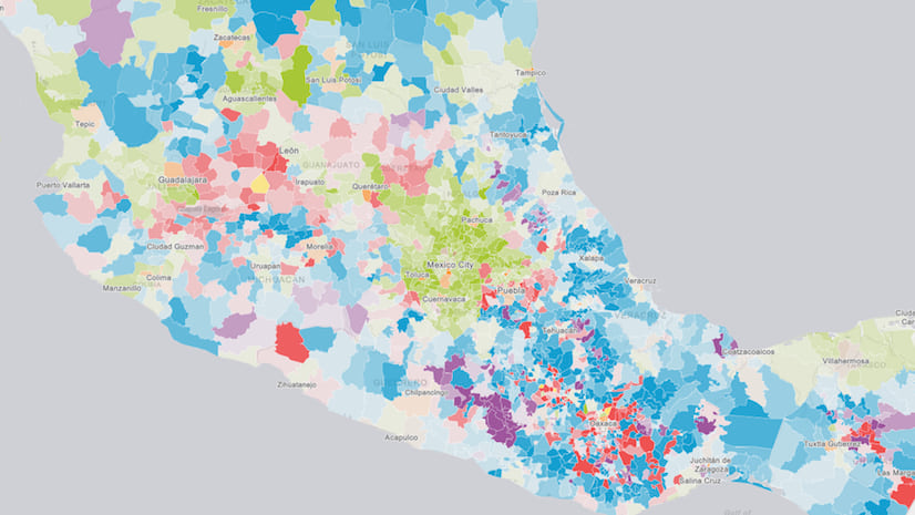
Creating a Predominance Visualization with Arcade
Learn more about smart mapping and how to use the predominance mapping styles with these helpful resources:

Article Discussion: