A common question at the ArcGIS for Excel booth during the Esri User Conference was how to add polygon and polyline datasets to a map from their Excel data. We’ve written this article to walk users through the process of adding these features to an ArcGIS for Excel map using data from Excel. The steps are the same for both polygons and polylines datasets.
In ArcGIS for Excel, you can map standard administrative boundaries or levels of your region’s geographies, including states, provinces, zip codes, block groups, census tracts, departements, statistical areas, regions, subregions, emirates, governorates, sectors, prefecture, etc. You can also map your own custom boundaries such as water districts, sales districts, or zoning boundaries. You can render the polygons layer on the ArcGIS for Excel map as long as there is a one-to-one relationship between the rows in your business data (Excel data) and the shapes in the service hosted on ArcGIS. You are specifying a dynamic map service or feature service from ArcGIS to use as a location type and performing a join between the fields from your Excel data and ArcGIS layer, and shapes with matched attributes will get rendered on the map.
Polygons
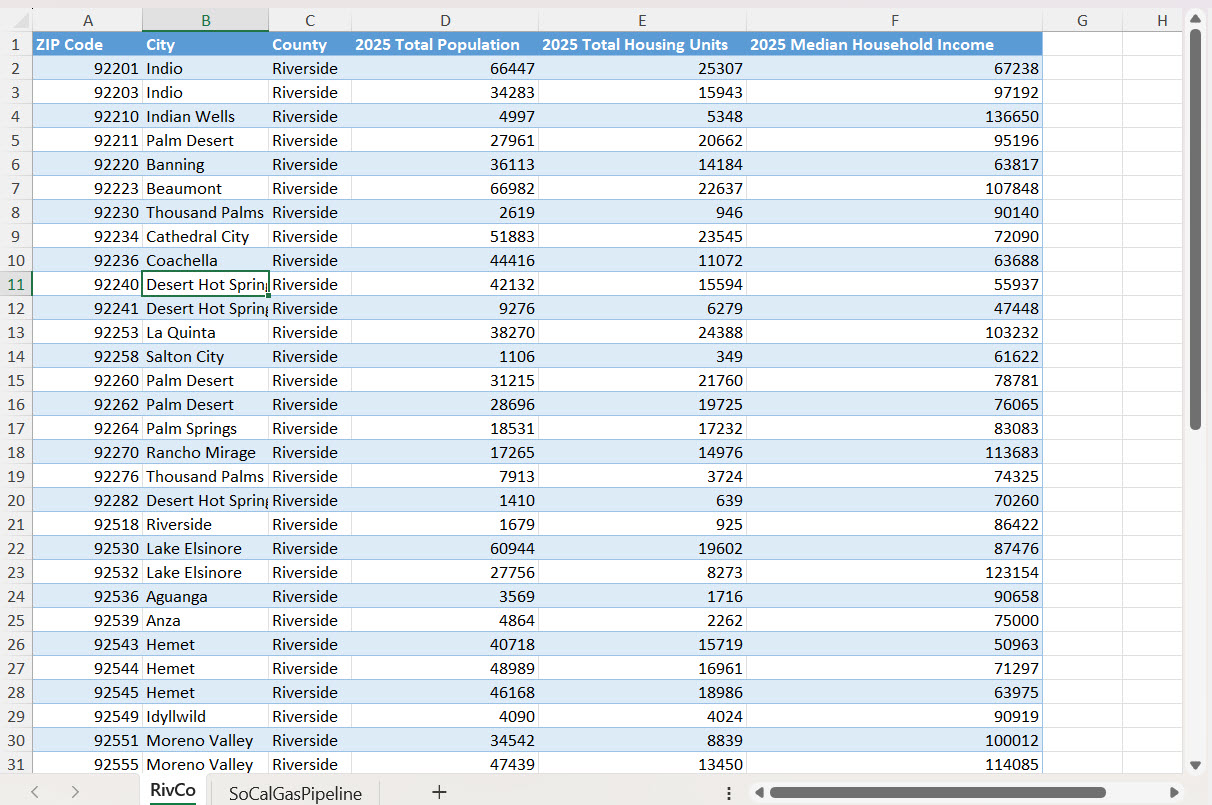
The dataset below includes demographic data for Riverside County ZIP codes with fields for Total Population, Total Housing Units, and Median Household Income. Our task involves:
- Rendering ZIP code polygons on the ArcGIS for Excel map.
- Applying color styling based on Total Housing Units.
- Normalizing by dividing Total Housing Units by Total Population. In this way, we can analyze the housing supply relative to population density across different Zip codes.
Follow these steps to add polygons features on the map –
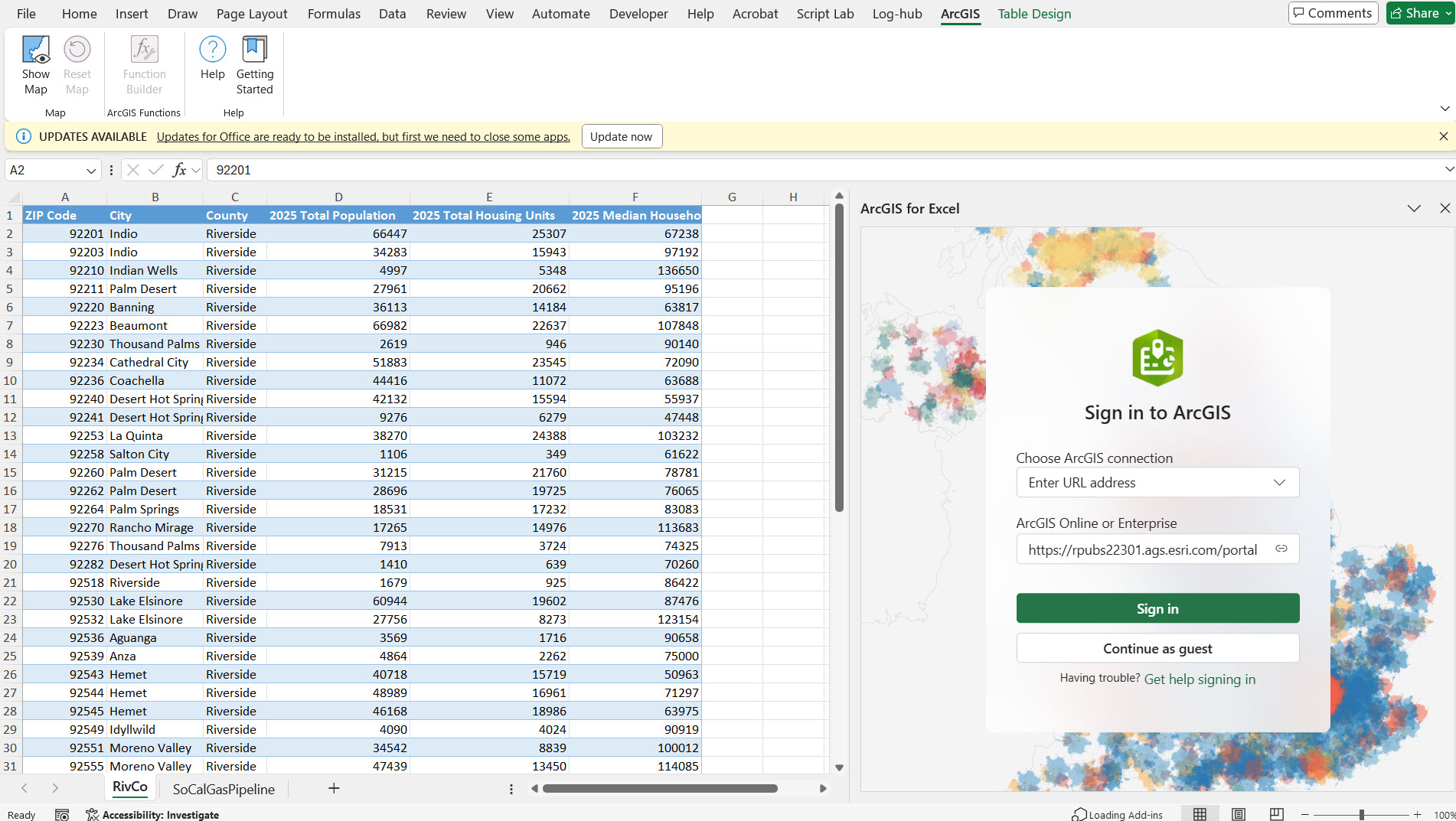
1. Open ArcGIS for Excel task pane. Sign-in to ArcGIS.
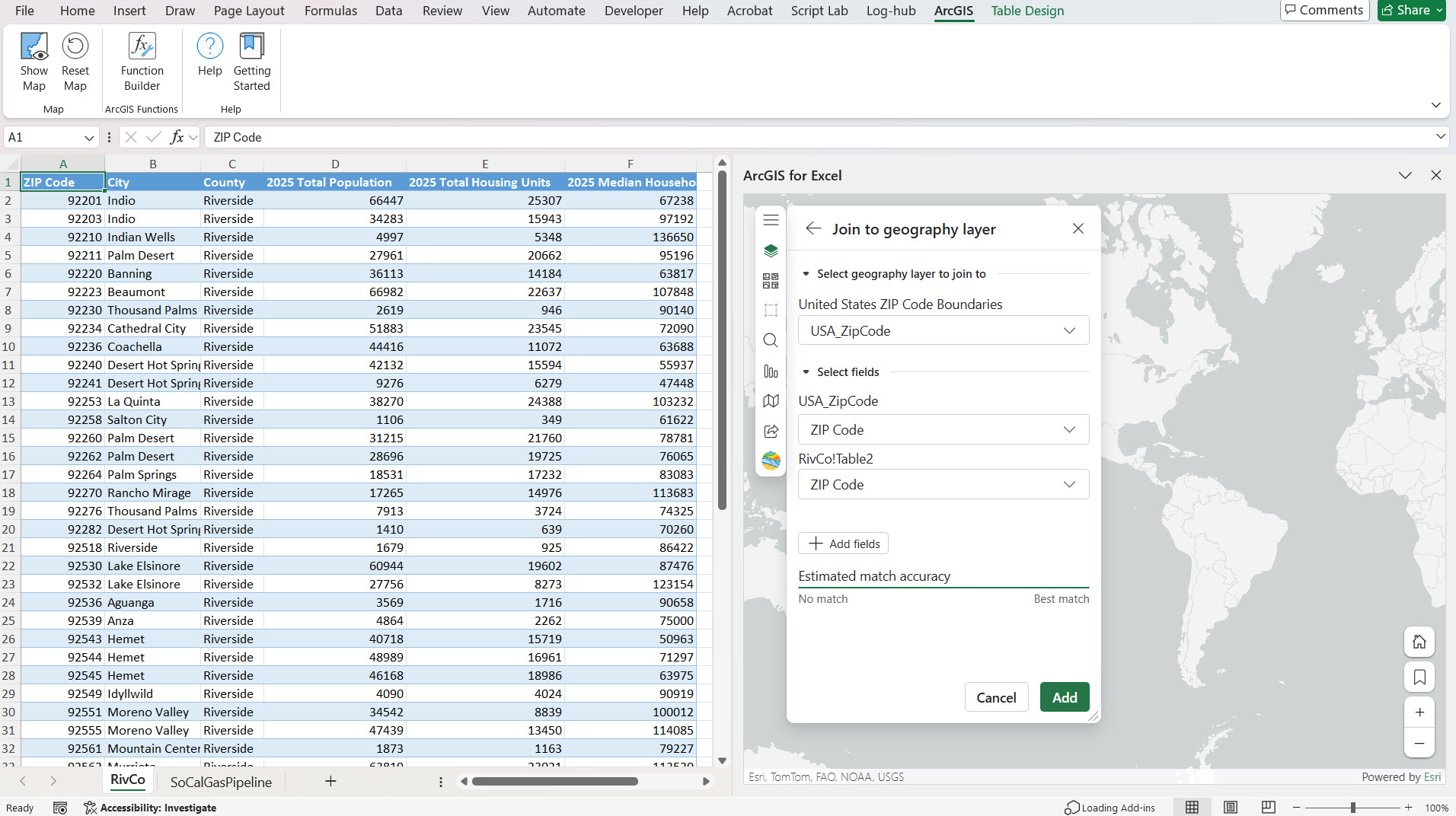
2. Select Layers Icon, select Add from Excel Icon, the Location types drop-down, and select the ‘Geography’ location type
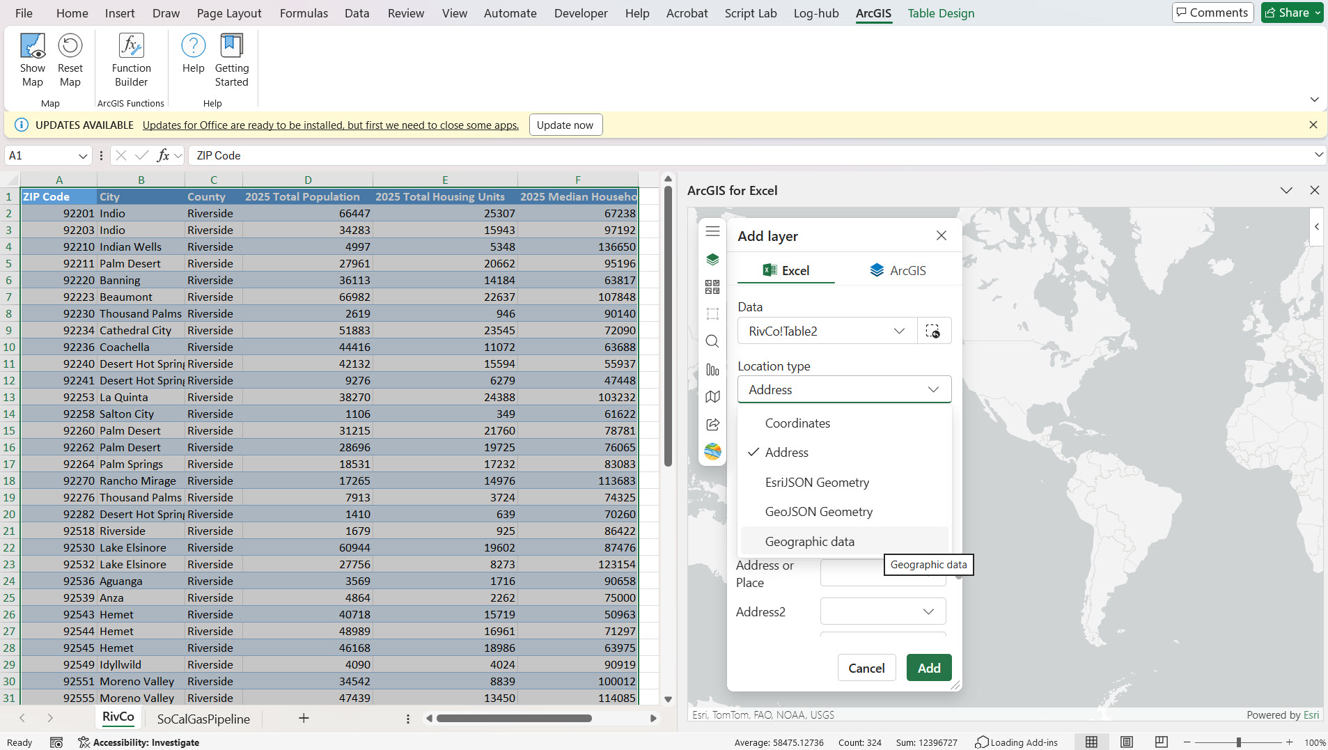
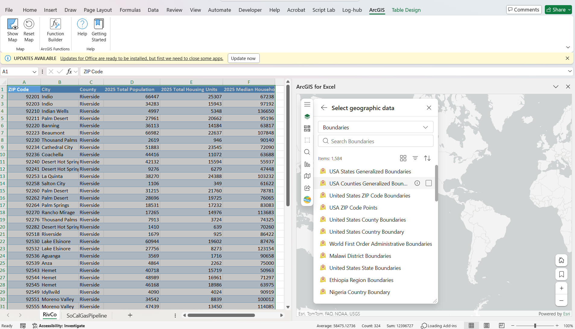
3. Change the dropdown selection in the ‘Select geographic data’ UI according to your preference and search for your ArcGIS layer. For example, I chose ‘ArcGIS Online’ from the dropdown and searched and selected the ‘US Zip Code Boundaries’ layer.
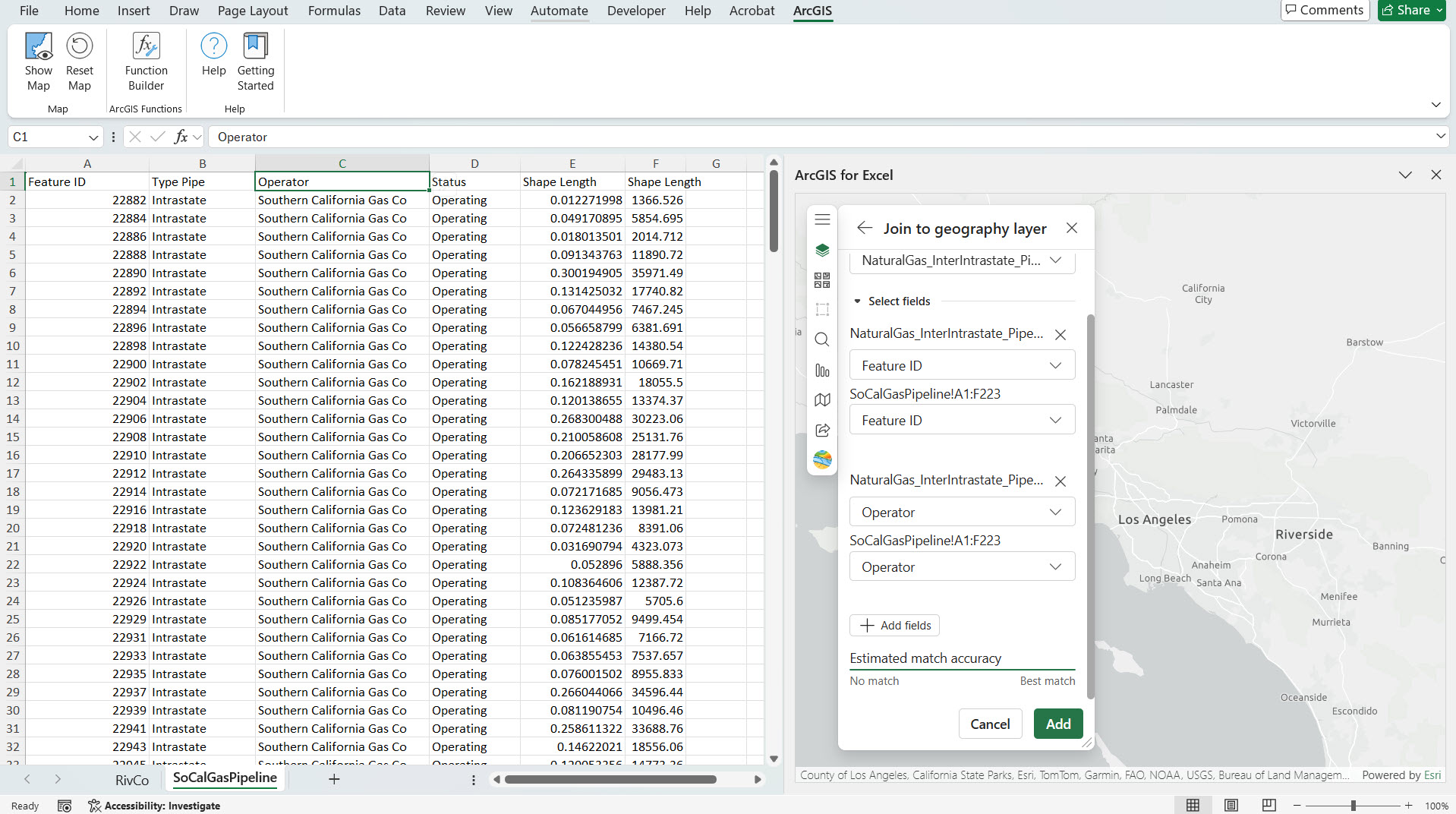
4. Perform layer join between the fields from your Excel data and ArcGIS layer. In the first drop-down ArcGIS layer is listed, and in the second drop-down, select the ‘Zip Code’ field from your ArcGIS layer, and in the third drop-down, select the ‘Zip Code’ field from your Excel data and select Add button.
5. Now ZIP codes are rendered on the ArcGIS for Excel map with layer styling by color using the Total Housing Units field.
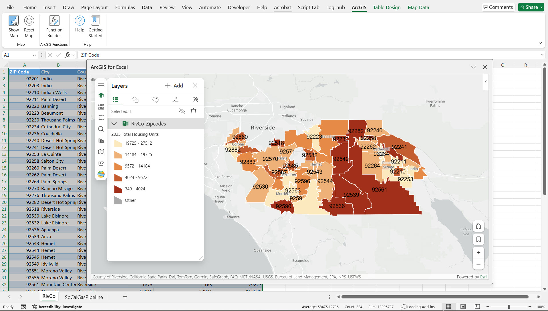
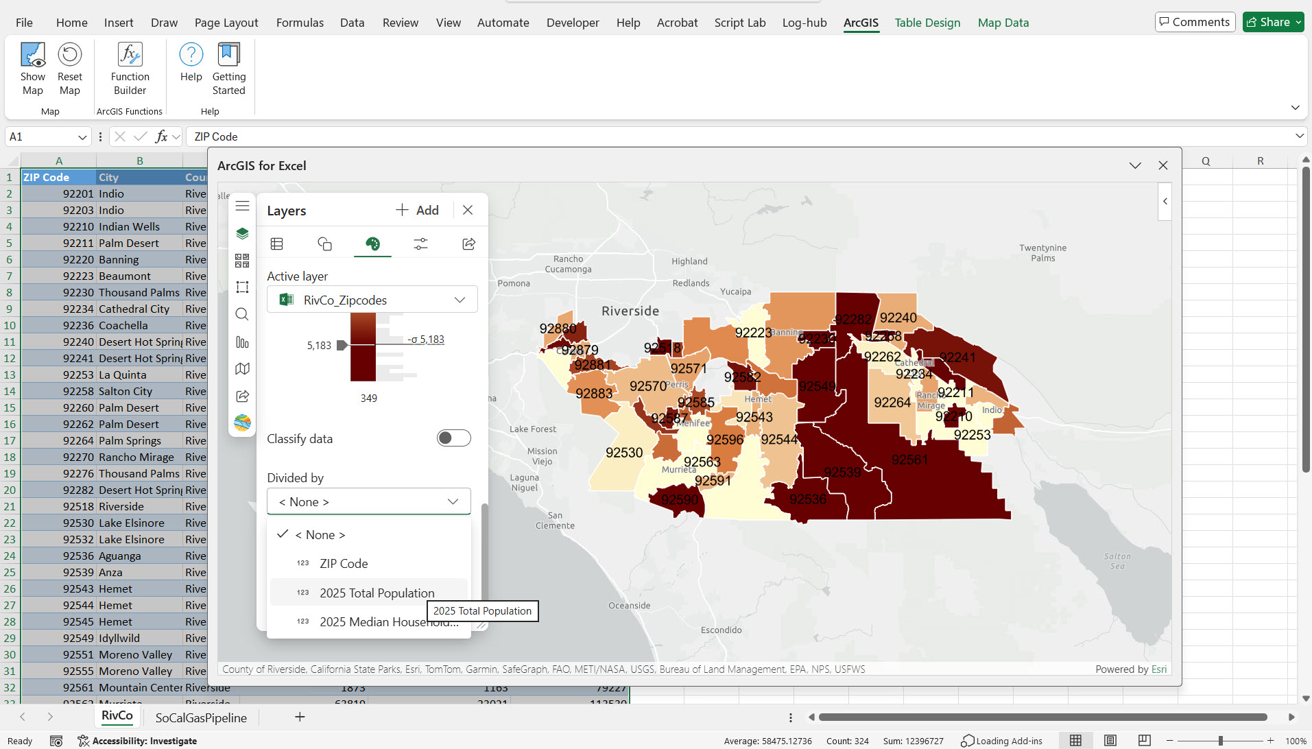
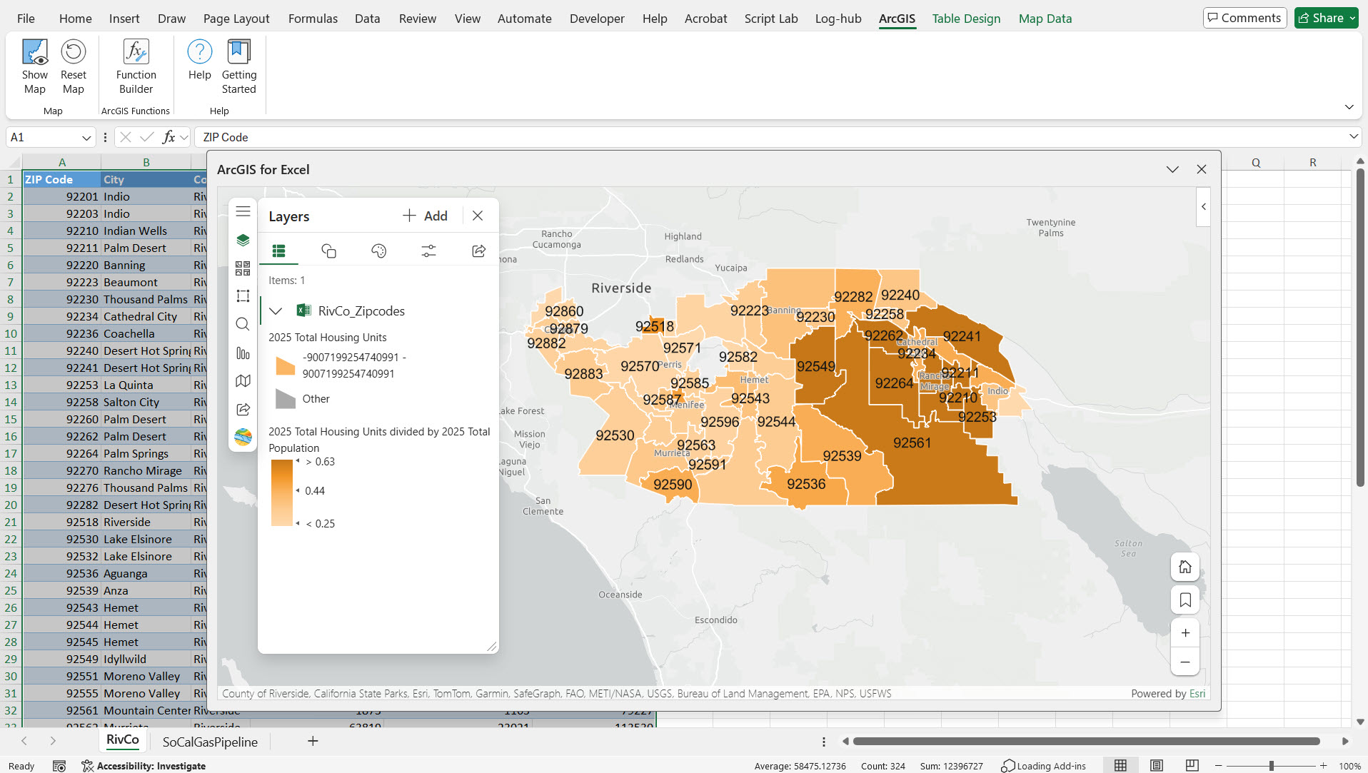
6. We apply labels to the features using Zip codes fields, normalized by Total Population, so that we can clearly analyze the housing supply relative to population density across different Zip codes. To apply normalization by Total Population in the UI, go to the Style Options section → Color Classification → Divide By and select Total Population.
Note – We can use up to three fields when joining layers. When matching county polygons, you typically need up to two fields – one for the county name and a second for the state name. For example, with Orange County, there are multiple Orange counties in different USA states – one in California, another in Florida, etc. To get the exact match, we need to use two fields – county name and state name.
Polylines
In my dataset in Excel, I have Southern California Natural gas pipeline polyline data, using layer joining between the fields from your Excel data and ArcGIS layer, here ArcGIS Layer is US Natural Gas Interstate and Intrastate Pipelines layer, and the matched attributes polyline shapes of Southern California Natural gas pipeline data in Excel will get rendered on the map. This process is demonstrated in the video below.
Spatial Filtering Tool
One of the Analysis tools in ArcGIS for Excel is Spatial filtering tool. The Spatial Filter tool analyzes the spatial relationships between two layers and creates a result dataset containing only features that meet specified spatial filter criteria. Check the Spatial filter tool documentation for more information.
To demonstrate Spatial filtering tool, I will be using the above Southern California natural gas pipeline polyline data, and as a second layer, I will be using the Riverside Facilities layer. In this layer, facilities across Riverside city, such as government facilities, hospitals, libraries, airports, and community centers, are represented by unique symbols. Using Spatial filtering tool, we can identify the facilities impacted by the gas leak by analyzing all locations within 500 meters. This is a powerful way to assess the risk and effective emergency planning. This process is demonstrated in the video below.
Demonstration
In the video shown below, the following operations are demonstrated:
- Adding Polygons layer using Excel data to ArcGIS for Excel Map,
- Adding Polylines layer to ArcGIS for Excel Map,
- Spatial Filter tool.
Conclusion
In this article, we’ve learned how to add both polygon and polyline layers to ArcGIS for Excel map through layer joining. Try these steps with your data to see how visualizing it on a map can improve your analysis and help you make better decisions.

Article Discussion: