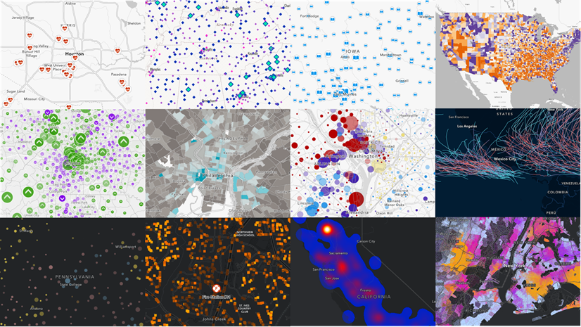
If you have ever made a map for advocacy, for decision support, or for policy evaluation, you are a policy mapper. This article will share some cartographic tips for various stages in the policy lifecycle.

Advocacy maps
When an issue is relatively new, there tends to be an advocacy phase. People learn of disappointing facts and then try to raise awareness about the problem.
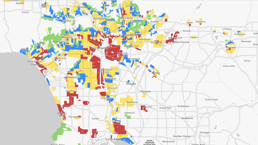
Cartographic tip: Effective advocacy maps often use a diverging color ramp, or the Above and Below theme in ArcGIS Online, to anchor the values being mapped to a goal or to the nationwide average. Many of the diverging color ramps in ArcGIS Online have one color that is very bright, which advocates can use to illuminate areas of interest. For example, the bright magenta areas in the map below show tracts with high levels of poverty.
, areas in dark yellow are low levels of poverty (only 3 % of individuals have income below poverty level), and areas in faint magenta or light yellow are in the middle (map's legend changes from yellow to magenta at 14%).")
The Above and below theme helps to map areas with room for improvement as well as successes. Don’t be afraid to advocate for the continuation of successful policies.
Policy comparison maps
It can be helpful to see what others are doing. How many other jurisdictions are currently doing something similar to what you’re thinking of proposing?
Cartographic tip: Policies are often categorical in nature. Therefore, maps that compare various policies often use the Types (Unique symbols) style. For example, this map shows payday lending laws across states.

Policy options analysis and policy design
Tinkering with policy levers is somewhat like tuning dials. For example, do we ban single-use plastic bags, or tax them? How much should we tax them? Does a 10 cent plastic bag tax yield double the outcome of a 5 cent plastic bag tax, or less? At what point does it become too burdensome, and politically unpalatable?
Calculating forecasts and projections, and running what-if scenarios can be difficult, even when there’s no policy change being introduced. In general, the longer the time horizon, the more uncertainty there will be in the calculations.
Cartographic tip: When the potential benefits (or consequences) are estimated, they are often presented as ranges. An unclassed color ramp is recommended for mapping ranges of values, or for mapping data with uncertainty.
Decision support maps
You can use maps as meeting discussion starters and to get stakeholder buy-in and build trust. Decision support maps are used in a variety of scenarios, including the following:
- Briefings for program administrators or elected officials
- Discussion starters for community meetings and listening sessions
- Presentations to city councils or county boards of supervisors
To make this effective, ensure that your map is clear to interpret, especially by people who are not used to looking at maps and data all day.
Cartographic tips:
- Make the legend as legible as possible. Consider changing the labels in the legend so that words appear rather than data values. In ArcGIS Online, you can change the display name of the layer which will carry through to the legend, and adjust the JSON to change the labels of the breakpoints. In ArcGIS Pro, you can format text in a legend many ways.
- Consider making your map’s title a question.
For example, this layer in Living Atlas does both. Its title is, “Where will tree planting improve urban health?” and its legend informs people that higher percentiles indicate higher benefits.

"A policy map is a map where the opportunity to intervene is made clear."
Outcomes maps
An outcomes map is like a status monitoring system, or score board. Often, dashboards are used for real-time situational awareness. These snapshots in time can lack context without a historical comparison. Showing two related maps, or even two related numbers, side by side can communicate if the situation is improving or getting worse.
Cartographic tip: When making before and after maps, make sure to style them similarly. Use the same maximum and minimum in both of your legend’s breakpoints. Doing this makes the change over time obvious when put into a swipe experience such as Media Map or Imagery Viewer.

As soon as you show someone a swipe map, they may also want to see a map that summarizes or quantifies the net change. Thoughtful symbology can help with interpretation by highlighting meaningful changes.
Policy evaluation mapping and analysis
Policy evaluations seek to answer questions such as the following:
- What was the effect of X on Y?
- Were there unintentional consequences? Additional benefits?
- Did our intervention work for some areas but not others? For some groups but not others?
While some double-blind, randomized controlled trials do exist, they are few and far between in the world of social science. Often, evaluation studies take advantage of locations in natural treatment and control groups, and look at the effects.
To answer these questions, policy evaluations often combine the ideas of a Policy Comparison map and an Outcomes map. For example, many studies have shown the effects of historical redlining practices, highlighting the connection to historical neighborhood grade and differences in outcomes (for example, temperature, prevalence of contaminated sites, and asthma rates). Here, the policy comparison is the neighborhood grade of the past, and the outcomes are today’s data.
Another study took advantage of state-level differences in minimum wage rates to look at the effect of income on household and family formation (for example, fertility intentions, cohabitation and marital rates, or divorce rates). By limiting the analysis to counties on the boarders of states with stark minimum wage differences, the treatment group here is young adults in bordering counties in the high-minimum-wage states and the control group is the young adults in bordering counties in the low-minimum-wage states. The policy comparison is the minimum wage policies, and the outcomes are the household and family formation rates.

Cartographic tip: Configure labels to help convey lots of information in one map. Here, an Arcade statement combines the state abbreviation and the dollar value into one label.
Identifying peer communities
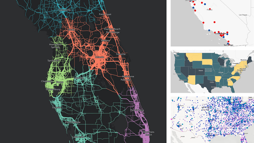
Finding a city, county, or district that is socioeconomically, demographically, or environmentally similar to yours can be helpful to serve as a benchmark. This way, you can get closer to isolating the effect of a policy itself, or event itself, and not the effect of other macro-level trends. For example, Professor Victoria Morckel gave a presentation at the 2019 American Association of Geographers meeting on the effect of the Flint, Michigan water crisis on home values. For a comparison group, she and her coauthors used the peer community of Saginaw, Michigan— a sociodemographically similar city that did not have a water crisis— since home values had been going down across much of Michigan during that time.
ArcGIS Pro’s Similarity Search tool identifies features that are most similar to input features to match. This tool allows you to specify attributes of interest, meaning it will find features similar to the input feature on attributes most important to your project.
The lifecycle repeats
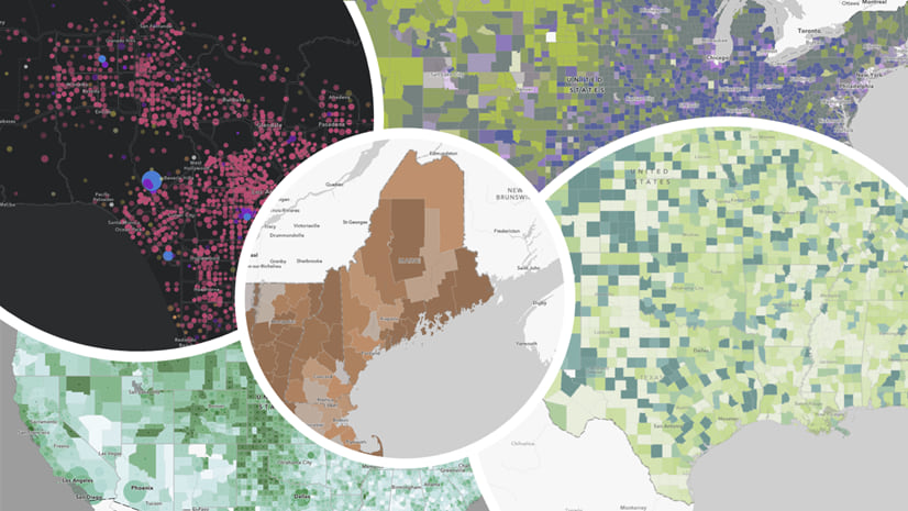
There’s overlap between all the various policy map archetypes discussed here, hence the overlapping circles in the diagram. Furthermore, the cycle repeats. One person’s outcomes map becomes another person’s advocacy map. One organization’s policy evaluation helps inform another organization’s policy options analysis and design. For example, what works, and what doesn’t work, about regulating tobacco and alcohol is now being used to inform policies about regulating vaping, cannabis, and even sugar. An issue can take years, even decades, to move through the policy lifecycle.

Where to begin?
Begin where you are! There’s no need to begin with an advocacy map and work all the way through (although you can if you want to stay with an issue for years). It’s okay to go out of order. It’s okay or to specialize and focus on one of these lifestyle stages, especially for GIS analysts.
The questions you seek to answer, the way you style your map, and the final app or story all contribute to carrying your message. What opportunities to intervene and what potential to strengthen your community will your maps highlight? Share your work and ask questions among fellow policy mappers in Esri Community’s State and Local Government space.
How can I learn more?
Try the ArcGIS Policy Mapping learn path, and explore the resources on the Esri Maps for Public Policy site. Also, you can watch a recording of a recent conference presentation (Accelerate Your Policy Mapping) that further explores these ideas.


Article Discussion: