Esri provides you with a slew of different basemaps to work with. Hopefully we’ve got at least one that meets your needs, but is it exactly what you want? Particularly if you are trying to match it to an established brand identity, how do you ‘massage’ the map to get that perfect fit?
More than ever before you are now in control of this! The combination of the new Map Viewer, and the ability to customize vector basemaps through the Vector Tile Style Editor, opens up all sorts of possibilities, including tying the map design to a particular brand. With both approaches the mechanics of this are easy, but there are some potential pitfalls you need to be aware of.
I’m going to walk you through a few of these, and hopefully show you how to proceed. Let’s look at some of the issues first:
Basemaps are complicated!
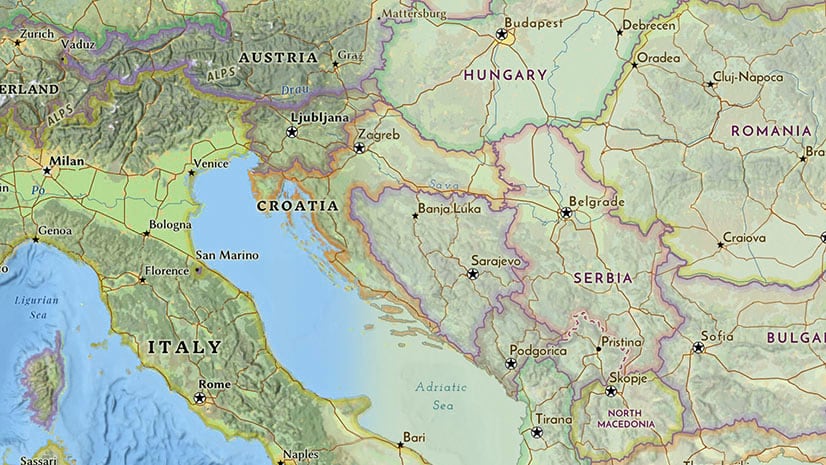
If you have never worked with a basemap before, they include a lot of symbols (The light gray basemap, for example, is one of our simpler ones, but it has around 250 symbol layers). This doesn’t mean you should be scared of it… It just means you need to be organized about how you go about making changes. Learn and understand some of the shortcuts that are available.
Basemaps are multi-scale
In effect a multi-scale map is a stack of over 20 separate maps that have to work together seamlessly, and it’s very easy to forget that when you are restyling in one view (we all do it!). It can be daunting, but you need to adjust your thinking beyond that one scale.

The context in which you plan to use the map might make this a bit easier though. You may only need it to function at a few scales – If you are building a store locator, for example, you may only really need it between, say, zooms 8-15. Although we don’t advocate ignoring other scales completely (you never know where people will go when they start exploring an online map), you can be a bit more relaxed outside of your focused scale range.
Basemaps can be cluttered
As I said before, we are dealing with a lot of symbols on these maps. Sometimes, irrelevant detail can get in the way of what you are trying to show. Well, check through our set of basemaps to see if you can find one that handles this for you. If not, then find one that is close, and switch some of that irrelevant stuff off! With the Vector Style Editor, it’s easy… OK, well you have to be a bit careful about consequences if you plan to butcher the map, but it’s not that difficult.
Basemaps might be … BASEmaps!
If you are looking for a basemap just to locate important or relevant sites, most of our offerings will work for you. Some of them are deliberately high contrast and bright, however. If you are looking for a ‘base’ to anchor a more complex subject, and you want the focus to be on that, you’re not going to use strong maps like ‘National Geographic Style’ or ‘Pop Art’. Remember that when you are creating your own version.

So, how can you adjust a basemap so that it ties in graphically with the rest of your brand? Let’s get into some of those mechanics:
Customizing through the Map Viewer
This is the simple way forward, and it may be all you need. Let’s start with the Canvas Map, the easiest of our basemaps to customize:
Blending
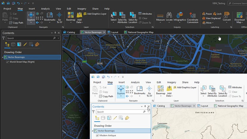
- Open your chosen basemap into the new Map Viewer (not the ‘Classic’), and remember to save your copy:
- In the left toolbar, go to ‘Map Properties’ This allows you to set a background color of your choice.
- Now go to ‘Basemap’, click on the basemap name at the top, then, if you have a choice, choose the base layer. Choose ‘properties’ (top right), and a window will open.
- Find ‘Appearance’ / ’Blending’. Click on ‘Normal’ and change it to ‘Multiply’ Your basemap is now blended into the background color.
- If the effect is too overpowering, try changing the blend setting to ‘Luminosity’.

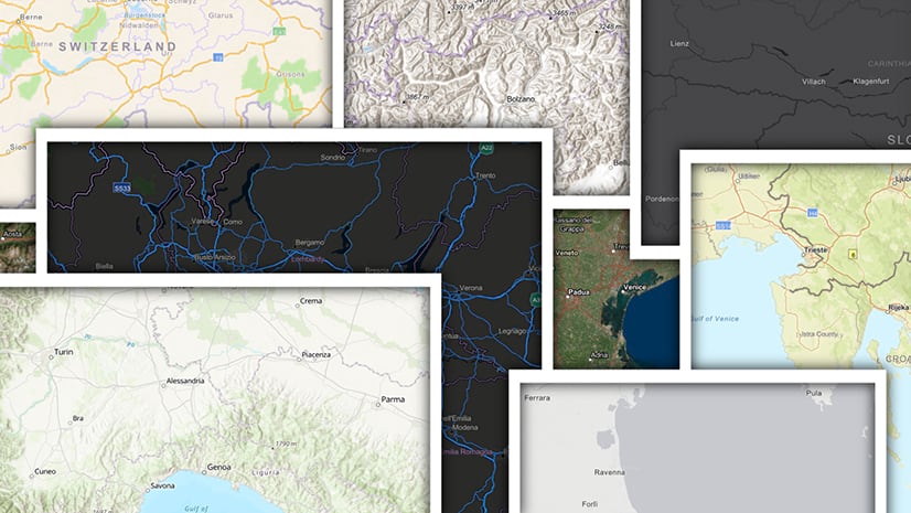
Experiment with some of the other filters to see what they do. Some will be a bit surreal, but you may find another that works for you. Any of our basemaps can be treated in this way, but of course the more colorful ones will fight back…
Effects
You can use the ’Effects’ filters now available to take a basemap in many different directions. I’m going to use the ‘Colored Pencil’ basemap for this – one of the more creative of our basemaps, and one that is difficult to customize because of the many patterned symbols.
Go to ‘Effects’ at top right. You can experiment with all of them (and use them in different combinations), but for basemaps these are the ones that are particularly impactful:
- ‘Grayscale is self-explanatory. Use this if you want a neutral map, or a starting point to work with something like the ‘Luminosity’ Blending effect.
- Use the ‘Brightness and contrast’ and ‘Saturate’ effects to change the strength of the map.
- ‘Hue Rotate’ will cycle the map through the color wheel, but for a basemap it may be best for making small adjustments to bring the color balance closer to your brand.
- ‘Invert’ will change the map from light to dark (or dark to light). This may look a bit disorienting… or it may be spectacular!

A combination of ‘Blending’ and ‘Effects’ allows you a great deal of control over the look of a basemap with just a few commands. Remember though that the more dramatic the change you make, the more carefully you will need to check the results on all symbols and at all scales.
If your basemap has a separate reference layer, you may want to make some adjustments to that too.
Note: At the moment Blending and Effects work best within the confines of the new Map Viewer. If you are planning to use them in another environment, test the result before you put a lot of work into it.
Customizing through the Vector Tile Style Editor
With this you’re really getting into the nuts and bolts of the basemap design, but there are some shortcuts…
Open the Vector Tile Style Editor and choose the basemap you want to work with. Remember to save your own copy of the map before you start working.
The ‘Quick Edit’ option
The Editor usually opens to this, and it can be an effective way of restyling. It’s self-explanatory, so change some of the hex values and see what you can do. It’s a bit indiscriminate though. You may need to get in and ‘tweak’ some of the details afterwards (clicking on a feature on the map itself will open the relevant symbol layer).

If you are short on inspiration, try the ‘randomize’ option… only for ideas though! It rarely produces a fully functional map, but it can be a good starting point. Remember that you have a ‘reset style’ button if you go too far with it.
The font tool here is a good way of making a blanket change to the map fonts, with 2 caveats: It will remove any ‘bold”, ‘italic’ etc. settings that are in the original, and you can only access fonts that are in our vector tile package. We’ve included a good variety of mainly open-source fonts, but if you have a corporate font it is unlikely it will be here.
So how can you get the convenience of the Quick Editor but with a bit more control?
The ‘Edit by Color’ option
Click on a color swatch and it will list all the features that use that hex value. You can switch it to something else easily. It’s a quick way of changing, say, the color of city labels, which are in multiple layers. It gives you a bit more control over the look of the map, without getting lost in the weeds.

The ‘Layers’ Option
This is where you ARE getting into the weeds! Click through some of the layers and look at the breadth of the information. As I said, it’s daunting at first! But it gives you control over just about every aspect of the map construction …
… including fonts. You can switch them item-by-item here, but again you are limited to those we have included in the vector tile package.

Also, this is where you can remove some features. Click on the ‘Roads’ group, for example, and toggle the ‘visibility’ control to remove all of them at once… or you can open the group and remove individual classes of road in the same way.

The ‘Edit Icons and Patterns’ option
This is an opportunity for you to adjust or replace some of the map icons and patterns. You can change only the symbols that are already in the basemap though – If you want to add your own locations, you will need to do that in a separate map layer.
Simple color adjustments can be made here, but the effect can be a bit random if the icon or pattern has more than one color. Alternatively, you can switch one of our symbols for your own. Icons and patterns are built using sprites (small graphic png files), and this tool is easy to use. Preparing the symbol can be a bit complicated though. You can find some more information on that here.
Never touched a map before?
I’m not here to teach you design, but if you haven’t worked with maps, they can present some unique graphic challenges:
- You may be dealing with many more symbols than you are used to (particularly in a basemap), all visually dependent on each other.
- Hierarchy is particularly important – you need the information to build up to the subject of your map.
- And it’s always worth removing a feature (and simplifying the map) if it has no direct relevance to what you are trying to show.
There are two ways I approach an exercise like this:
- The ‘sledgehammer’ of changing the background colors (usually land and water). It can be very effective, and quick to give a result. There will be consequences for every other feature of the map though. It takes some time to work through the scales and review it all (and you do need to do that!). The closer the replacement value of your color is to the original, the more likely it is that you can avoid extra work.
- The more subtle approach of keeping the map itself neutral (gray even…), then picking out key features and labels in a brand-sympathetic color. This can be particularly effective if you use one of our dark maps as a starting point.

If you are not familiar with our basemaps, one way you might approach it is:
- Start with the Quick Editor to establish your basic idea …
- Then move to the ‘Edit by Color’ option to fine-tune some of the detail …
- Then finish off in the ‘Layers’ option if there are any individual features that are bugging you.
And you are not the first! You will find numerous basemaps in Living Atlas and ArcGIS Online that have been through this sort of exercise. This one is from the Philadelphia Enquirer.
So…
Organize your thoughts, decide if there is an Esri (or other) basemap that would make a good starting point, take a good look around it to see what is feasible for you … and if you come up with a really effective map, we would love to consider it for inclusion in Living Atlas.

Article Discussion: