Filling a polygon with a pattern tile can be an interesting way to bring some style to your map (basemap or otherwise). It can be frustrating though! I talked here about the requirements for creating a seamless and effective pattern to cover a large area. It involves some careful construction and a fair bit of trial and error.
So when John Nelson introduced us to the concept of using AI to build pattern tiles (see below) I decided I needed to investigate it more.
The Product
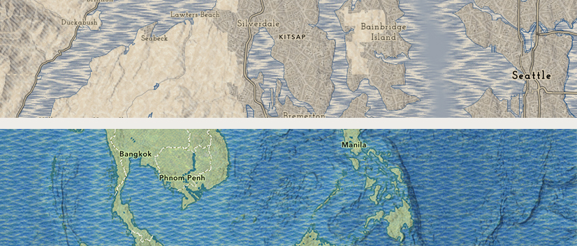
I worked with vector tiles and the ArcGIS Vector Tile Style Editor (VTSE) as this is my main area of interest. I had no goals in mind – I decided to let some maps (let’s call them ’basemaps’) develop organically as I tried things out.
For tile construction I used Microsoft Copilot, with Adobe Photoshop and Illustrator for other adjustments.
Pattern Tiles
The size of the tile is important. They may not render correctly if they are not square, and it is safest to build at a resolution that is a multiple of 2 (4, 8, 16, 32, 64, 128, 256, 512). Smaller tiles may be more efficient, but the likelihood of the pattern repeating itself is greater. Keep the tile size down if you can though, and don’t go above 512px. For most of my work here I used 256px.
Map 1: 19th Century-inspired
The Prompt is everything!
John helped me to craft my initial attempts at creating an AI prompt. The key requirement is to make sure the tiles work seamlessly. A sentence like ‘Make it square, and it must tile, so that the edges repeat smoothly’ added to the prompt helps this. For my first attempts I decided to go for a classic ‘look’, so I set it up as a ‘19th century cartographer’.
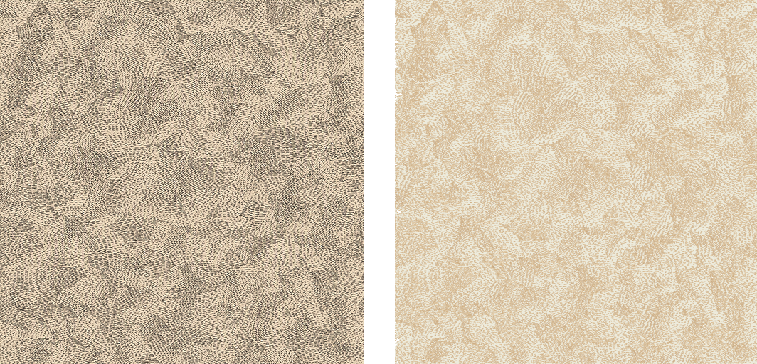
Early attempts were mixed, and, despite the prompt, the results did not always tile effectively. My first successful result was this:
‘You are a 19th century cartographer. Create a textured surface using short pen strokes. Make it square, and it must tile, so that the edges repeat smoothly’.
It was interesting, but I wasn’t sure how to use it, particularly as I wanted to include a hillshade layer in my final map. I ended up reversing it and adjusting the opacity so that it provides a subtle texture to the land. It’s something like the ‘paper’ texture that John has used on occasion.
Occasionally the results are surprising. The result of this prompt was not what I was expecting, but it is an interesting and usable effect:
‘You are a 19th century cartographer. Create a pattern surface using short blue horizontal pen strokes. Make it square, and it must tile, so that the edges repeat smoothly’.
That seems to be one of the strengths of the AI approach! Keep an open mind and don’t be surprised if the result takes you in a different direction.
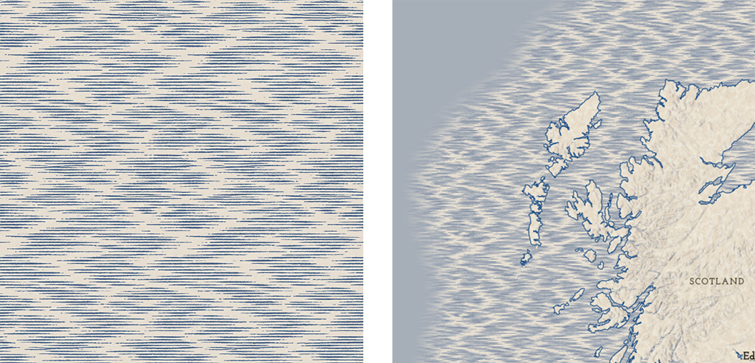
I added this to the water with a slight tonal adjustment. Then I added a blurred layer above derived from Esri basemap bathymetry to limit the pattern to coastal regions.
Know the limitations
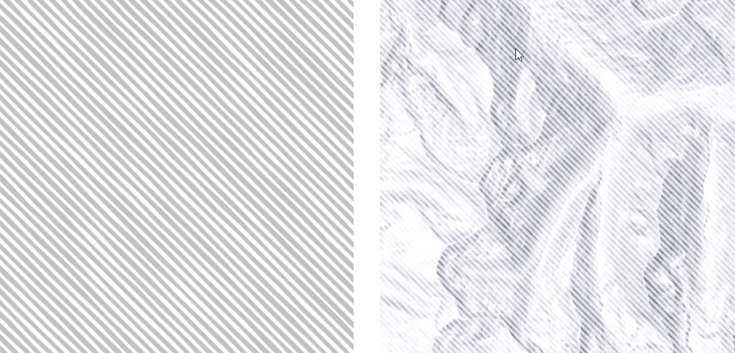
Some effects seem to be problematic for AI, at least at the time of writing. I wanted to create a rough diagonal hatch to overlay hillshade, but however much I tried to refine the prompt I could not get a result that would tile effectively. I’m guessing that the angle, with the combination of an uneven line and an even pattern, was too confusing.
In the end I constructed a tile manually, and there will be times when this makes more sense. I built the hatch in illustrator, used filters to roughen it, then reversed it for the final tile. The hatch was placed over hillshade to give it a rough screened effect.
For urban areas I wanted an ‘urban’ texture. Early AI attempts tended to be very pictorial, but I refined the prompt until I got this result.
‘You are a 19th century cartographer. Create a monochrome view from vertically above of a European urban area with no large buildings. Make it square, and it must tile, so that the edges repeat smoothly’.
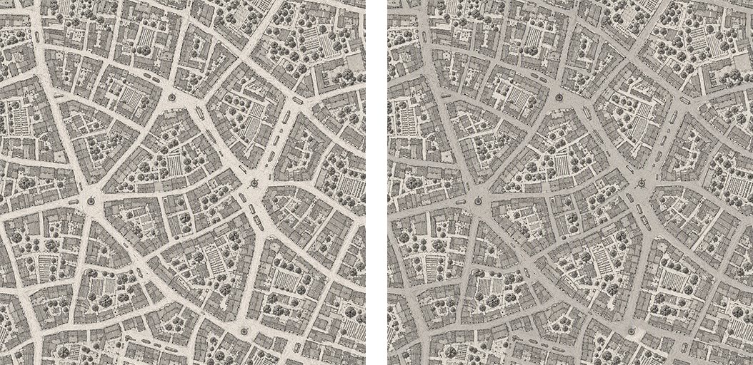
It tiles very well, but the street pattern was likely to interfere with the actual street pattern at larger scales, so I adjusted it to make it less distinct. With some added opacity I was able to use it as a subtle ‘urban’ pattern within the polygon.
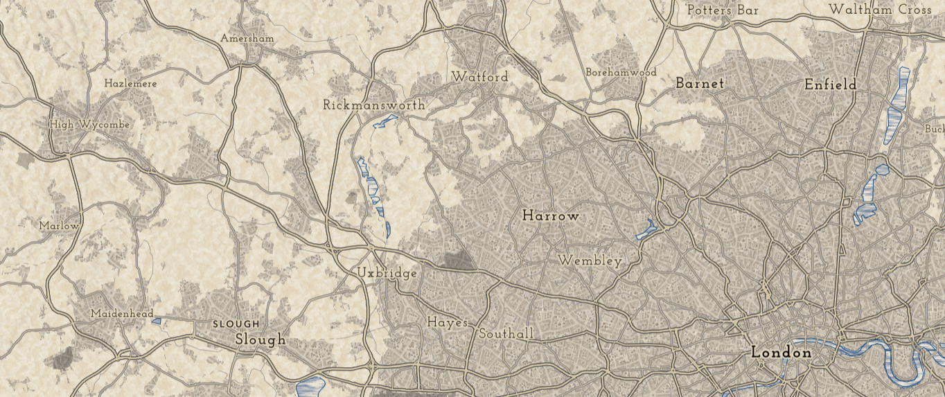
Here is the final map:
https://arcg.is/G1OCO0
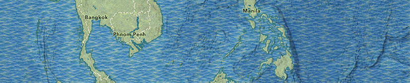
Map 2: Artistic rendering
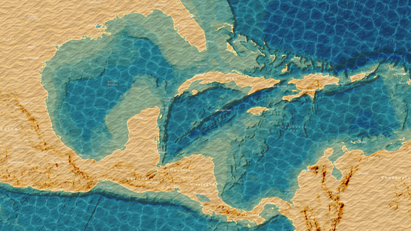
For my second prototype I decided to start with the raster base from Esri’s National Geographic Style Basemap, then use pattern tiles to give it more of an artistic rendering. I wanted it to be subtle, so I went for a Georges Seurat-inspired pointillistic effect.
My first tile was a simple prompt:
‘Create a green even texture in the style of Georges Seurat’.
I adjusted this for color and strength to create a land pattern, then evened it out some more to minimize repetition. I made a color adjustment to a copy to create the tile for ‘ice’.
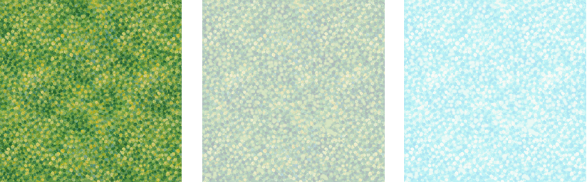
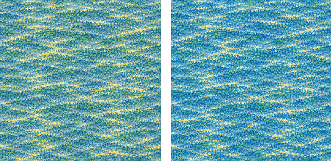
For water I used this prompt:
‘Create an even water texture in the style of Georges Seurat. Make it square, and it must tile, so that the edges repeat smoothly’.
I made a slight color adjustment to the final tile, but otherwise it was ready to use.
The final map is a combination of layers with the National Geographic Style base at small scales, and World Hillshade at large scales. Blends, effects and transparency* settings were used to merge them together.
Here is the final map:
Summing up:
Patterns on a map are always a risk. They add additional, sometimes confusing, ‘noise’, but they can be the thing that really wakes your map up! Be cautious with basemaps, where a rich pattern may be adding too much competition to your subject matter (My two samples are poor in this respect, which is why I hesitated to call them ‘basemaps’).
But with the help of AI, experimenting with pattern tiles is a whole lot easier than it was before, so you can afford to play around. Don’t expect the prompt to give you a finished result! You may be lucky, but the likelihood is that it will need some further adjustment, and it may be that you will need to switch gears and use ‘old style’ construction.
Regardless, as part of your mapping process, tiles can be used to add some real character to what you are building.
* For clarification:
ArcGIS Pro and Map Viewer use ’transparency’. The higher the value, the more ‘transparent’ the item is. The VTSE, in keeping with many graphics programs, uses ‘Opacity’. The lower the value, the higher the ‘transparency’.

Article Discussion: