Perhaps as important as fire to the USA Wildfires map is the smoke forecast layer. Fire is a punctuated risk, but the resulting smoke is a far-flung and pervasive risk. The National Weather Service smoke forecast layer is a helpful resource for understanding the current, and projected, concentrations of airborne particulates. Recent improvements to this live feed’s interface have made it more intuitive.
- A simple stepped-time interface
- Now-centric starting point
- Smoky looking smoke
UI
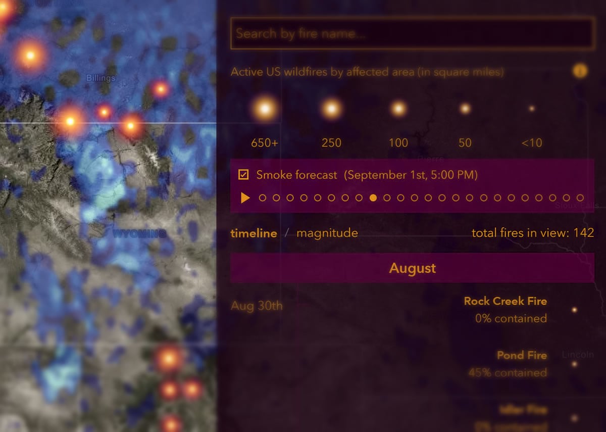
Previously, the smoke forecast layer consisted of a checkbox and a time label that updated as the feed cycled through the iterations of the smoke forecast. Now there is a play/pause toggle and a series of time tics so you have a visual sense for where the animation is in time, and can jump directly to any instance.
Time
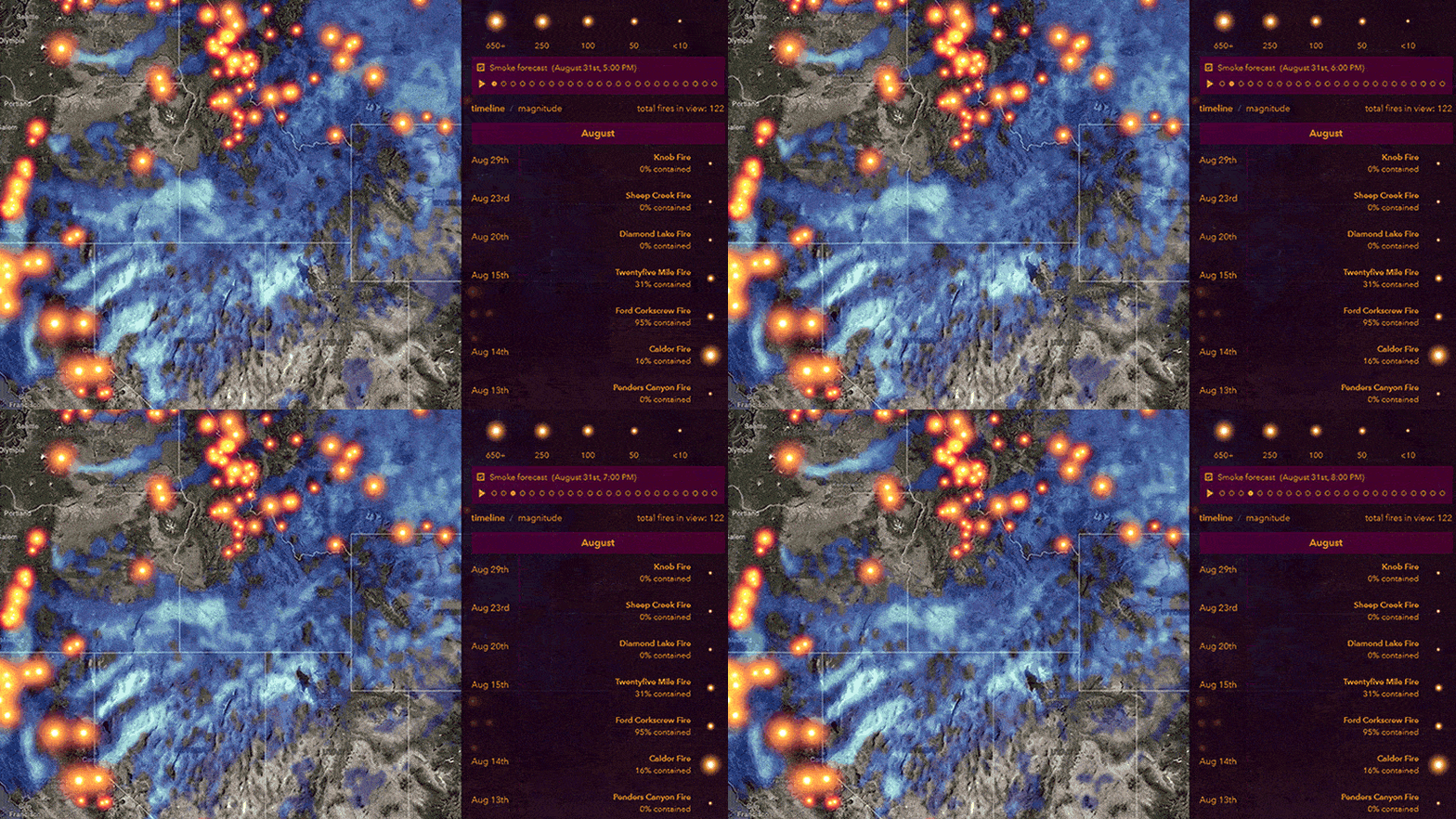
The source forecast feed consists of 48 one-hour predictions. These predictions are updated every 24 hours. Previously, all 48 hourly smoke images played in the animation, but this meant that, depending on the time of day you were visiting the map, many of the first frames (up to a full day) of the animation had already occurred in the past. The USA Wildfires map now starts out more intuitively at the current time, and animates 24 hours into the future.
Visualization
A version of this USA Wildfires map in years past had a color scheme and blur effect that naturally represented smoke. This was sneakily applied to the map service with CSS filters in the app. When the smoke forecast map service was upgraded to a hosted feature service, technical limitations prevented layer-specific CSS styling and the smoky visual effects were lost. This was an opportunity to leverage relatively recent updates to the ArcGIS API for Javascript to apply these layer effects directly within the map.
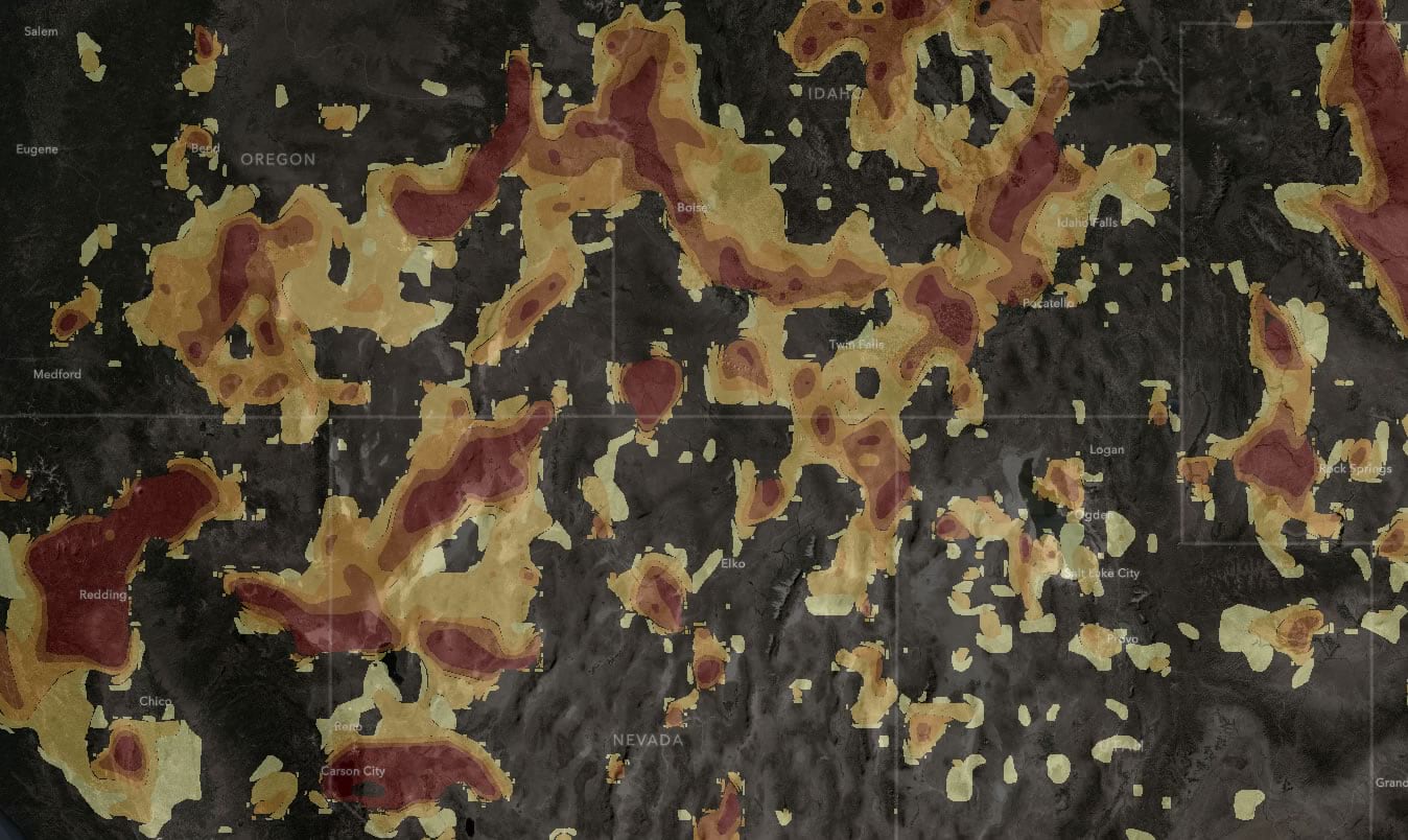
Here is the default styling of the smoke forecast feature service.
Conveniently, a simple inversion of this color scheme results in a gray-to-blue appearance where denser smoke appears lighter. This works well over the dark Firefly basemap of the USA Wildfires map, and is a good example of “natural mapping.” In industrial and graphic design, “natural mapping” refers to an interface control mirroring its real world manifestation. Think of the car seat-shaped buttons that control a car’s seat position. Natural mapping. Smoky smoke.
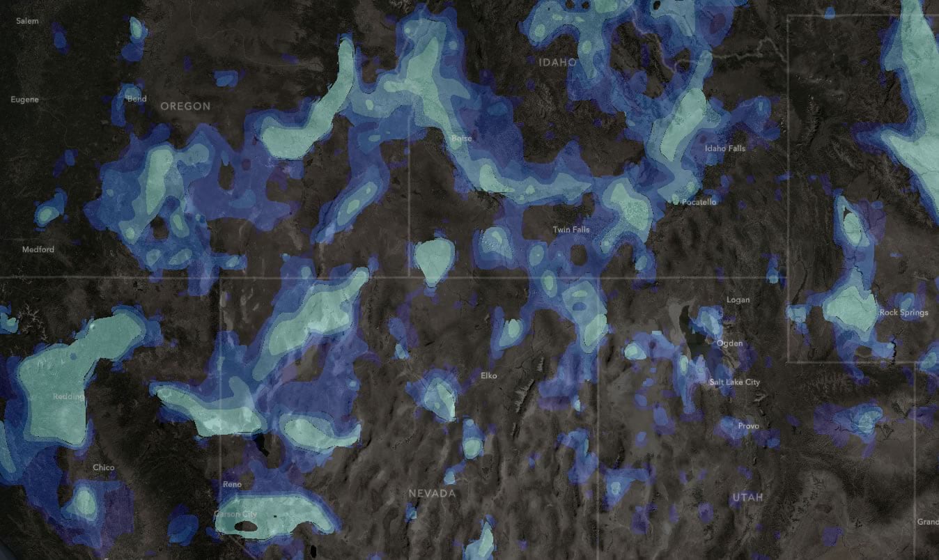
To further visually evoke smoke, and take into consideration questions of spatial uncertainty, these crisp polygons were given a blur effect.
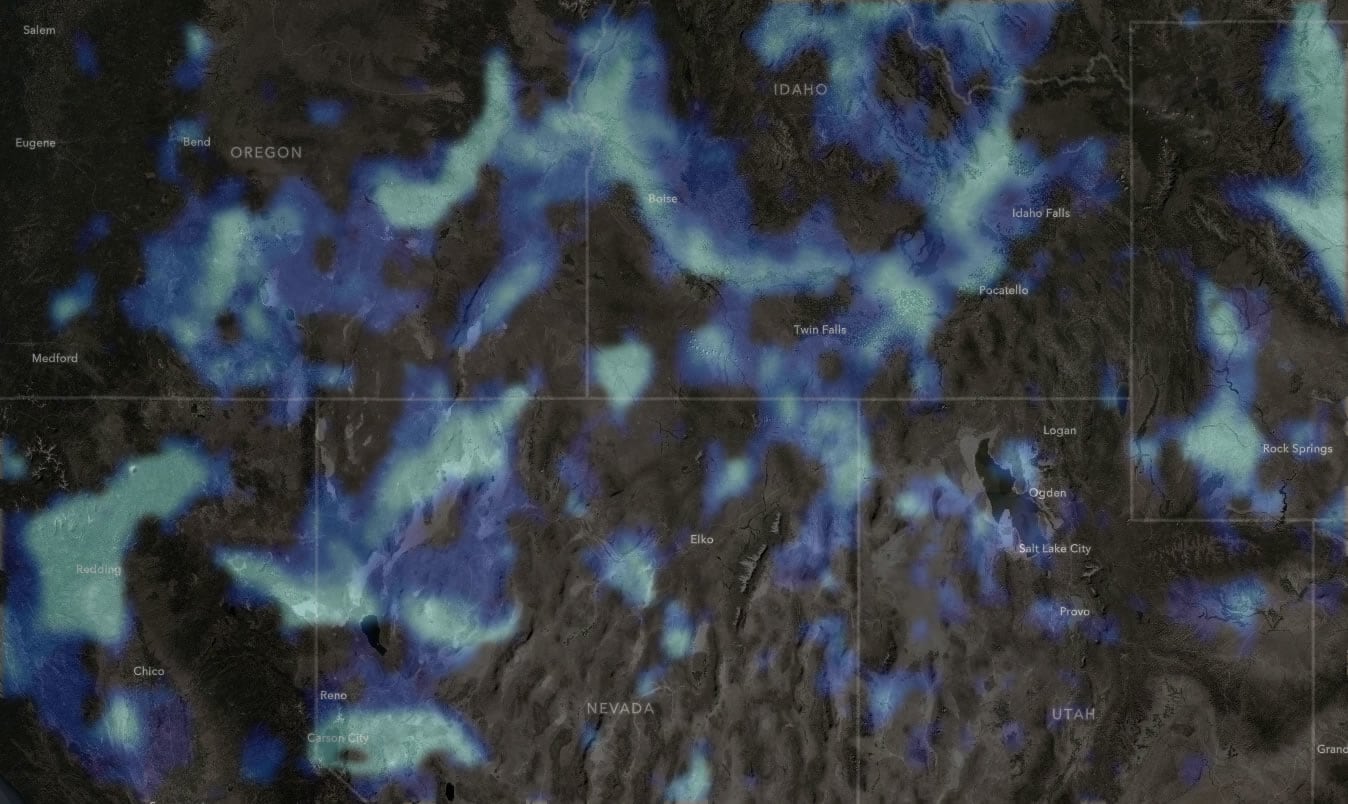
Find some glorious examples of layer effects from the intrepid API team, here.
…
Thanks for checking out the USA Wildfires map. We very much hope that it is a helpful resource to you. It was made as a resource for ourselves and our families who were, and continue to be, affected by wildfires and smoke, and we take every effort to make it practical and convenient. If you think of ways that we can make this map better and more helpful, please reach out to us and share your ideas.
Love, John and Jinnan

Article Discussion: