Water scarcity is one of the defining challenges of the coming decades. A growing population will put additional pressure on available water resources. Already, 10% of the world’s population experiences high water stress. Moreover, water use has grown at twice the rate of population growth, worsening the crisis but revealing that we can achieve significant positive impacts if we take decisive actions. By 2050, ensuring food security, reducing water stress, and avoiding water scarcity will be critical priorities.
Integrated Water Resources Management (IWRM) is a process for coordinating water development, management, and use across human activities and ecosystems. The IWRM process requires informed decisions supported by comprehensive data, data that integrates and transforms the outputs of complex hydrologic models into indicators of the water resources conditions. These indicators estimate and define factors such as water stress, depletion, and associated risks including flood, drought, coastal, and regulatory risks. Tools that translate complex hydrological data into decision-relevant indicators, such as the Aqueduct tools are essential.

The Aqueduct 4.0 Global Water Risk dataset from the World Resources Institute (WRI) is now available in ArcGIS Living Atlas of the World. Aqueduct 4.0 translates complex hydrological model outputs from PCR-GLOBWB 2 into intuitive water risk indicators at HydroSHEDS v1 level 6, with aggregations at provincial, state, and national levels. This comprehensive framework assesses both current conditions and future projections of water resources to inform decision-making.

Baseline Conditions and Future Projections
Aqueduct 4.0 provides water risk assessments for a baseline period (1979-2019) and three future projection periods:
- 2015-2045
- 2035-2065
- 2065-2095
And under three climate and development scenarios:
- Optimistic Scenario (SSP1-RCP2.6)
- Business-as-usual Scenario (SSP3-RCP7.0)
- Pessimistic Scenario (SSP5-RCP8.5)
The projections leverage CMIP6 climate forcings and the PCR-GLOBWB 2 hydrological model. In addition, Aqueduct includes sector-specific weighting schemes to evaluate water-related risks across different industries.

Understanding Water Risk
Aqueduct provides a comprehensive framework that evaluates 13 distinct water risk indicators across three main categories:
- Physical Risks – Quantity: These indicators assess water availability and variability, including: Water Stress, Water Depletion, Interannual Variability, or Groundwater Table Decline, Riverine Flood Risk, Coastal Flood Risk or Drought Risk
- Physical Risks – Quality: Water quality indicators that affect usability: Untreated Connected Wastewater, or Coastal Eutrophication Potential
- Regulatory and Reputational Risks: Governance and access indicators: Unimproved/No Drinking Water, Unimproved/No Sanitation: percentage of population without access to improved sanitation
Aqueduct in Living Atlas
The Aqueduct item in Living Atlas includes three layers: Future Annual, which provides water risk indicators for three future time periods under multiple climate scenarios; Baseline Annual, which offers indicators for the historical baseline period (1979–2019) to establish benchmarks for comparison; and Baseline Monthly, which delivers monthly water stress and depletion data, particularly useful for regions with distinct wet and dry seasons.
Cartography
These layers are designed to work with a diverse set of Esri Basemaps. The colors have high saturation values in anticipation for users to have more functionality with their own map styles. They are also designed to be used with Layer Effects, Blend Modes, and Transparency to further enhance their visualization.
Here are three examples: (1) Baseline Annual on the National Geographic Basemap with Multiply Layer Effect; (2) Future Annual with Multiply and Drop Shadow on the Charted Territory Basemap; and (3) Baseline Monthly with Multiply on the Environment Basemap with the labels using the Invert Layer Effect.

Symbology and Pop-ups
Each layer has customizable symbology and pop-ups tailored to its specific focus:
– Future (Annual)
The symbology displays a bivariate map of gross water demand and water availability for the business-as-usual scenario (2065-2095). This visualization highlights contrasts between high-demand, low-availability areas (orange), high-demand, high-availability areas (purple), low-demand, high-availability areas (light blue), and low-demand, low-availability areas (grey).
The pop-up shows projected demand and availability, along with water stress projections for all three time periods and scenarios.

– Baseline (annual)
The baseline annual layer uses baseline water stress for symbology, highlighting watersheds with extremely high or high overall water risk.
The pop-up summarizes water risks by category: (1) Physical Risks Quantity, (2) Physical Risks Quality, and (3) Regulatory and Reputational Risks. It also displays interannual variability by month to show whether conditions vary drastically throughout the year or remain relatively stable.

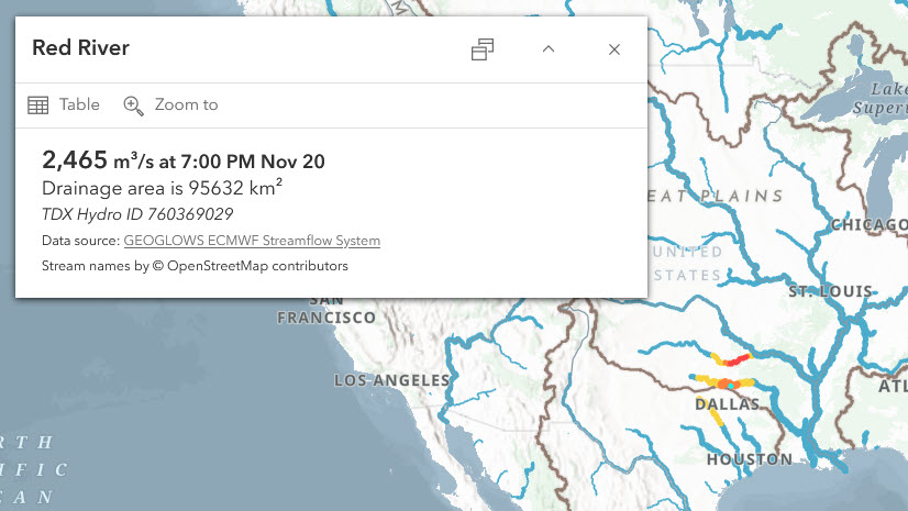
Note that watershed names are not included in the Aqueduct dataset but are retrieved dynamically using an ArcGIS Arcade expression from the Global Water Provinces layer from Utrecht University. This blog post explains how on-the-fly expressions can be used, with an example using OpenStreetMap data and GEOGLOWS.
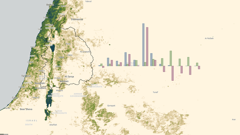
– Baseline (monthly)
The pop-up displays seasonal and interannual variability, along with monthly water stress and depletion charts.
Rather than showing results for a specific month, the layer displays major basins identified by the first three digits of the Pfafstetter code.

Filtering and Customization
Like other Living Atlas layers, Aqueduct layers can be added to custom maps, used in ArcGIS Online or ArcGIS Pro analysis, and filtered to focus on specific risk categories or indicators. For example, custom layer views can display:
- Basins with extremely high baseline water stress (score > 4.0)
- Areas with declining groundwater tables
- Areas facing both physical and regulatory water risks
Summary
Aqueduct 4.0 is now available in Living Atlas, bringing one of the world’s most comprehensive water risk datasets to the ArcGIS Online platform. As part of the Living Atlas collection, Aqueduct joins authoritative datasets on environment, climate, and demographics to support better decisions and strengthen integrated water resources management processes. Aqueduct drives actionable strategies to reduce water scarcity in the years ahead.

More Information
For detailed methodology and data downloads, see the technical note and GitHub repository.
Interested in water resources and GIS? Visit the Esri Water Resources industry page or join the Esri Community and ask questions to our experts.


Article Discussion: