You can now explore where people and their communities are at risk from wildfire with a new hosted layer in ArcGIS Living Atlas of the World. This new feature layer contains wildfire hazard potential (WHP) statistics for the conterminous United States based on the USDA Forest Service, Fire Modeling Institute’s wildfire hazard potential analysis. Wildfire hazard potential provides information on the relative potential for a wildfire that would be difficult for fire crews to contain.
Areas with higher wildfire potential values represent fuels with a higher likelihood of experiencing high-intensity fire with torching, crowning, and other forms of extreme fire behavior. - Fire Modeling Institute
The data has been aggregated into seven geography levels allowing us to view WHP in a way that many of us are familiar with:
- States
- Congressional District
- County
- ZIP Code
- Tract
- Block Group
- 50 KM Hex Bin
How are people and communities affected by wildfire?
Wildfire has many benefits for the health of the environment including cleaning the forest floor, killing disease, and helping some tree species germinate. However, as fires have grown larger and human populations have expanded, it’s important to provide a more accurate picture of how communities are at risk for wildfire.
"On its own, WHP is not an explicit map of wildfire threat or risk, but when paired with spatial data depicting highly valued resources and assets such as communities, structures, or powerlines, it can approximate relative wildfire risk to those resources and assets." - Fire Modeling Institute.
In order to pair wildfire hazard potential with additional spatial data, demographic attributes were added to the dataset so we can more clearly visualize where people live that also have high wildfire potential. We can answer questions like “Where are populations expected to grow that have a high fire risk?” or “Where are the areas of with moderate to high wildfire hazard potential and high home values?”.
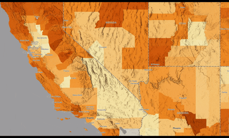
For example, what is the wildfire hazard potential in my town?
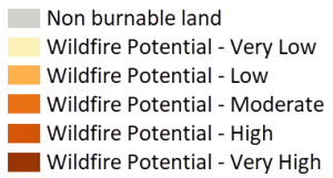
A score of 5 is very high risk and a score between 0-1 is likely non-burnable area such as water or asphalt. People that live in areas of moderate to high risk are more likely to be affected by wildfire events including evacuations, higher home insurance, and bad air quality due to smoke.
The map below opens to ZIP codes but as you zoom into the map, detail increases to show 50 KM hex bins, tracts, and block groups. Click on a feature in the map for additional information or pan and zoom to discover other patterns.
Where is population growth that has a potential future risk of wildfire?
Are people moving to or building in areas that have potential high risk? As populations and housing needs grow, development has pushed onto the boundaries of undeveloped wildlands. This expansion into the wildland urban interface creates structures that are at a higher risk of wildfire.
The below map highlights areas that will have population growth over the next 5 years (size) with average wildfire hazard potential (color). The largest and brightest circles on this map show where the future risks are likely to occur. Click on a feature in the map for additional information or pan and zoom to discover other patterns.
What areas have high home values and high fire risk?
Home value impacts how much a homeowner will pay in home insurance, which covers fire protection. Areas with more risk may have a harder time insuring their home as extreme wildfires has become increasingly common.
The following map shows the relationship (also known as bivariate mapping) between median home value and average wildfire hazard potential. Areas with both high WHP scores and high median home incomes appear in darker reds and purples.
This is only the start of the multitude of questions that can be answered by this layer. Additionally, USA Wildfire Hazard Potential with Demographics is available through Living Atlas or ArcGIS Online, ready to enhance your maps and apps. The layer is fully customizable including symbology and popups, and can take advantage of the latest capabilities such as blending in Map Viewer Beta and Arcade. Check out the gallery below to see additional questions that these ready to use maps answer.
These web maps can also be found in ArcGIS Living Atlas, this group, or the gallery application. For a more detailed look into wildfire, read this story map about Wildfire in the Western United States.
How was this layer made?
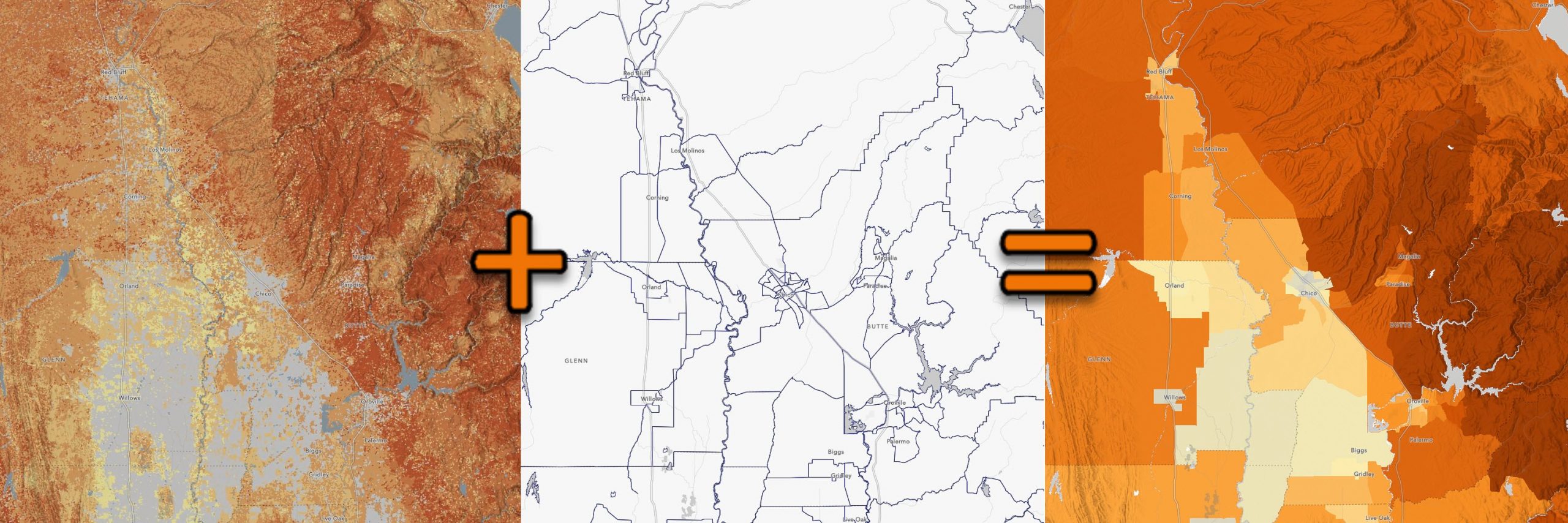
The USDA Forest Service Fire Modeling Institute creates a Wildfire Hazard Potential (WHP) raster using spatial datasets of wildfire likelihood and intensity generated for the conterminous United States with the Large Fire Simulator (FSim), spatial fuels and vegetation data from LANDFIRE 2012, and point locations of past fire occurrence (ca. 1992 – 2013). Using these inputs, they produce an index of WHP for the conterminous US at a 270-meter resolution. The map is presented with 5 classes of WHP: very low (1), low (2), moderate (3), high (4), and very high (5). Values of zero and 1 are non-burnable lands or water. There is a corresponding imagery layer in Living Atlas.
This raster was brought into ArcGIS Pro and using Zonal Statistics as Table, raster statistics were calculated using US standard geographies as the feature zone input for the analysis. Geographies included are: State, County, Congressional District, ZIP Code, Tract, and Block Group. The resulting statistical tables were subsequently joined to these geographies. 50 km hex bins were created using Generate Tessellation and then joined to zonal statistics as described above.
Next, the layers were enriched with 2020 Esri demographic attributes in order to better visualize wildfire hazard risk as it relates to the human population. Attributes include population, households & housing units, growth rate, and calculated variables such as population change over time. Additionally, state, congressional district, and county have a population weighted average WHP score created from the hex value population values which help us better understand the human impact for larger geographic areas. For full detailed steps, please visit the layer’s item detail page.
Additional wildfire resources
For additional resources regarding wildfire, visit ArcGIS Living Atlas, Esri’s Disaster Response Program or check out one of these blogs:
- Improve Your Wildfire Maps with These New Layers
- New Wildfire and Weather Map for Public Information
- Map in a minute: Fire

Article Discussion: