ArcGIS Data Pipelines is a no-code data engineering application in ArcGIS Online that simplifies creating and automating data preparation workflows.
At this year’s Developer & Technology Summit, ArcGIS Data Pipelines Product Manager Sarah Hanson offers a great example of how ArcGIS Data Pipelines can be used to efficiently optimize the quality and readiness of data for visualization and analysis.
As a data engineer working at an agricultural research firm that studies crop yield trends, Sarah is tasked with preparing wheat production data that the organization can use to drive their mission-critical work. More specifically, she needs to transform wheat crop production data downloaded from the USDA’s National Agricultural Statistics Service (NASS) website into a usable feature layer that has crop yield information stored as columns by county.
See it in Action
Dive into the Steps
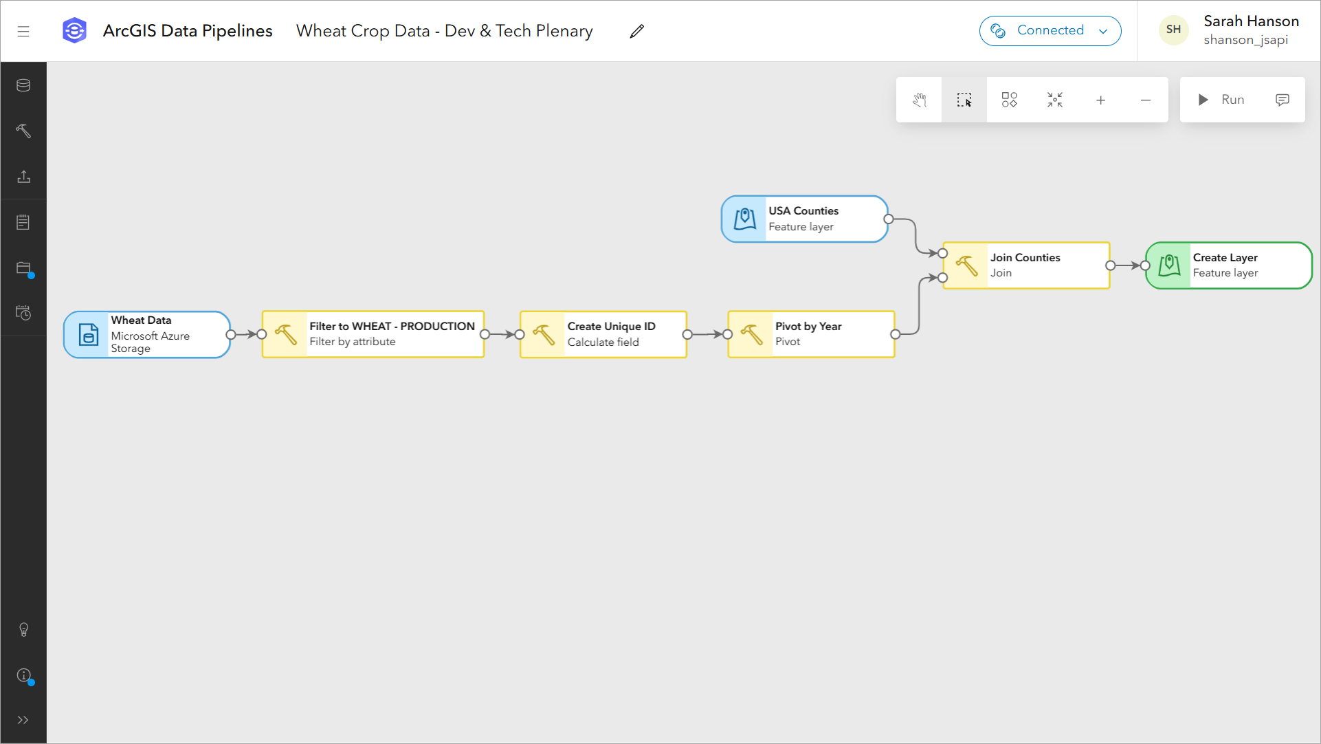
Sarah shows a data pipeline that’s configured to do the following:
- Connect to a wheat production dataset (.csv) stored in an Azure Storage container.
- Filter by attribute, to isolate just a single variable, total wheat production.
- Calculate field, to create a unique ID for each county, by concatenating the state and county codes.
- Pivot, to convert the long table into a wide one, where the resulting table has one record for each county and the production values for each year are organized into separate columns.
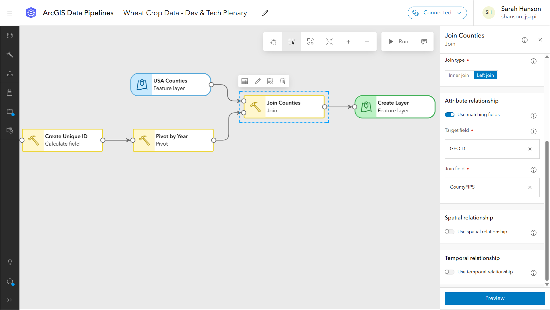
- Join, to geospatially enable the data, using a USA Counties feature layer sourced from the ArcGIS Living Atlas.
- Create a feature layer that the organization can leverage for visualization and analysis.
The Data
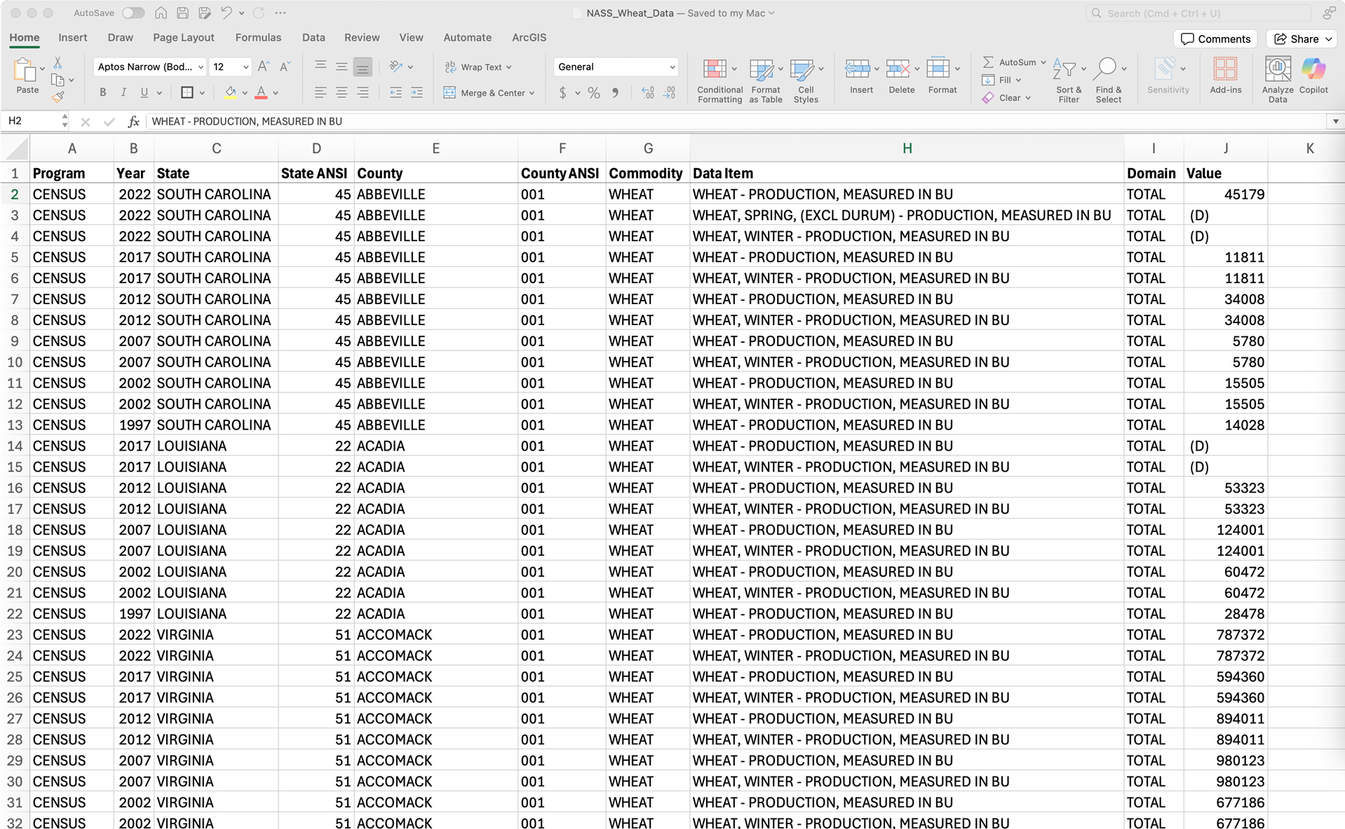
The wheat crop production data was downloaded from the USDA’s National Agricultural Statistics Service (NASS) website. It includes county-level wheat production data from 1997 through 2022, storing multiple variables, including total wheat production. This results in a very long table with multiple records per county.
The Need
“The best way to visualize related information in a map is to transform it into a single table, with the geometries, in this example, counties,” Sarah explains. The goal is to transform this CSV so that each county will become a unique record, with the wheat production values for each year stored in separate columns. Additionally, the data will need to be joined to a counties feature layer, so we can visualize it on a map.
Thanks to Data Pipelines, and its ability to make complex data preparation tasks easy, she shares that this task only took her a few minutes to complete.
The Workflow
Sarah’s workflow starts with connecting to the CSV dataset which is stored within an Azure Storage container. “Data Pipelines allows you to bring in data from many sources including public URLs, cloud storage like I am using, databases, and more,” she explains.
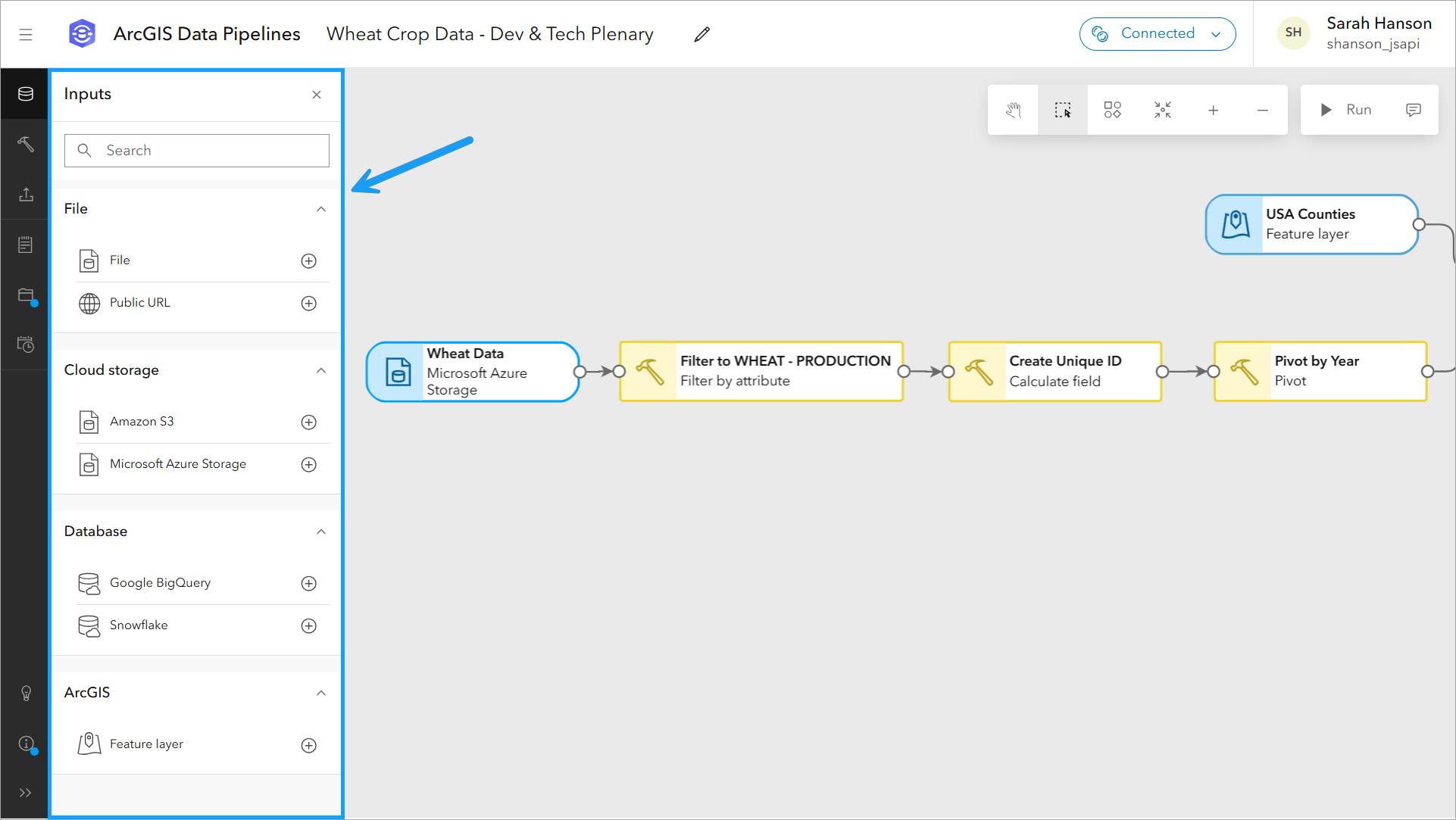
She then points out the data engineering tools that Data Pipelines includes, that can be used to clean, construct, format, and integrate datasets before showing the tools used in her workflow.

Let’s take a deeper dive into each of the tools that Sarah uses in her data pipeline.
To prepare her data, Sarah uses the following tools:
- Filter by attribute – Limits records to those that meet certain criteria, in this case wheat production totals.
- Calculate Field – Creates a unique id for each county by concatenating state and county codes.
- Pivot – Converts the current long table with multiple values per county into a wide table with a single record per county.
- Join – Spatially enables the pivot results by joining it to county boundaries.
When reviewing the tools used in her data pipeline workflow, she focuses on the Pivot tool, one of the newest data engineering tools added to Data Pipelines. “This tool is used to convert a long table into a wide one,” she explains. In the tool configuration pane, she specifies the field containing unique county IDs (CountyFIPS) to define the records, the field Year to define the columns, and the total wheat production values (Value) to define the cells.
Note: Because each county only has one value for the total wheat production data, the aggregate function Any works fine. Had there been multiple values for each county and year in the table passed into the tool, specifying a function like Mean would have been warranted.
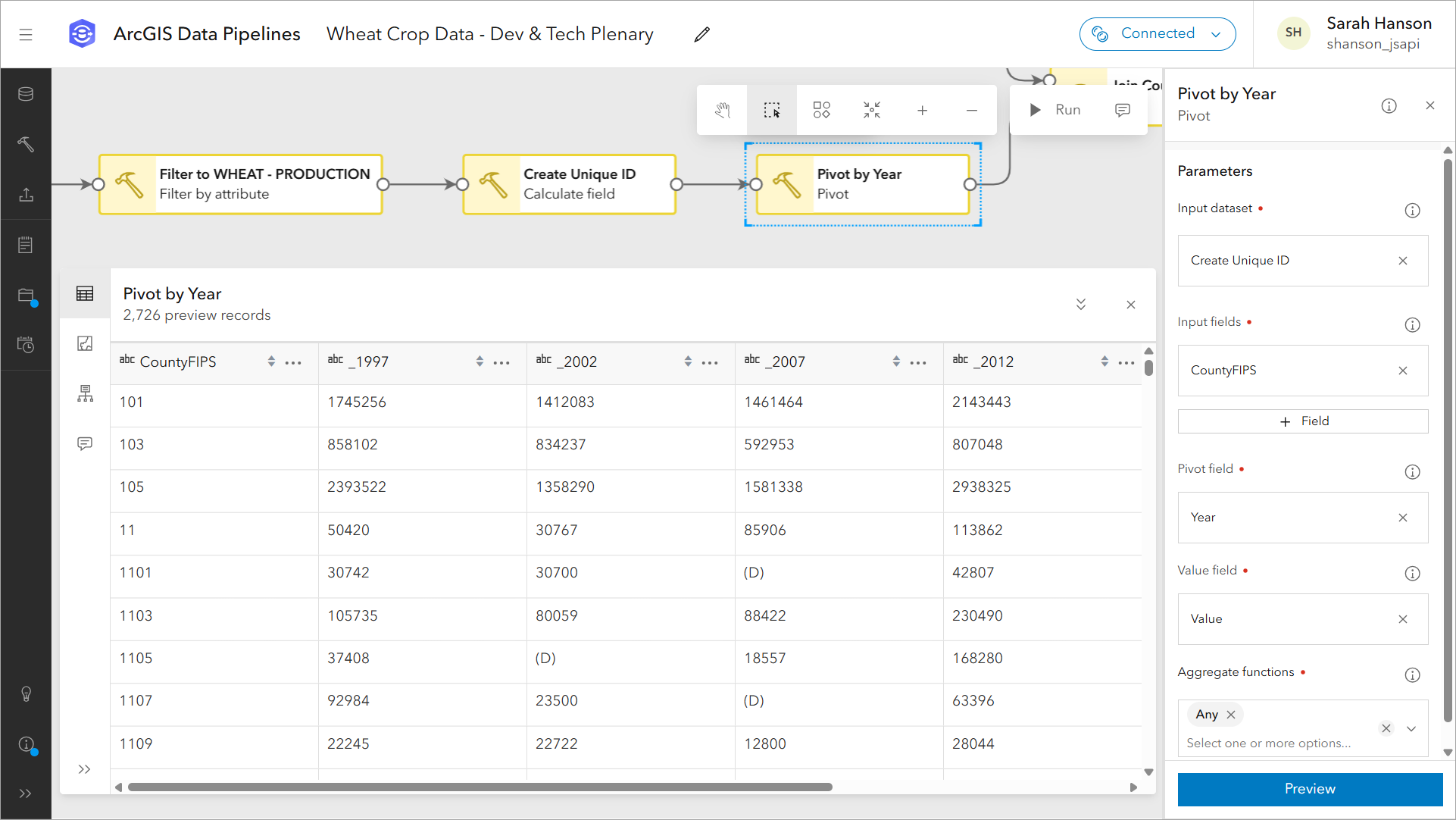
In the preview of the Pivot tool, we can verify the results are what we are expecting. At this point in Sarah’s workflow, the data has all of the attribute information that she needs. However, while the data does contain spatial information such as county ID, it does not yet contain a geometry field that can be used for mapping and visualization. Luckily, this can be solved with another tool in Data Pipelines; the Join tool.
Sarah proceeds to join the results from the pivot tool with a counties feature layer from the ArcGIS Living Atlas. She joins the two datasets based on a matching attribute, county ID, and explains that we can also join based on spatial and temporal relationships as well.
In the final step of the workflow, Sarah explains that the results of the join tool are written out to a feature layer in ArcGIS Online by using the output Feature layer tool.
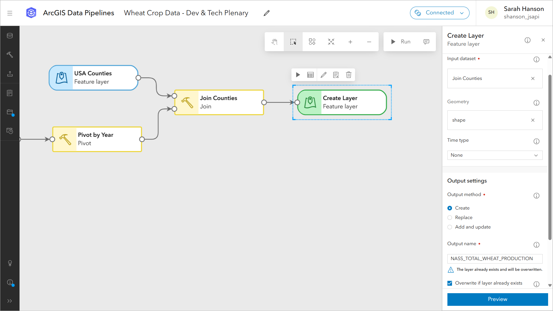
“For writing out data, there are options to support updating target feature layers, including replace, add and update, and the newest option, overwrite, which accommodates schema changes.” Then, she points out the run button in the top right-corner of the editor, which triggers the data pipeline to run and write the prepared data out to a feature layer.
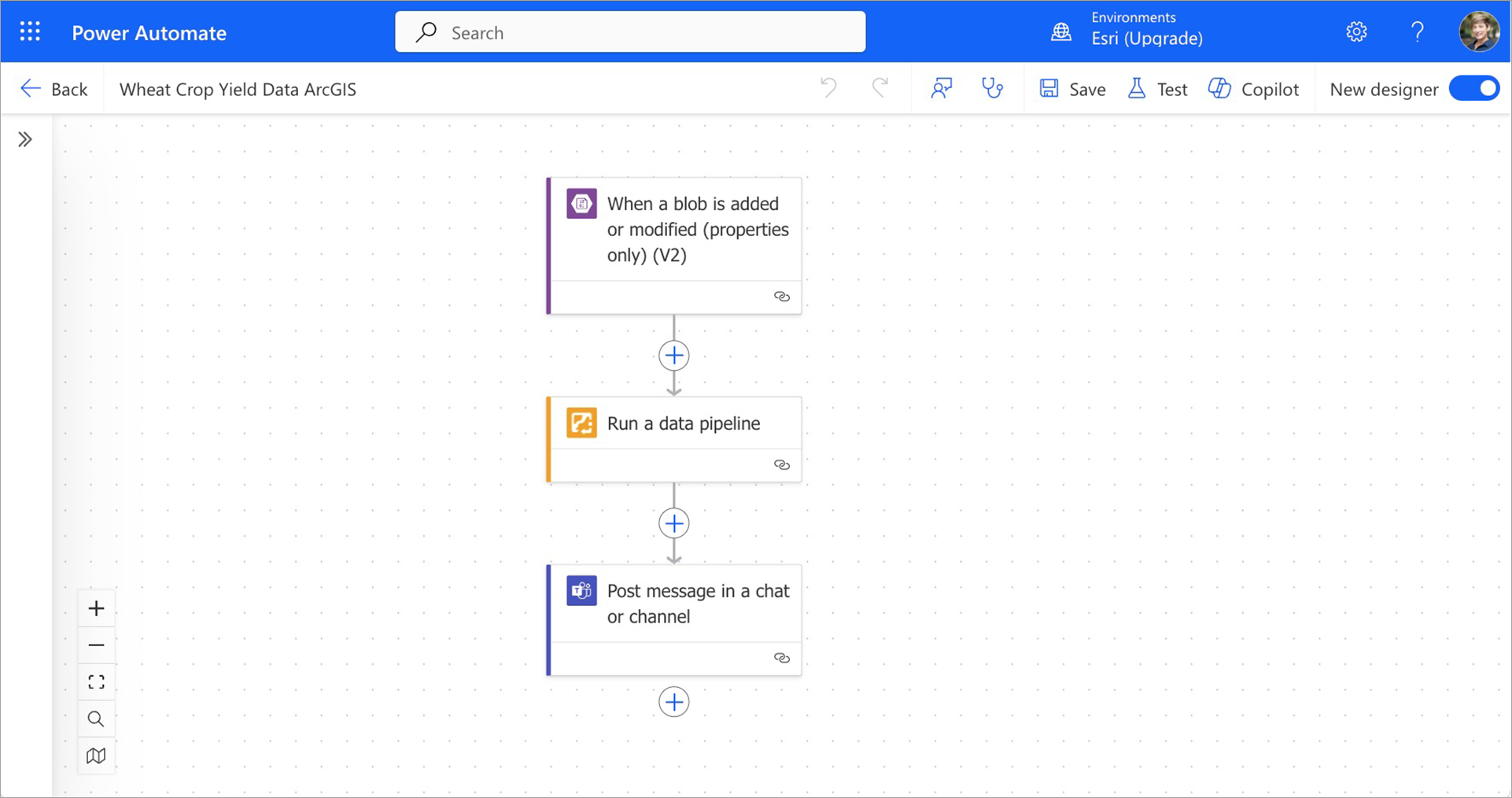
Before ending, Sarah points out the automation options that are available. Data pipelines can be run on a schedule using built-in task scheduling functionality, the ArcGIS API for Python (an experimental module at the time of this demonstration), or using Microsoft Power Automate and the new Run a Data Pipeline action.
In the final step of her demonstration, Sarah shows the item page for the resulting feature layer, switching over to the Data tab to highlight the fully transformed dataset.
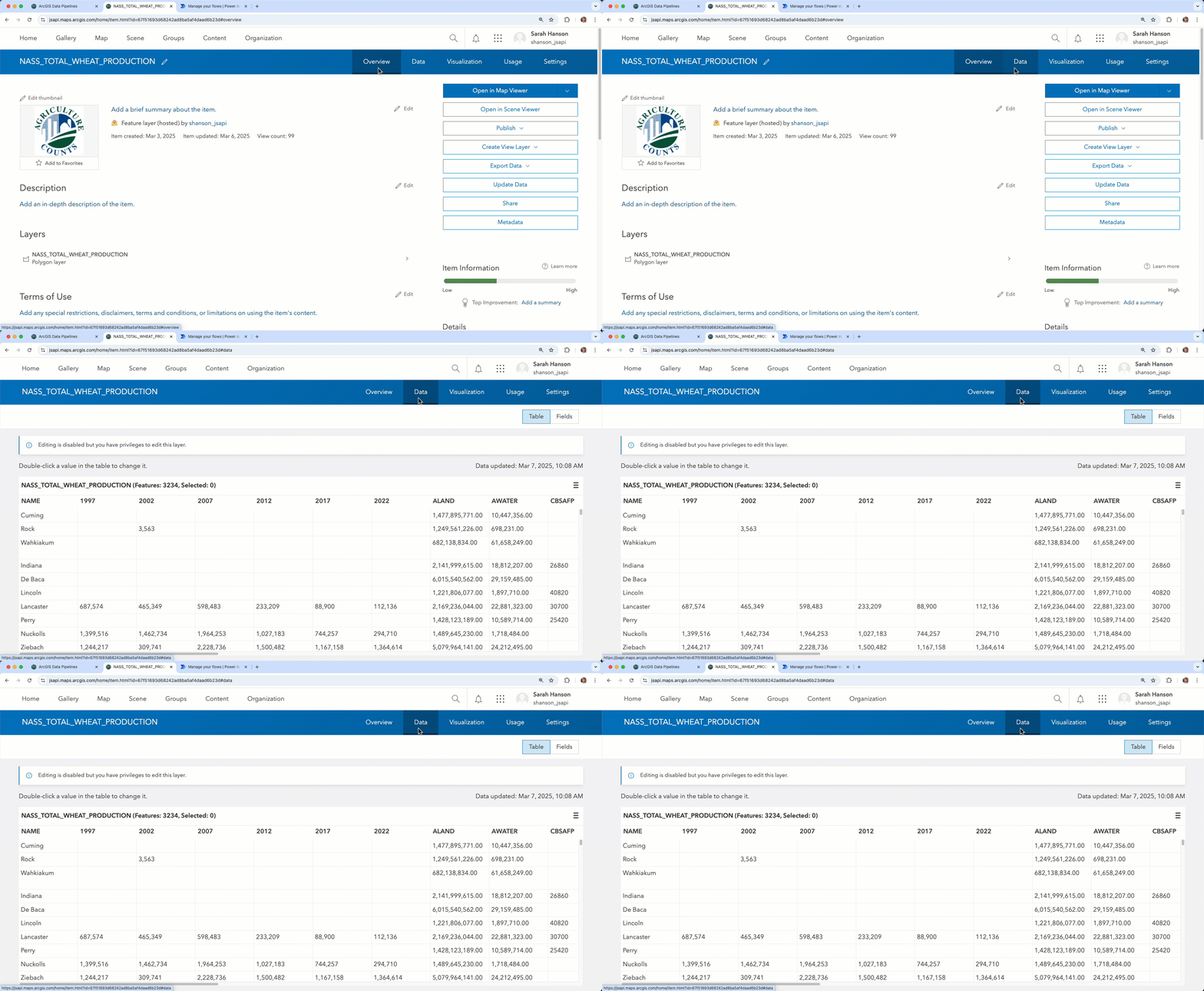
“This is the resulting feature layer that my organization can now use for visualization and analysis.” Sarah exclaims. “Thanks to Data Pipelines, optimizing the quality and readiness of data in ArcGIS has never been easier.”
Summary
In this blog we’ve provided a detailed overview of Sarah’s demo of ArcGIS Data Pipelines from our recent Developer & Technology Summit. We took a look at the data Sarah uses, the data pipeline workflow she creates to clean and build her data, and how data pipeline workflows can be automated to further streamline data integration for your organization.
Additional Resources
If you’re interested in learning more about Data Pipelines, you can visit the What’s New in ArcGIS Data Pipelines (February 2025) blog for the additional details on the enhancements and improvements for the February update of Data Pipelines. You can also explore the following resources:
- Try out ArcGIS Data Pipelines by following this tutorial
- Read other blogs about ArcGIS Data Pipelines
- Explore the Esri Community
We value your opinion on new enhancements and improvements, and we want to hear from you! Please share your ideas or ask us a question in the Data Pipelines Community.


Commenting is not enabled for this article.