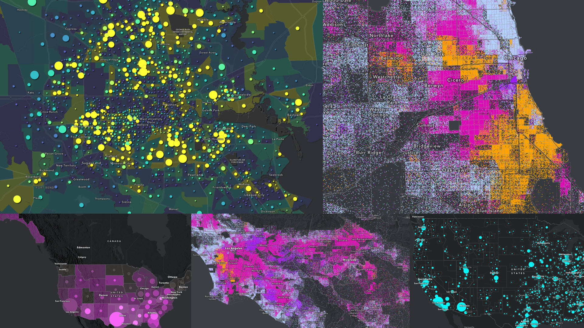
Pop-Quiz: When does it make sense to use a dark basemap? (There can be more than one right answer.)
A. When creating a map to be used in low-light environments (e.g. field worker collecting data at night)
B. When creating a map to be shown on a large monitor in an Operations Control Center
C. When creating a map about a heavy, somber topic
D. When creating a map for workshop materials that will be printed out in individual packets
Hopefully you chose A, B, and C. Creating a map with a dark basemap is usually for a screen rather than for print. Creating a map for which light is coming through a display monitor is different from creating a map that will be printed out on paper. Furthermore, creating a dark map in which light is coming through a display monitor is different yet again. This blog post will cover some symbology considerations for dark basemaps.
Color ramps designed for dark basemaps
Do not simply switch to a dark basemap after you have styled your map. The color ramps that work best for light basemaps are not the same as color ramps that work best for dark basemaps. When using a light basemap, the darker, brighter colors usually depict the higher values (especially when using traditional high-to-low ramps for percentages or rates). The darker colors stand out against the light basemap.
Conversely, when using a dark basemap, we want the brightest (or lightest) colors to be the highest values, and the darkest colors to be the lowest ones. This creates a contrast between the basemap and the data.
Take a look at this example: a web map showing the count and percent of mobile/manufactured homes.
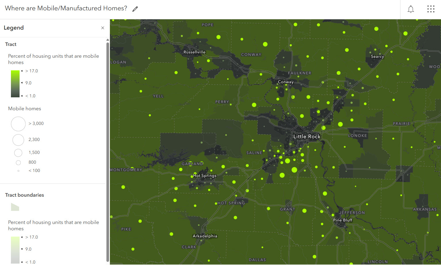
The darkest gray is actually the lowest percentage. They fade into the basemap in order to de-emphasize those census tracts. The tracts with the brightest green are the tracts with the highest percentages.
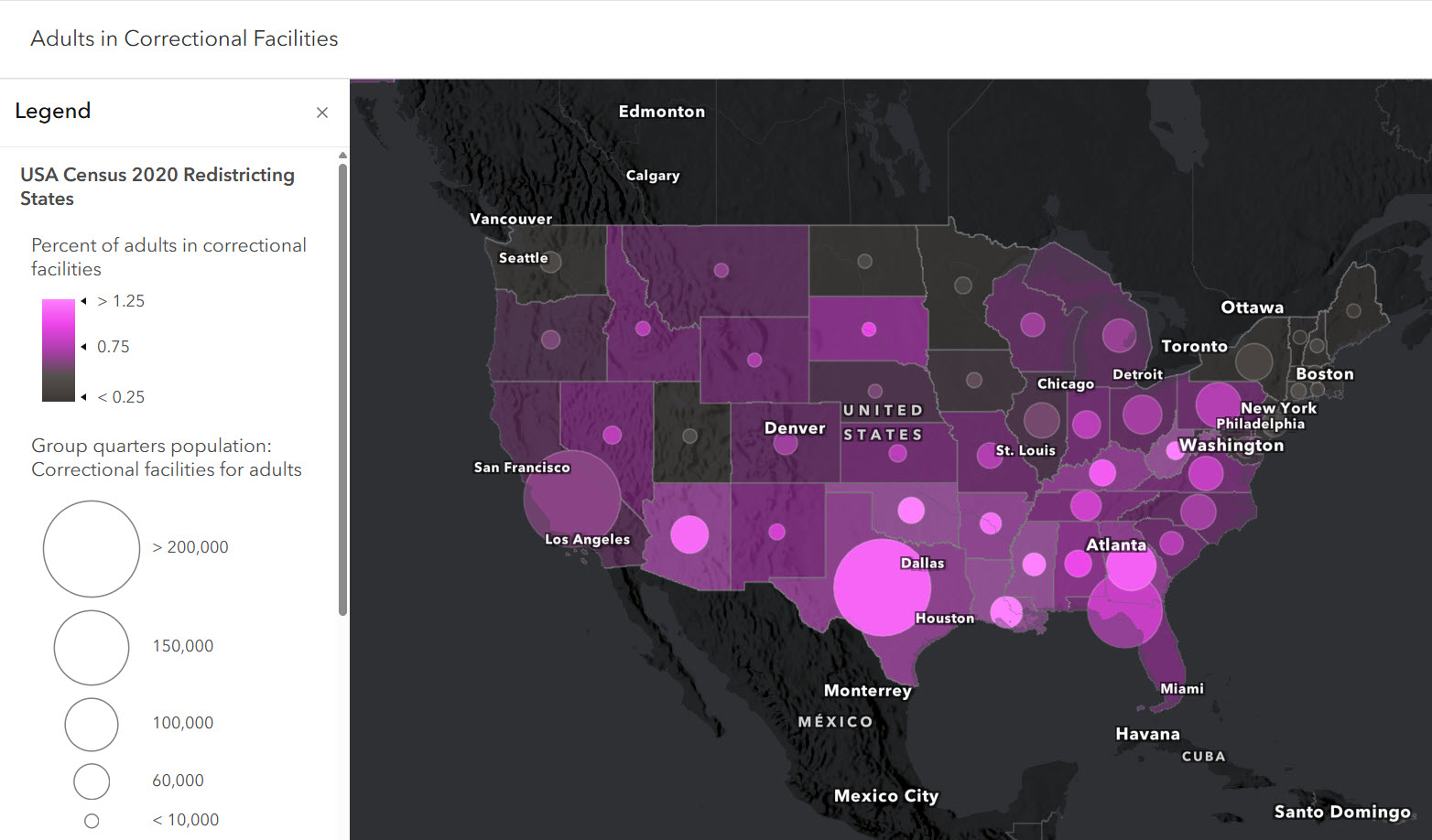
Similarly, another web map showing adults in correctional facilities uses a dark gray to pink basemap. A dark basemap here is appropriate given the heavy nature of the topic.
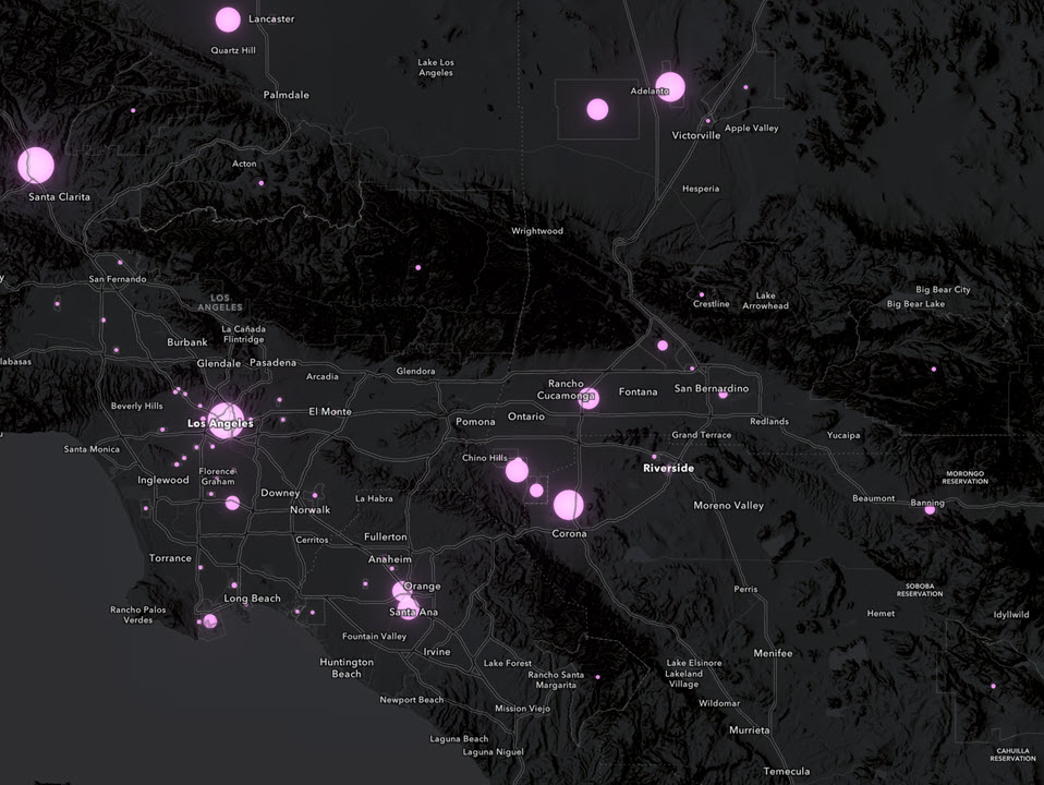
When zoomed in to tracts and block groups, percentages are not as relevant, so all this map shows is the count at those scales. The size of the symbol depicts the count of the population, and the bloom layer effect creates a bright glow against the dark basemap.
Take advantage of tagged color ramps
Both of these examples use color ramps that have been tagged “best for dark basemaps.” Use this color ramp tagging to help subset the color ramps to focus on the ones that are best for your map. These color ramps have been specifically designed to work with Esri’s dark basemaps in that they have a darker color for lower values and a bright color for higher values.
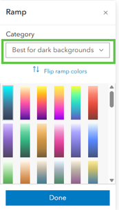
You are still encouraged to experiment with all color ramps for your specific map. You can easily reverse any color ramp you like by clicking “Flip ramp colors.”
Let Smart Mapping help you
If you’re on a dark basemap already, the Smart Mapping capabilities within Map Viewer knows. The first suggestions you will see are color ramps that are best for dark basemaps.
Color with the Above and Below theme
For example, if you have either the dark gray canvas or the dark human geography basemap in your map, and choose the Above and Below theme, you will see the diverging color ramps with dark gray in the center as the first suggestions.
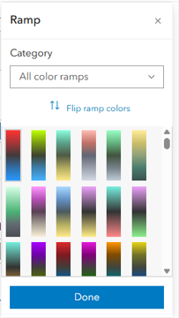
These Above and Below color ramps with dark gray in the center help to de-emphasize the features near a middle value, such as a nation-wide percentage or a goal. Use the handles on the breakpoints to adjust and see the map change in real time. Visualization is often the very first step in analysis.
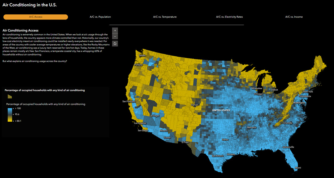
The resulting map might look something like this one, featured in this Air Conditioning web experience created by Ashley Du on the ArcGIS StoryMaps editorial team. The bright yellow counties tell one story, the bright blue ones tell the opposite story, and the dark gray counties tell yet a third story. The semi-transparent outlines allow the color patterns to really reveal themselves, which helps create this eye-catching map.
Relationship
Just as ArcGIS Online has Above and Below color ramps designed for dark basemaps, so too does it have Relationship color ramps designed or dark basemaps. Relationship maps compare two different values to show the high-high, low-low, as well as the off-diagonals, allowing four different groupings to be visible on one map. On a light basemap, these relationship color ramps have the “high – high” quadrant in the darkest color. For dark basemaps, the color grid is transposed and brightened. When used effectively, these ramps really help the “high – high” quadrant stand out from the rest. For example, this map below shows the counties with both high population and high air conditioning access in a vibrant, bright green.
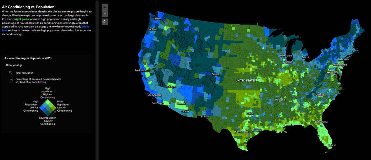
Again, the added transparency in the outlines make the bright areas brighter. The thick default outlines would interfere with the color patterns at work.
Dot Density
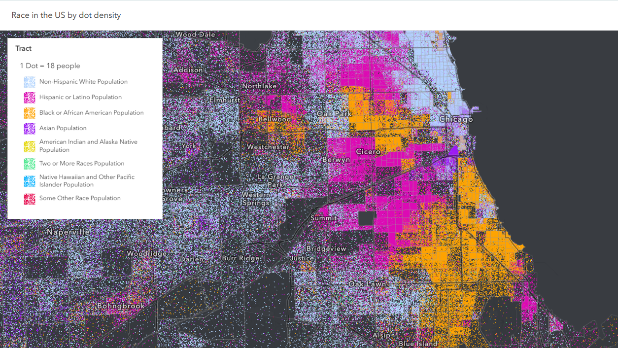
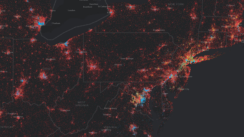
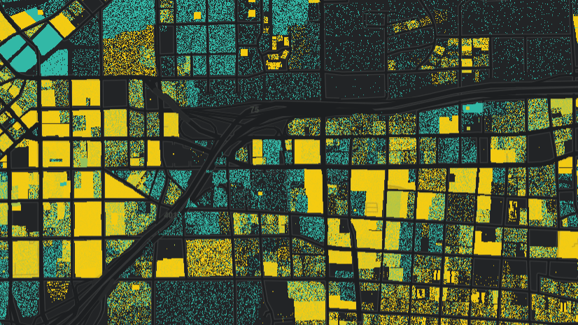
Another drawing style that works well with dark basemaps is Dot Density. Dot Density maps takes advantage of the size and shape of the polygon to show the count or amount of something (such as population) in relation to the size of the feature. It’s particularly great at showing the counts of different groups of population (or housing, etc.) in one map. The mix of different categories comes through nicely against the neutral dark gray canvas. One example is the dot density race and ethnicity map from Lisa Berry. We can see racial and ethnic patterns, as well as overall population density, in the same map.
In Summary, do more than change the basemap
Use dark basemaps with purpose. If you change the basemap on an existing map, change the symbology as well. If you change the basemap first, Smart Mapping will present great color ramp options to you.
One final tip: make sure at least part of the basemap is shown in the default extent when the map opens. A reversed color palette needs a dark background as a cue to the map’s reader what is happening. If the opening is zoomed in so that the basemap is completely covered, people might read the ramp differently from what you intended. So, don’t zoom in too far in the opening default extent.
Whether you are creating a map about a serious topic in which you’re trying to evoke a stark tone, or you’re designing maps that will be used in low-light environments, dark basemaps can be your friend when used well. I can’t wait to see the maps you create with dark basemaps!

Article Discussion: