We know that real-world datasets are not normally distributed, but all too often we see maps whose symbolization presumes the data distribution is. This blog will explore some considerations for color ramps and breakpoints for when your data are not normally distributed.
A normal distribution is perfectly symmetrical and centered right at the middle, which makes the histogram look like a bell curve. This means lots of data points are in the middle, and few are at the top and bottom ends. If a distribution is perfectly normal, its histogram is perfectly symmetrical, and therefore the mean and the median are equivalent.

Skewed data is not symmetrical, meaning there’s more bunched together on one side of the histogram. Depending on the situation, this can be great. If all students in a class do exceptionally well on a test (a professor’s dream!), then there would be more scores bunched on the top end of the histogram.
The mean and median are not equal when the distribution is skewed. Skewness can be measured by how far apart the mean and the median are in relationship to the standard deviation.
For those who love a statistical equation:
Skewness = 3*(Mean – Median)/(Standard Deviation)
where anything between -1 and 1 being more normally distributed (and a value of zero indicating no skewness => perfectly normal). Anything below -1 and above 1 indicates a high level of skewness.
What if the symbology choices in our map do not match the skewness of our data? Let’s first start with looking at the symbology choices in a normal distribution.
Example: Percent of Adults who are Married

Across the nationwide distribution of marital status data by census tract, the histogram is very close to normal. While the nation-wide percent of adults who are married is 50%, when taking the mean value across all tracts (not accounting for population differences), it’s 48.46, and the median is 49.90, and a standard deviation of 13.86. Using the formula above, the skewness here is -0.31, indicating a low level of skewness.
For low-skewed distributions like these, smart mapping does a good job of suggesting symbology breakpoints. The middle handle is set to the mean of the data (in this case, 48.46). The upper and lower breakpoint handles (where the upper and lower color limits are set) are 1 standard deviation above and below the mean. All tracts that are 1 standard deviation below the mean and lower get the lightest color, and all tracts that are 1 standard deviation above the mean and above get the darkest color.

The national percentage is 50% when taking the population in each tract into account. We can adjust the breakpoints slightly to 64 and 36 to force 50% to be the middle breakpoint that displays in the legend. With very little adjustment needed, we have a map that shows patterns across space clearly.
Skewness can enter as soon as you look at your local area.
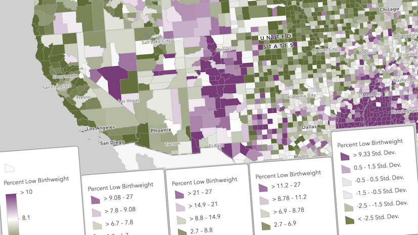
Percent Married in Utah vs. in Washington, DC
The percent of adults who are married varies widely across states, from 55.8% in Utah at the top end, to 32.3% in Washington, DC at the lower end. If we wanted to present these two maps side-by-side, then one shared color ramp with the same breakpoints used across the two maps is a clear way to do that.
, and most tracts in DC are light tan (indicating a low percent married).")
However, when GIS analysts at state or local governments are interested in mapping patterns in their own local area, they want to see variation within that area. Map symbols based on the national values may obscure local variation because the map symbols have to account for every feature across the country. Let’s look at how smart mapping suggests breakpoints for these, and what adjustments we can make to further refine our maps.
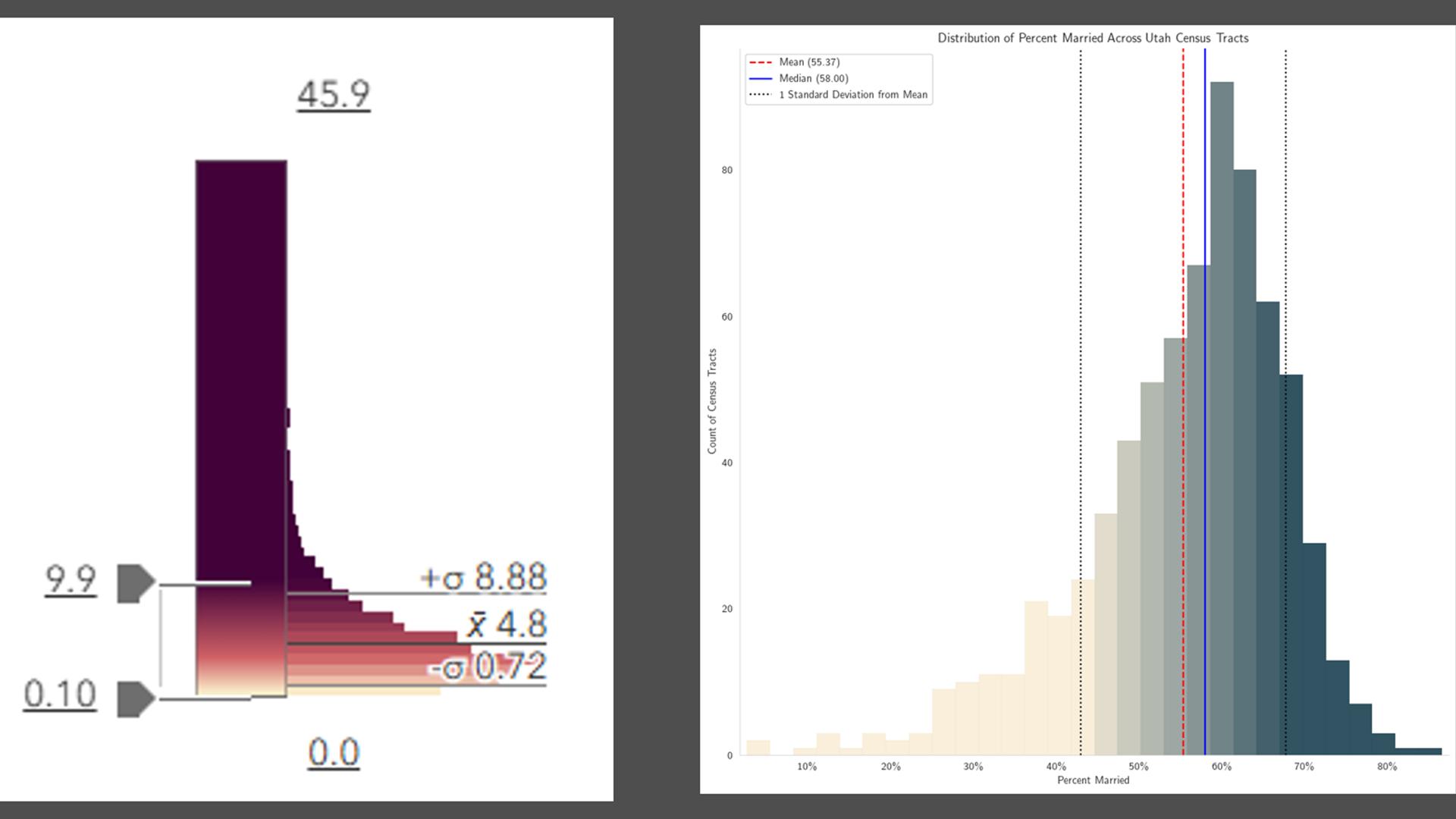
While examining the histogram for the state of Utah, we see that this distribution is “negative-skewed” or left-skewed,” meaning there is a longer tail on the left, or the lower values. A longer tail on the left means more bunching on the right, or the higher values. While the state’s percent of adults who are married is 55.8%, the mean of all tracts treated equally is 55.37, and the median is 58. In the chart, the blue line (median) is to the right of the red line (mean). Using our formula, the skewness for Utah’s distribution is -0.64. (Recall the the national distribution’s skewness was -0.31.)

The data is shifted to one side, but the symbology as assigned is not. This is why the map of Utah’s census tracts looks so dark.
At the opposite end, DC is “right-skewed,” with a skewness of 0.26.
.")
Refresh the suggested breakpoints
We can recalibrate the map’s colors to match the data’s distribution in the filtered areas. After applying the filter to subset our tracts to just ones in the state of Utah, click the refresh button (highlighted in the green square) to generate new suggested breakpoints. It suggests 67 and 43. We can see that the map has more variation in it now (not as dark blue as before), revealing more localized patterns.
.")
Likewise for Washington, DC, refreshing the smart mapping suggestions yields breakpoints of 47 and 18, creating a more varied map suitable for displaying DC’s own patterns in percent of adults who are married.
.")
Before, the national breakpoints were washing out all the variation at the lower end of the distribution that an analyst in DC would be interested in.
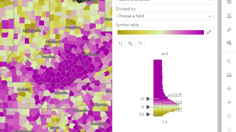
Of course, you are able to refine these breakpoints further. The suggestions from smart mapping are a data-driven starting place, with an emphasis on the phrase starting place. For example, we used a meaningful real-world value of 50% to center our map, since that is the national percentage.
What happens when our distribution is not centered near 50%, but closer to zero?
Example: Percent of children in the care of grandparents
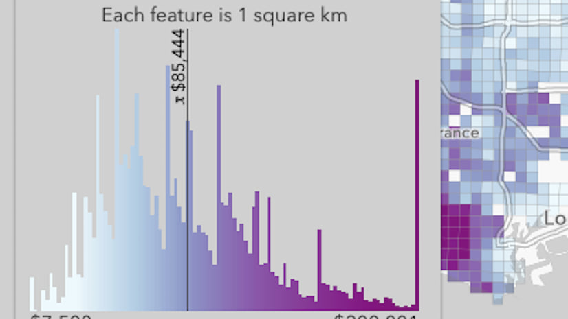
The national percentage of children in the care of grandparents is 3.4%, and the vast majority of counties fall between 0 and 10%. In fact, the distribution has a skewness of 0.75. If your percentage is bunched up near the lower end of the distribution, some color ramps are better than others. Especially when the spatial pattern can be clustered. In this case, counties that have high percentages tend to be located close to each other. The map’s job is to show the variation at the level of granularity that the data can support.
Color ramps with a bright color at one end, and a different, dark color at the other end will create high contrast between your data and the basemap. Avoid color ramps with white or near-white at the bottom (or near-black if you’re using a dark basemap), because they can hide a large chunk of your data. See how the counties with very low values in the Wyoming to Wisconsin region almost look like they are missing when using the the white-to-blue, and even white-to-red. When the color ramp has some yellow at the bottom, adding contrast with the basemap, it’s clear that these counties are ones with low values because they show up in a different color than the counties with high values because they show up in a different color.

Up until now, we have looked at mapping percentages. Now let’s examine a highly-skewed distribution of counts.
Example: Speakers of the Cherokee language
Speakers of the Cherokee language, and other rare and geographically concentrated counts, can be challenging to symbolize. Often, there are more tracts with a count of zero than there are with positive numbers, and those that do have positive numbers can have large ones. Start by filtering out the features (tracts/counties/etc.) with a count of zero, then use a faint background symbol style to make it clear which features are being represented by the symbols.

Refine the settings
Often we want to stretch the breakpoints out to show maximum variation, however when most of the data is bunched at zero, or very low numbers, stretching the breakpoints doesn’t create the best map. Experiment with compressing the breakpoints rather than stretching to give the map more signal. For example with the attribute of Cherokee speakers age 5 and over, smart mapping picks up on the fact that this attribute is a count, and suggests the Size drawing style. However, the default map has room for improvement.
The largest-sized symbol is being applied to the PUMA with the maximum number only (in this case, 1,786 individuals who speak Cherokee). The smallest-sized symbol is being applied only to the PUMAs with the minimum number.
By moving the lower breakpoint up to the mean here (39.3, which we rounded to 40), and moving the upper breakpoint down a bit, we see more signal around Sacramento, Knoxville, and Oklahoma City. We can also increase the size range from 55 to 60, so that the largest symbols appear even larger.

Finally, since the bigger symbols overlap each other, add a transparent white outline to the circles, so that the smaller ones on top of the bigger ones show up better.
Takeaways
- Data in real life are almost never truly normal. That’s okay, smart mapping suggests symbology which you can refine and customize for your needs.
- Take advantage of charting capabilities both in Map Viewer and in ArcGIS Pro to explore your data’s histogram further.
- If your data is bunched at the bottom, go for color ramps to create high contrast between your data and the basemap.
- If your dataset has lots of zeros skewing things, experiment with applying a filter, or use transparency by attribute to hide them visually.
What other challenges do you run into when mapping skewed data? Let us know in Esri Community.


Nice article. This is very useful. In PRO I have to use diverging color ramps all the time because rarely a dataset will be normally distributed
Thank you very much. Agreed, we are big fans of diverging color ramps (Above and Below theme in ArcGIS Online).