
2026: The Year of the Globe?
If you attended the 2026 Esri User Conference in person this year, you may have seen a collection of dozens of different rotating globes on the Plenary stage or in the Map Gallery. Showcasing bioclimate, soils, earthquakes, hurricanes, and even lunar geology, these globes were part of an effort to animate a wide variety of basemaps and environmental datasets from Living Atlas and beyond — and were all created in ArcGIS Pro.
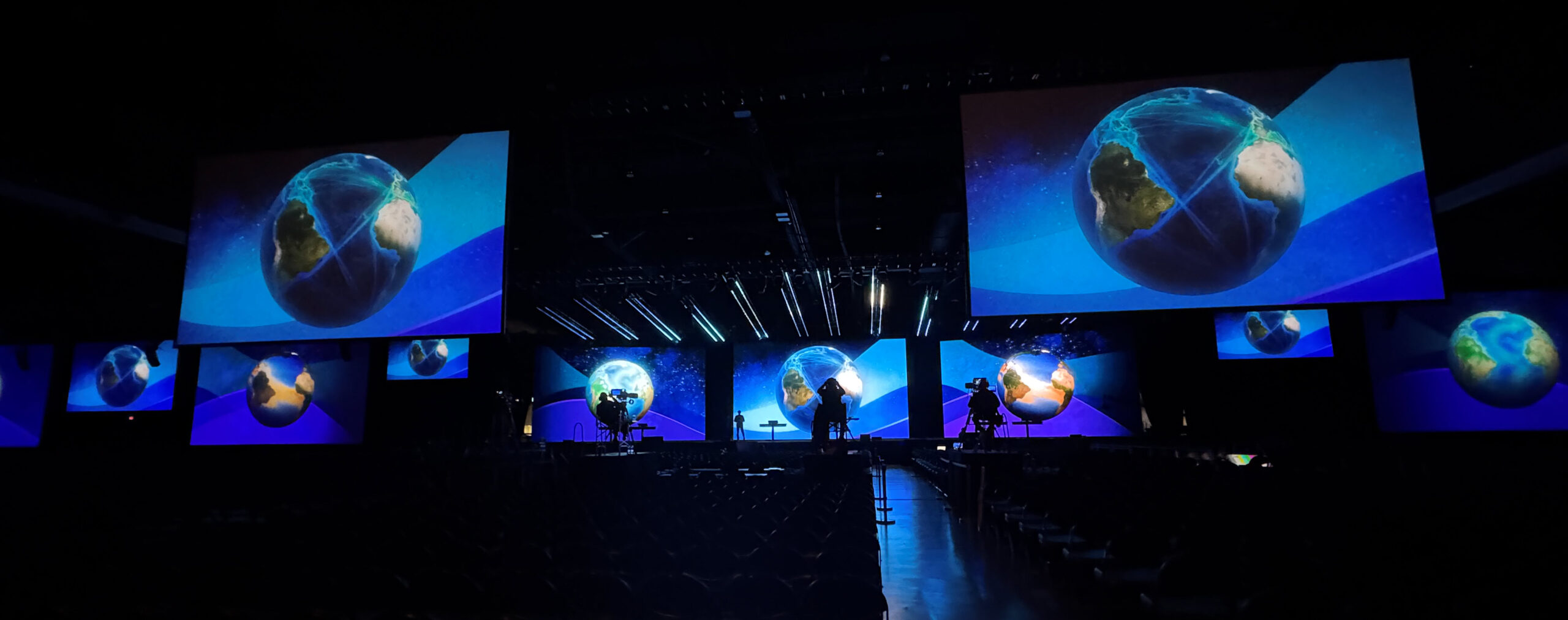
A subset of six of these animated globes were thematically-linked, showcasing the dynamics of the different components of the Global Water Cycle. If you wandered through the Map Gallery, you might have also seen them featured in a dedicated kiosk, supporting the Geowater book release.
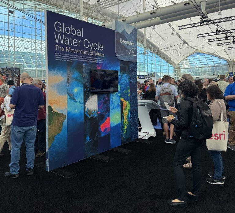
Geowater
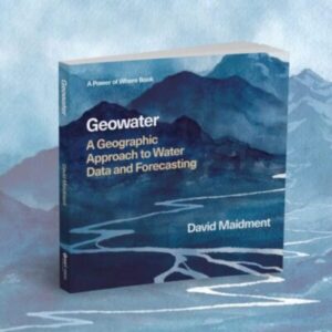
Geowater: A Geographic Approach to Water Data and Forecasting, demonstrates how the geographic approach connects maps, data, and analytics to address water-related challenges, ranging from local flooding to global water management. Written by David Maidment, known for his body of research on surface water hydrology and the application of GIS to hydrology, Geowater is based on the eight core geomethods first established in Jack Dangermond’s book, The Power of Where.
Understanding the storage and movement processes of the global water cycle through geoaccounting is a complicated process, but the first step in understanding each component is putting the data on the map – or in our case, the globe. The result of synthesizing and exploring these datasets is shown in the synchronized collection of animated globes below, highlighting 6 key water cycle variables:
How does one go about turning data into visualizations like these?
A How-To Guide for Global Animations
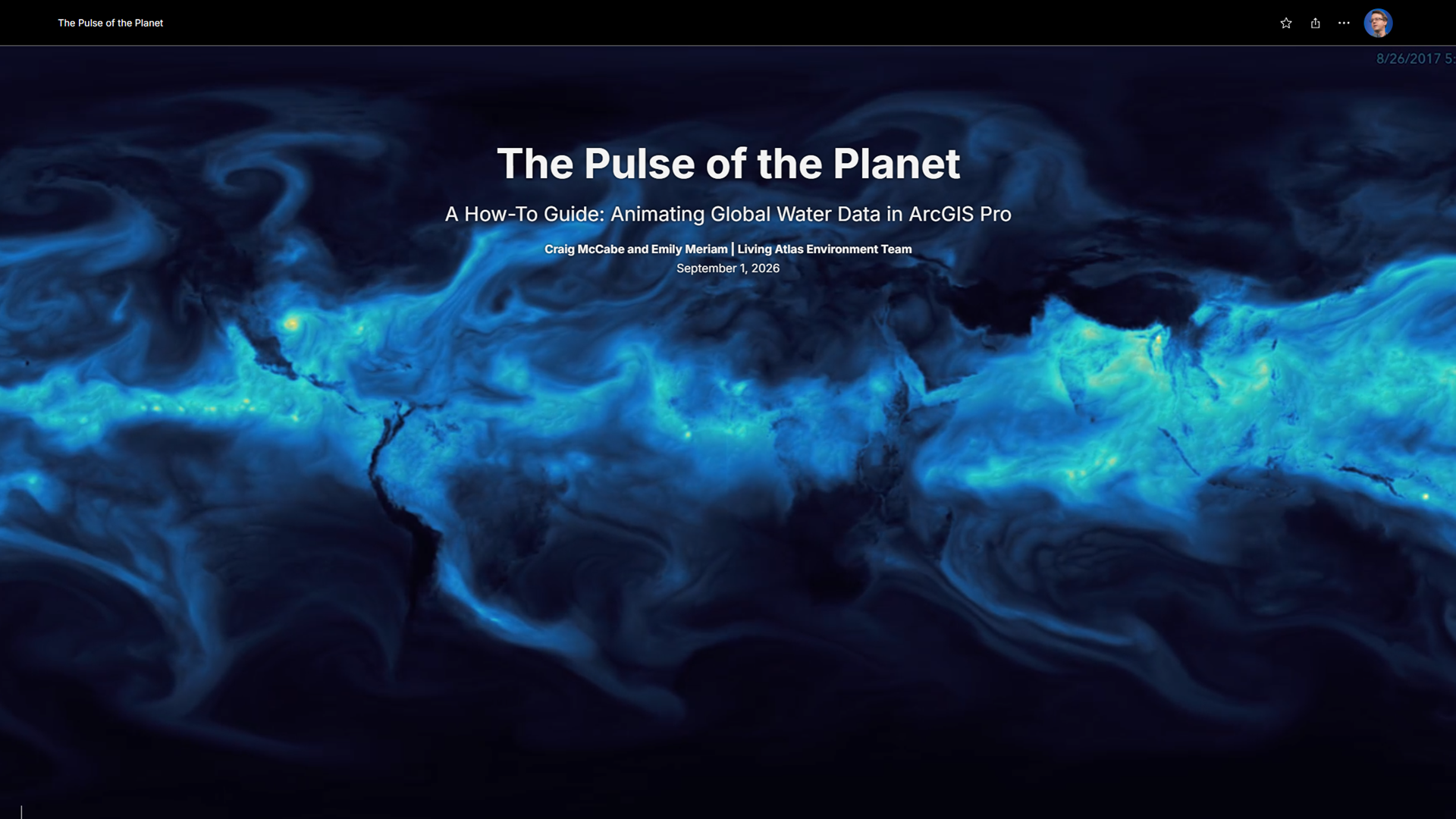
If you’re interested in creating your own global animations of atmospheric variables – or any dataset, for that matter, you’re in luck! We’ve summarized the process of creating these water cycle globes in a step-by-step StoryMap guide: The Pulse of the Planet | A How-To Guide: Animating Global Water Data in ArcGIS Pro.
The story walks you through downloading atmospheric moisture data for the hurricane-rich months of August and September 2017, configuring and styling the time-series in ArcGIS Pro, then exporting the calmly-spinning globe animation you see below:
If you’d like to get started, click on the image below to head over to the story. Enjoy!


Article Discussion: