Background
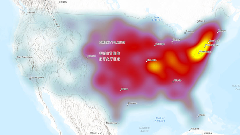
Extreme weather events and natural hazards exert a heavy toll on communities across the United States, yet understanding exactly where and how much damage has occurred remains challenging. NOAA’s Storm Events Database is at the forefront of resources, providing insights into damages incurred by 48 storm event types. By examining property damage records from this database, we can reveal the spatial and temporal patterns of damage caused by key hazards.
This blog walks you through an ArcGIS Pro workflow that uses two spatial analyst tools to model the property damage intensities at a local level by county. The Space Time Kernel Density tool generates continuous damage intensity surfaces and the Zonal Characterization tool aggregates those intensities by county. We will use flood, extreme heat, heavy snow, drought, and wildfire as examples in this workflow. You will learn how to customize search time windows, interpret density outputs, convert kernel-based density values back to U.S. dollars, and map the counties with the highest and lowest cumulative damages.
Importance of understanding localized hot spots
Local decision makers need fine-scale damage estimates to allocate recovery funds, prioritize resilience measures, and inform zoning or building codes. A county-level assessment captures community-specific impacts that national or state aggregates can otherwise obscure. By combining multidimensional density analysis with zonal summarization, it is possible to transform raw event locations to actionable county totals, all while reducing manual overlays and repetitive geoprocessing steps.
Data preparation
Our analysis draws on NOAA’s Storm Events Database, which logs each recorded flood, drought, wildfire, snow event, heat wave, hurricane, tornadoes, and other hazard events that may or may not cause property damage since the 1950s. Before 1996, only tornado, thunderstorm wind, and hail data were available. We, therefore, used data from 2000 through 2020 to maintain temporal consistency for all the considered storm events. After importing storm event records and county boundaries into an ArcGIS Pro project, we verified that each event has valid geometry, a date field, and a property damage attribute in U.S. dollars. That leaves us with approximately a million event records.
Density analysis with Space Time Kernel Density
We ran the Space Time Kernel Density tool to transform discrete storm events points with damage information into smooth, monthly time slices of damage intensity. For each hazard type, we adjust the search time window—such as 5 years for floods, 12 months for heat waves, or 60 months for hurricanes—to reflect event seasonality. A cell size of 20 kilometers and a search radius of 250 kilometers were used to create a balance between spatial resolution and computational efficiency. The output is a multidimensional raster in which each slice depicts weighted damage intensity over the chosen window at a monthly interval.

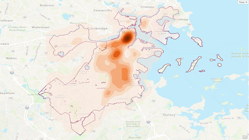
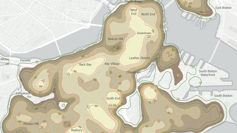
Interpret the density surfaces
While traditional kernel density rasters reveal hot spots where damage from storm events cluster, the multidimensional output density rasters from Space Time Kernel Density provide much more insight. By browsing through the Multidimensional Analysis pane from the STKD output, you can observe how hot spot locations shift over time, including capturing drought cycles, snow-season peaks, or hurricane-landfall patterns. These visual cues guide deeper investigation and help validate the subsequent zonal summaries.

Use Zonal Characterization to identify county-level damage
Next, we ran the Zonal Characterization tool to sum density values within each county boundary for every time slice. This produces an output table of summed density values, and an optional feature class with the same attributes for each county. The advantage of the Zonal Characterization tool is that it allows us to calculate more than one statistical property for a value raster and we can include more than one value raster in one operation. Most importantly, the tool can calculate statistics for input raster if they are multidimensional. Therefore, the output multidimensional density rasters from the Space Time Kernel Density tool can be directly used here and we can calculate the mean, minimum, and maximum damage density per county across each time slice for each county.

Because the Space Time Kernel Density outputs are normalized by area and time, to recover the U.S. dollars damage totals per county, we need to multiply each county’s summed density by the cell area and the time-window length.

Importance of thoughtful interpretation
Deriving the numbers is only half the work; interpreting what they mean in context is where true insight emerges. By breaking down this complex analysis into clear, sequential steps, we simplify a multifaceted problem: first generating the density surfaces, then summarizing them by jurisdiction, and finally converting kernel outputs back into dollars. This stepwise logic not only makes the workflow reproducible but also ensures that each intermediate output can be examined on its own merits. When you spot an unexpected spike or dip in damage for a county, you can trace it back through the density slice that drove it, understand its temporal window, and even drill into the raw storm records. In essence, simple, modular steps empower you to tackle complexity with confidence and clarity.
Takeaway message
County-level analyses uncover localized vulnerabilities that statewide averages can mask. Hazard-specific density windows highlight temporal nuances such as drought impacts accumulate slowly, while tornado losses spike sharply. By chaining the Space Time Kernel Density and Zonal Characterization tools, you reduce repetitive geoprocessing and produce reproducible results more efficiently.
Conclusion and next steps
This workflow demonstrates how the Space Time Kernel Density and Zonal Characterization tools can transform raw storm-damage points into actionable, county-level insights. This empowers analysts to translate raw storm damage records into clear, county-level summaries, enabling targeted resilience planning and informed policy decisions. By harnessing the multidimensional and zonal tools in ArcGIS Pro, you gain a repeatable, scalable method for assessing localized impacts from any natural hazard.
To extend this approach, consider experimenting with different temporal windows or cell sizes, exploring multidimensional analysis tabs, or automating your chart creation using the Charting pane for an interactive dashboard. Whether you are a GIS analyst, emergency response planner, or policy maker, this approach helps you pinpoint localized hot spots, streamline your analysis, and communicate insights that drive smarter resource allocation. By blending advanced GIS analytics with clear visualization, you’ll empower stakeholders to pinpoint risk hot spots and allocate resources more effectively.

Article Discussion: