Space Time Pattern Mining tools in ArcGIS Pro allow you to analyze and solve problems using time series data in a space-time cube. The recent 2.6 release includes a new toolset to conduct time series forecasting with a space-time cube, providing you different approaches to forecast time series in multiple locations. Check out the demo below from the UC 2020 plenary to get a quick overview of these forecasts and analysis, if you haven’t got a chance.

After taking an overview of the four tools in the Time Series Forecasting toolset with the COVID-19 data in part 1, part 2 and part 3 of the article series, this final part uses one of the forecast tools, Exponential Smoothing Forecast, as an example to help you master the steps for forecasting, gain insights of the data, and dive deeper into the visualization and interpretation of forecast results. Using U.S. state-level data of natural gas consumed during the generation of electricity between 2001 and 2009, we will forecast the consumption in 2010 using the Exponential Smoothing Forecast tool.
Create a space-time cube using a CSV file
The raw data contains natural gas consumption of power plants by month by state in CSV format. The key fields are state’s abbreviation STATE, consumption value CONSUMPTION, and date DATE in mm/dd/yyyy format. The state boundaries shapefile from the U.S. Census Bureau includes polygons by state. The key fields are state abbreviation STUSPS, and geographic identifiers GEOID. The CSV file and the polygon file are used together to create the space-time cube using the tool Create Space Time Cube from Defined Locations.
Before creating the space-time cube, there are some requirements that the CSV file and polygon file should satisfy.
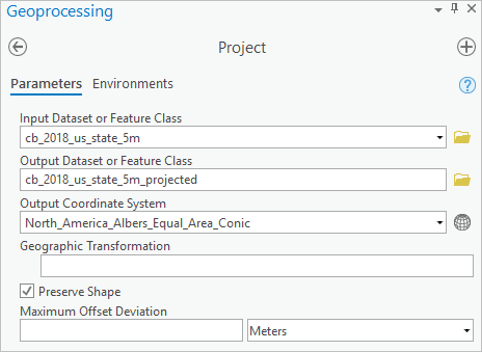
- This tool requires projected data in order to accurately measure the distances. This can be done using the Project tool if necessary (Figure 1).
- There should be a numeric location identifier shared by the CSV file and the polygon file.
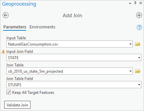
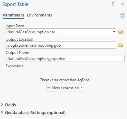
In our data, the polygon file has a numeric Location ID named GEOID. However, there is no counterpart in the CSV file to match with this GEOID. A tip to solve the issue is to use the Add Join tool to create a GEOID field for the CSV file (Figure 2). When running this tool, we use the state abbreviation (STATE and STUSPS) to match records in the CSV with the polygons, so that the CSV file gets the corresponding GEOID field. After using Add Join, the output field name follows the format of “InputFeatureName.fieldName”. To strip the “InputFeatureName.”, we can export the CSV file by right-clicking the CSV in the Contents pane and navigating to the Export Table tool (Figure 3).
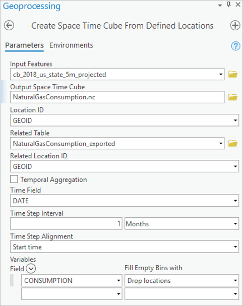
Now we can run the Create Space Time Cube from Defined Locations tool. We can create the natural gas consumption space-time cube by following these settings (Figure 4):
- Use GEOID in both Location ID and Related Location ID. These are numeric fields used to join the Input Features and the Related Table – string field is not acceptable here.
- Uncheck the Temporal Aggregation box and set the Time Step Interval as 1 Month. Since the input data is monthly and we want to create a monthly cube, there is no need to aggregate temporally.
- Set the Time Step Alignment as the start time. Since the date in this data is consistently the 1st of each month, the Start Time option will slice the time interval into Jan 1 – Jan 31, Feb 1 – Feb 29, Mar 1 – Mar 31, etc. If End Time was selected, the output time interval would be Jan 2 – Feb 1, Feb 2 – Mar 1, Mar 2 – Apr 1, etc.
- Use CONSUMPTION as the Variables Field and Drop Locations with empty bins.
Forecast with exponential smoothing
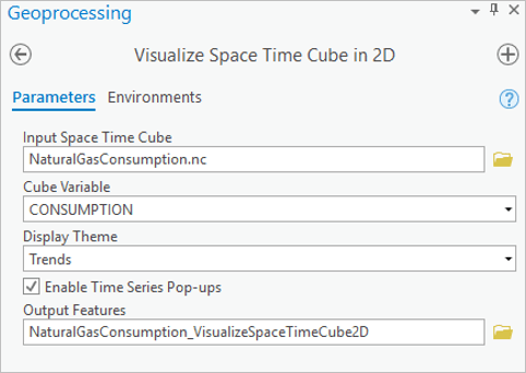
The Space-Time Pattern Mining toolbox provides tools to visually explore the natural gas consumption to help select the appropriate forecast method. We can use the Visualize Space Time Cube in 2D tool following these settings (Figure 5):
- Choose Trends for the Display Theme.
- Enable Time Series Pop-ups.
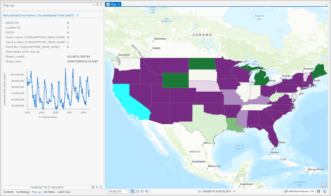
After running this tool, the time series pop-up can be seen by clicking a feature on the map. For example, we can visualize the time series in California, and observe the sharp increase in natural gas consumption each May-July (Figure 6). By exploring across states, we see that the time series usually have annual cycles. Exponential smoothing is a great candidate for modeling and forecasting this data since it can capture seasonality by decomposing the time series into the season component and other components in an additive way. In addition, forecasts are produced as weighted averages of past observations, with the weights decaying exponentially as the observations get older. In other words, the more recent the observation the higher the associated weight.
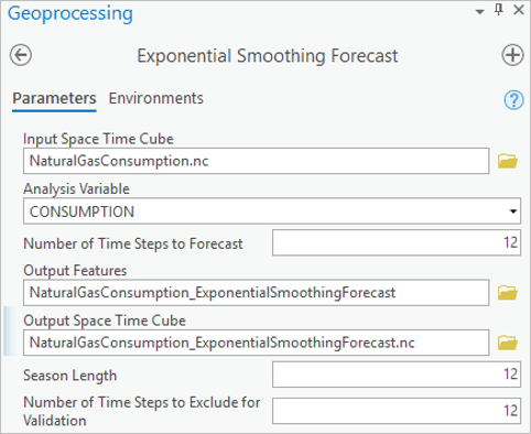
Now let’s run the Exponential Smoothing Forecast tool following these settings (Figure 7):
- Set the Season Length as 12, as we know from data exploration that the time series is seasonal each year.
- Set the Number of Time Steps to Forecast as 12, representing the 12 months in the year 2010. Refer to the tool documentation for more details.
Set the Number of Time Steps to Exclude for Validation as 12, so that the year 2009 is used to validate the performance of the forecast.
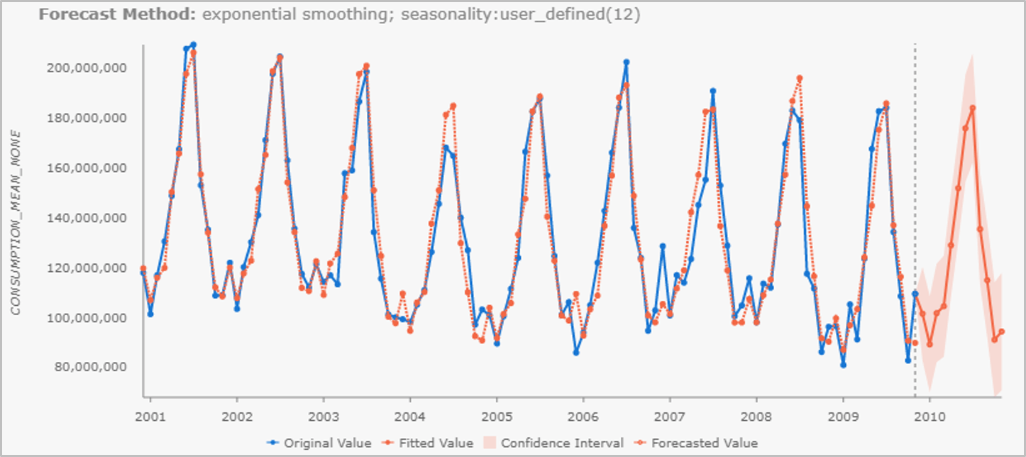
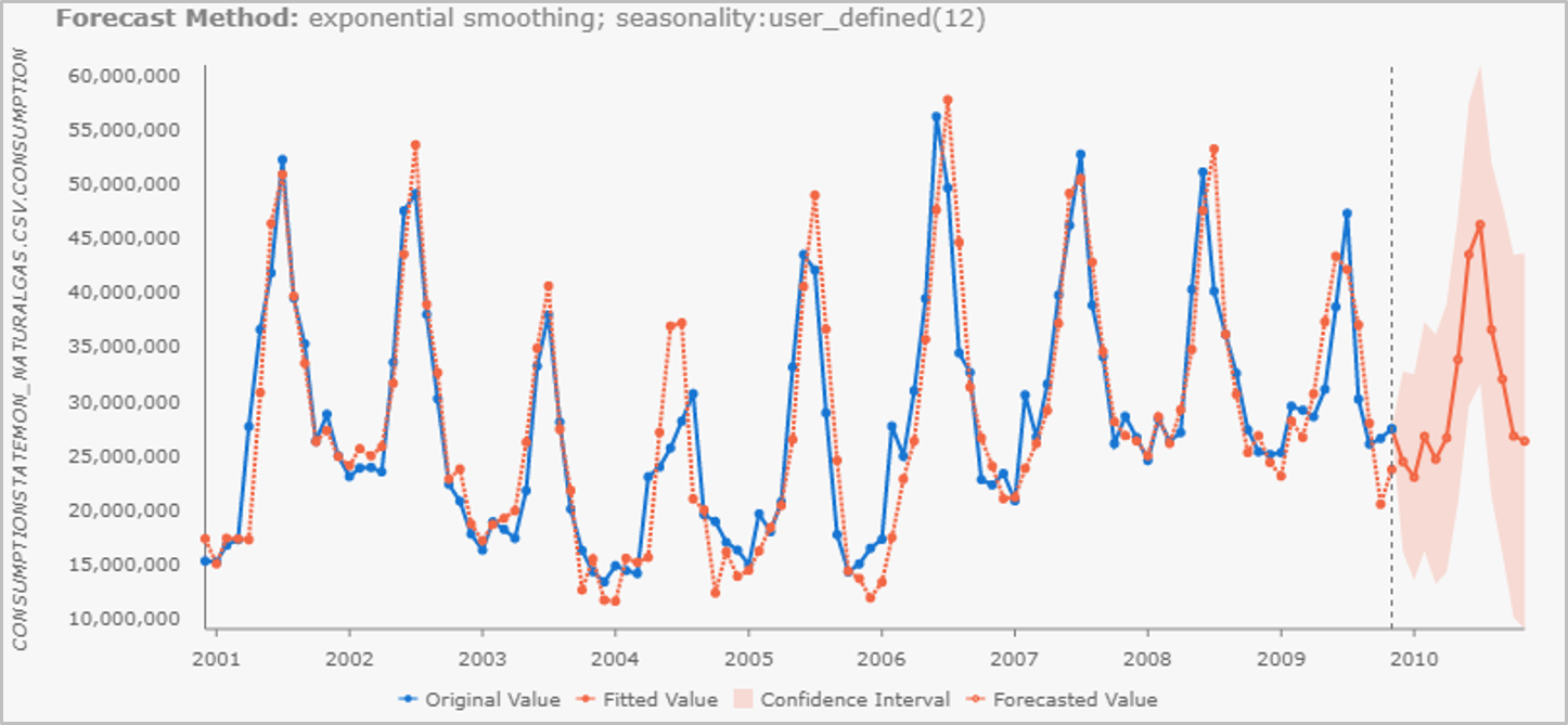
After running the tool, we can click each feature to see the original and forecasted values with confidence intervals for each feature in the pop-up chart. As an illustration, Figure 8 shows the forecast value with confidence intervals in Texas (a) and New York State (b). Compared with New York, Texas has a relatively stable trend and seasonal pattern of natural gas consumption which leads to a narrower confidence interval. In contrast, the consumption in New York fluctuates considering both the trend and seasonal variance, leading to a wider confidence interval.
Visualize and interpret the forecast results
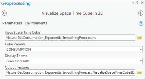
The Exponential Smoothing Forecast tool decomposes the time series into several components in an additive way, including trend, season (if season length specified is greater than 1), and residuals. Refer to Hyndman, R.J. et. al. (2018) and the tool documentation for more information. This decomposition can be visualized using the tool Visualize Space Time Cube in 3D following these settings (Figure 9):
- Use the output space-time cube of the Exponential Smoothing Forecast tool as the input cube here.
- Select Forecast results as the Display Theme.
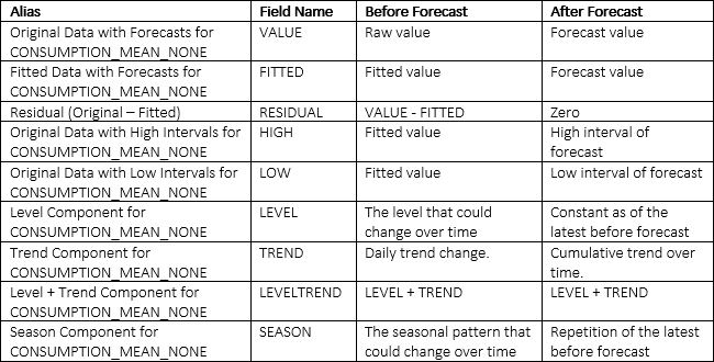
The output feature class has rich fields to facilitate visualization. Some of the fields have different meanings for time steps before and after the forecast, which are explained in Table 1. Before the forecast, the sum of LEVEL, TREND, SEASON and RESIDUAL is equal to the raw value, while once the forecast starts, the RESIDUAL is zero and LEVEL, TREND and SEASON add up to the forecast value.
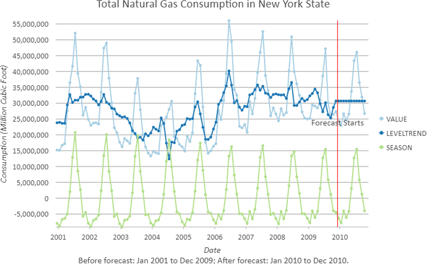
The tool automatically creates a line chart of original data with forecasts summing over all locations under the associated layer in the Contents pane that we can manipulate through the Chart Properties pane. For the purpose of understanding the time series, VALUE, LEVELTREND and SEASON is a good combination for visualization. The chart will show all features by default, but we can filter to show results for a single location by selecting it on the map then filtering the chart by selection. For example, Figure 10 shows time series decomposition in New York. The red vertical line is where the forecast starts.
Figure 10 shows a significant shrinking seasonal variance overtime in New York state. This is not visible in Figure 8(b). The forecast of the seasonal component in 2010 is the repetition of the year 2009. In addition, the trend forecast in 2010 is flat although the trends fluctuate historically. This is because the forecast mimics the latest flat trend during 2007-2009 and gives little weight to older data, according to the Exponential Smoothing method.
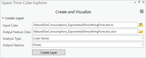
If we are interested in exploring the overall pattern of the forecast cube, we can also visualize the forecast results through the powerful add-in for ArcGIS Pro, Space Time Cube Explorer (STCE). After installing the add-in, we create and visualize the layer following the settings in Figure 11 in a Global Scene.
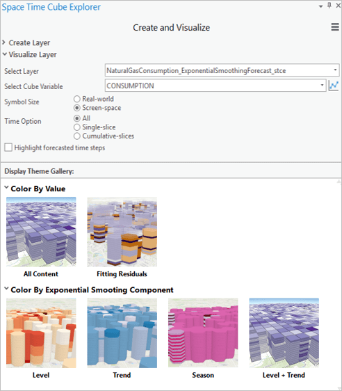
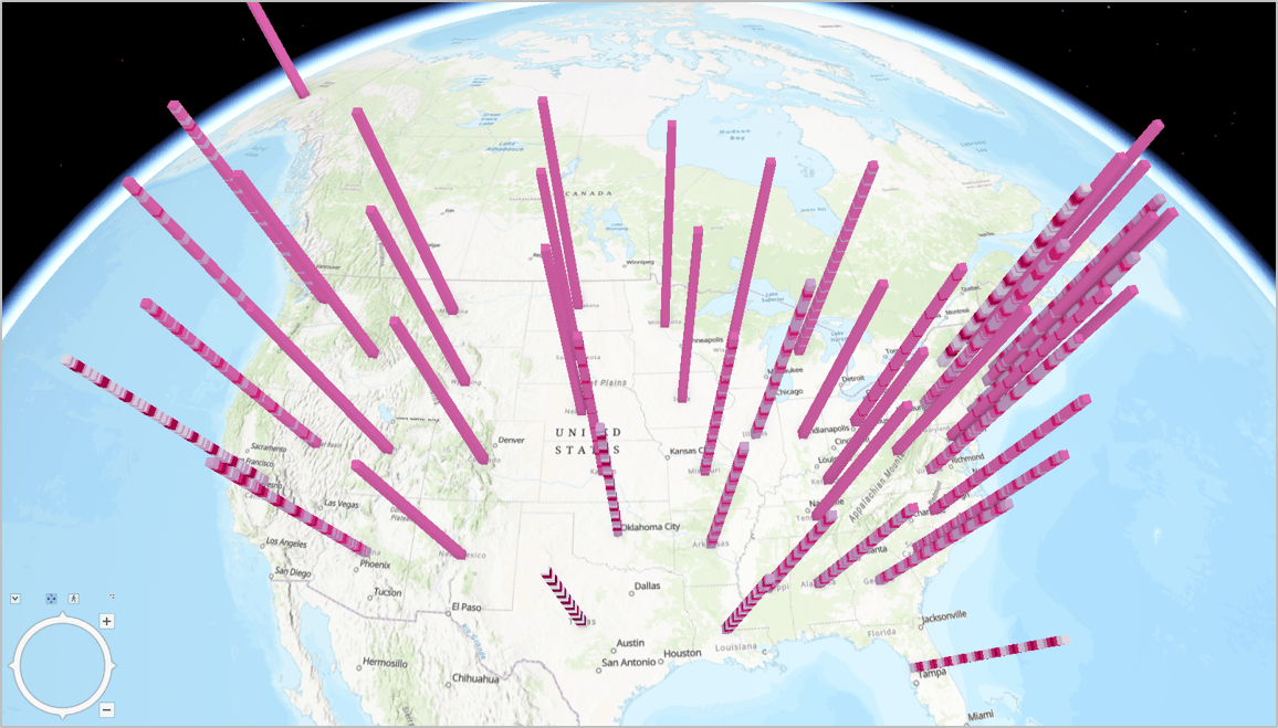
If we select “Season” in the Display Theme Gallery, the seasonal components from the Exponential Smoothing Forecast tool are visualized dynamically (Figure 12). It is very easy to visually capture locations with strong seasonal fluctuation using this theme. We recommend trying different settings in STCE to explore the overall patterns in the forecast cube.
If you are interested in further exploration of the forecast cube, other tools in the Space Time Pattern Mining toolbox, such as Emerging Hot Spot Analysis, Time Series Clustering, and Local Outlier Analysis are applicable. In addition, the forecast output from the three tools, Curve Fit Forecast, Forest-based Forecast, and Exponential Smoothing Forecast, are comparable through the Evaluate Forecast by Location tool.
Summary
There are so many applications for this type of time series forecasting. Everything from COVID-19 modeling to energy usage. And seeing the spatial patterns of those forecasts, and the models used to create them, helps us understand our world in a deeper, more meaningful way.
We can’t wait for you to get your hands on these tools! Please reach out to us with your feedback. You can find more resources for these and many other spatial statistical, spatial machine learning, and space-time pattern mining tools in ArcGIS Pro at https://spatialstats.github.io/.
Data Sources
- U.S. Energy Information Administration (EIA) electric power consumption data (consumption_state_mon) filtered by only Natural Gas (MCF) Energy Source. Available from OpenEI website at https://openei.org/datasets/dataset/electric-power-monthly-monthly-data-tables
- U.S. Census Bureau states boundary shapefile cb_2018_us_state_5m.zip available online at https://www.census.gov/geographies/mapping-files/time-series/geo/carto-boundary-file.html
Other References
- Hyndman, R.J., & Athanasopoulos, G. (2018) Forecasting: principles and practice, 2nd edition, OTexts: Melbourne, Australia. https://otexts.com/fpp2/expsmooth.html
- Guide to interact with a line chart https://pro.arcgis.com/en/pro-app/help/analysis/geoprocessing/charts/line-chart.htm
- An overview of the Time Series Forecasting toolset in ArcGIS Pro https://pro.arcgis.com/en/pro-app/tool-reference/space-time-pattern-mining/an-overview-of-the-space-time-pattern-mining-toolbox.htm

Article Discussion: