
Would you like to cartographically place your marker symbols from a polygon symbol layer but make use of an automated process?
Using the new Convert marker placement to points tool*, we can easily convert polygon markers to a new points layer retaining all the existing styling and resolving any conflicts along the way!
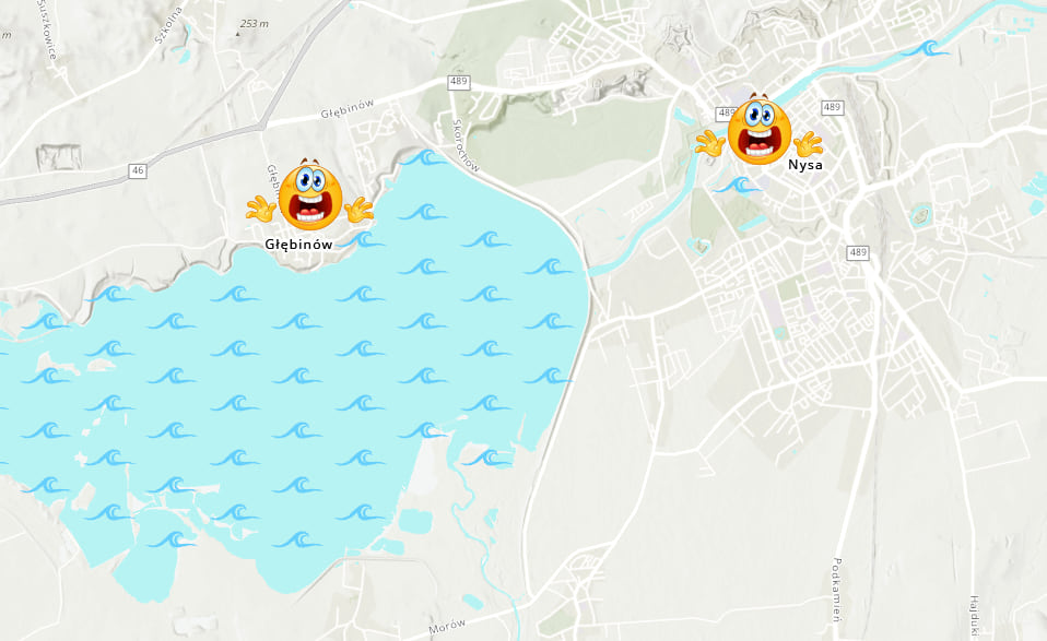
Map like a pro and avoid trees in roads, or unintentional tsunamis! A few fine-tuned changes to the position of markers might add clarity to your map and make it easier to read.
New to Pro? Read the short “how to style polygons with markers” section at the bottom of the post.
Boundaries
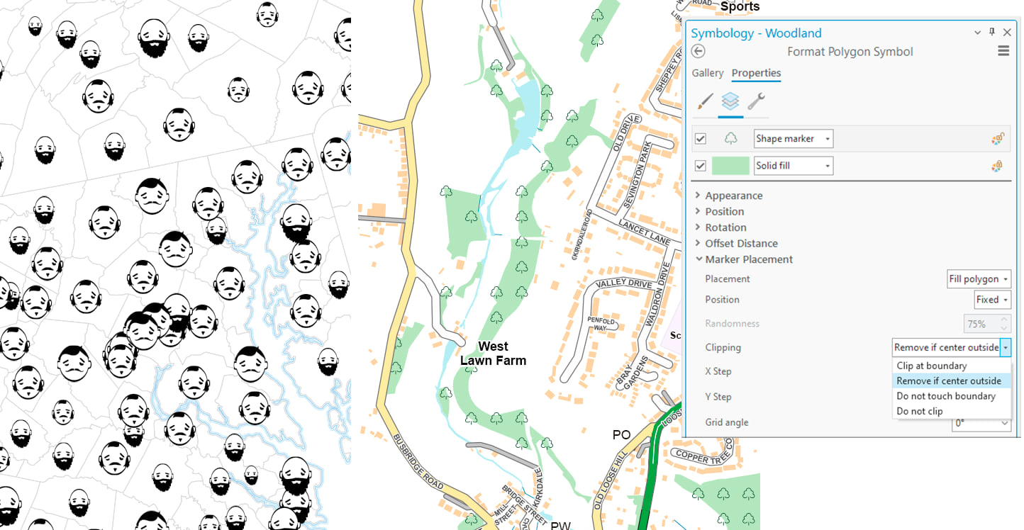
In our polygon symbology’s regular marker properties – before even using the tool – we can specify, under Marker Placement, if we want clipping to occur at the polygon boundaries.
There are certain scenarios in cartography where we may prefer not to use clipping. If we have a natural feature such as an area of woodland, it can sometimes look better to let the trees grow up from their underlying green polygon than to have them cut off at the polygon edges. This is especially true for narrow, unfenced polygons without an outline. Similarly, thematic map symbols can often exceed their polygon bounds, e.g. John Nelson’s “wine versus beer” map.
In such cases, we can either not clip (below left), or remove markers whose centerpoint is outside of the polygon (below right).
However, if we have a qualitative map of states of the US symbolized by the logo of their largest company; then regardless of whether we have one marker or a pattern of markers, we are likely to want to use boundary clipping.
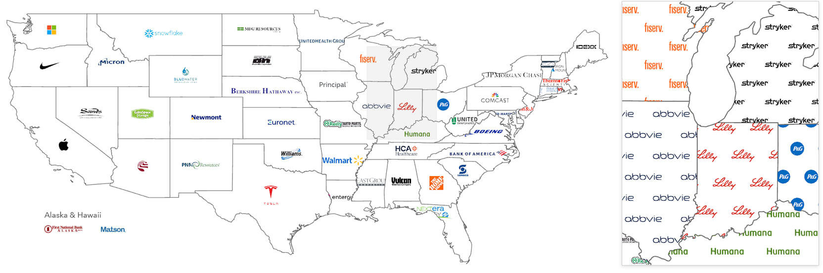
“Largest company” refers to listed companies with highest market capitalization as reported by Yahoo, December 2023.
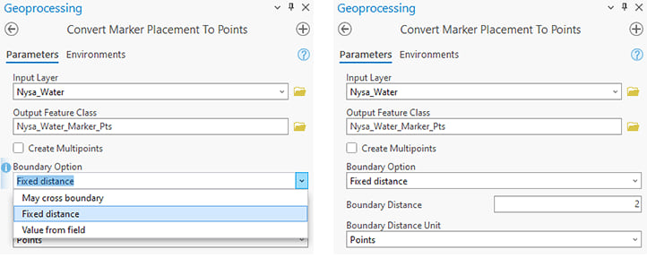
When we run the tool, the boundary option will honor the clipping setting and take only the markers we see†. But we get the option to refine the output further by removing symbols within a set distance from the boundary. This may be useful in scenarios such as ensuring a minimum distance between symbols and neighboring features or preventing waves from spilling into towns and cities!
Applying a boundary of a fixed distance will default to 0 points, i.e. nothing outside of the polygon will be retained. But we can specify a distance (and units) or alternatively read them from our data.
So here, I have set the boundary distance to 2pt to maintain a small aesthetic gap between any wave symbol and the edge of the polygon.
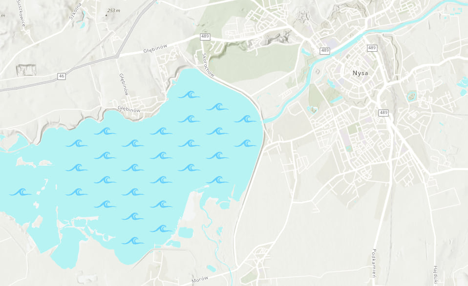
The tool has worked great! But why not just use “do not touch boundary” in the original symbology I hear you ask!
Well, it would have been a possible better starting point, but it may not have avoided the little islands in the lake. Also, here we have more control over the gap to preserve between the (polygon symbol) boundary and the markers.
Barriers
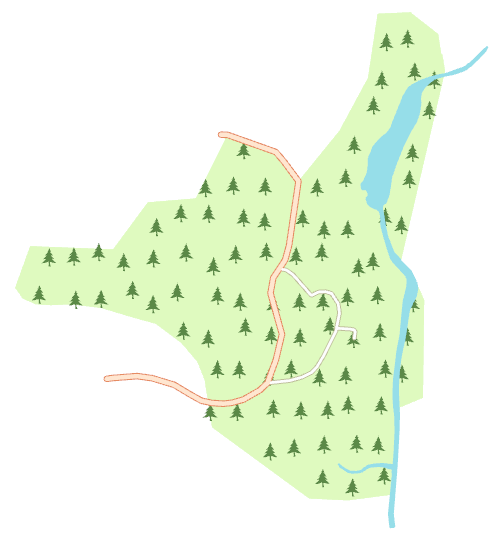
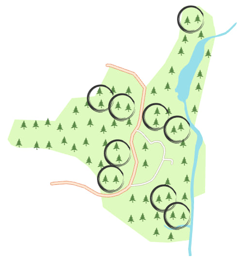
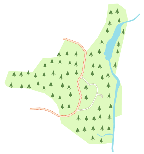
The barriers setting may be useful in scenarios such as ensuring clarity of routes on a trail map or simply making sure that we avoid trees covering or overlapping roads — which makes the road network harder to read on the map and would be an obstruction to traffic!
Applying a fixed distance will default to 0 points. But we can specify a distance (and units) or read them from our data.
So here, I have set roads to 2.5pt and water to 0pt: Meaning there will be a 2.5pt gap retained between the tree markers and the edges of roads, and they cannot be placed on top of roads or water.
Before
After

Displacement
It is important to understand that displacement method has nothing to do with boundaries, barriers, or any other conflicting map elements. This displacement pertains to the actual markers themselves, i.e. to spread apart marker points that are too close to one another when a random marker placement has been used.
Take the same example as last time. I am really happy with the marker placements in their slightly random but clean pattern but to maximize legibility, we can fine tune the result to ensure none of the symbol markers are within 6pt of one another.
So here is the same image as before, but with the symbols I want to tweak highlighted.
And if we run the tool with an added displacement apart to ensure a minimum gap between markers of 6pt.
And once again but this time I have asked the markers to displace towards the regular pattern grid as opposed to directly away from one another.

Multiple symbols or a single symbol
You don’t need to have a marker pattern to use the tool. Even if you have one marker per polygon as we saw with the company logos, or a set of polygon marker layers from a join, these will work in the tool too — which is very handy for any manual repositioning. There is also the option to ensure we keep at least one marker.
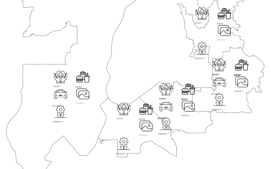
In the example below, we have point data of supermarket stores with available “extra” services that has been joined to district polygons. The icons you see are the output of the tool (the resulting point symbol markers) over the input (polygon symbol markers) which is a perfect match as I didn’t use clipping. In this case the markers would likely benefit from manual repositioning once converted to points.
The limitation is that the tool only runs on marker placements and only on polygons. It won’t work for example on markers from graduated or proportional symbols such as the Chernoff faces unless they were manually sized and positioned as marker fills, and it won’t run on dictionary-rendered markers even if they are polygon-based.
Hopefully the new Convert Marker Placement to Points tool will aid more of us to map with the same high-level of cartographic finishing as national mapping agencies like Swiss Topo.
Final tips
If your polygon data or marker files are very detailed, the tool will take longer to run. Consider if your raw data polygons should be generalized for your map scale; and also consider using font-based marker symbols or creating your SVGs with precision to less decimal places.
For a published map, you may also wish to edit the output to fine tune your symbol placement.
Notes
† If the marker is a group of markers to begin with, e.g. the default orchard symbol in Pro, then the whole square of symbols will show
* The tool is available in the Cartography toolbox with an advanced license
How to style polygons with markers
1a. Right-click on a polygon layer in the Contents panel and select Symbology. This will take you to the Primary symbology tab. Then click on its symbol.
or
1b. Alternatively, simply click on its symbol in the Contents panel.
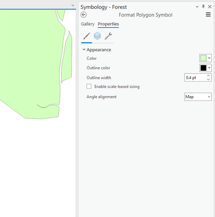
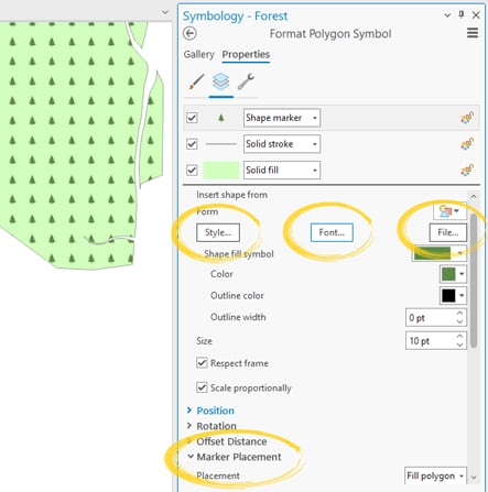
2. Either of the above will take you to the Gallery tab of Format Polygon Symbol. From here, click on the Properties tab and you should have something similar to the image below.
3. Go to the Structure tab and Add symbol layer choosing Marker layer.
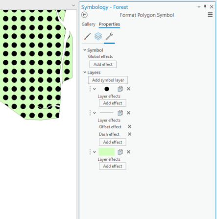
4. Go to the Layers tab and change the default shape marker (a filled circle), to the marker symbol you want to use. This can be from a style, a font, or a SVG or EMF file.
5. Using the rest of the Appearance section, you can set the color, size, position, etc. As well as the Marker Placement settings. Explore each of the settings here.

Article Discussion: