In July, I presented at the Esri User Conference for the first time, alongside my talented colleagues Ken Field and John Nelson for the ArcGIS: Designing Thematic Maps session. During the session, we each made three maps using the same dataset. We highlighted different thematic mapping approaches and provided tips and critiques for our own maps along the way.
For all of our maps, we visualized themes in the World Happiness Report. It consists of a wide variety of data points for each country, including a life evaluation score (‘happiness’) and explanatory factors such as Gross Domestic Product, freedom, and social support.
To see the full presentation and explore Ken and John’s maps, watch the livestream recording available for registered attendees.
Act 1: Concentric Circles of Happiness

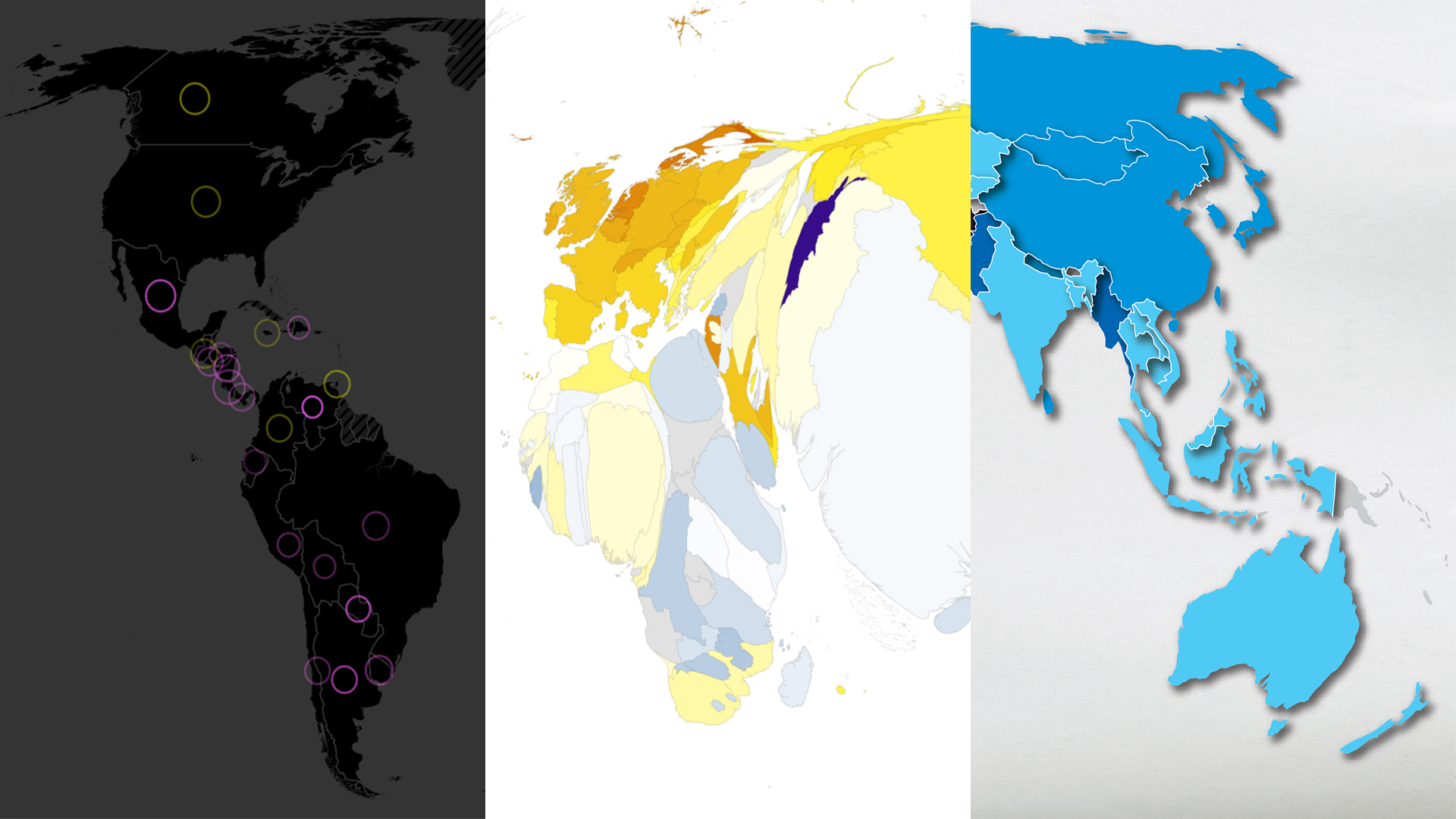
For my first attempt, I made a proportional symbol map using a dark background and bright circle symbology. Inspired by John Nelson’s World Happiness Report map, where he symbolized each happiness metric in one map.
My original goal for this map was to have two circles for each country, one for 2019 and one for 2024. Unfortunately, there was little variation in the two time periods for most countries, so the two symbols were almost completely overlapped in most places. I decided to take a different route.
The final map has one symbol for each country, and each symbol represents two values. Proportional symbol size represents the 2024 life evaluation score. Yellow means a decrease in score since 2019, and magenta means an increase in score from 2019.

Transparency denotes whether this change was small (more transparent) or large (less transparent). The brighter and bolder the symbol, the greater the change from 2019 to 2024.

I think this map worked ok, but the symbology is a bit busy, even with the help of an inset map to provide more detail for Europe. With a bit more time, the design could be simplified even further. I could also see this as a chart instead of a map. Maps are great, but that doesn’t mean everything has to be a map!
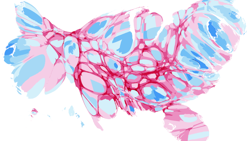
Act 2: Lauren’s First Contiguous Cartogram

For my second map, I visualized life evaluation scores with the new Generate Contiguous Cartogram geoprocessing tool, now available with the ArcGIS Pro 3.5 release. A contiguous cartogram distorts the area of polygons to be proportional to each other based on a numeric field while preserving shared boundaries.
I wanted to distort country size by population, so I selected this attribute for my numeric field. There are two methods to choose from depending on the amount of distortion you prefer. Flow-based is the default, which is what I used.

To represent the life evaluation score, I designed a bivariate color ramp: yellow for ‘happier’ countries and blue for ‘less happy’ countries. Color selection is tricky, and it is important to consider your audience and how color is perceived in different cultures. For me, yellow felt happier (think sunshine) and blue felt less happy (think cloudy skies).
More ‘abstract’ maps, like a contiguous cartogram, can create extra work for the audience to understand if you don’t give them a helping hand along the way. To help the audience, I included map notes, additional labels, and even repeated legend colors in the title and text.
Act 3: Freedom Dies in Darkness

For our third attempt, the goal was to design a map that served the purpose of drawing an audience’s attention. Examples of this type of map might include social media posts, book covers, or animations. This created an opportunity to discuss how big and bold design can be eye-catching but may not be the most intuitive for your audience in comparing data across the map.
I started in ArcGIS Pro and then exported an AIX to ArcGIS Maps for Adobe Creative Cloud. I chose this workflow so that I could utilize the layer effect capabilities in Adobe Illustrator for each of the symbol classes I set up in ArcGIS Pro. The organized layers in the AIX exports helped save time when testing different designs for the different symbol classes.
This map focused on the ‘freedom’ attribute in the dataset, which asks “Are you satisfied or dissatisfied with your freedom to choose what you do with your life?” For the countries that felt ‘freer,’ I used a bright blue and an outer shadow effect to make the country’s shape appear as if it was rising off the page. For the countries that were reported as ‘less free’ I used a darker blue and an inner shadow effect to make the country appear to be sinking into the page.
I think this map looks ‘cool’ but the various shadow effects make it difficult to tell some of the colors apart. The shadows don’t add any additional context because they symbolize the same values as the color ramp.
I really enjoyed presenting with Ken and John, and I hope all those who attended were able to learn from the maps we made and get inspired for future map making.
Want to try making your own thematic maps with this data? John added it as a feature layer in ArcGIS Online.
If you want to take a deep dive into different thematic mapping approaches, check out Ken’s book Thematic Mapping: 101 Inspiring Ways to Visualise Empirical Data available from Esri Press.


Article Discussion: