A story is much more than the map, text, and media it’s built from. Each of these elements is important on its own, but when unified through visual design — consistent color palettes, cartography, and intentional aesthetic choices — they begin to speak a shared visual language.
In this two-part blog series, we’ll explore how to build that shared visual language with intention. A well-developed visual language brings consistency across your cartography, theme, and supporting graphics — reducing visual noise, reinforcing your story’s message, and giving readers a more focused and polished experience throughout.
- Part I: Designing your map
- Part II: Designing your story
Part one looks at how your maps can serve as a source of design direction and how your cartographic choices can help reinforce the tone of your story. We’ll share a set of techniques — from basemap selection and visual effects to fully custom styles in the Vector Tile Style Editor techniques for designing maps that seamlessly integrate into your stories.
In a future instalment, we’ll dive further into building a visual language with graphics, themes, and other visual elements.
Starting with the map
Maps are often the first design decision made in a story, and they tend to set the tone for everything that follows. The colors, symbols, and overall aesthetic of your cartography can help to communicate the visual mood of your story. For instance, a map of shipbreaking practices would likely call for a darker, more somber palette than a map of golf analytics; those are very different stories, and the maps should feel that way. Approaching these cartographic choices with your message in mind is one of the most effective ways to build cohesion in your story.
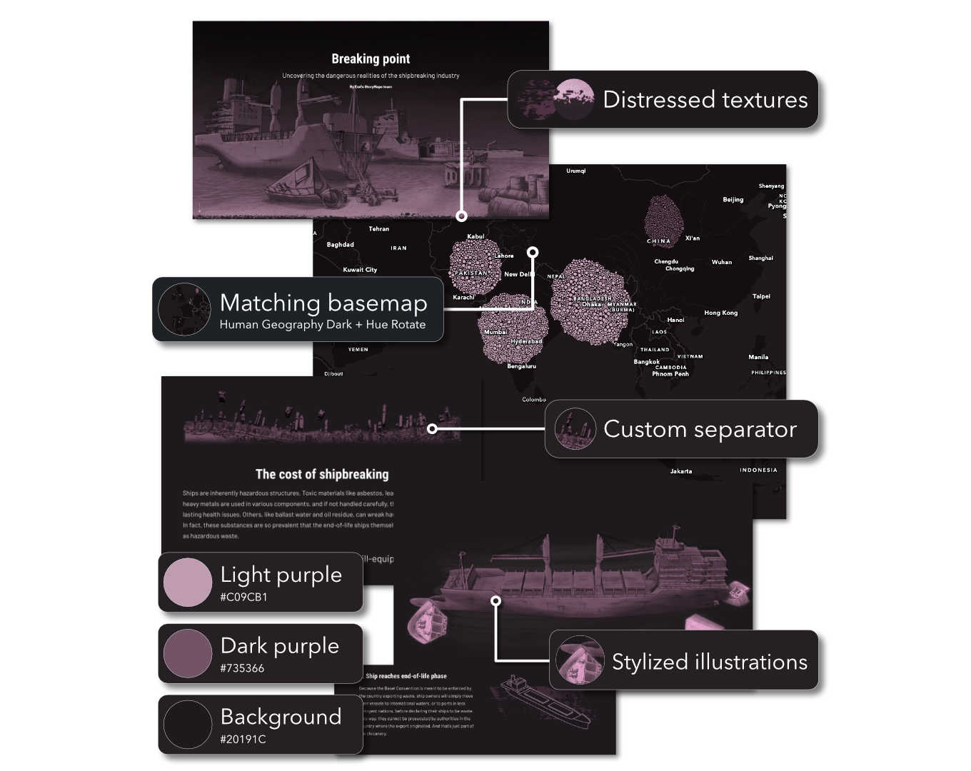
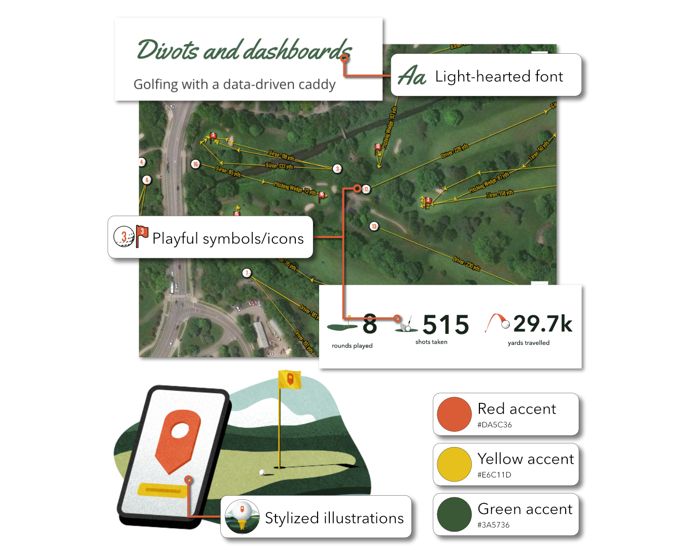
With that in mind, a few guiding questions can help navigate your aesthetic choices. Here are a few that we recommend considering:
- What feeling or message do you want your story to convey?
- How can the map’s color palette influence the rest of your design choices?
- How can all your visual elements work together to create a cohesive reading experience?
- When taken as a whole, do these visual elements all feel like they belong to the same story?
These questions can help you recognize where your maps, graphics, and theme already share common ground and where there’s room to strengthen those connections. With that foundation in place, we’ve assembled some practical strategies that help you align your cartography and design, creating a more visually cohesive story.
Off-the-shelf basemap
While the basemap beneath your data plays a supporting role and often recedes into the background, it can be an important first step in map design. Not only does it provide the essential geographic context and the scaffolding for your data layers, but it also establishes the visual aesthetic. As a result, any changes to the underlying basemap can instantly transform the look and feel of your map.
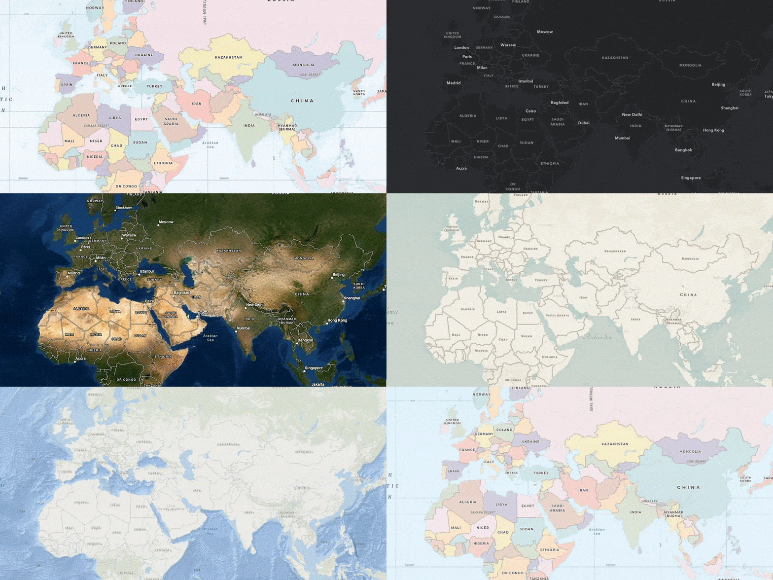
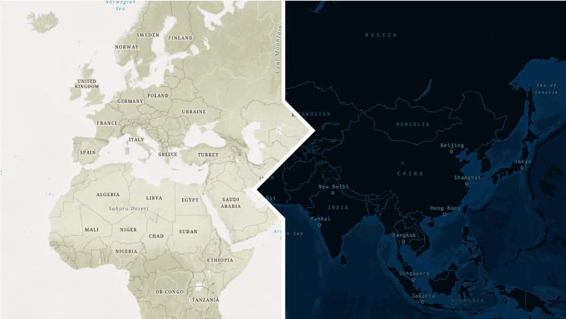
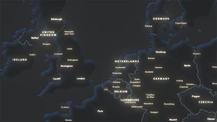
The Living Atlas offers many basemaps to choose from. When selecting which to use in your story, consider not only the thematic layers it provides but also whether its fonts, colors, and graphic elements complement your story’s visual style. A thoughtfully chosen basemap becomes the foundation that supports both your map and the story around it.
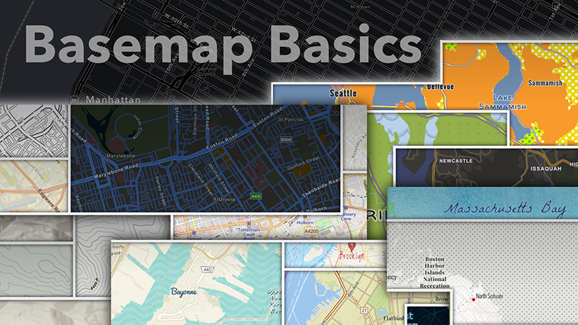
For more tips on maximizing your basemaps for ArcGIS StoryMaps, see this blog →
Customize with effects
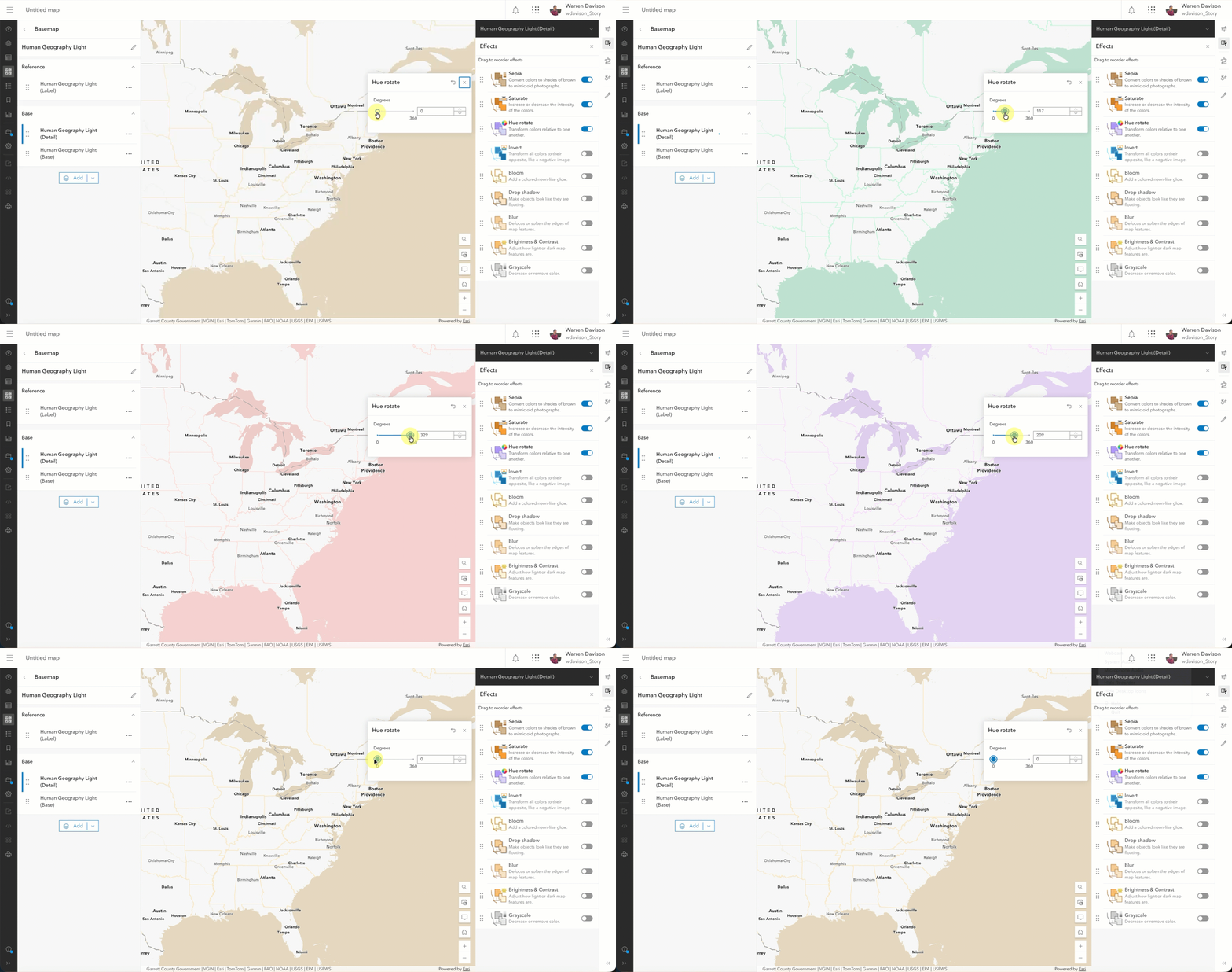
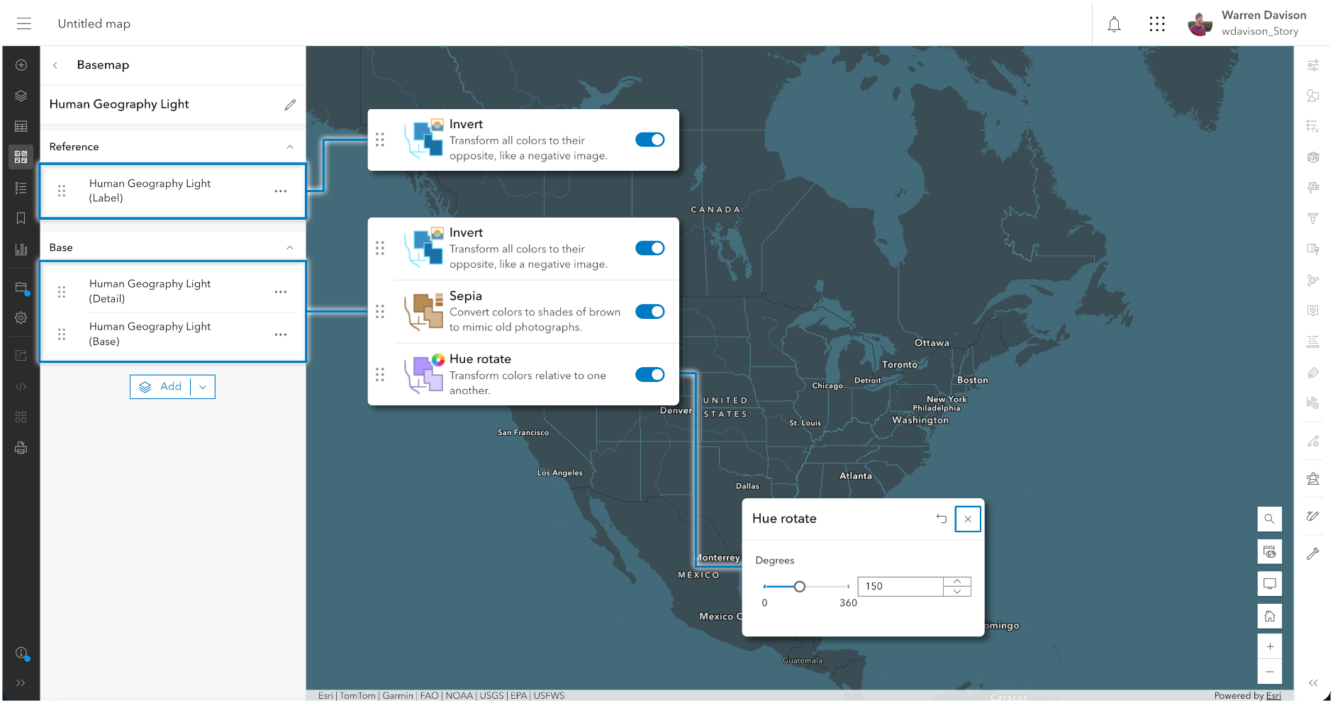
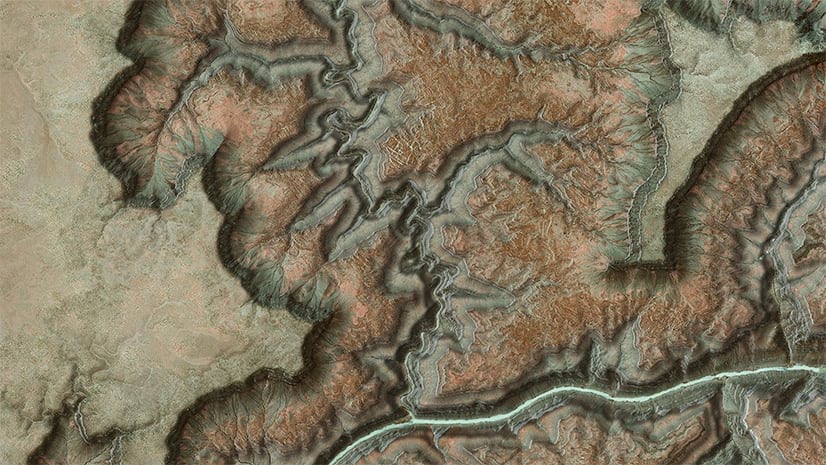
Even when you start with one of the many off-the-shelf basemaps, you’re not locked into its default appearance. A great way to customize it is by using effects right in Map Viewer. Effects bring Photoshop-like capabilities to layers in web maps and can be applied to any layer supported in Map Viewer, including basemap layers. This is an excellent way to quickly modify a basemap and create something entirely bespoke for your story without having to author a completely new basemap from scratch.
For more examples of how to customize vector basemaps with effects, see this blog →
Do-it-yourself tiles
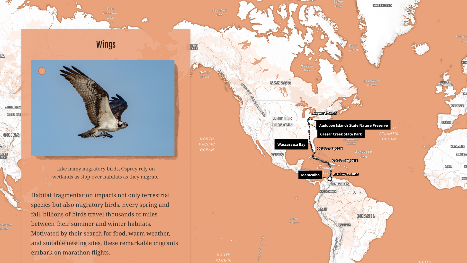
When shifting the hue or contrast of a basemap isn’t enough, there are other tools. The ArcGIS Vector Tile Style Editor is an application for creating custom styles for Esri vector basemaps or your own vector tile layers. It enables detailed customization of each layer in a basemap by adjusting colors, symbols, textures, labels, and layer visibility across zoom levels.

This level of granularity offers flexible design possibilities. A basemap authored in the VTSE can be customized with your story’s color palette or pushed into a distinct aesthetic — illustrated, monochromatic, or textured — that reinforces the mood of your narrative. The result is a basemap that feels purpose-built for the story it lives in.
See this blog for a collection of examples and resources related to customizing vector basemaps →
Design your maps
The techniques covered here — basemap selection, visual effects, and custom vector tile styles — provide a set of cartographic tools for building maps that fit seamlessly into your stories. The basemap is just the foundation of that process: it establishes the visual tone of your map and, by extension, sets the palette that the rest of your story can draw from.
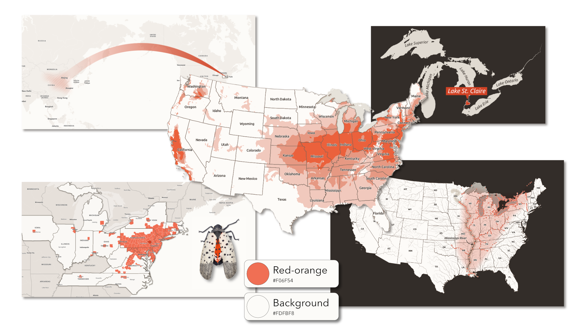
Thoughtful choices about color, symbols, and cartographic style help to create the kind of consistency that makes a map feel well-designed. But a cohesive visual language extends beyond the map.
In part two, we’ll explore how to carry that visual identity into the broader story design and develop a consistent, polished experience from the first panel to the last.


Article Discussion: