If you’ve been using ArcGIS StoryMaps for a while, you’re likely familiar with the theme builder to modify the look and feel of your content. It’s an easy way to visually transform your work. But what if you’re feeling creatively stuck and don’t know where to begin? That’s where the ArcGIS StoryMaps assistant can help. This AI-powered assistant can generate a custom theme based on keywords, descriptions, or reference images you provide. Well-crafted descriptions and strategic reference images can help produce stronger results that are likely to align with your creative vision.
This blog shares practical tips for generating better theme results with AI to speed up your creative workflow.
Note: Your ArcGIS Online administrator must configure AI assistants before you can access them. Learn more about the ArcGIS StoryMaps assistant here.

Custom themes with AI
The ArcGIS StoryMaps theme builder lets you customize the design of your content with endless color, font, and style choices. This gives you granular control over the various design decisions in a theme, and while this level of customization is crucial for organizations, it can be overwhelming if you don’t already have an established color palette or brand. The assistant can help define an accessible visual identity by generating a custom theme based on a few keywords or descriptions. Even if you don’t use the generated theme as-is, it can be a valuable brainstorming tool—giving you new ideas for color palettes or font combinations that you haven’t yet explored.
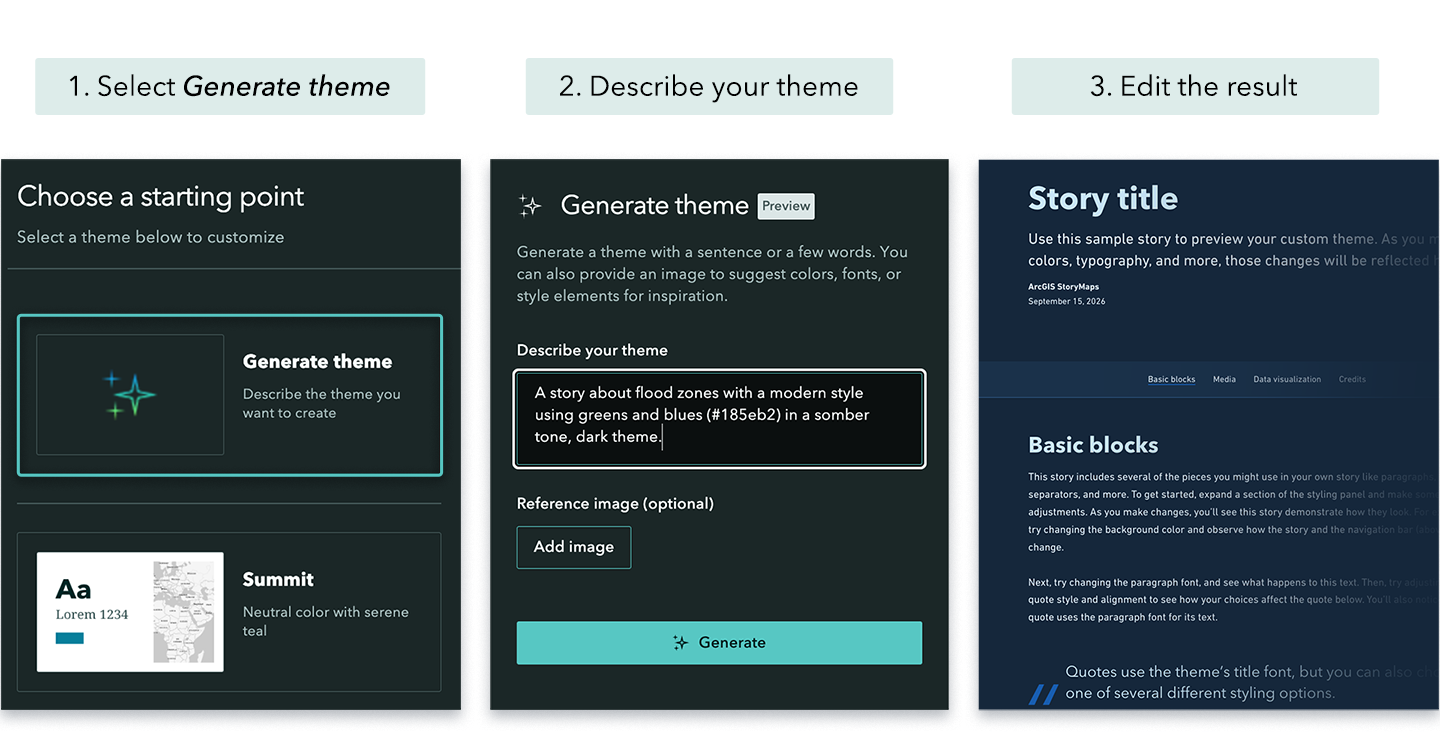
While typing a few keywords or short descriptions will generate a theme, the quality of those descriptions can make a noticeable difference on the output. If the generated result is not what you were expecting, here are a few tips you can try to improve the outcome.
Tip 1: Use descriptive language
When describing your ideal theme, using descriptive language increases the likelihood that the generated result will align with what you have in mind. When you provide more specific cues, you’re helping guide the visual direction that the AI assistant will take.
Here are a few ways to improve your theme description
- Include the topic of your content
Ocean conservation, construction updates, deforestation, flood zones - Reference a specific style or era
Vintage, historical, modern, bookish, 1950’s Swiss design - Identify color themes
Rainforest, wildfire season, winter berries, greens and blues. If your brand uses specific HEX color codes, include them in your description (for example, #185eb2). - Specify your content’s narrative tone
Playful, optimistic, formal, somber - Define the theme’s background lightness
Light theme, dark theme
Example: A story about flood zones with a modern style using greens and blues (#185eb2) in a somber tone, dark theme.
Tip 2: Use reference images to guide the result
Images communicate visual qualities that may be difficult to describe with words alone. That’s why reference images are one of the best ways to guide the assistant toward a result that better aligns with your creative vision. If you have an image, such as a landscape photo, an illustration, or your organization’s marketing materials, upload it as a reference image to help guide the generated theme.
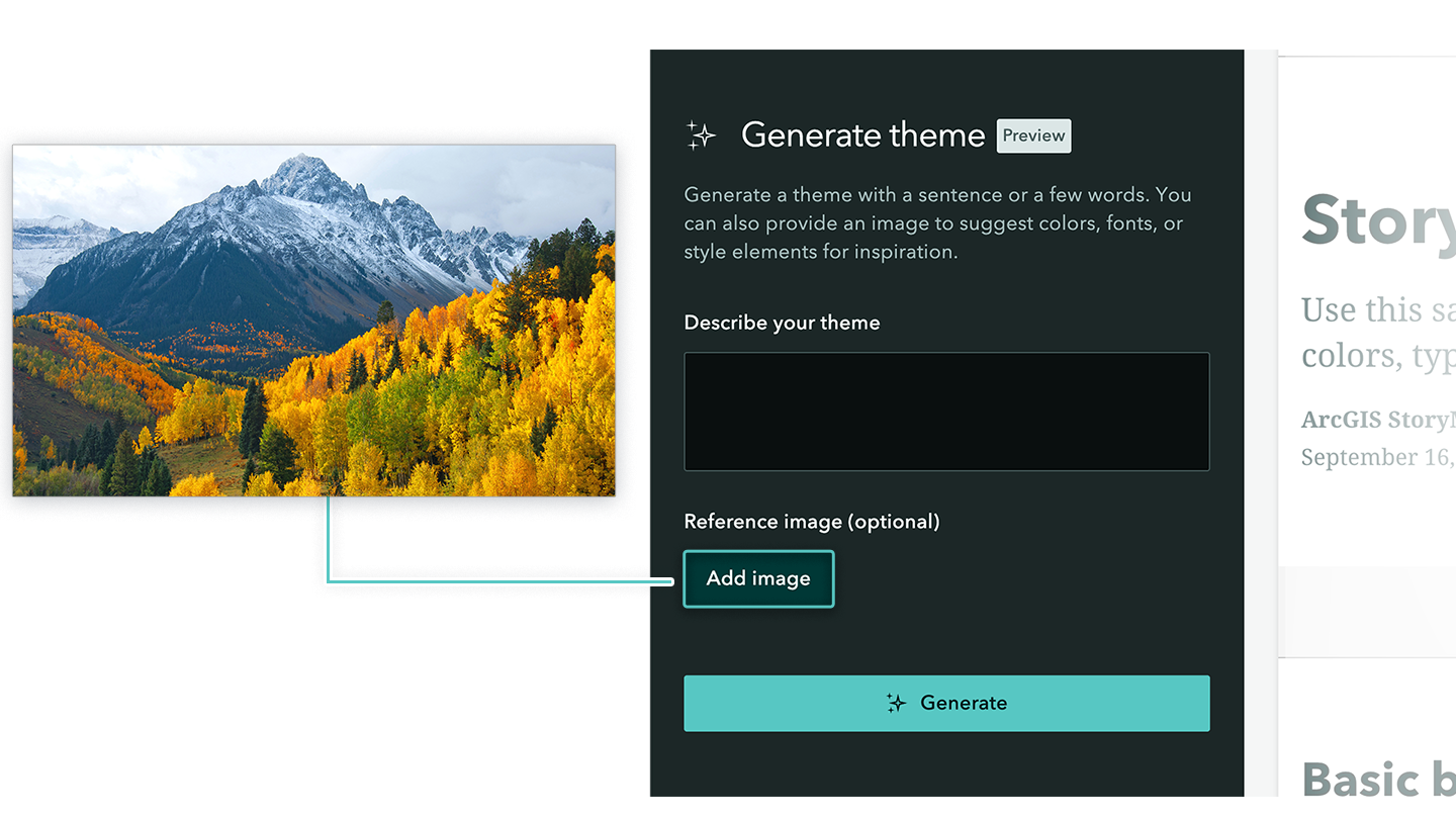
Additionally, you could combine multiple images into a single collage-style artboard and use that as a reference image. To do so, gather multiple images, such as photos, illustrations, and logos into a single document, then upload a screenshot of that collage.
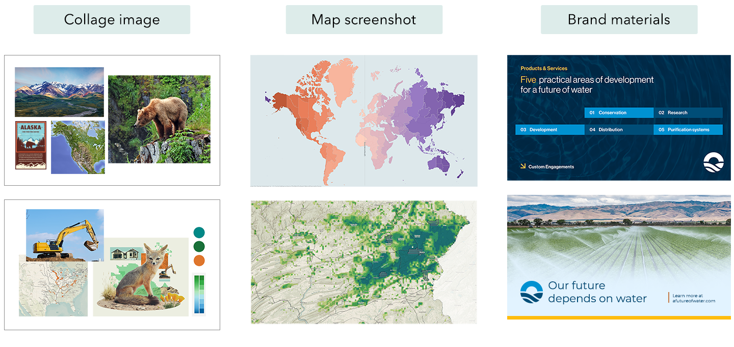
Here are a few reference image ideas to try
- Single image
Photo, illustration, presentation slide, poster, etc. - Map screenshot
Screenshot of a highly stylized map that will be featured in your content - Existing branded materials
Brochure, flyer, logo, branded letterhead - Collage of images
Compile various types of images into a single document
Tip 3: Combine text description with a reference image
The best approach to generating a theme that aligns with your expectations is a combination of tips 1 and 2. Pairing a detailed text description with a reference image gives the AI assistant the best possible chance at generating a theme that reflects your vision. For example, you might pair a screenshot of your stylized map with a description that specifies HEX color codes.
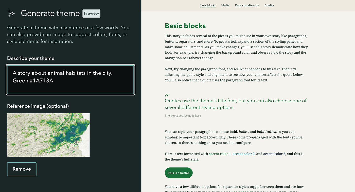
You might also try uploading a single collage image that contains various colors, fonts, illustrations, and photographic images, and then pair it with a text description that defines theme lightness.
Tip 4: Customize the generated theme
These practical tips can help generate better results, but what if it’s still not exactly what you wanted? The good news is that you can use the generated theme as a starting point and modify the details to get it just right.
The AI assistant can generate endless color combinations; however, its font selection is limited. Currently, the assistant will only select fonts from the drop-down menu under the typography section—a total of 29 font options. While the AI assistant is constrained to these 29 fonts, you have the option to add even more from Google’s extensive library of over 1,000 font families. When evaluating your options, prioritize readability by choosing fonts that are clear, legible, and accessible to a wide audience.
Additionally, be sure to check for adequate color contrast before finalizing your color palette. If a color does not have sufficient contrast against the background, a red warning icon will appear in the color box, indicating that the color should be adjusted to improve legibility.
Learn more about accessibility best practices in this story →
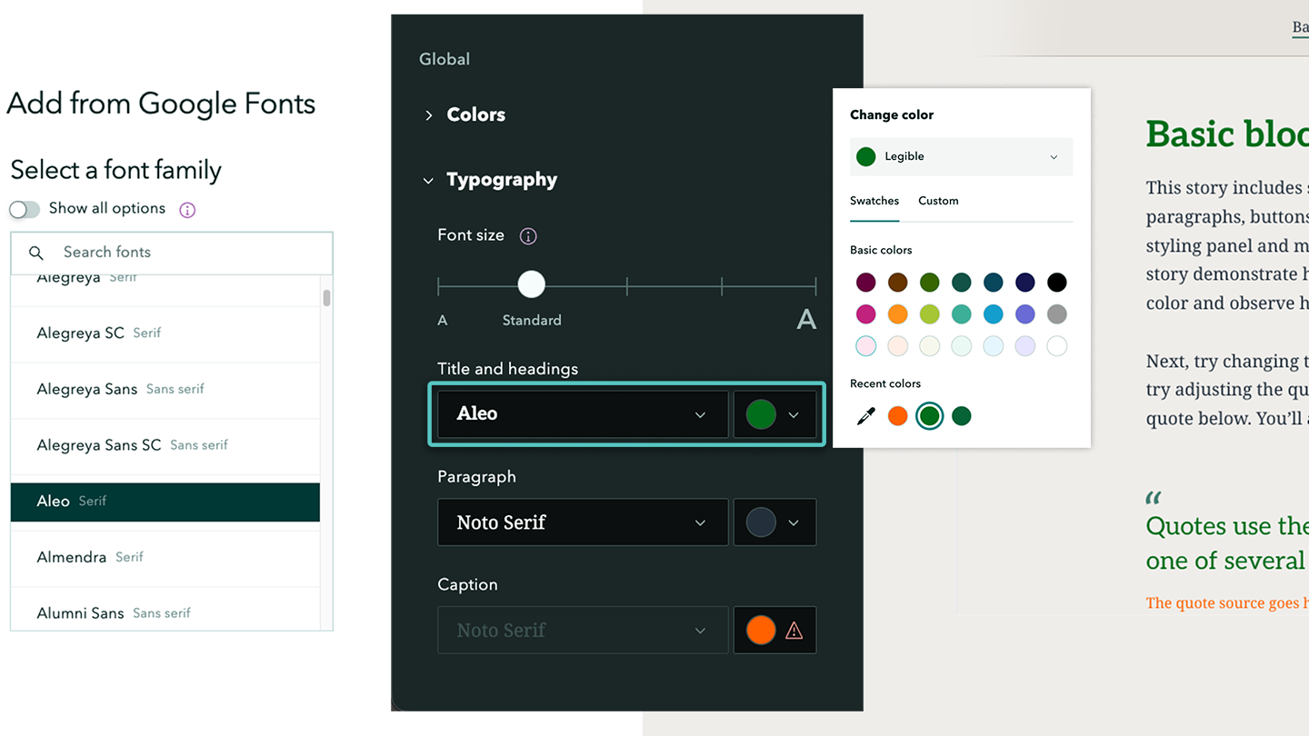
Finally, here are a few ways to customize the generated theme to your preference
- Add a custom separator
Use an illustrative graphic as the theme separator to give your content a unique visual accent - Change the basemap
The theme builder comes with 15 options for a basemap, but you can access even more styles through the Living Atlas by selecting the ‘Browse more maps’ button under the Basemap section - Add Google Fonts
If you’re looking for more expressive fonts or want to closely match your organization’s branding, chances are you’ll find something within the Google Fonts library
Conclusion
Generating a theme with the ArcGIS StoryMaps assistant is most effective when you combine descriptive text with thoughtful reference images and then add your own creative spin. In this way, the assistant can help brainstorm new ideas and spark your creative momentum to design themes that feel more intentional, distinctive, and aligned with the tone of your story.


Commenting is not enabled for this article.