
Azah Yamin first drew us into her world of geospatial storytelling with her submission to the 2024 ArcGIS StoryMaps Competition titled May I, Walk You Home? Named a finalist in the Planning category, Azah immersed us in transit-oriented development (TOD), a term that could sound intimidating to the uninitiated — but not if Azah has anything to do with it.
Using visual intrigue, map and image choreography, and a focused narrative, Azah composed a rhythmic story that flows naturally from beginning to end, all while endearing readers along the way.

I try to think of it as turning the data into a bedtime story. It should feel clear, easy to read, and just the right length.
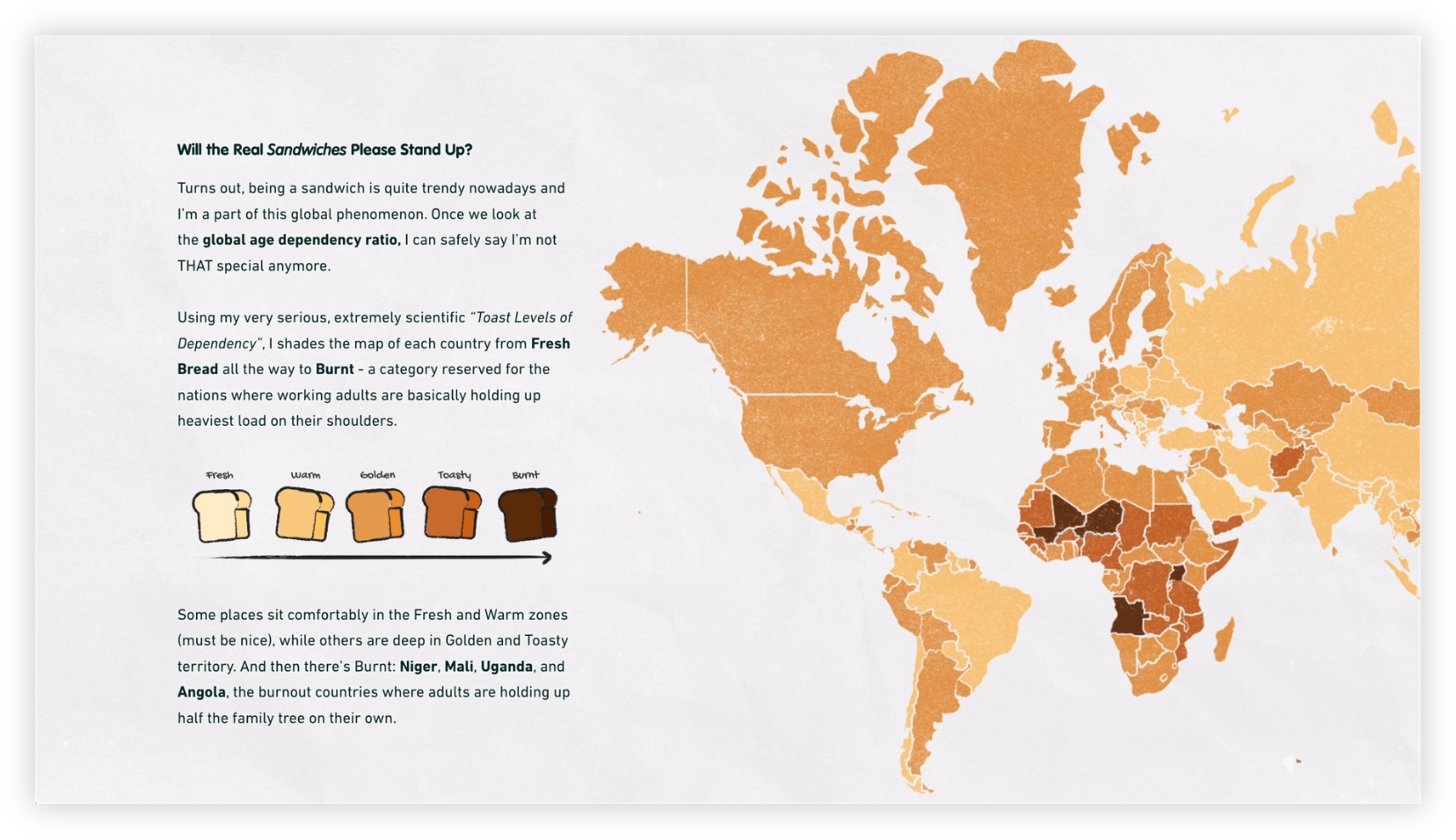
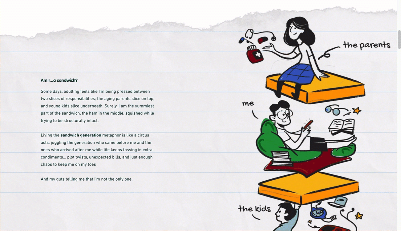
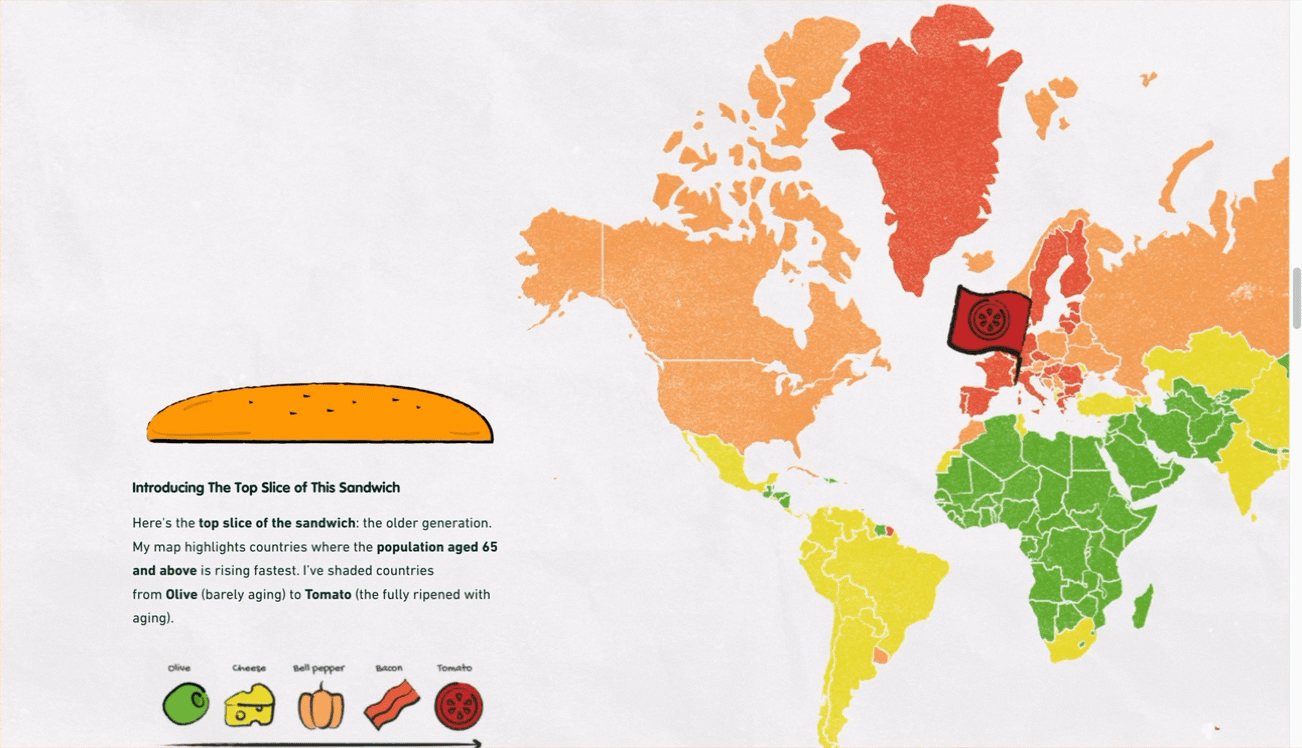
And the 2025 ArcGIS StoryMaps competition? Azah has delivered — and been named a finalist — again. In her story titled Dear Diary, Adulting Just Got Too Expensive, Azah returns with a relatable, focused narrative and energetic maps and graphics to examine global demographics and costs of living; broad topics that Azah masterfully assembles into a sandwich, literally.
In our March 2026 | StoryScape issue, we explore the significance of creating rhythm in geospatial storytelling to keep your audience reading, something Azah Yamin knows a thing or two about. Join us in the delight of learning more about Azah and her approach to creating unforgettable stories.

Thank you very much for taking the time to share your experience and insight with us, Azah! We often hear from storytellers that their life path hasn’t been linear. Does this resonate with you? Can you tell us more about your education and work experiences?
It was anything but linear, as I did not come from a GIS background. I was trained in architecture, and that shaped the way I think about how people access information. My education was very much about turning ideas into clear visual and spatial narratives, whether through drawings, models, or presentation boards. After graduating, I practiced architecture for a period before moving further into digital design, where I was involved in projects focused on humanizing digital experiences, particularly in the banking and insurance sectors. That was where my attention shifted from physical space to how people move through information and interfaces, with a strong emphasis on making complex systems accessible and understandable for a wider audience.
When I started working with maps, I realized they made it easier to break down complex information and guide people through it step by step. You are not just looking at static content; you move through it, and the story unfolds as you go. In many ways, it felt very close to how I had been trained to think in architecture, arranging elements so they are clear, intentional, and easy for people to engage with. With maps, that process felt even more natural.
My path into GIS was accidental, but it also felt like a natural extension of everything I had been doing before. I have always used design to guide people through a story, and GIS simply became the platform where that could happen in a more seamless and meaningful way. The discipline changed, but the intention never did.
Can you share with us how being an UI/UX designer influences your approach to geospatial storytelling? Are there tips or practices from your community that can benefit the geospatial storytelling community?
Designing for the user has always been at the core of my daily work as a UI/UX designer, particularly through creating experiences for GIS products in ArcGIS Experience Builder and ArcGIS Hub. That strongly defines how I approach geospatial storytelling, because it always begins with the audience. I think about who the story is for, whether they are familiar with maps or completely new to them, and how to make the content clear and welcoming, with the intention of reaching beyond a technical or professional audience.
The UI/UX mindset translates naturally into StoryMaps through practices that are common in our field. One of them is designing for scanning rather than for linear reading. Most people do not move through digital content from top to bottom, so visual hierarchy, clear entry points, and familiar interaction patterns help them understand where to begin, where to focus, and how to move forward.
We also think a lot about cognitive load. Not every map needs to be interactive, and not every dataset needs to be visible at once. Sometimes a static visual, a single number, or a short line of text communicates more effectively because it allows the reader to pause and absorb the story before moving forward.
At the end of the day, both fields are about communication. UI/UX has always been about reducing friction between people and complex systems, and geospatial storytelling has the same opportunity. When we design geospatial stories with the same care we design user experiences, we lower the barrier to entry, and that is how we bring more people into the conversation, not just experts.
Can you share more about why you created May I, Walk You Home? and Dear Diary, Adulting Just Got Too Expensive?
Both topics are things I am personally comfortable with, but in different ways. May I, Walk You Home? is my master’s dissertation retold in a conversational way. The research has always been very close to me, but during my studies it lived in a very formal and structured space. StoryMaps gave me the chance to present it in a more human way, focusing on the lived experience and the emotions behind the data, not just the findings.
Dear Diary, Adulting Just Got Too Expensive came from a different place. It is built from data that I relate to in my everyday life. It reflects conversations I have with friends and colleagues, the small struggles that quietly shape our routines, and the things many of us are going through but do not talk about enough. In that sense, both stories are personal. One grows out of my academic journey, and the other from lived experience.
For me, it is less about finding interesting data and more about making the data meaningful. I rarely assume data will speak for itself, so I focus on building a story around it that helps people connect with it in a personal and familiar way. Because of that, my process is quite simple. It starts with the data and a search for the human angle that connects it to everyday experiences. From there, I work on making it less technical and simplifying the message until the story feels clear and approachable.
Your stories are focused and intentional, leading to a story length — and experience — that is natural to read all the way through. Can you talk about your process for composing a focused and intentional story?
I am always assuming the audience is everyone. That is why I try not to sound too serious or too technical, and I avoid a tone that feels overly polished. It is important for me to set the tone as if I am talking to a friend. Ideally, it feels like friends sharing a piece of juicy gossip. I like the idea of spreading data in the same way, because data deserves its own emotional plot.
I’m also comfortable letting the writing retain a small imperfection, because it keeps the story feeling human rather than being too mechanically perfect. That slight roughness helps create a voice people can relate to and feel at ease with.

That tone then shapes how I structure the whole experience. I think of the story as something that needs to be choreographed together with the visuals, what the reader sees first, where the pause happens, when the map takes the lead, and when the text steps in. It is very much about pacing and rhythm, allowing each section to flow naturally into the next so the reader never feels overwhelmed.
I do not always create a formal storyboard, but I am constantly editing and rearranging, removing anything that interrupts the rhythm and adding small transitions that keep the story connected. The goal is for it to feel light and effortless to read.
How did you get introduced to ArcGIS StoryMaps—and why do you use it for your storytelling projects?
Since most of my work revolves around ArcGIS Experience Builder, ArcGIS Hub, and custom map builders, I was not directly exposed to StoryMaps at the beginning. Working closely with the technical team, I was always exploring how far we could push our custom maps and, in the process, probably testing their patience with my ideas. Every new interaction or layout meant extra configuration on their side and a fair bit of head-scratching, but they always found a way to make it work.
It was only when someone on the team pointed me to StoryMaps and told me to explore its possibilities that things shifted. For the first time, the tool moved at the same speed as my ideas. Storytelling stopped depending on configuration and started depending purely on the strength of the concept and the design.
Do you have a favorite builder feature?
It is hard to choose a favorite because every builder feature plays a different role in shaping the story. But if I had to live with just one, it would be the sidecar block for its versatility. It allows the visuals and the narrative to take turns leading, and it gives me control over pacing, focus, and how much information the reader sees at each moment. With the sidecar block, the story flows in a way that feels almost like reading a picture book. It also reflects the scrollytelling approach that UI/UX designers are very familiar with, where scrolling becomes the interaction and content is revealed progressively. This helps manage cognitive load and lets the reader move through the story at a natural rhythm.
Azah, your perspective is so valuable to our storytelling community! Do you have any final insights or advice for us?
I am not sure I am the best person to give advice, as I am still learning myself. But one thing I keep reminding myself is to humanize the story as much as possible. I try to think of it as turning the data into a bedtime story. It should feel clear, easy to read, and just the right length. Something you can finish before bedtime, not at the length that keeps you awake all night trying to get through it.
For me, visualizing data is not about showing everything I found, but about showing just enough for the reader to understand. Deciding what to reveal, what to simplify, and what to leave out is often the hardest part. There is always the temptation to include one more chart, one more map, one more interesting detail, but not everything that is interesting is essential. Data dumping can quickly turn an interesting narrative into a terms-and-conditions page that everyone skips. Data reduction, on the other hand, is an act of care for the audience.
That thinking also influenced how I compose the rhythm of the story. I alternate between text, maps, and visuals so the reader can rest and then re-engage. A dense section of information is often followed by something more visual or spatial. In that sense, visuals are not only there to explain the data; they create breathing space, shift the pace, and sometimes carry the emotional weight of the story. They give the reader time to absorb what they have just learned before moving on.
Looking back, I think that’s what I’ve been trying to do all along: not to show more data, but to gently guide the audience through it.
To close, and since we’re on the topic of rhythm, do you listen to music while you create? Do you have any music recommendations for the community?
My work playlist is essentially my kids’ playlist, whatever they are looping that week, so it is always evolving. I do have a soft spot for Olivia Rodrigo’s songs because of the way each one tells a very specific story. They make you feel the intensity of a dramatic heartbreak even when your own life is perfectly fine. My daughter, who has never even been in a relationship, sings along with complete emotional commitment, and I love that. It is a reminder that you do not have to share the same experience to feel the emotion behind a story. That is also what I try to achieve in my work — creating stories that people can connect with, even when the data is not about their own lives.
This featured storyteller interview was prepared as a part of the March 2026 | Finding your rhythm issue of StoryScape℠.
For more interviews and articles like this one, be sure to check out StoryScape℠, a monthly digital magazine for ArcGIS StoryMaps that explores the world of place-based storytelling — with a new theme every issue.

Article Discussion: