Ever finish a story and sit back to marvel at all you’ve achieved, only to feel like there’s just something missing? Well, you’re not alone. It happens to me all the time. I’m here to tell you that there are things you can do to level up your story design and add that final polish to any story. I keep these techniques, and many more, in my back pocket on any project. There are even enough tips & tricks that if we’re lucky, we may get a sequel!
Today I’ll be sharing some techniques for manipulating boundaries. It’s subtle, but the premise is that not every visual element within a story, cartographic or otherwise, needs to fit perfectly against the edges of its container. In the same way that a cartographer may allow an errant peninsula to playfully break the neatline, constituting a delicious design choice, we too can boldly play with boundaries when adding visual elements to our stories.

Conforming to structured boundaries, brazenly ignoring, or cleverly hiding them are all conscious design decisions that determine the look and feel of your story. This design language can set the story’s tone before the first sentence is read and build an immersive reading experience. So, let’s look at some of my favourite ways the seams can be manipulated in stories and how they can influence the reading experience.
As we dive into this first series of techniques, know that there are some blurry boundaries between them. You could use many different approaches to perform each, and many work in conjunction with each other. Therefore, I don’t intend to be prescriptive with any specific method. Instead, I seek to inspire and toss out wild ideas beyond everyday use that may be useful for spicing up your next story.
Erasing
First up is visually erasing the seams with your story. As you can guess, this is about hiding or disguising the boundaries within your story. This technique aims to seamlessly integrate maps and graphics so that they visually support the narrative in an understated fashion. Unintended errant borders and high-contrast boundaries can visually detract from the appearance of the story and disrupt a smooth reading experience.
In my experience, playing with layout, shapes, and transparency or colour can be used to craft some visual trickery that makes those pesky seams magically disappear.
For instance, in the Digging up Dinosaurs story, I wanted to create the illusion that as the reader scrolled beyond the cover, they were being transported below the surface and viewing a cross-section of a fossil excavation.

“How’d you do that?!” you ask. Well, that’s why we’re here, all learning together. In this case, it was a matter of hiding the boundary between the cover image and the rest of the story below. To achieve this effect, I ensured the bottom of my cover illustration had an adequately wide strip of colour that matched the background colour I selected for my story. This created the perception that there was no perceivable boundary between where my illustration ended, and the body of the story began.
To add to the illusion, I floated the rest of the fossilized skeleton to the story’s right. I created this illustration as a PNG with generous transparent background, but colour-matching the story background would achieve the same result. Admittedly, in this case, the alignment took a little experimentation, but sometimes that design experimentation can make all the difference.

Applying the design language throughout your story is important for consistency. To continue the stratigraphic illusion and reinforce the buried fossil theme in this story, a Stegosaurus fossil appeared later in another section.
While floating prehistoric fossils in your story might be fun, image transparency can be applied to more practical uses for improving the visual design of your story. For instance, when including images and graphics, any time the pixels surrounding your subject distract or contrast too much with the background of your story, it might be worth seeing if you can modify the image. Removing or replacing the pixels surrounding your subject using the image cropper or your favourite image software can direct readers to the focal point of your image and create a more seamless viewing experience.

Erasing examples
- An Introduction to Sea Ice
- Aerial odysseys: bird migration in the Americas
- America’s mental health crisis, mapped
- Living in the Age of Humans
Blurring
Completely hiding the boundaries between elements can be a valuable tool for creating a seamless reading experience. However, there are times when we can’t, or we don’t want to, make them completely disappear. In these cases, if our goal is to flow smoothly from one element to another in our story, we need to minimize these visual speed bumps, where our readers might be jolted out of the intended experience.
One example where we can blur the transition between elements in our story is within an embedded web map. Unfortunately, we don’t have the same pixel-level control here as we do with images, so if we want to minimize this speed bump, we’ll need to get creative cartographically.
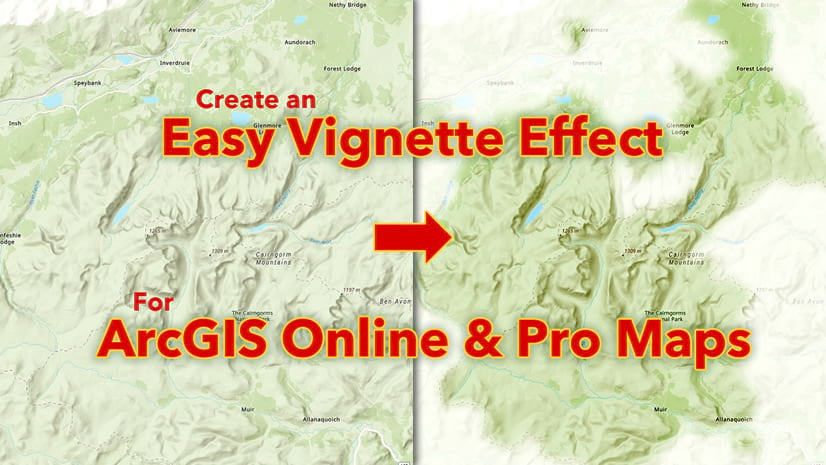
Vignettes are the answer! Vignettes offer a powerful solution for hiding the boundary between the body of our story and the map. When the mask matches our story background, the reader can scroll into a web map and barely notice the transition. In addition, vignettes do double duty by creating a focal point in our map, drawing the reader’s eye toward the data or feature we want to highlight.
My talented colleague Cooper Thomas demonstrated an excellent example of vignettes in this story. The application of a vignette in this map obscures irrelevant geography and draws the reader to the focal point of the map. A bonus is that since the vignette matches the background colour of the story, the visual speedbump is greatly reduced between the preceding text and the map.

If you’re itching to get to work applying this technique to your web maps my cartographic compatriot John Nelson has assembled a helpful tutorial covering this technique.
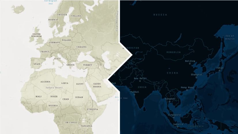
So how might we blur the boundaries of other content types? Well, vignettes aren’t just for web maps! We could apply the same feathered edge to images to ease the transition from text to image or reverse. This is especially relevant if you create static maps using ArcGIS Maps for Adobe Creative Cloud. In combination with a healthy dose of PNG transparency, a subtle feathered edge can be used to gradually transition a reader from a full-width map back to the story and avoid the sensation that the map abruptly stops.

Blurring examples
Breaking
The final technique I’d like to cover is breaking the boundaries. This technique is like our map neatline example and involves having our maps and graphics boldly extend beyond or reinforce established visual borders. This technique can generate visual interest and can also greatly influence the reading experience. Distinct boundaries can be used as a narrative tool in a story, creating a pause for emphasis or helping readers parse content.
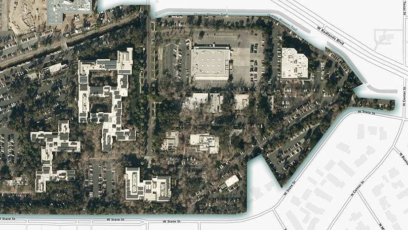
One method to defy the boundaries within your story is to emphasize them with dynamic edges. A little graphic editing, in the form of cropping, can give you creative control over where the boundary falls, adding a unique flavour to the transitions in your story.

In the example above, my incredible colleague Gustavo Cardenas creatively cropped the bottom portion of his photo using a torn edge, adding dynamism and texture to the cover of his story. This kind of cropping can also be used to emphasize transitions between sections within your story. Applying subtle geometric decorators can draw attention to the transition to the next section of your story and encourage the reader onwards.

As opposed to manufacturing a new boundary in your graphics, this creative cropping can be applied to photos with a natural break, such as the horizon. For instance, using a little image editing, the sky could be made transparent to create a bold dynamic boundary between the graphic and other elements in your story.

Additionally, colour can be used as a tool to emphasize the boundaries throughout your story. Drawing upon the accent colours of your story in bold graphics, imagery, or background can visually partition sections of your story. These sections can facilitate a deep dive into the analysis of a dataset or elaborate on a related narrative arc within your story. Regardless of the content within, the clear division of content can punctuate the reading experience.

Examples
- Sacred Places, Sacred Ways
- A homecoming for Gonarezhou’s Black Rhinos
- Great Wetlands of the World
- Sounds of the Wild West
Summary
To wrap things up, there are many ways that you, as an author, can craft your story for maximum visual effect. While I’ve only covered a few methods here, there are likely many more out there, so experiment and perhaps even combine techniques together for variety.
Whether you want readers to effortlessly travel through each section of your story or want to punctuate the narrative with dramatic emphasis, know that the design language of your story can help influence this reading experience
Hopefully, these novel tips & tricks have sparked some new creative ideas that you can apply to your next story. I’d look forward to seeing what you create!

Article Discussion: