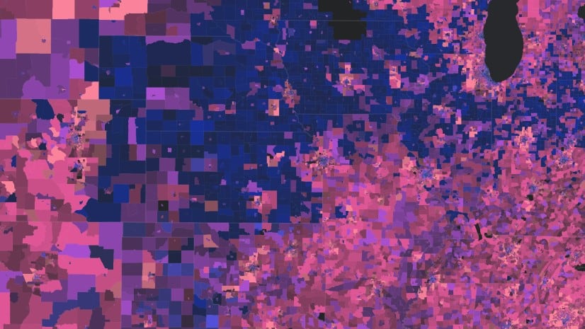
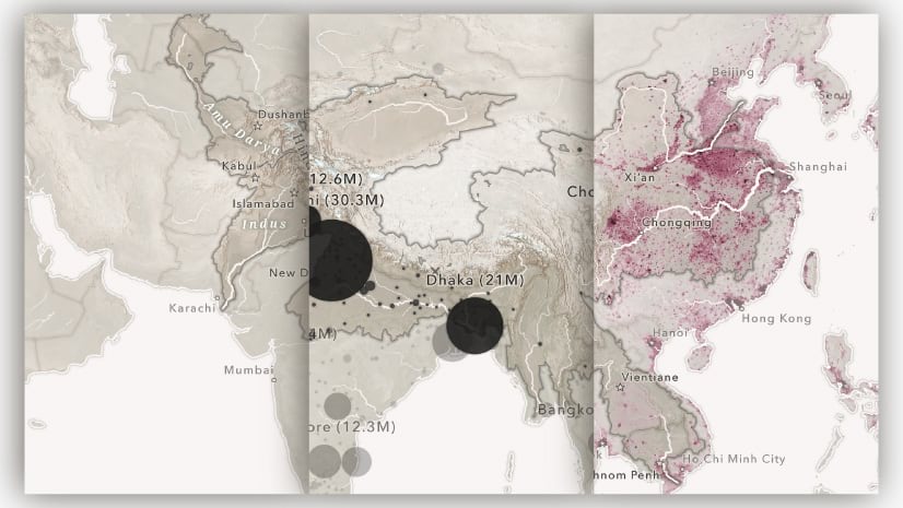
From storms and wildlife to vessels and buses, in the age of interconnected sensors and real-time data, there is rarely a shortage of datasets to map. However, mapping these datasets presents unique challenges.
While we often think of a storm or a bus as a singular feature on a map, the data we collect about them can consist of a series of observations over time — snapshots of changing positions, conditions, or measurements. These observations of a single storm or bus may number in the hundreds or even thousands. Multiply that across a season of storms or a fleet of buses, and any meaningful patterns can get lost in the noise.
While the sheer number of observations may appear to make these datasets unintelligible, time is the key. A storm, a bus, or any other subject can only be in one location and have one set of attributes at a time. In this way, the timestamp serves to connect the observations, tracing the spatial and temporal path of the data.

Telling stories with tracks
Spatially, this observation data traces the breadcrumb trail of a subject and can be used to tell a compelling story. Movement plays a central role in many spatial narratives — whether it’s the migration of wildlife, the path of a storm, or the ascent of a mountain. When visualized on a map, these journeys become powerful storytelling elements. Mapping movement not only shows where something went, but also invites curiosity: Where did this start? Why did it take this direction? What happened here?
As the map evolves alongside the narrative, the path provides a visual throughline. It creates continuity from one moment to the next, helping to create a more cinematic and immersive experience.
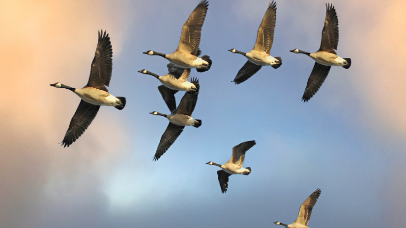
A good example of this is the story Animals on the move, which explores the incredible movements of wildlife by following the GPS-tracked journeys of three different animals. Visualizing their movements as animated tracks not only reveals their impressive migrations, but it also brings their stories to life. Readers can follow along as the animals graze in valleys, soar over wetlands, or navigate vessel traffic — experiencing their journeys step by step. This immersive perspective not only builds empathy, but highlights the real-world pressures wildlife face. By tracing their paths, readers gain a deeper appreciation for the habitats they rely on and the importance of protecting migration corridors and critical ecosystems.

These kinds of narrative journeys are made possible by time-based visualizations. As we’ve documented before, these can provide a deeper understanding of a wide range of topics and datasets. This is especially true when working with movement data. Whether historical or streaming in real-time, visualizing movement over time reveals where and how something changed, telling a story: where something started, where it went, and how it changed along the way.
Choreographing these timestamped observations as a track makes these stories clearer and more intuitive. Linking individual observations — such as those representing a storm, vehicle, or animal — into a continuous line helps visually reconstruct the journey. Suddenly, scattered points become a clear path.
That path does more than just show location. It communicates motion, direction, and behavior. Did it take a direct route or double back on itself? Did it pause often or move without stopping? These patterns, hard to detect in raw point data, become instantly legible when rendered as a track.
Tracking your own data
The ability to visualize time-enabled data as tracks is supported directly within the ArcGIS Maps SDK for JavaScript (JS Maps SDK). This new capability uses a timestamp and a track ID field in your point layer to dynamically render them as the vertices of a line, all without tedious pre-processing.
Visualize historical track data
This sample demonstrates how to visualize historical hurricane locations as tracks (beta) in a GeoJSONLayer.
In addition to a timestamp, each observation must belong to a track as identified by a unique ID. This track ID is used to group observations related to each instance of a subject, whether that be a storm, vehicle, or wildlife.
Layer.timeInfo = {

                  startField: “timestamp”,

                  trackIdField: “storm_id”

};
When configuring the track visualization, several components make up the visual, including:
- latestObservations representing the most recent points based on the current time slider position or the latest records in real-time data.
- previousObservations representing a cumulative collection of points that occurred previous to the latestObservations.
- trackLine which serves as the linear connection between points in the sequence.
layer.trackInfo = {
  previousObservations: {
    renderer: {
      // renderer configuration defined here
    }
  },
  latestObservations: {
    renderer: {
      // renderer configuration defined here
    }
  },
  trackLine: {
    renderer: {
      // renderer configuration defined here
    }
  }
};

Each of these elements can be configured separately and encoded with its own variables, providing great flexibility for representing different aspects of movement, such as speed, direction, category, or time. Conversely, these elements can be configured for more operational storytelling to support real-time use cases. In these cases, only the latest observations might be visible to improve clarity and reduce visual clutter.
Regardless of the use case, the individual elements allow you to tailor the visualization to highlight the story your data is telling, revealing patterns and behaviors that might otherwise go unnoticed.
Conclusion
So, whether you’re mapping the travels of a tagged sea turtle or tracing bus routes across a city, track visualizations offer a cleaner, clearer, and more visually compelling way to display movement in your maps
Explore Animals on the move to see the renderer in action, then try it for yourself in your own time-enabled maps and stories.

Article Discussion: