This post was originally published in December, 2020, and was most recently updated in September, 2024 to reflect the latest enhancements to the ArcGIS StoryMaps product.
_________________________
There’s no shortage of content out there for the digital reader to peruse—our storytelling community alone is creating thousands of new stories every day! If you want to cut through the noise and capture your audience’s attention, you’ll need the power of visual design on your side. Luckily, with ArcGIS StoryMaps’ design panel you have a variety of tools at your fingertips for making a story that’s sure to catch the eye.
Tour the ArcGIS StoryMaps design panel
For those not familiar, the design panel can be opened up from the header of the story builder. This panel is a command center of sorts, dictating all kinds of details about how content appears in your story. The design decisions you make here are broken down into a few key parts. [Note that briefings and collections also have their own design panel, though some of the options and capabilities differ from stories; this blog post will specifically cover the design panel for stories.]
Cover layouts
Think of the cover as your story’s first impression. It’s that initial view that welcomes a reader to your content and hints at what’s in store, should they keep reading. That’s a pretty important role.
We always tell people to start with a bang, something that grabs a reader by the eyeballs and immediately pulls them right in. But there are a variety of ways to kick off a story. Switch between the six available layouts in the design panel and you’ll start to see how changing from one to another can also dramatically affect a reader’s emotional response. As different as they are, each layout can be highly effective — picking the right one depends on what kind of first impression you’re after.
Three of the cover options fill the allotted space with the cover media (usually involving some cropping of the media), while the other three fit the entire media into the space. We’ll walk through each of them in some more detail below.

Minimal (fill; initial setting for all new stories): Maybe the thing that will most interest your target audience is better conveyed through words than visuals. This can often be the case for how-to articles, thought pieces, or press-release-style updates. For all these scenarios, a descriptive headline is what matters most, and the minimal layout makes sure nothing gets in the way of your title coming across loud and clear, and you can opt to center or right-align the title to best suit your story.
You can still add a little visual flourish at the top, perhaps something abstract or textural, if you find your opening needs a little more flair. If you do add an image to your cover, make sure you adjust the focal point in the image properties to keep the most important area of your image visible across screen sizes.
One use for the minimal cover could be to create space for a kind of story preface, like we did in this example, inserting some introductory text immediately after the subtitle and using full-width media to separate it from the body of the story.
Top (fit): Also positions the media above the title, but will show the whole piece of media.
Full (fill): This layout is perfect for stories where you really want your audience to feel transported to a specific location. Fill the screen by uploading some atmospheric video, or use a high-quality landscape or cityscape photo to introduce the setting. Or, if your story centers around an especially artistic map, use an image of it here to preview the impressive work a reader can explore if they keep going.
In the full cover layout, be aware that you have a lot more flexibility with the positioning, width, and background of the title card. Experiment with the position and background styles (transparent with a shading applied to the underlying media to make the title and other text more readable; a solid, fully opaque background; a full transparent background with dark text, and a fully transparent background with light text). Whichever you choose, make sure your title, subtitle, byline, and date (if applicable) are legible against the cover media!
Card (fit): The title card will be “stacked” on top of the media, but partially off to one side to keep most of the media showing. You can adjust the title card’s width (in three sizes), as well as whether it’s on the left side of the right side of the media.
Split (fit): There are some photos and videos over which you can legibly lay text, and then there are some over which you can’t. For media that falls in this second category — think images with lots of texture or light-to-dark contrast, or a map with lots of labels — this layout lets you present your title and subtitle right alongside an unobstructed, alluring visual. It’s also better suited to display any portrait-oriented photos or videos you may be considering for your cover.
Side-by-side (fill): Similar to the split layout, except the media will fill the available space. You have the option to expand the space the title occupies relative to the media space, and vice versa. Like with the minimal cover, don’t forget to set a focal point for your cover media. And, in this layout, you also have the ability to expand or shrink the media portion using the double-headed arrow between the media and the title.

Optional story sections
Moving on down the design panel, the next section enables storytellers to activate two additional story components: an in-story navigation bar that will enable readers to immediately jump to designated parts of the story (toggled off at the start), and a credits block at the very bottom of the story (automatically toggled on).
Navigation: When you enable this option, all of the top-level headings in your story (including those in sidecar slides and in the credits block) will be treated as bookmarks that will appear in a navigation bar that sticks to the top of the screen as a reader scrolls down a story. When a reader clicks on an item in the nav bar, the story will jump right to that section of the story.
When in the story builder, hover over the navigation bar and you’ll see a little gear icon appear; click on that to access a control panel, with which you can edit the text for a heading as it will appear in the nav bar, or turn items off entirely. Up to thirty items can be displayed in the nav bar for a given story.
Credits: Turn this on to add a block to the end of your story, within which you can list contributors to the story, sources for data and media, and other footnotes in a two-column format. This section will automatically take on a slightly lighter or darker shade than the story’s background color to help it stand out.

Themes
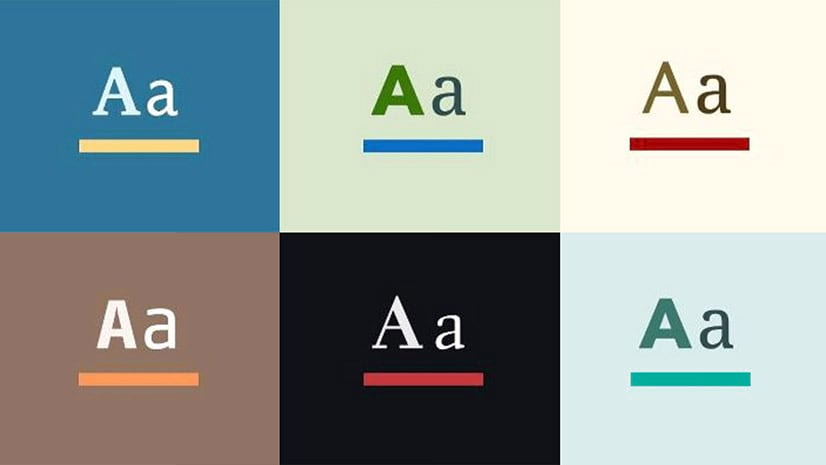
Story themes have the biggest impact on your story’s look and feel. A story’s background color, accent colors, typography, express map appearance, and other visual elements are all determined by theme-related decisions you make here.
You want to think through theme choices carefully. Your readers will expect the visual style of a story to align with the tone of its overall narrative, so be sure you’ve considered what the colors and fonts you’ve chosen will signal to your target audience. Having some familiarity with the basics of typography and color theory, and how you can use both to shape the emotional reactions to your content, will make choosing the most appropriate theme much easier.
Right out of the box, ArcGIS StoryMaps presents six pre-built themes:
Summit: This minimal, modern theme feels clean and approachable, making it a practical, versatile workhorse that can do justice to a wide range of story topics (like this one). For those curious, here are some theme specifics:
- Background color: #ffffff
- Title font: Avenir Next, #002625
- Body font: Noto Serif, #304e4e
- Accent colors: #087f9b, #fc3b36, #04240e
- Basemaps: Human Geography Light, Light Gray Canvas
Obsidian: Obsidian’s dark background and serif heading fonts make it feel a bit more buttoned up than easy-going Summit. It’s ideal for stories on the more serious side, or for those that are a little more edgy and dramatic. Alternatively, the near-black background is perfect for highlighting photography, as well as maps that use firefly or other seemingly glowing cartographic techniques. Here are Obsidian’s theme specs:
- Background color hex code: #0e1116
- Title font: Charter BT, #f3f3f3
- Body font: Basic Commercial, #e6f2f2
- Accent colors: #ea5b41, #4d6aff, #0ec2db
- Basemaps: Dark Gray Canvas, Human Geography Dark
Ridgeline: Ridgeline was designed with nature in mind. Whether you’re recounting the story of your field research, sharing the history of a natural park, or researching the origins of your go-to salad, this theme’s charismatic fonts and subtle green background bring a sense of connection with the outdoors into your story. Here are Ridgeline’s specs:
- Background color hex code: #f2f6ed
- Title font: Klint, #192c36
- Body font: Real Head, #637372
- Accent colors: #31b871, #3884f4, #525868
- Basemaps: Topographic, Light Gray Canvas
Mesa: Where Ridgeline is bold and adventurous, Mesa is composed and wise. Its tan background and elegant serif fonts make it ideal for stories about history (both personal and global), culture, or a host of other digital humanities subjects. These are Mesa’s specs:
- Background color hex code: #faf2e6
- Title font: Elante, #131940
- Body font: Elante, #574237
- Accent colors: #d13e37, #5d6b8f, #ad7300
- Basemaps: Modern Antique, Human Geography Light
Tidal: Perfect for telling stories about the ocean and other vast or weighty topics, Tidal’s background gets darker as readers descend into a story, giving them feeling of diving deeper and deeper in to the topic. The theme specs, if you need them:
- Background color hex code: #113f5d at the top, moving to #082131 at the bottom
- Title font: Ocean Sans, #ffffff
- Body font: Mahsuri Sans, #bebd1
- Accent colors: #438486, #a85848, #547aa8
- Basemaps: Ocean, Streets Dark Map (also uses the Firefly basemap instead of traditional satellite imagery)
Slate: Inspired by newspapers and print media, Slate evokes a journalistic tone pairing using serif fonts with bold color tones. It’s great for stories about current events, historical explainers, or other newsy items.
- Background color hex code: #f7f7f7
- Title font: Pax, #001c1b
- Body font: Swift Neue, #585858
- Accent colors: #b03535, #2b74ca, #e0aa57
- Basemaps: Newspaper, Human Geography Dark
Featured themes
If those six themes don’t quite fit the bill for your story, but you’d still prefer to leave the heavier aesthetic decisions in the hands of design professionals, you can check out the Featured themes gallery for a handful more pre-created options. Featured themes are designed with particular story types, topics, or moods in mind.

Custom themes
While the preset themes available in the builder provide excellent, reliable starting points for anyone who wants to craft a polished-looking story, there will be times where you need to stray from these preset themes to better achieve your intended look and feel, or to align with specific brand guidelines. That’s where the theme builder comes in.
To apply a custom theme, click Browse my themes in the Theme section of the design panel. You’ll be taken to a gallery of any custom themes you’ve already created, plus ones that have been designated “approved” themes within your organization, other themes people in your organization have created, themes you’ve favorited, and themes that are shared to groups you’re in.

If you’re scratching your head right now because, well, you haven’t made any themes yet, fear not: You can immediately to jump to your My Themes page by clicking Manage my themes in the fine print at the bottom of the Theme section of the design panel. There, you can create your own custom theme from scratch. When you first create a new theme, you’ll be prompted to pick from one of the six standard themes to use as a starting point. You’ll then have control over a number of design decisions, including:
Background and accent colors: A story’s primary accent color is applied to embellishment details like buttons, quotes, and the dot navigation in sidecar blocks. It also affects the initial styling of express map features. Each theme has a primary accent color and two configurable secondary colors, with the option to input hex codes to tailor your story’s color scheme precisely to your specifications.
Font pairings: The two main types of typographies in StoryMaps are that of a story’s title and headings, and that of its paragraph text. Storytellers have a preset list of 32 different fonts to pick from, and if that’s not enough, the full library of Google Fonts (over 1,000 more fonts) is at your disposal as well. Mix and match until you arrive at a pairing that works best for your story, and fiddle with the default text coloring, too (an in-app contrast checker will keep you aware of whether your text color choices are legible against your story background color).
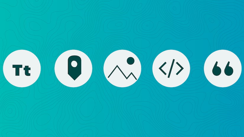
Design elements: Custom themes also provide some additional flexibility in terms of the story’s more peripheral design elements: buttons, quote blocks, and separators. There are three different styles for each, plus left/right/center justification or a full-width option for the separator. You can also upload a custom separator if you’d prefer.
For step-by-step instructions on using the theme builder, follow this tutorial. Also be sure to check out this blog post for helpful tips on how to put together strong, aesthetically pleasing themes.
Custom logo
Last but not least, you can also add your own logo to the header and/or cover of a story through the design panel. This is great for anyone making a story on behalf of a brand or organization, especially since you can add a link to your website from the logo. Making a personal story? Upload a personal logo and link it to your portfolio, or a collection of other ArcGIS StoryMaps content you’ve made.

Some parting suggestions
If you’ve made it this far, you now know just how powerful a tool the design panel can be, and how you can leverage it to make your stories more magnetic to your readers. On top of that, I’d like to leave you with two more points to keep in mind.
Strive for consistency
Like good movies, good stories let the audience forget about whoever made the content in the first place. You want all the attention focused on the narrative or argument as it unfolds, not on the decisions that guided content creation.
Establishing a unified look and feel through all of a story’s visual components is critical to fostering this kind of immersive reading experience. If you’re using one of the preset themes, use the specs provided above to ensure harmony between any express maps and web maps you include in your story. And, if you’re making any original charts or infographics for the story, make sure they use colors and fonts that match or complement your chosen theme.
Be sure to avoid any graphics that look so different from the rest of your content that a reader will get pulled out of the story by such a jarring visual departure; you could lose them entirely if that happens.
Select a theme that sets the right expectation for your audience
Ok, this is basically a repetition of what I said earlier, but it’s too important not to repeat. Visual cues like colors and fonts do a lot of heavy lifting for online readers. These elements quickly alert someone to the kind of read they are in for.
Dark colors and serif fonts, for example, suggest a more formal or somber subject, and will emotionally prepare a reader for something more serious. They’d set the wrong emotional tone for a light-hearted story about a road trip to adopt a new puppy, for example, and this discord can make a reader feel off-balance. Off-balance readers more likely to move on to another piece of content, so let’s all agree not to make them feel that way!
When planning your story, think about the emotional and cultural connotations of colors and fonts, then pair that with your story goals to find a theme evokes the right response in someone as they go through your story. It might take a little practice, but once you master it, the payoff is pretty powerful.


Article Discussion: